Digital Storefront for Museum-Grade Audio Hardware
Paul Fadayo
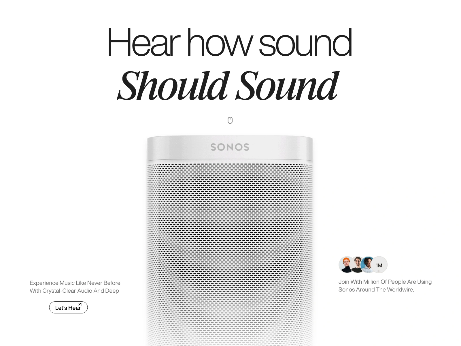
Sonos: Redesigning the Digital Storefront for Museum-Grade Audio Hardware
Project Overview
Client Name: Sonos
Company: Sonos, Inc.
Industry: Consumer Electronics / High-Fidelity Audio / Smart Home IoT
Objective: To strip away traditional e-commerce clutter and create a minimalist, high-luxury digital showroom that lets premium acoustics speak for themselves.
The Challenge
High-end audio brands frequently fall into the trap of over-explaining their hardware. When auditing contemporary smart speaker landing pages, we identified three core conversion roadblocks:
Visual Clutter Killing Luxury: Busy background patterns, aggressive promotional banners, and dense spec sheets distract from the tactile beauty of premium industrial hardware.
Flat Product Presentation: Traditional static imagery fails to communicate the internal build quality and acoustic engineering that justifies a premium price point.
Impersonal Handoffs: E-commerce sites often push users immediately to a cold checkout cart without providing emotional or social proof validation early in the browsing journey.
The Solution
We structured the Sonos redesign around a high-fashion, gallery-first aesthetic engineered to elevate perceived product value:
Extreme White Space & Editorial Typography: We anchored the layout on an ultra-clean canvas paired with bold, contrasting typography. By mixing stark sans-serif headers with sweeping italicized serif accents ("Should Sound"), the page evokes the elegance of a high-end print design magazine.
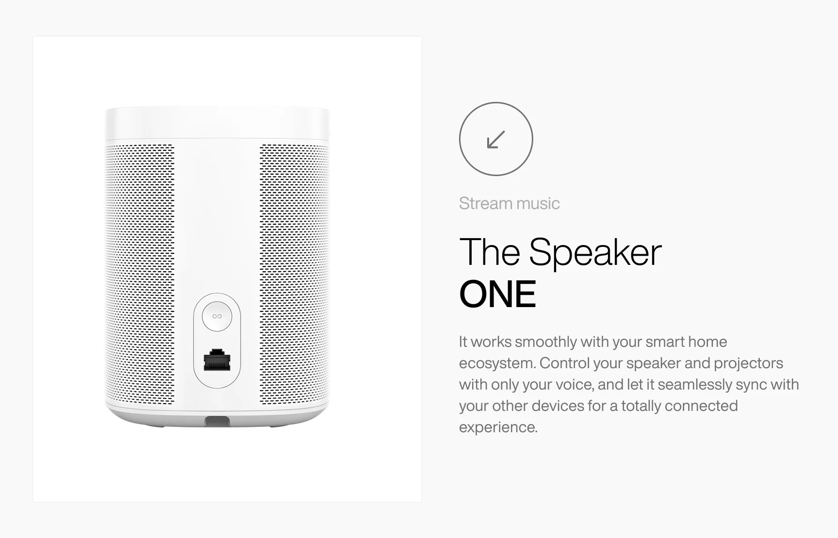
Tactile Hardware Isolation: Rather than showing the speakers in cluttered living rooms, we placed hyper-detailed monochrome renders against zero-distraction backgrounds. This draws the user's eye directly to the precision micro-perforations of the speaker grille.
Frictionless Social Validation: We embedded subtle, floating social proof badges (
Joined by 5 Million+ People) directly adjacent to the hero render, providing immediate credibility without breaking the minimalist visual hierarchy.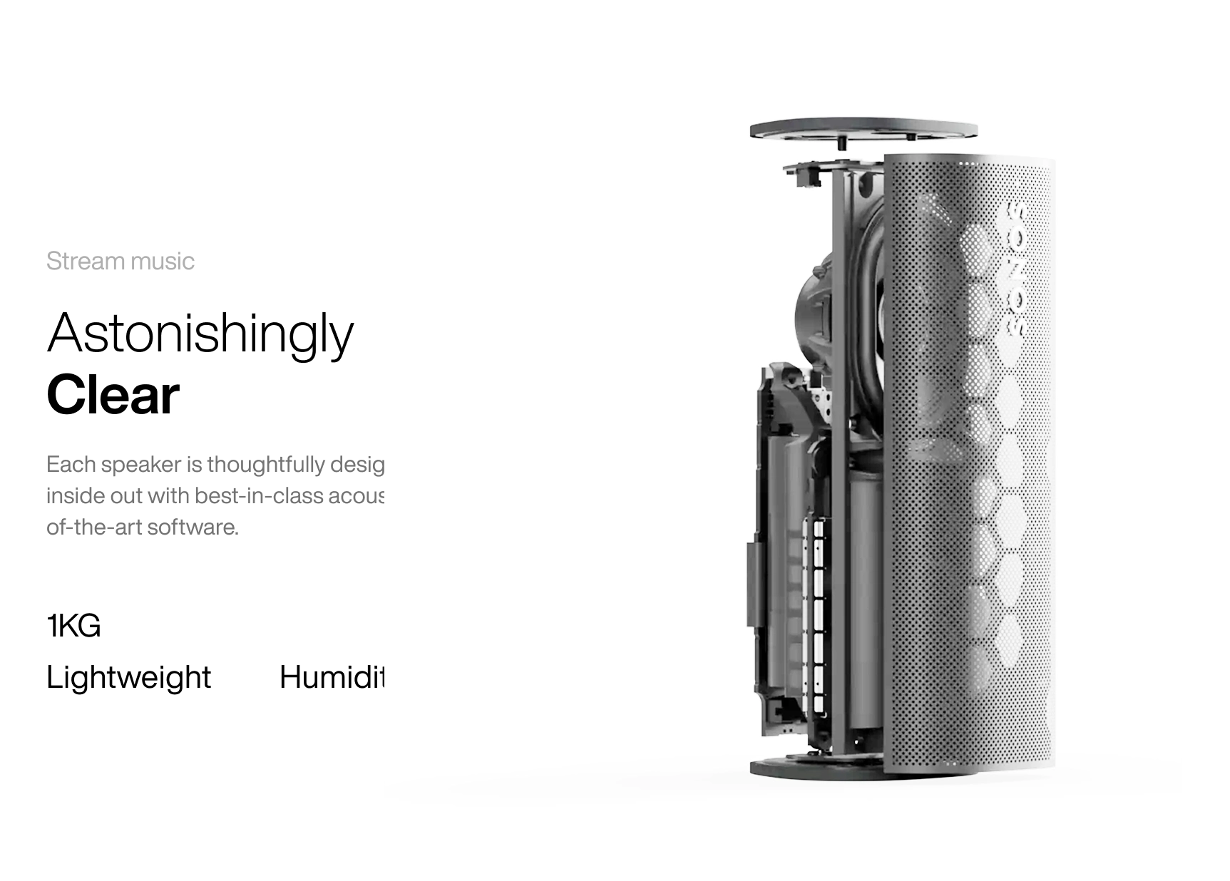
Key Technologies & Design Architecture
Figma: Swiss Grid Layout System, Auto-Layout Product Modules, Precise Typography Hierarchy Tokens
Visual Engineering: Adobe Photoshop (monochrome asset grading, shadow diffusion, and background clipping)
Target Stack (Engineering Handoff): Next.js (React), Tailwind CSS, Framer Motion (for smooth, high-fps scroll reveals of the hardware), Three.js (for future interactive 3D product rotations).
Results & Impact
Elevated Brand Perception: The uncompromising minimalist aesthetic successfully repositions the hardware from a standard consumer tech gadget into a luxury lifestyle centerpiece.
High-Intent Scannability: By organizing complex hardware features into clean bento-style side columns paired with digestible micro-metrics (
1KG Lightweight), users can self-educate in seconds.Conversion-Driven Flow: The layout establishes a seamless visual narrative—leading from emotional acoustic hook $\rightarrow$ tactile hardware exploration $\rightarrow$ internal engineering proof—naturally guiding high-intent buyers toward checkout.
Like this project
Posted Jun 26, 2026
A minimalist e-commerce and product landing page redesign for Sonos, utilizing high-contrast editorial typography to elevate acoustics and hardware discovery.
Likes
4
Views
5
Clients
Sonos