Visual Identity Design for Civoré Signature

Obaloluwa Samuel


Civoré Signature: A Visual Identity for Quiet Confidence
Elegance that is precise, confident and unmistakably personal.
Project summary: Designed the visual identity for Civoré Signature, a fashion brand for confident professionals: a monogram seal, teal-and-bronze palette and brand applications.
Client: Civoré Signature
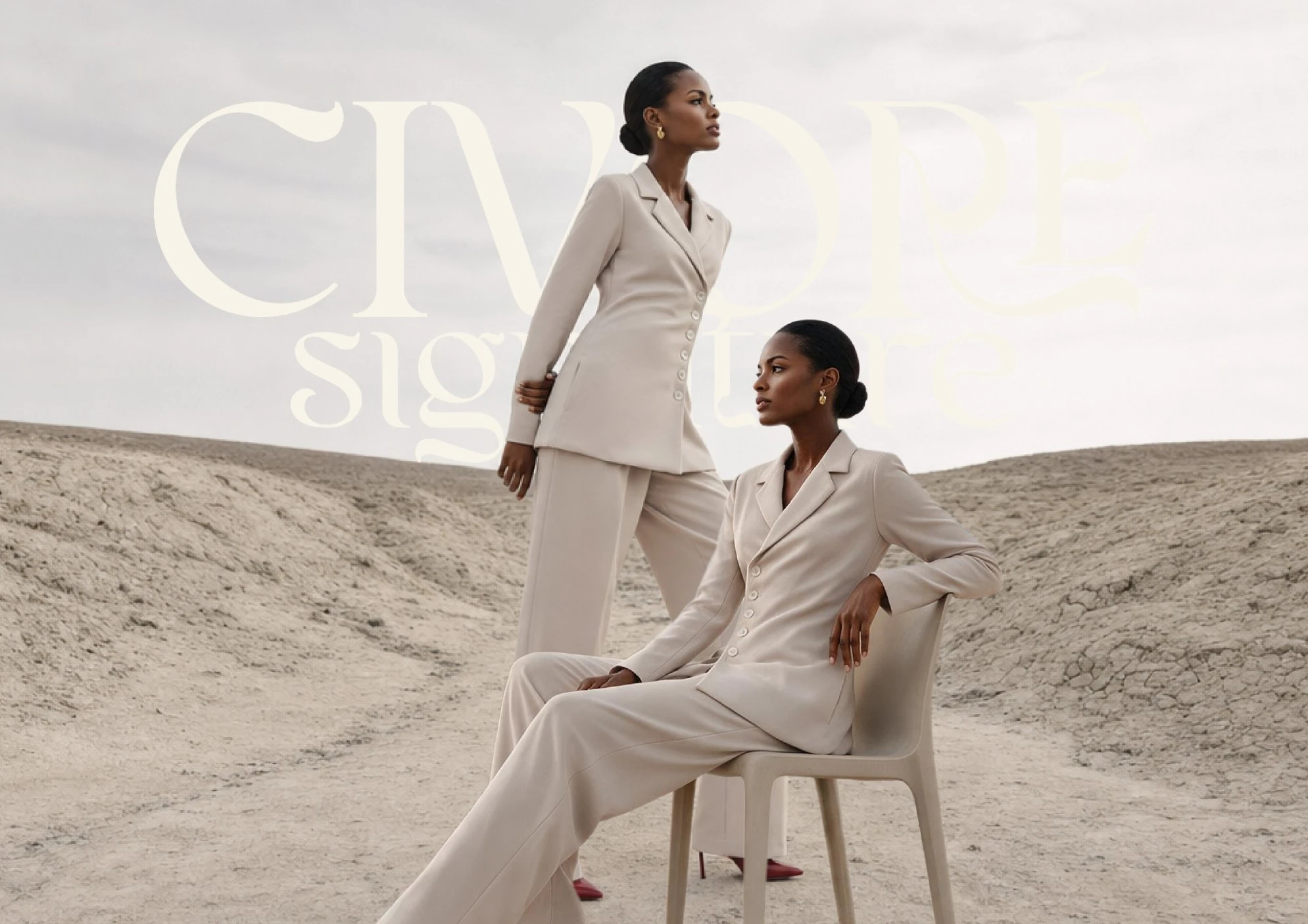
Overview
Civoré Signature is a fashion brand built on a simple belief: how you present yourself is part of who you are. Its clothing is made for the modern professional, whether in the boardroom, at a social gathering or simply moving through the day. Every piece is designed around elegant shapes, careful details and a sophisticated, understated style.
The identity had to carry that same belief. Not loud, but precise. Not generic, but personal.
My task was to design a visual identity that could sit on a small garment label and a large outdoor billboard with equal confidence, and still feel like one brand.
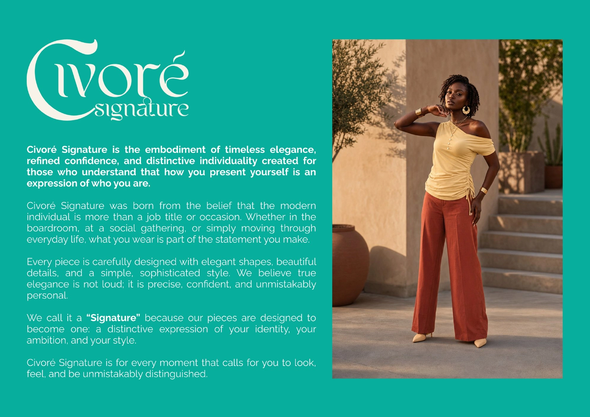
Starting from the idea of a signature
The name gave the project its direction. A signature is personal, expressive and instantly recognisable. It is the one mark that can only belong to you. That is exactly what the brand promises its customers: clothing that becomes a distinctive expression of their identity, ambition and style.
I built the identity around that idea. The monogram pairs the C and S of the name in a single, flowing gesture, so it reads like a stroke of the pen rather than a constructed symbol. It sits inside a thin circle with the brand name set around the ring, giving it the feel of a seal or a maker’s mark.
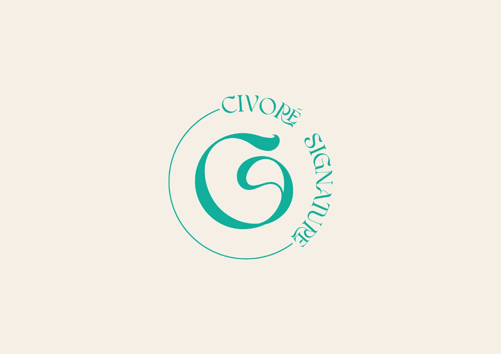
The monogram seal
A logo system that works at every size
Fashion branding has to perform in very different places: stitched into a label, foil-stamped on a tag, shown as a social avatar, or mounted on a building. One logo rarely does all of that well, so I designed a small system with two main lockups.
The wordmark. “Civoré” is set in an elegant display style with a large, swashed C, and “signature” sits in a lighter, smaller line beneath it. It is built for editorial moments, packaging and headlines.
The monogram seal. The circular emblem is compact and self-contained. It handles the small and tight spaces: woven labels, hang tags, business cards, profile images and signage.
I also turned the monogram into a repeat pattern. It adds texture and recognition to surfaces such as stationery and backgrounds without needing the full logo.
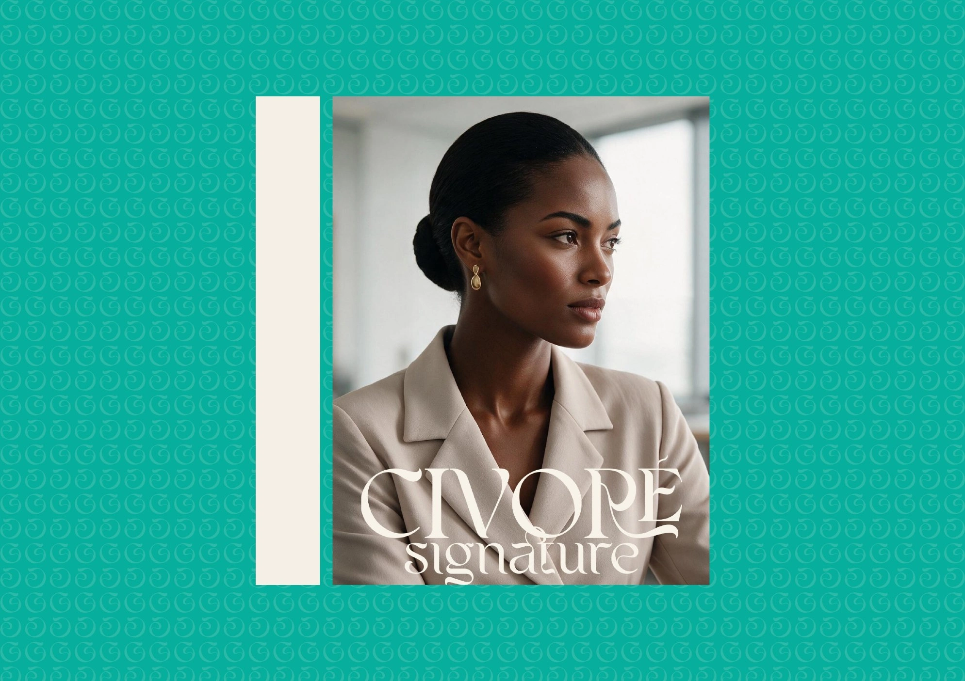
Wordmark and monogram pattern
A palette with warmth and distinction
Much of fashion lives in neutrals. I wanted Civoré Signature to feel refined without disappearing into them, so the palette is anchored by a confident teal and grounded with warm, natural tones.
• Civoré Teal #06AE9C: the signature colour, fresh, assured and easy to recognise
• Soft Aqua #F5F0E6: a lighter companion for backgrounds and supporting graphics
• Warm Paper #51C2BA: a soft cream that keeps layouts calm and premium
• Ink #262624: a deep charcoal for contrast and weight
• Bronze #A9713F: a warm accent that echoes foil, leather and earth tones in the photography
Teal gives the brand its personality. Paper and ink give it elegance. Bronze adds warmth so the system never feels cold.

Colour palette
Typography and voice
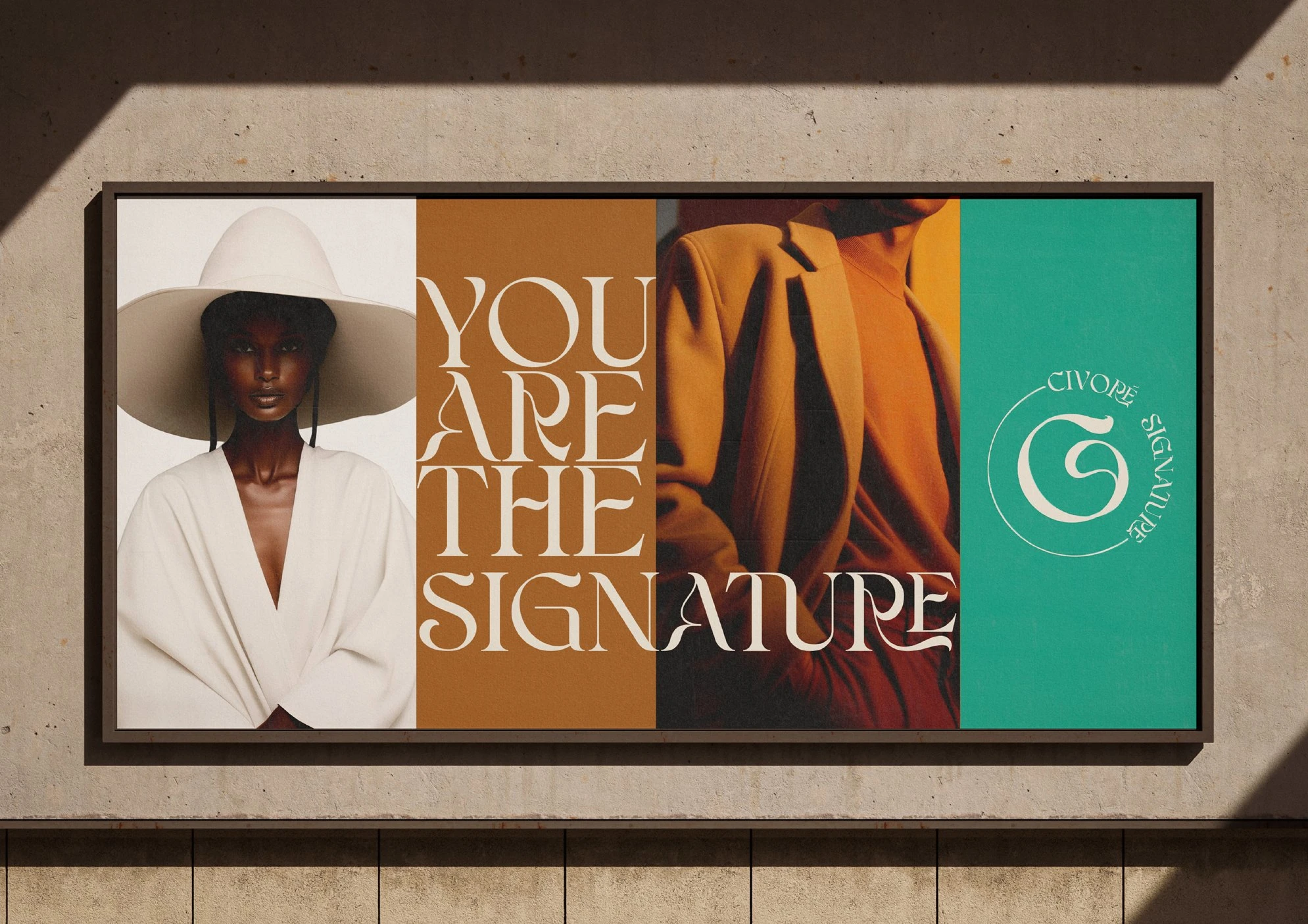
The typography follows the same contrast as the rest of the identity. A high-contrast display style with flowing swashes carries the brand’s expressive moments, and on the billboard the letters of “You are the signature” stretch and curl across the layout like a flourish. A clean, modern sans handles taglines and supporting text, with a light weight set against a bold one, as in “WEAR YOUR EXCELLENCE”.
The messaging stays short and direct, in three lines that are easy to remember:
• Wear your excellence.
• You are the signature.
• Be you.

Bringing the brand to life
A fashion identity is only convincing once you can see it on real things. I developed a set of applications to test how the logo, colour and typography behave across touchpoints.
On the product
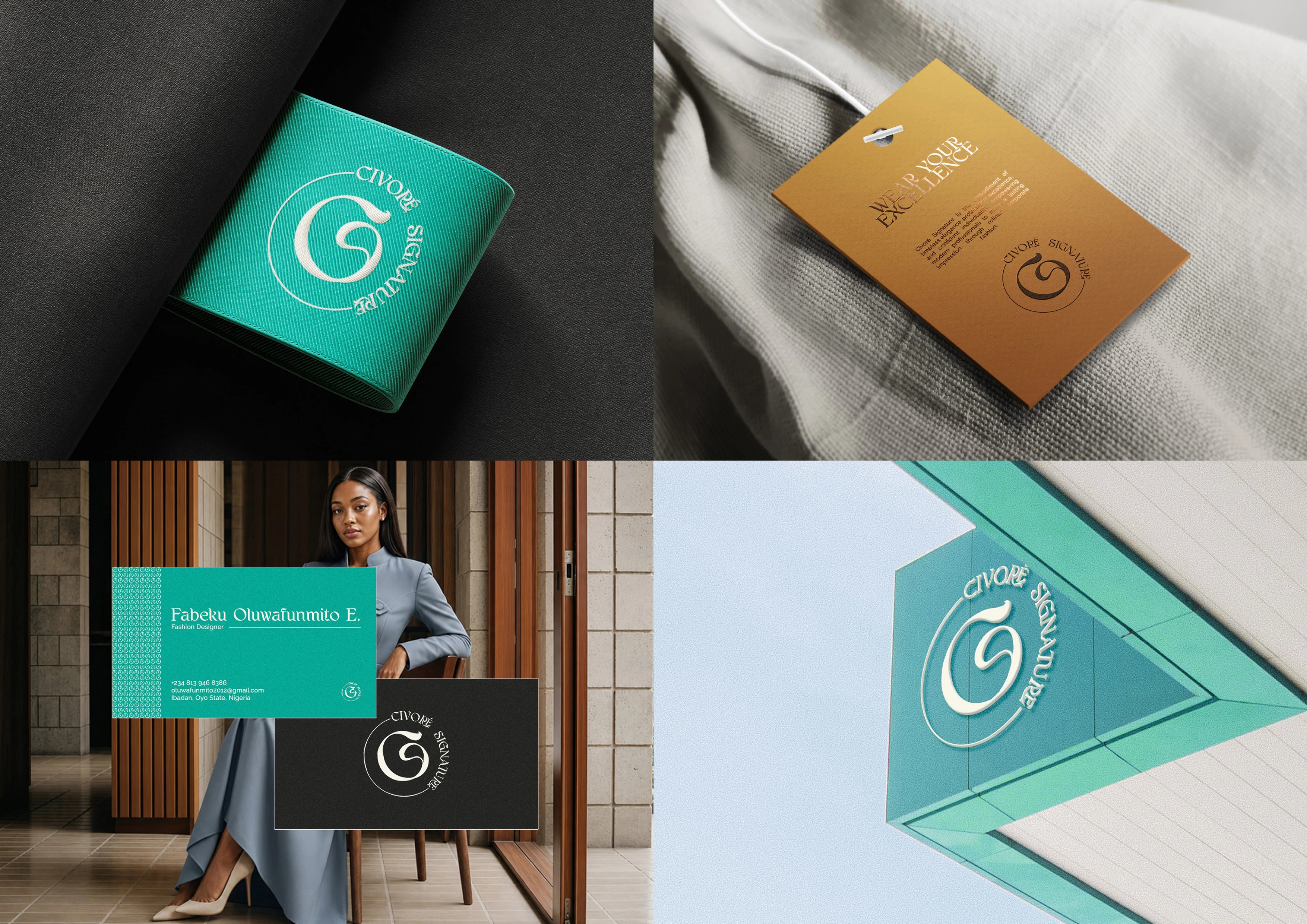
The monogram seal is embroidered in cream on a teal woven label and foil-stamped on a bronze hang tag carrying the line “Wear your excellence”.
Stationery and packaging
Business cards pair a teal front, with the monogram pattern as a side strip, with a charcoal back showing the seal. The shopping bag keeps things simple: cream paper, teal wordmark, teal handles.
Spaces and outdoor
On signage, the seal reads clearly even from below at an angle. On the billboard and street poster, large type and tonal photography let the brand speak at a glance.
The result
Civoré Signature now has an identity that feels as considered as its clothing. The monogram gives it a personal, handcrafted mark, the palette gives it a distinctive and warm presence, and the system of wordmark, seal, pattern and tagline keeps everything consistent from a tiny label to a full billboard.
Like this project
Posted Oct 26, 2026
Civoré Signature creates clothing for modern professionals, combining elegant and thoughtful details for the boardroom, social gatherings and everyday life.
Likes
1
Views
0
Timeline
Sep 1, 2026 - Sep 15, 2026