
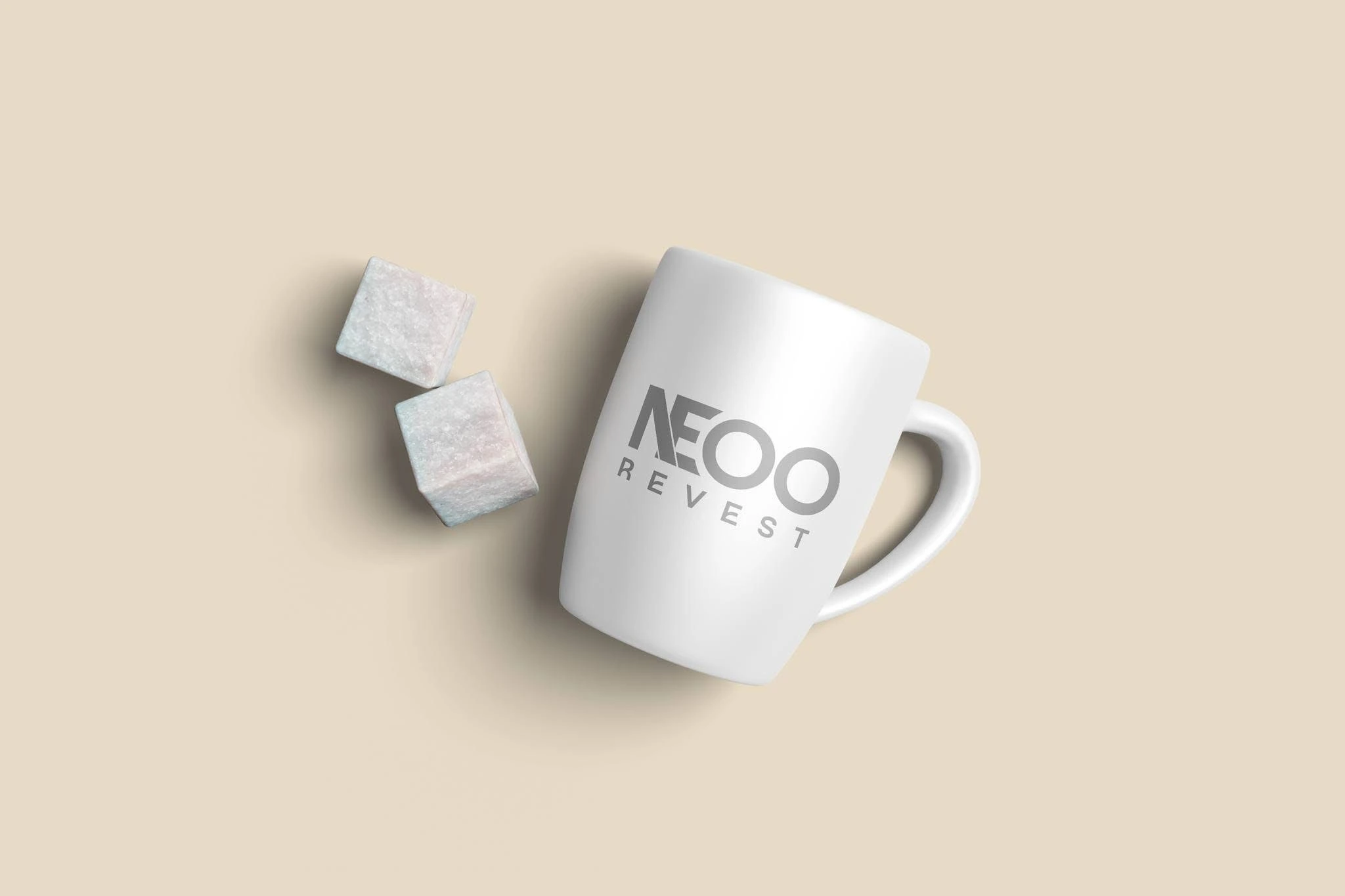
NEOO Revest
NEOO Revest is a Brazilian waterproofing company. I redesigned its visual identity to make the logo clearer, more legible at small sizes, and more dependable across social and print applications.
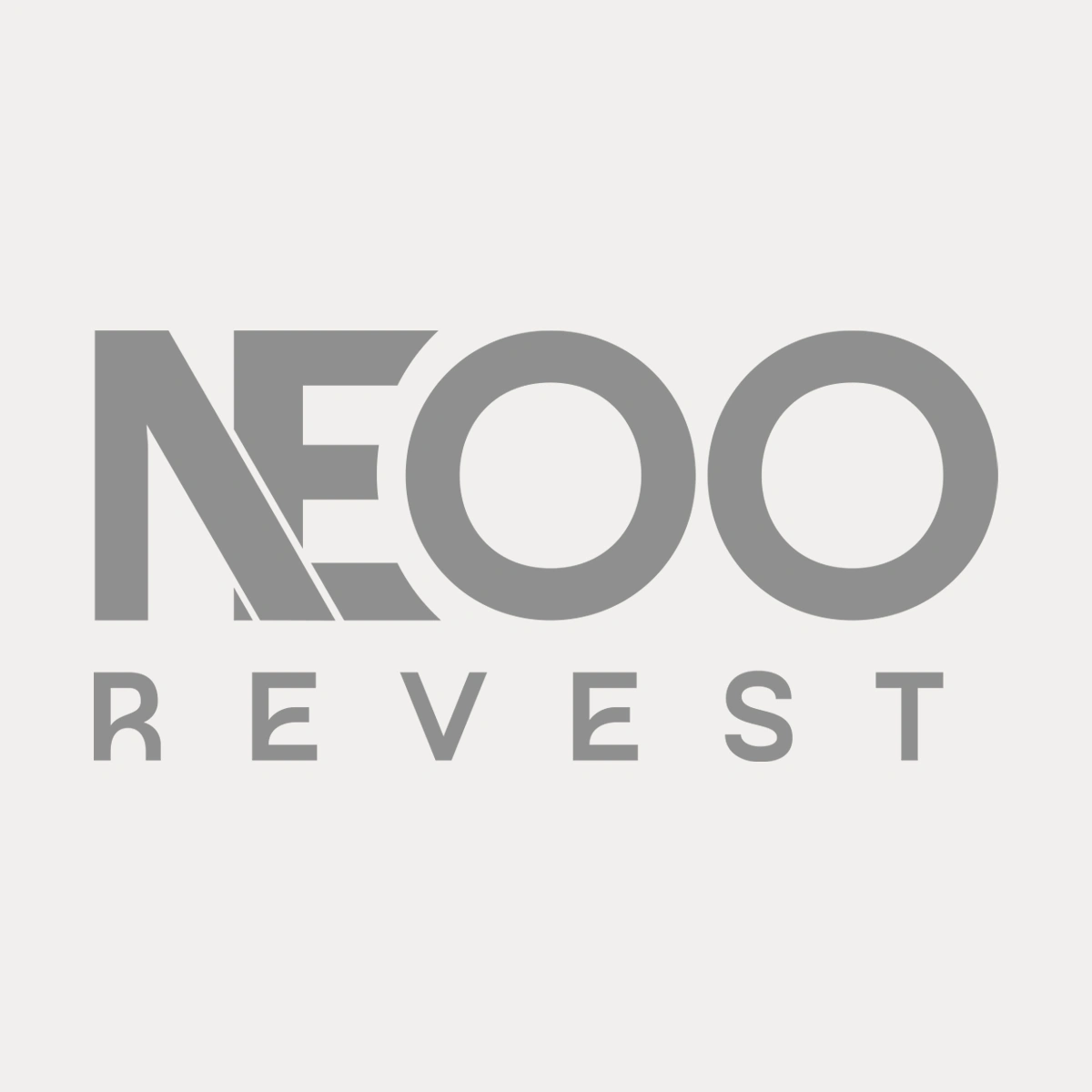
Final NEOO Revest logo
The challenge
The original logo used thin letterforms that were difficult to read at small sizes. The two “O” characters were also positioned too closely together, reducing clarity across social media and print applications.
The approach
I rebuilt the wordmark with stronger, more readable letterforms while keeping the brand recognizable. I also refined the spacing between the two “O” characters to improve clarity and created a standalone icon for more flexible brand applications.
The final direction used a light beige and brown color palette, giving the brand a cleaner and more professional appearance.
Mockups
Deliverables
• NEOO Revest logo and icon
• Logo and icon in 3 color variations
• PNG exports
• Photoshop PSD files
• Adobe Illustrator files
• PDF logo files
• One pager brand guide
Outcome
The redesigned NEOO Revest identity provides a clearer, more recognizable logo system with improved readability across digital and print applications. The final identity was delivered in multiple color variations, with a mini brand guide and editable source files for consistent future use.
The client also shared the finished rebrand in an Instagram Story after the project was completed.
0 likes · 4 views · Sep 28, 2026
A clearer, bolder identity for a Brazilian waterproofing company, built for social, print, and future brand recognition.

