OCTOPLUS - Brand Identity & Logo Design

Wajeeh Qaiser

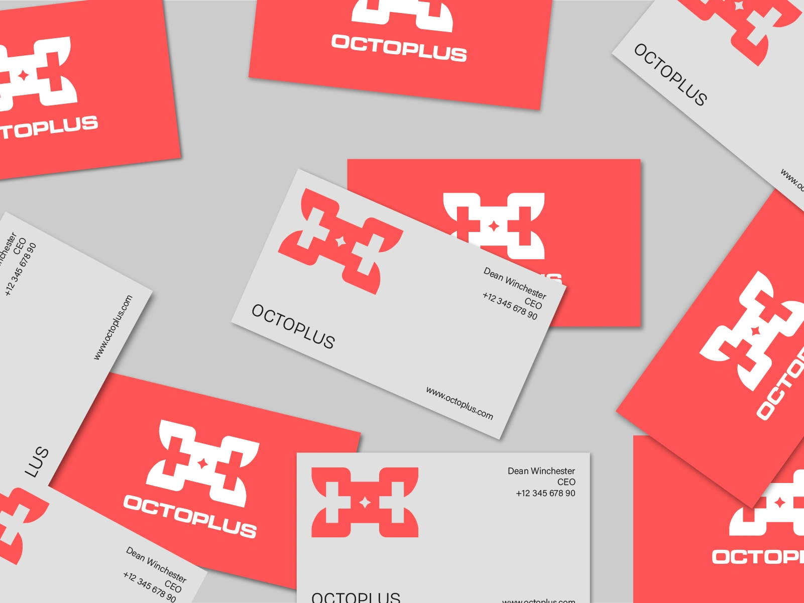
OCTOPLUS - Brand Identity & Logo Design for Aerospace & Technology
01. Building a Brand Around Innovation and Precision
OCTOPLUS is an aerospace and technology company focused on developing advanced solutions in aviation, automation, and intelligent systems. My goal was to create a modern brand identity that reflects the company's forward-thinking approach while communicating precision, reliability, and innovation.
I wanted the branding to feel professional and future-focused without becoming overly complicated. Every design decision was guided by the idea of creating a strong, recognizable identity that represents OCTOPLUS as a company built around technology, engineering excellence, and progress.
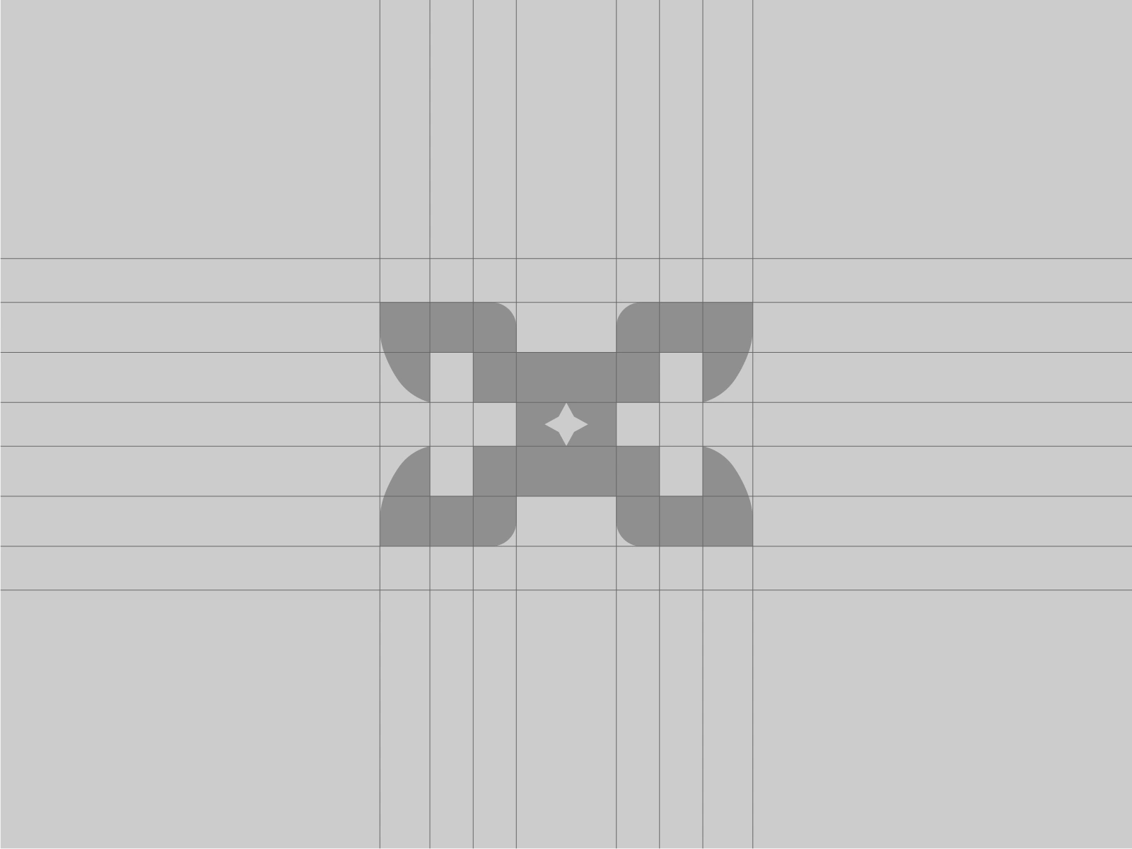
02. Creating a Modern and Memorable Logo
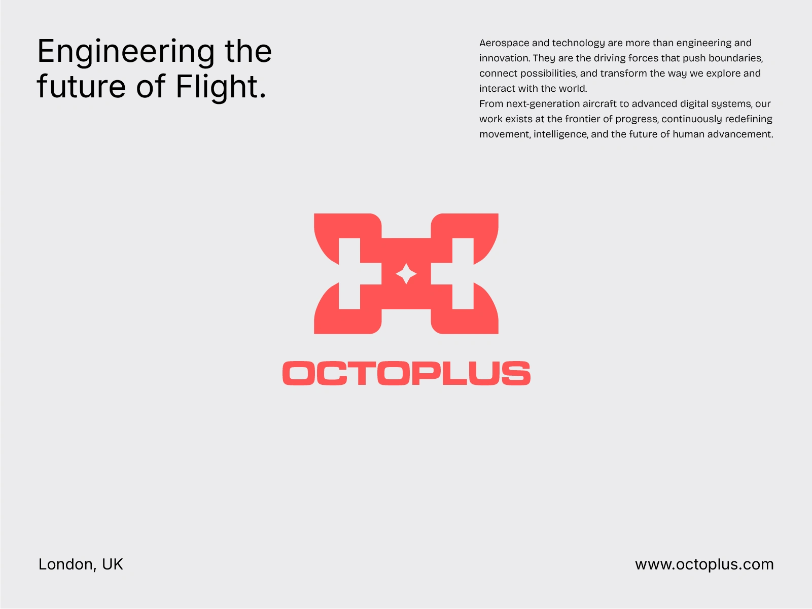
For the logo design, I focused on simplicity, clarity, and versatility. The idea was to establish a visual identity that feels modern and technical while remaining clean, recognizable, and easy to remember.
Rather than relying on overly complex graphics or typical aerospace design clichés, I approached the branding with a minimalist design philosophy. My focus was on creating a professional visual language that communicates confidence, precision, and innovation while remaining suitable for an evolving technology company.
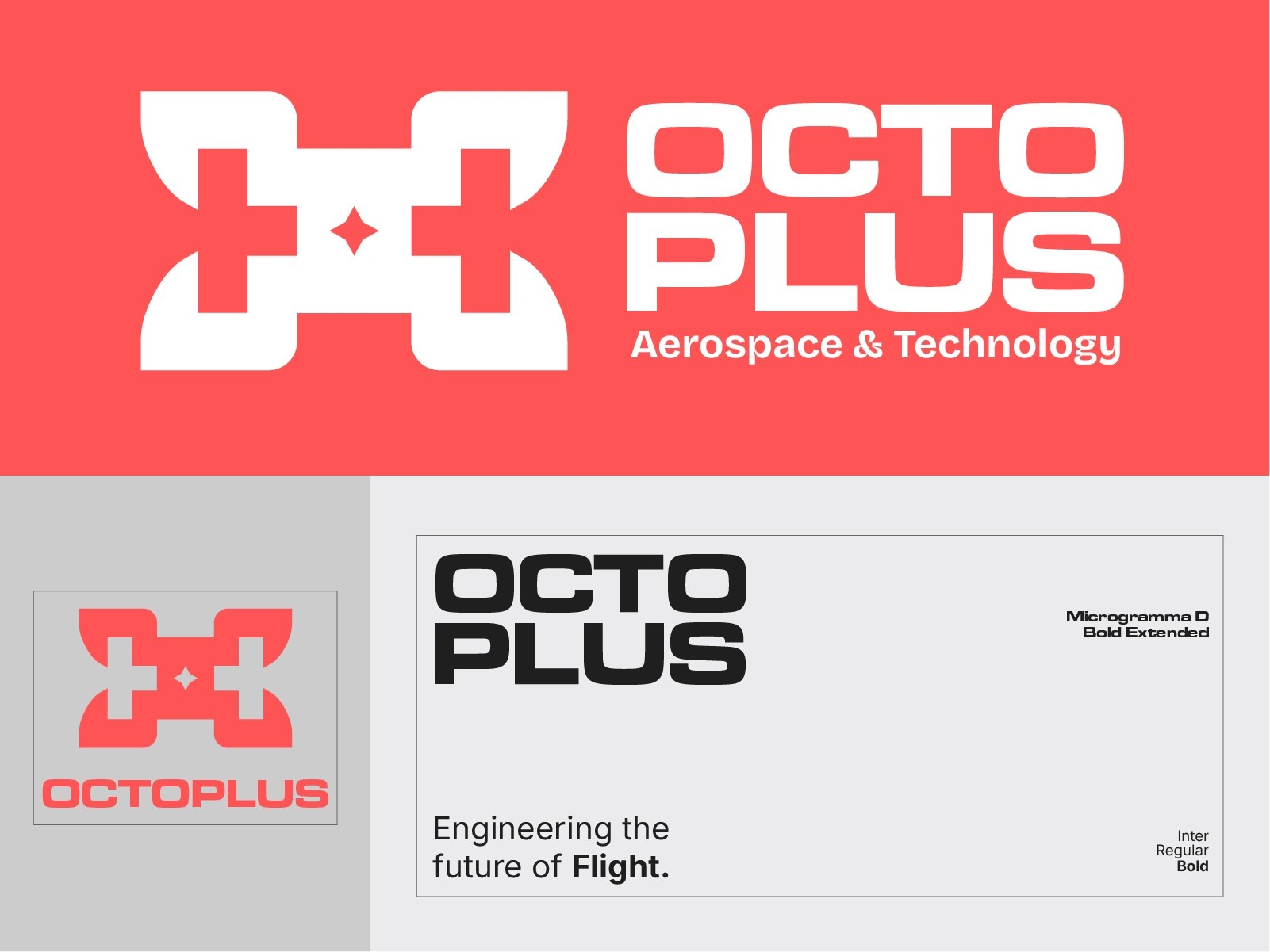
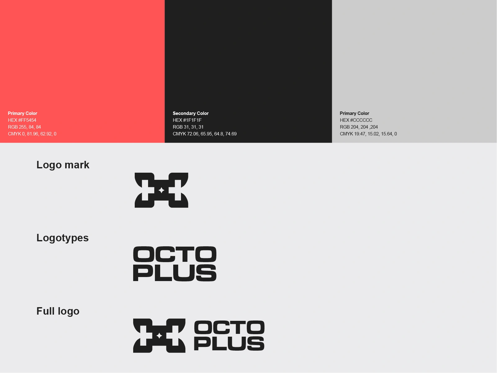
03. Developing a Consistent Visual Identity
A strong brand is more than just a logo. It's about creating a visual identity that feels consistent wherever people interact with the company.
For OCTOPLUS, I focused on a cohesive branding direction built around modern typography, thoughtful visual hierarchy, and a clean design approach. The goal was to create a flexible identity that could translate naturally across digital platforms, corporate materials, presentations, and future brand applications.
By keeping the visual language consistent and purposeful, I aimed to give OCTOPLUS a professional appearance that reflects its commitment to quality, technology, and engineering excellence.
04. Bringing the Brand's Vision to Life
One of the most important parts of this project was making sure the brand identity represented what OCTOPLUS actually stands for.
The company is driven by innovation, integrity, and a commitment to developing reliable, future-ready aerospace and technological solutions. I wanted those values to come through in the branding without making the design feel unnecessarily complicated.
By combining a modern aesthetic with a clear, professional visual direction, I worked toward an identity that reflects both the technical side of the company and its ambition to shape the future of aerospace and technology.
Final Result
OCTOPLUS brings together modern logo design, minimalist branding, and a cohesive visual identity built around precision and innovation. Rather than following typical aerospace design trends, I focused on creating a clean, professional identity that reflects the company's forward-thinking vision. A brand designed not just to look modern, but to communicate reliability, engineering excellence, and long-term progress.
Like this project
Posted Oct 22, 2026
Designed a modern, minimalist brand identity for OCTOPLUS, an aerospace and technology company focused on precision, innovation, and progress.