Gizmos & Co. – E-commerce Branding & UI Redesign
Grace Pereda @ Graceful Studio
Gizmos & Co. – E-commerce Branding & UI Redesign
Project Overview
Gizmos & Co. is a tech accessories store based in Malaysia, aiming to establish a stronger presence in the competitive e-commerce space. Initially, the project started as a UI design for their online store, but as I explored their existing branding, it became clear that a full visual identity redesign was necessary to give the brand a modern, cohesive, and scalable look.
The Challenge
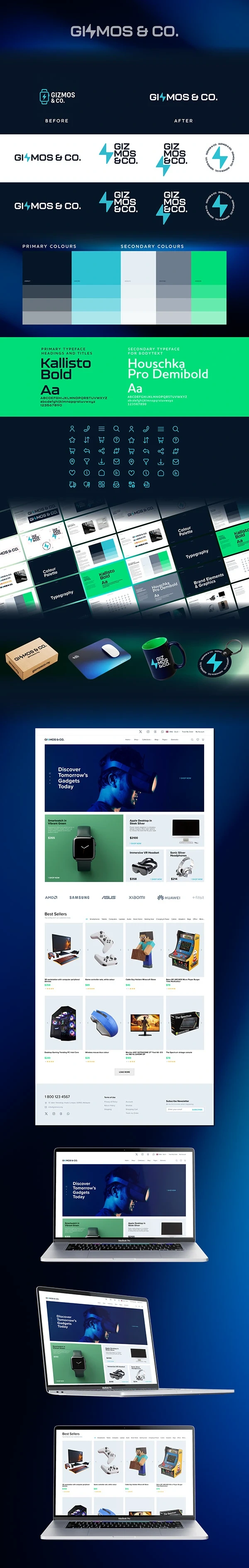
The previous branding was created quickly, serving only as a placeholder while the company began selling products on third-party platforms. The logo consisted of white text reading Gizmos & Co. alongside a separate thunderbolt icon resembling a smartwatch, creating visual inconsistency. As the company planned to launch its own e-commerce platform and expand into other markets, it needed:
A modernized visual identity to reflect its growth and ambition
A unified UI design for a seamless shopping experience
A flexible logo system adaptable to different digital and print applications
My Role & Process
Lead designer for branding and UI design.
Process:
Research & Brand Audit:
Reviewed the existing logo, colors, and typography
Identified gaps in visual consistency and scalability
Logo Redesign:
Simplified the logo into a single cohesive mark
Integrated the thunderbolt directly into the Gizmos & Co. name for a bolder, more unified identity
Created a primary logo and an alternative one-line version for different use cases
Typography & Color System:
Selected Kallisto as the main typeface for its modern, tech-forward look
Paired it with a clean secondary font for body text and digital interfaces
Defined a clear color palette:
Dark Blue (#061627) for sophistication and trust
Light Blue/Thunderbolt (#2DC1D2) for energy and dynamism
White (#FFFFFF) for clean, versatile backgrounds
UI Design for E-commerce:
Designed a modern landing page layout showcasing products, pricing, and promotional areas
Added consistent iconography and visual elements aligned with the new brand identity
Brand Applications:
Created guidelines for logo usage, color consistency, and typography
Suggested ways to integrate the new branding into marketing materials and future digital products
The Outcome
The result is a modern, cohesive brand identity and e-commerce UI that positions Gizmos & Co. as a professional, trustworthy, and scalable tech accessories brand.
The new logo system adapts seamlessly across platforms
The defined color palette and typography create a consistent visual language for all digital and print assets
The landing page UI sets a strong foundation for future online growth and customer engagement
This redesign gives Gizmos & Co. the tools to stand out in a competitive market while staying flexible for future expansion.
Like this project
Posted Mar 31, 2026
Tech accessories store branding and UI redesign. Transformed placeholder branding into a modern, cohesive identity with unified logo, color system, and e-commerce UI.