Financial Dashboard Redesign for Quant Investing
Project Overview
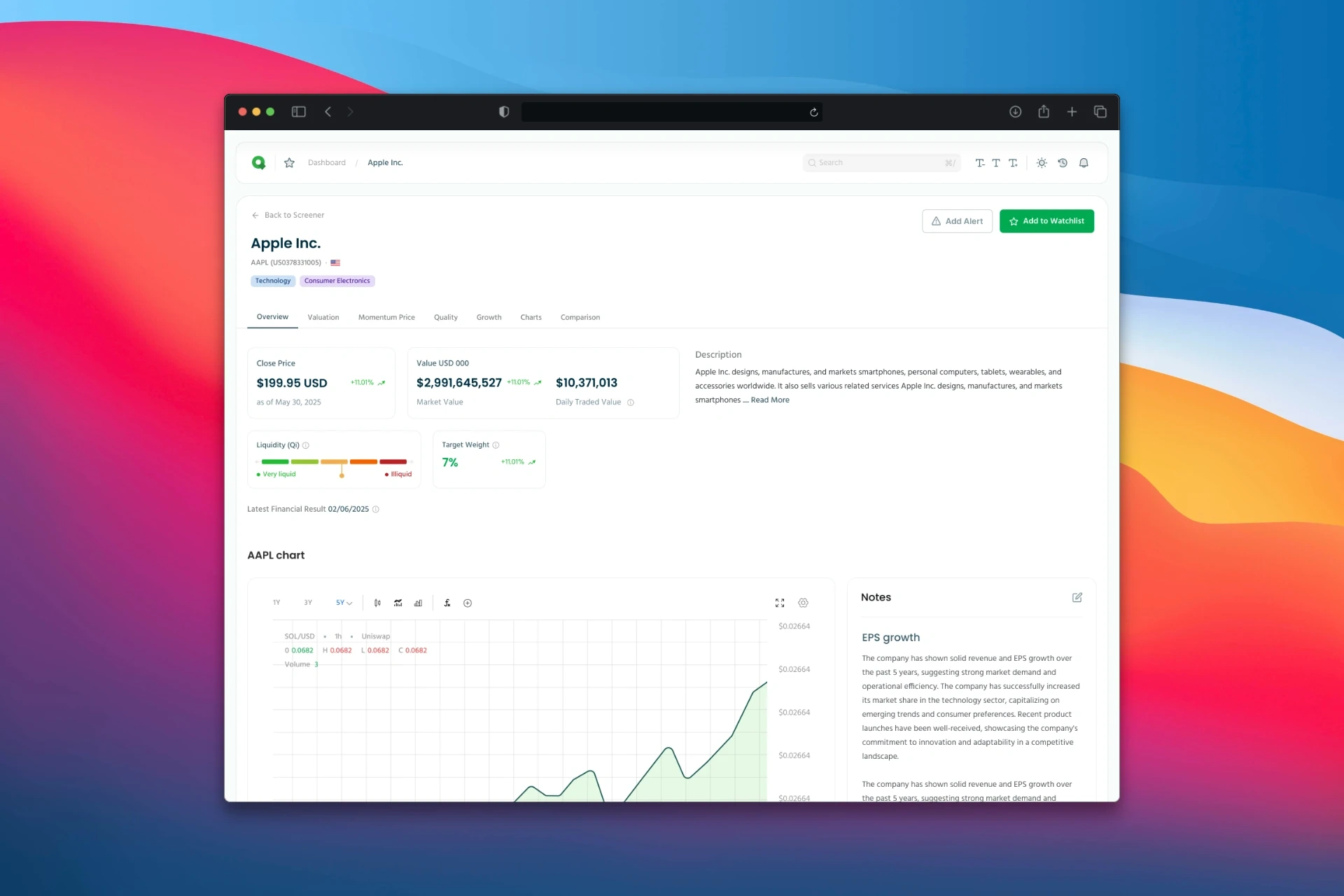
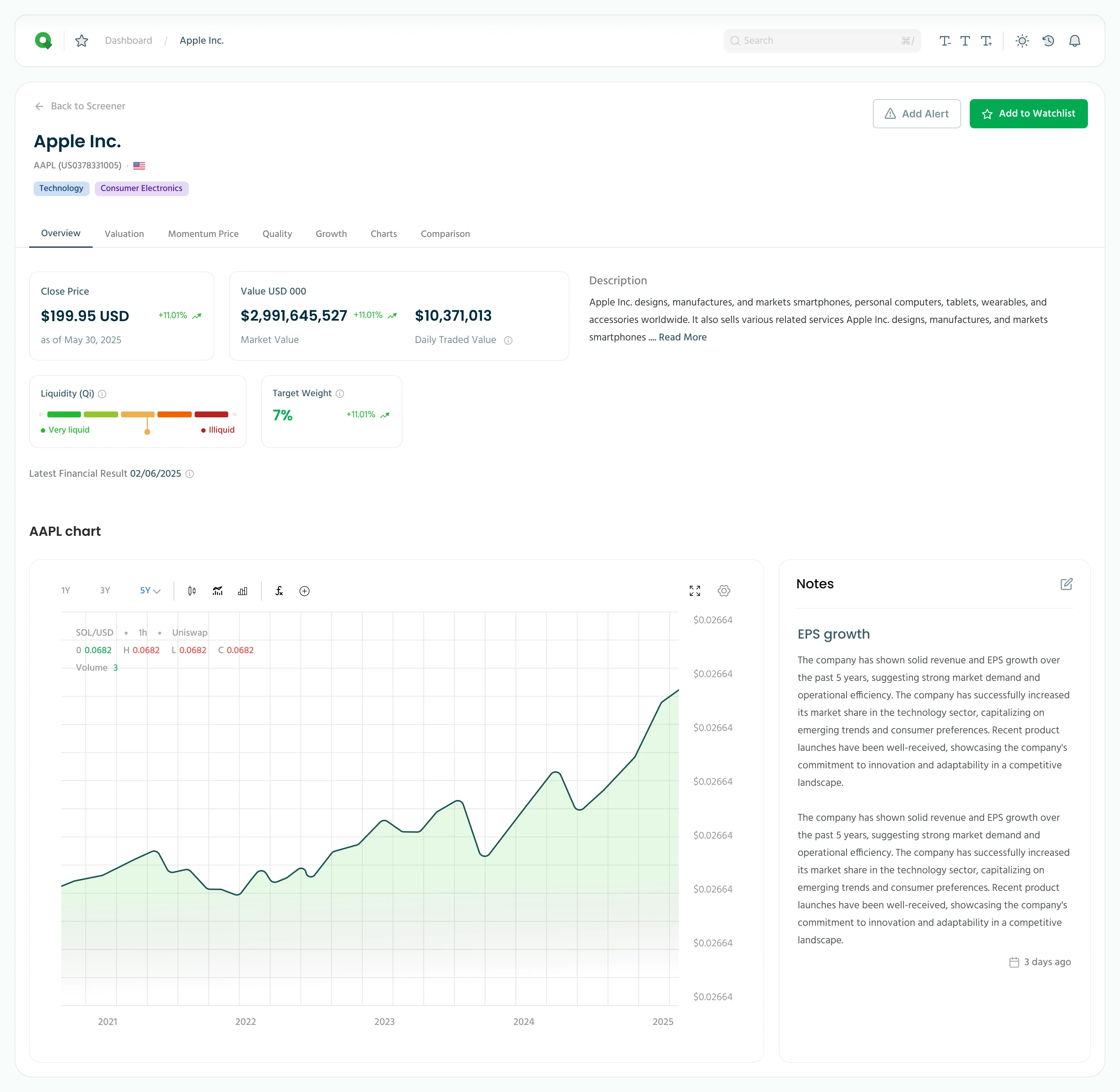
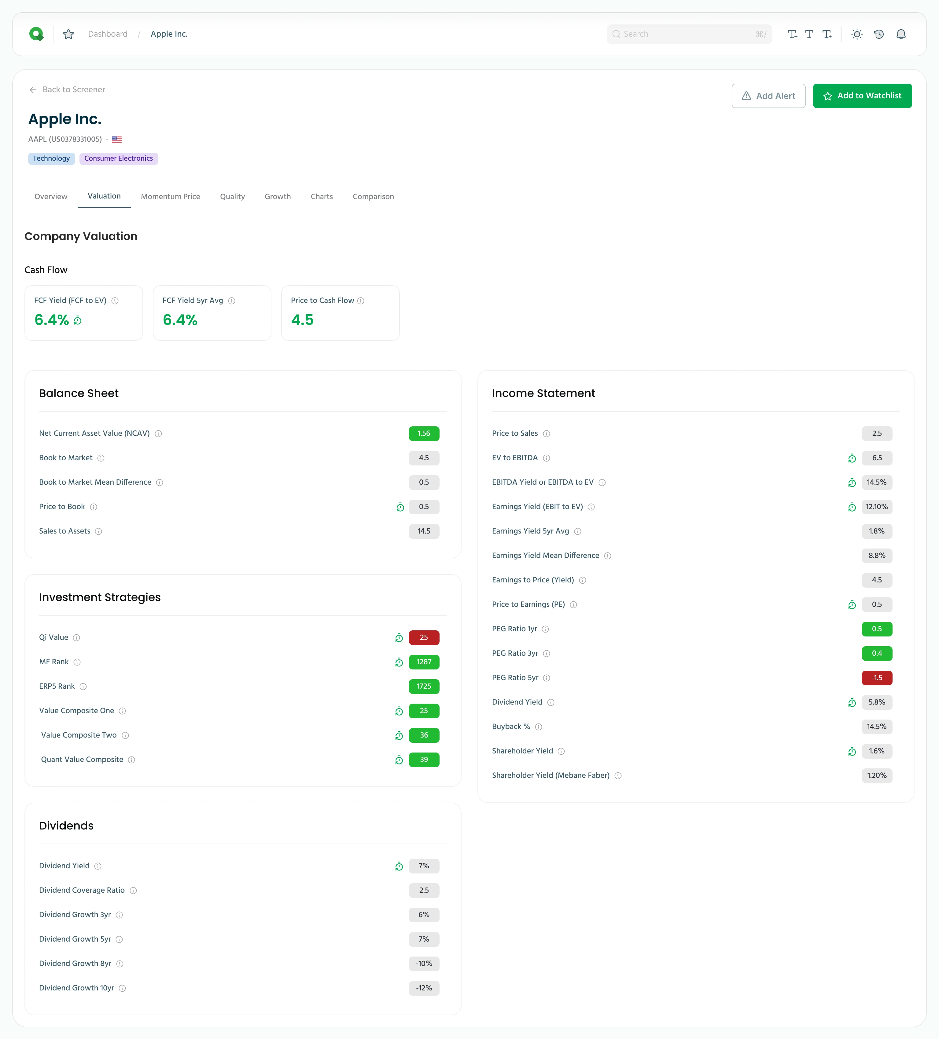
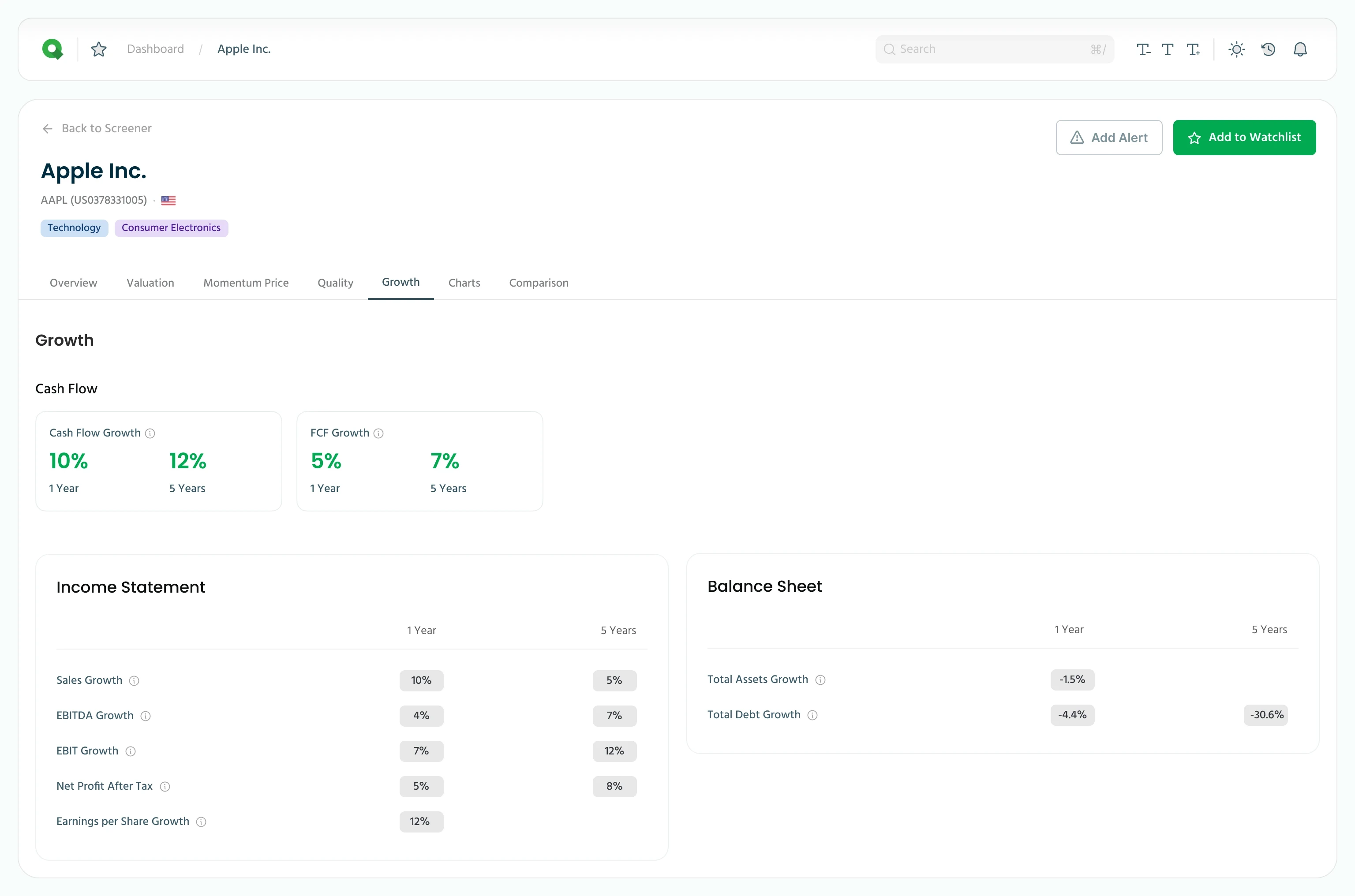
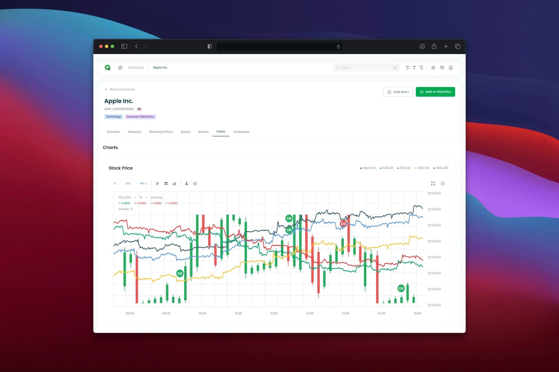
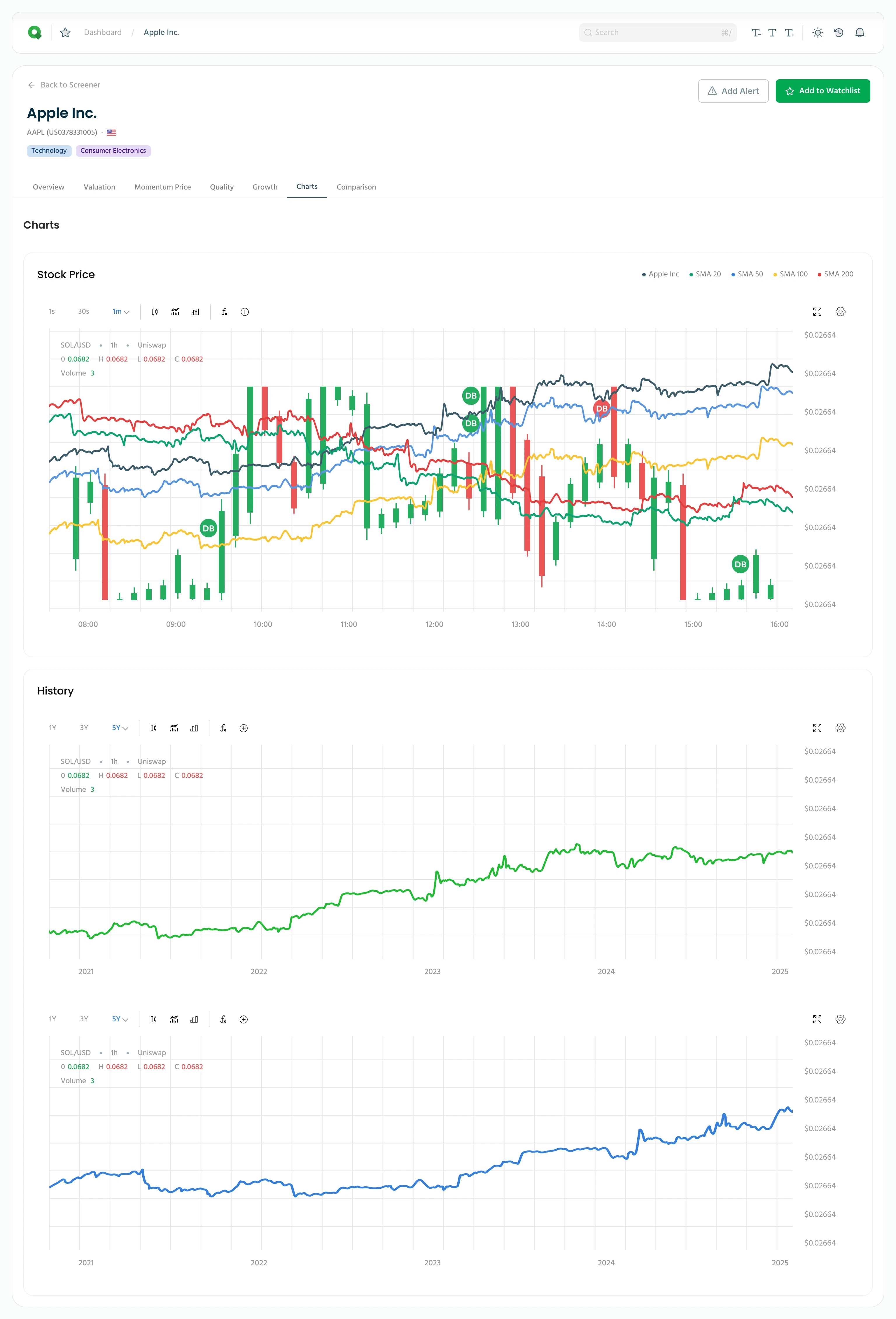
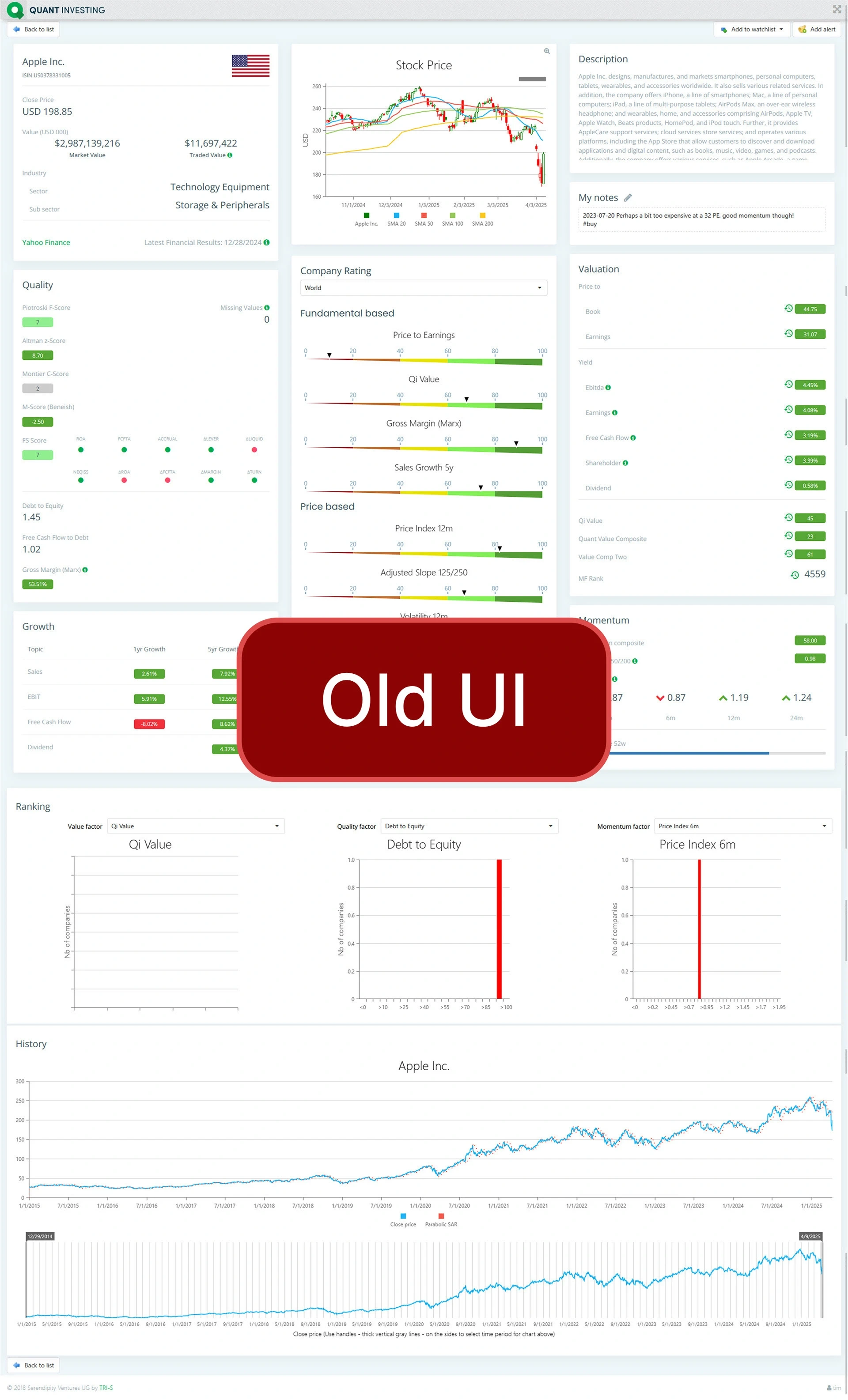
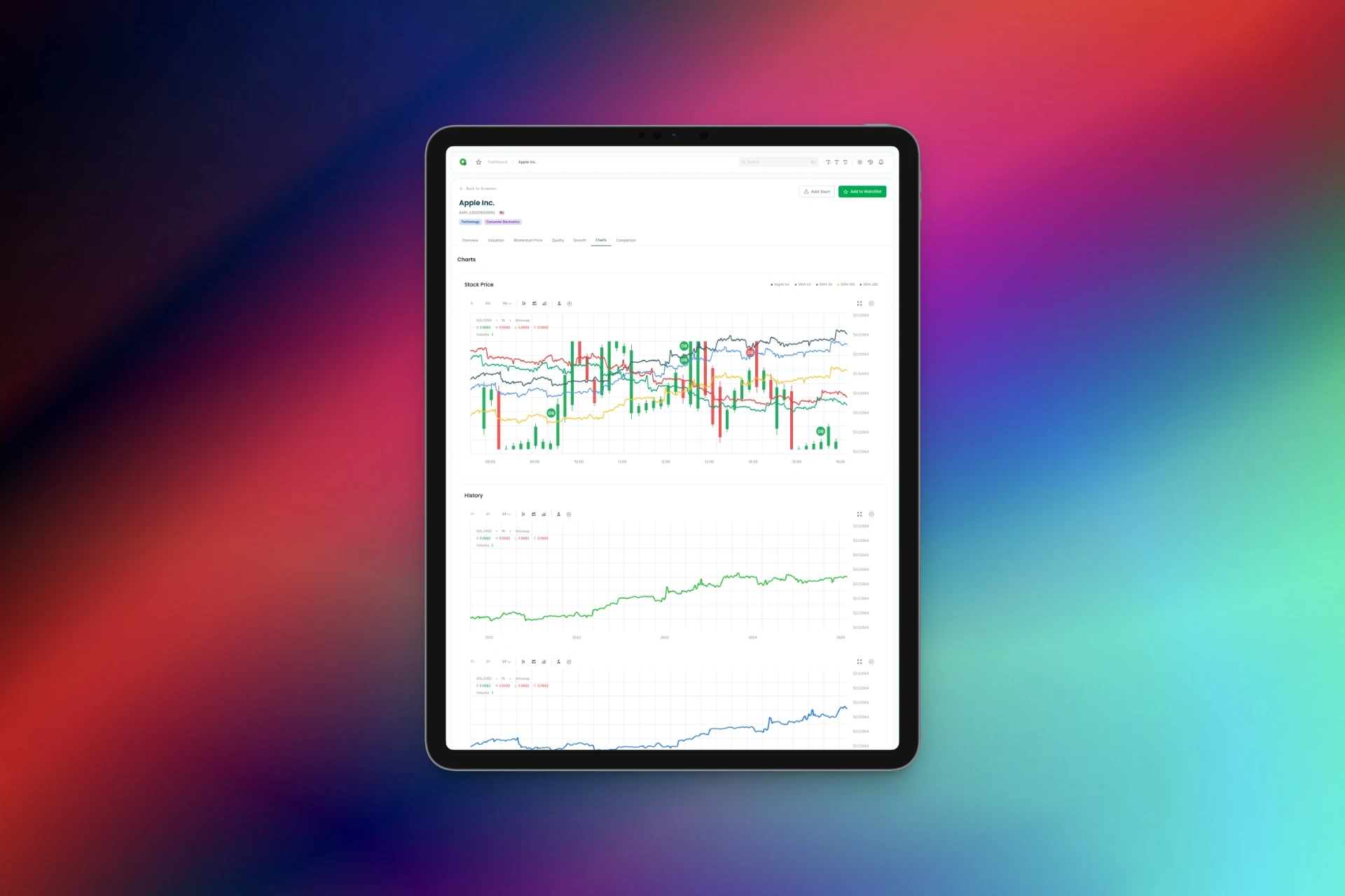
www.quant-investing.com is redesigning the Company Financial Dashboard on its subscription-based platform, which helps individual investors evaluate stocks using quantitative data.
The goal is to modernize and simplify the user experience while enhancing the clarity and effectiveness of the financial data visualizations.
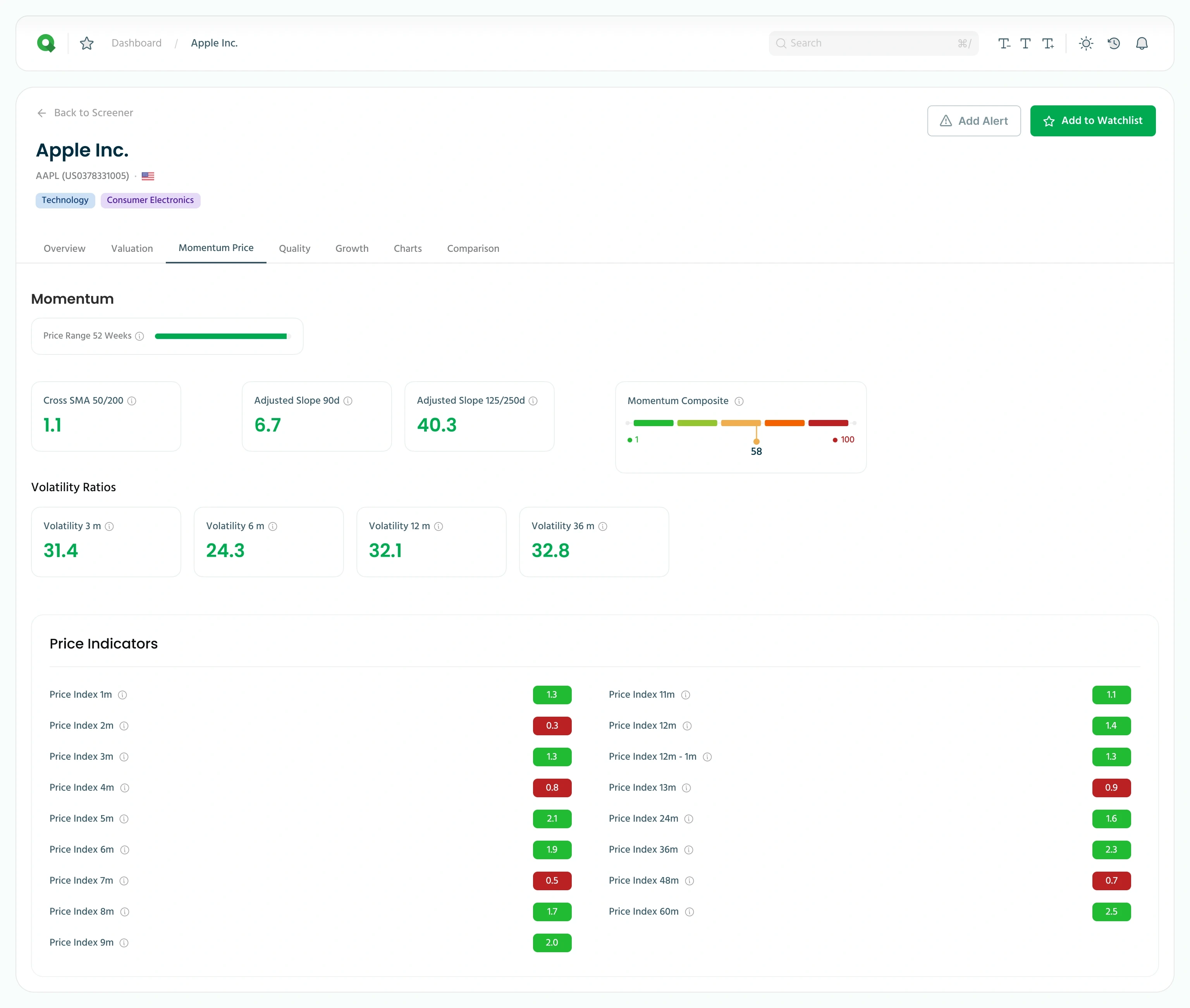
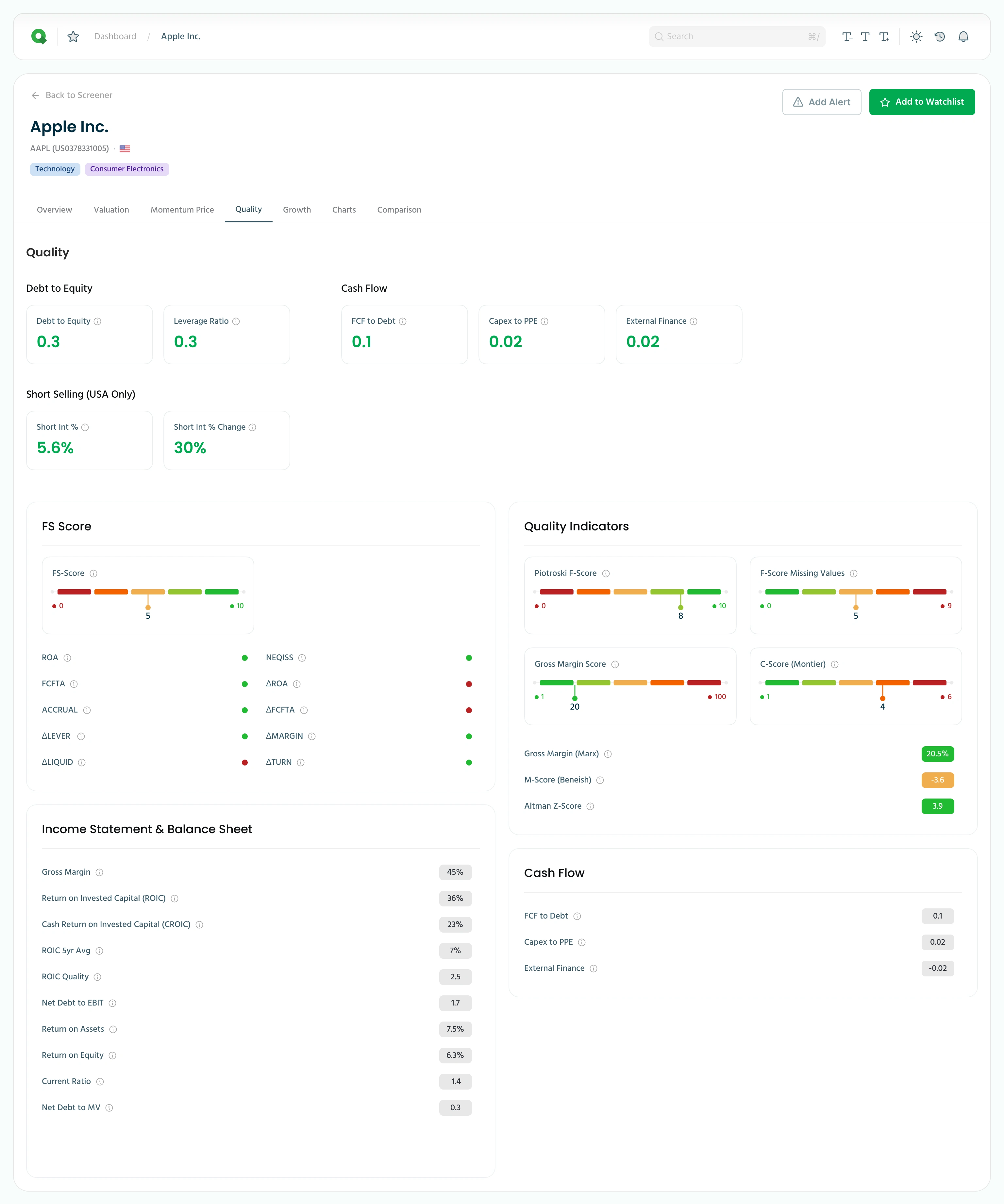
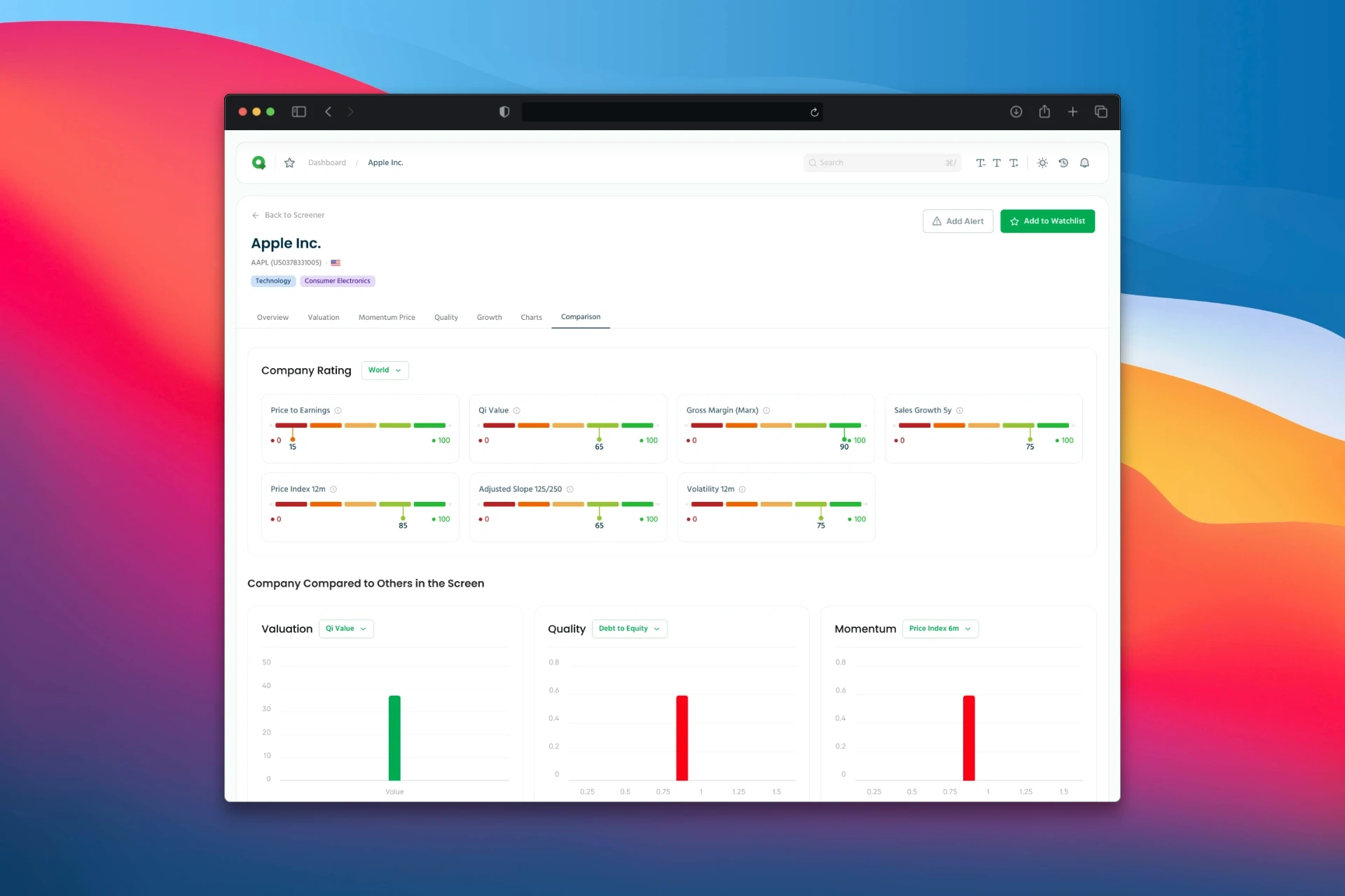
The new design should be clean, professional, and immediately signal whether a metric is positive or negative, how it compares to a range, and what it means — using consistent visual cues, helpful tooltips, and intuitive layouts.
Target Audience
Private investors managing their own money.
Users understand financial metrics but expect quick visual cues to assess opportunities.
They value speed, clarity, and depth in financial dashboards.
Redesign Goals
Clean up the layout, reduce visual clutter.
Clearly indicate whether each ratio or score is "good" or "bad", based on threshold logic or percentile rankings.
Show relative performance within a range using bars, colour scales, or ranks.
Retain and improve tooltip-based info icons (currently “(i)”) to define each metric and explain its relevance.
Ensure high responsiveness and accessibility across desktop and mobile devices.
Like this project
Posted Aug 28, 2025
Redesigned financial dashboard for Quant Investing to enhance user experience and data clarity.
Likes
1
Views
9
Timeline
Jun 12, 2025 - Jul 21, 2025

