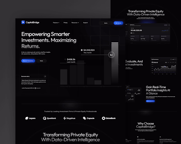
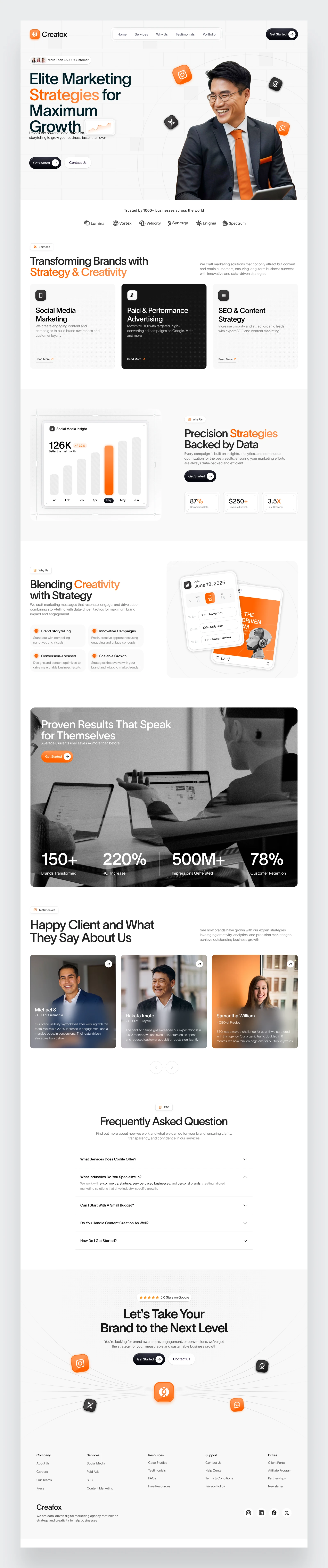
Digital Marketing Agency Landing Page Design
Rahmat Nur Kholis

Creafox - Digital Maketing Agency
This landing page was created for a digital marketing agency focused on delivering data-driven strategies and creative execution to help brands grow. The goal was to reflect the agency’s sharp positioning—where strategy meets storytelling—while maintaining clarity and professionalism.
The design approach follows a minimalist yet modern direction, with plenty of white space for breathing room and easy readability. Accents of orange are thoughtfully integrated to bring warmth, draw attention to CTAs, and add a touch of energy without overpowering the overall aesthetic. The result is a clean, conversion-focused layout that communicates trust, creativity, and growth.
Full Page
Like this project
Posted Apr 23, 2025
Designed a minimalist, modern landing page for Creafox, a digital marketing agency.
Likes
1
Views
5
Timeline
Apr 1, 2025 - Apr 5, 2025