Indie Living Brand Identity and Logo Design

Upslide Design Studio

Indie Living
Brand Identity and Logo Design Case Study
Project Overview
Indie Living is a lifestyle and furniture brand rooted in craftsmanship, heritage, and thoughtful living. The goal of the project was to design a logo and visual identity that feels warm, artisanal, and timeless, while still being modern enough to scale across physical spaces, print, and digital touchpoints
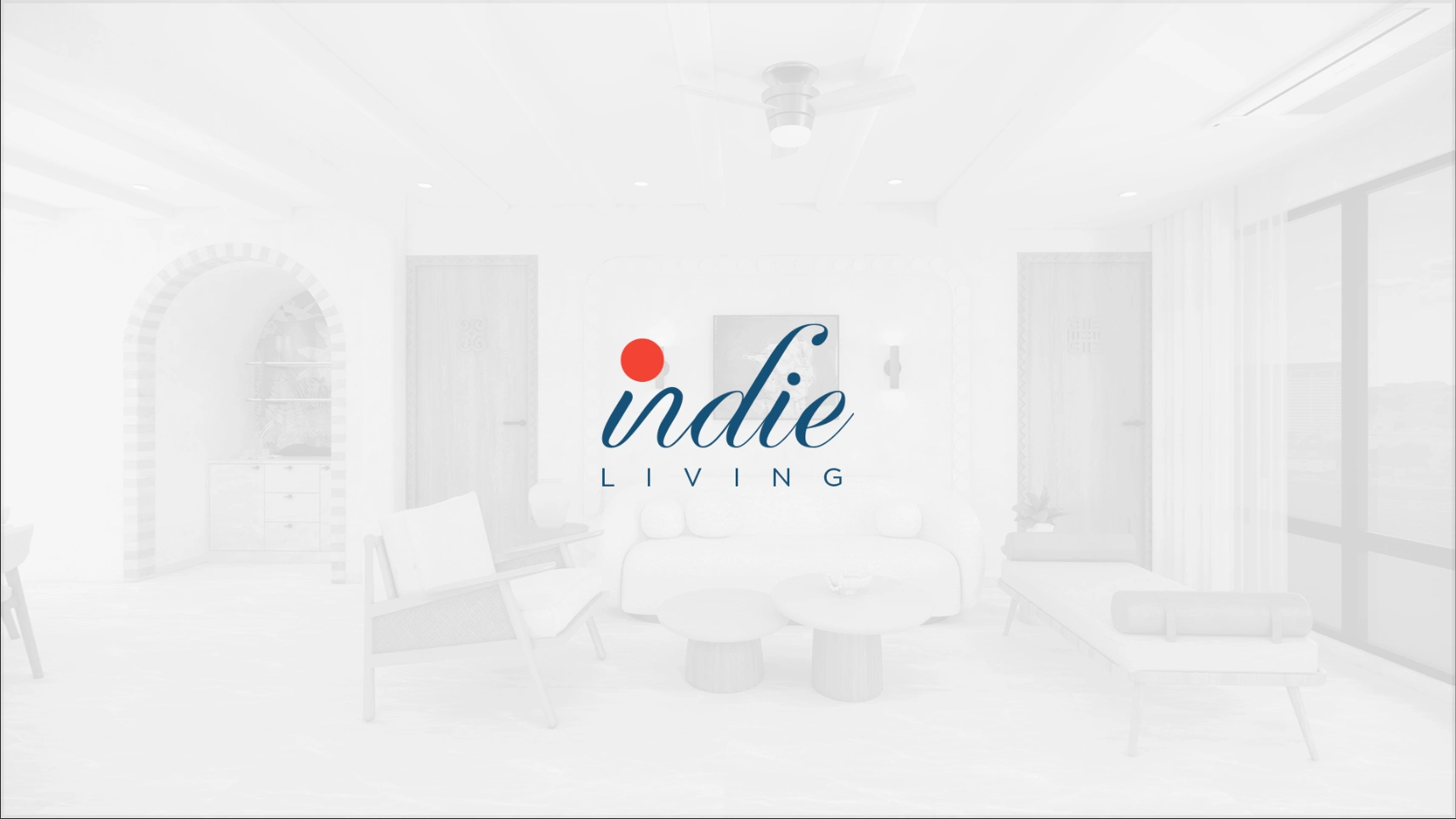
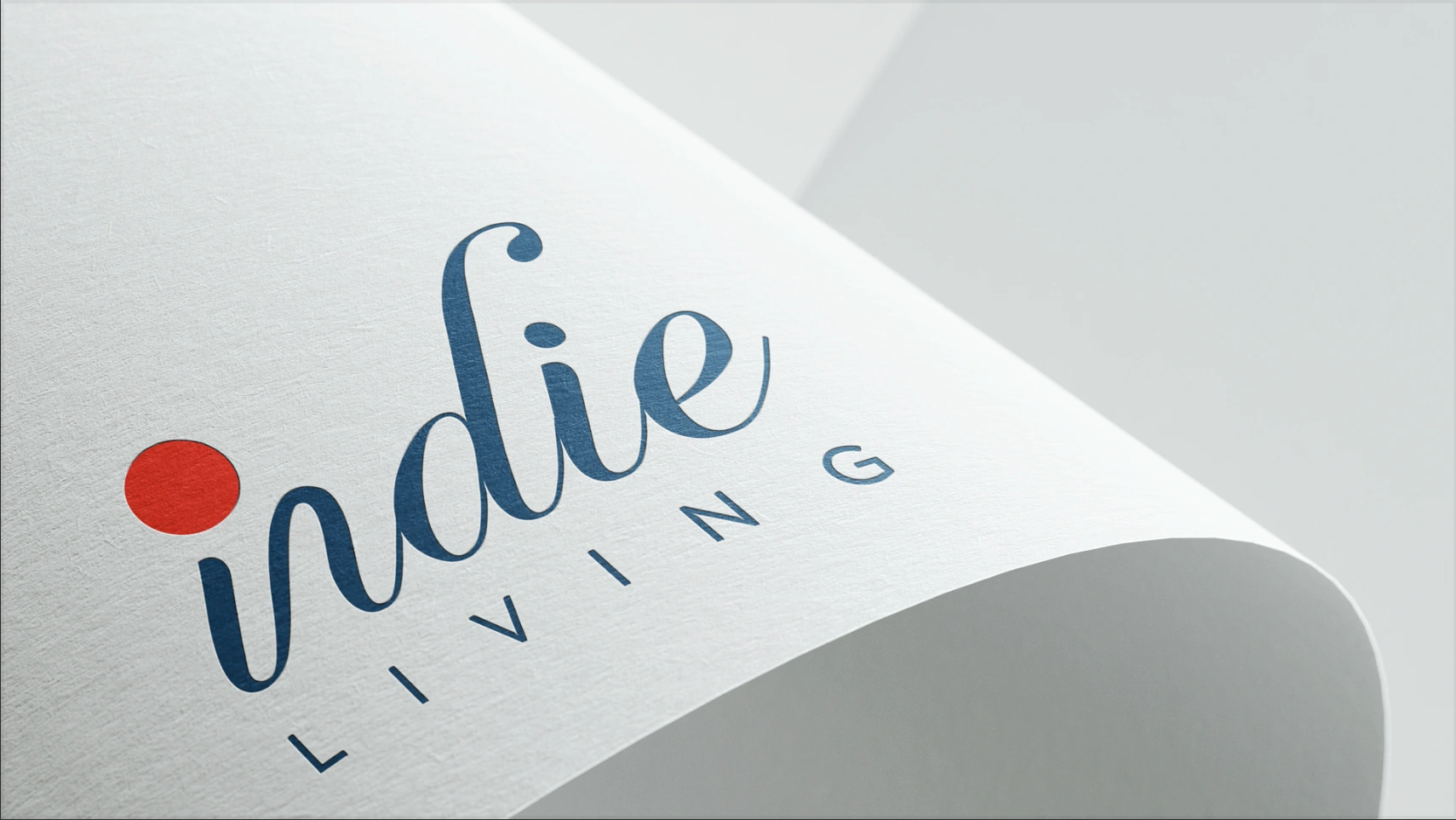
Logo of indie living
The Challenge
Indie Living needed a brand identity that could balance multiple dimensions.
The identity had to reflect heritage, culture, and craftsmanship while still feeling premium and approachable. It also needed to work seamlessly across interiors, packaging, stationery, and editorial formats. Most importantly, the brand had to avoid common clichés seen in handcrafted or ethnic brands.
The identity needed to feel personal and lived in, not decorative or trend-driven.
Brand Direction and Concept
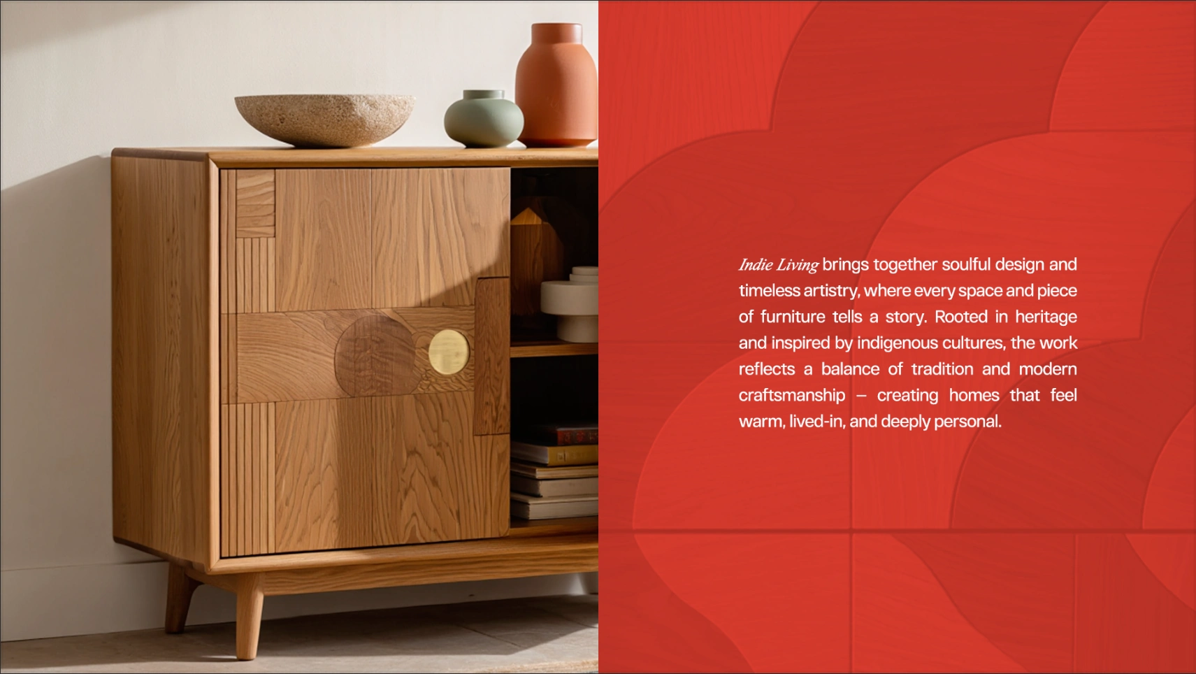
The core idea behind Indie Living was rooted in heritage and shaped by stories.
Instead of relying on heavy symbols or visual motifs, the brand direction focused on typography, subtle emotion, and restraint. The identity was designed to feel like it belongs naturally inside a calm, well designed home rather than demanding attention.
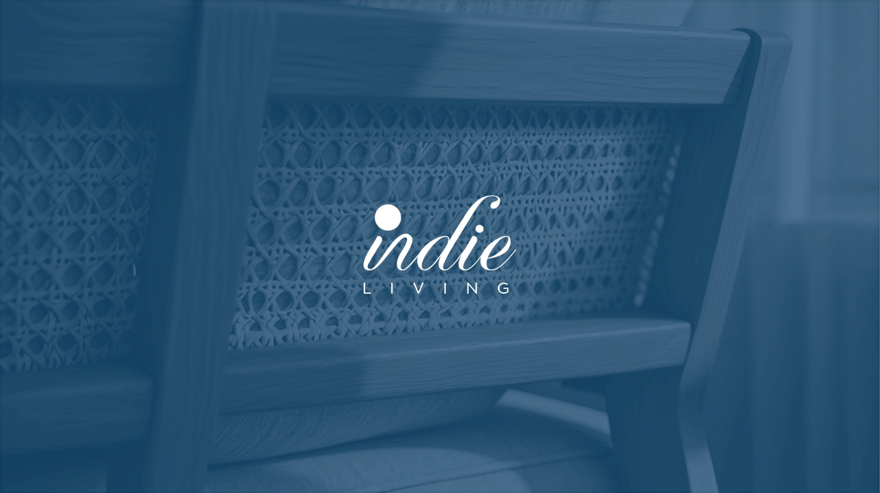
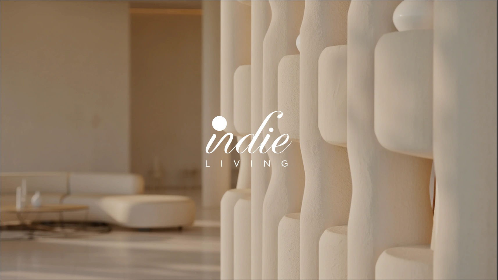
white logo of indie living
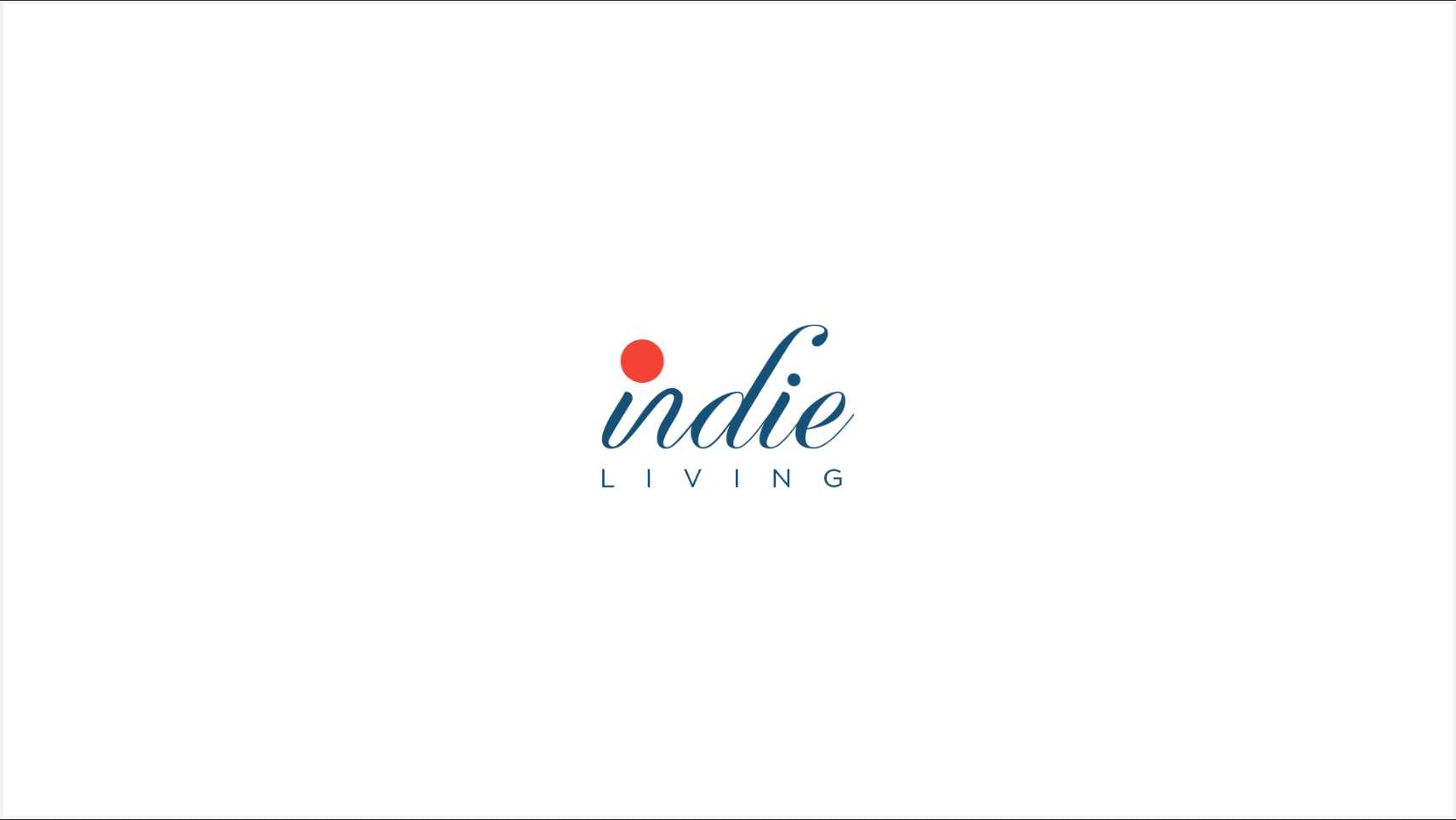
Logo Design Approach
Wordmark Led Identity
The logo is a custom wordmark built around the name “indie”, paired with a minimal and spaced “LIVING” descriptor.
The lowercase treatment adds approachability and warmth. The soft curves and flowing strokes reflect handcrafted quality, while the absence of sharp edges reinforces a sense of calm and comfort.
The Red Accent
A small red dot accent is used as a focal point within the wordmark.
It acts as a quiet signature rather than a dominant graphic. The accent introduces contrast and memorability while symbolically representing individuality, craft, and human touch. This single detail allows the rest of the logo to remain understated and elegant.
Color Palette
The palette is intentionally minimal and emotionally driven.
Deep Carmine Red conveys warmth, individuality, and cultural depth. Muted Indigo or Rhino Blue communicates trust, calm, and sophistication. White brings clarity, space, and balance.
Together, these colors allow the brand to sit comfortably within interior environments, packaging, and editorial layouts without overpowering the products.
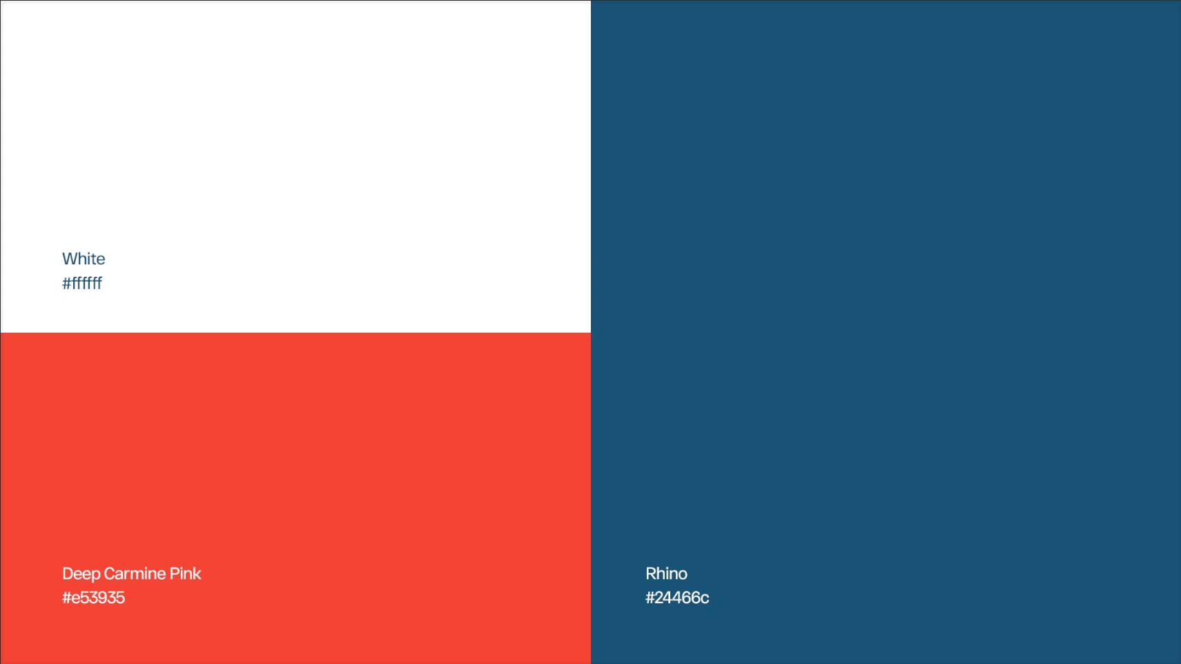
colour pallet
Applications and Mockups
The identity was tested across multiple real world touchpoints.
Business cards and stationery were designed to feel minimal, tactile, and premium. Editorial layouts and brand cards focused on storytelling and visual calm. The logo integrates naturally within interior spaces and architectural contexts. Packaging and print applications maintain consistency while remaining flexible and scalable.
Across all applications, the logo works both as a focal element and as a quiet brand mark.
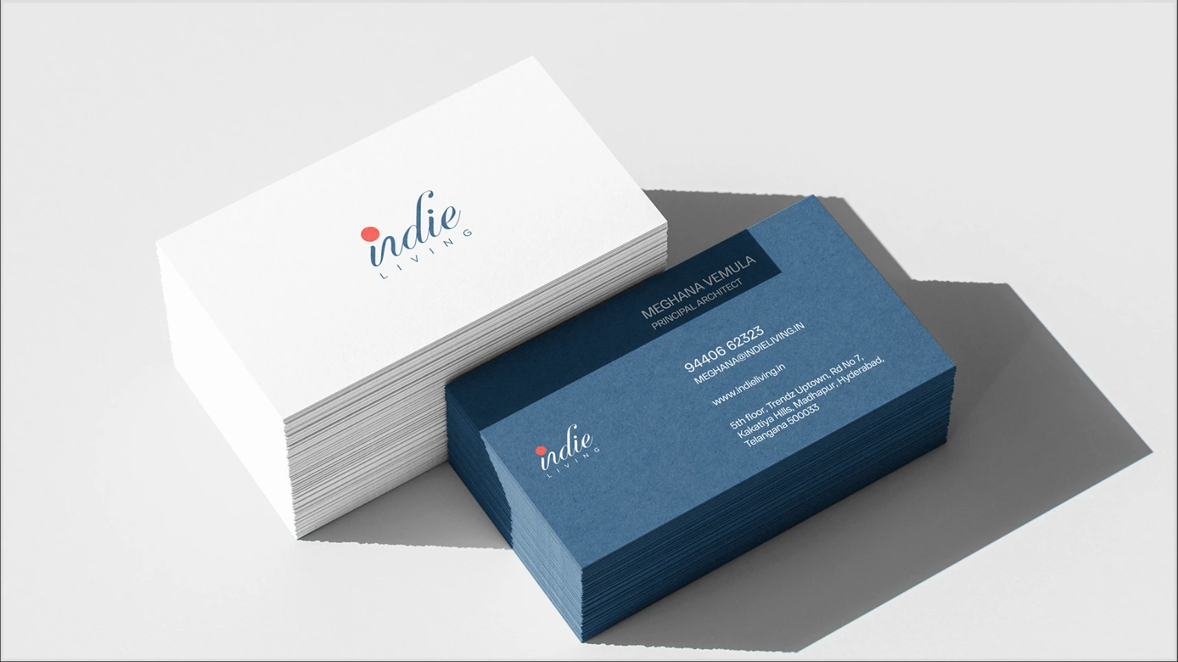
business card of indie living
Pattern and imagery design
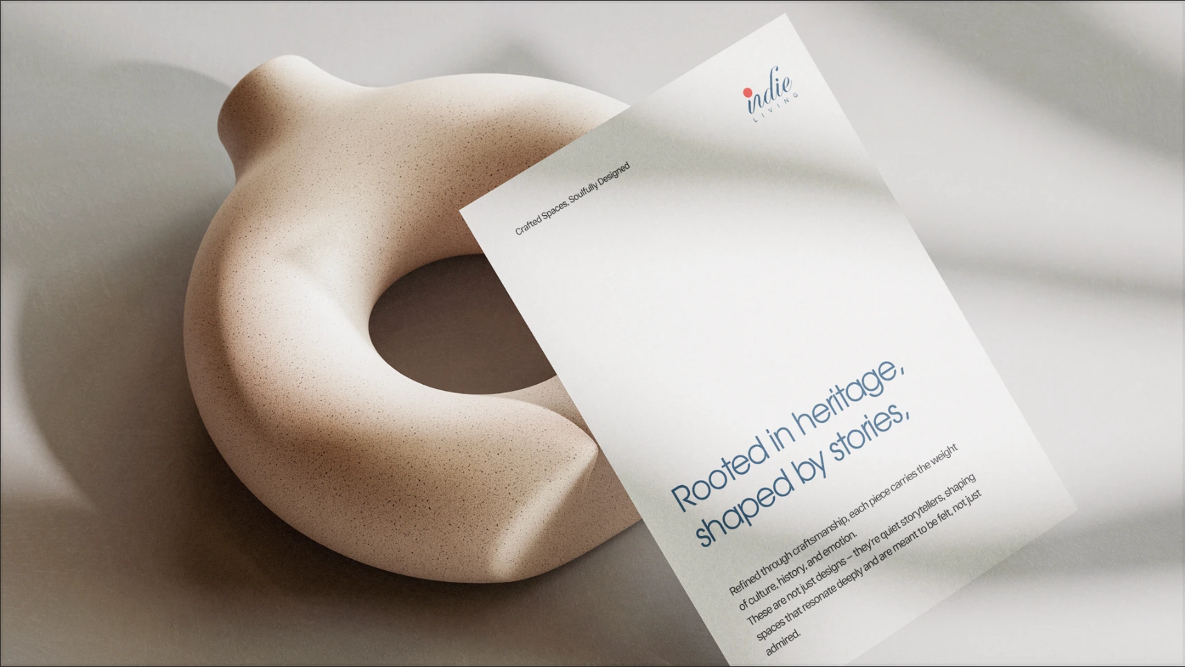
Letter head
On print
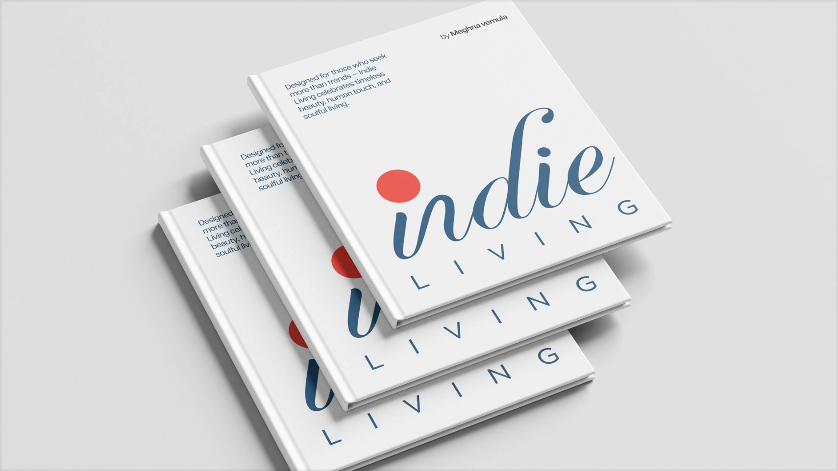
Booklet design
The Outcome
The final identity positions Indie Living as a thoughtful, premium, and story driven brand.
It reflects a deep connection to craft and culture without visual noise. The system is timeless and designed to grow with the brand over years rather than following short lived trends.
The logo supports the products instead of competing with them, allowing the furniture, materials, and stories to take center stage.
Key Takeaway
Good lifestyle branding does not need to be loud.
For Indie Living, restraint, typography, and subtle emotion came together to create a brand that feels authentic, warm, and enduring, much like the spaces it is meant to live in.
Like this project
Posted Dec 16, 2025
Designed an artisanal, modern brand identity and logo for Indie Living.
Likes
1
Views
2

