Sushi Hikari | Brand Identity
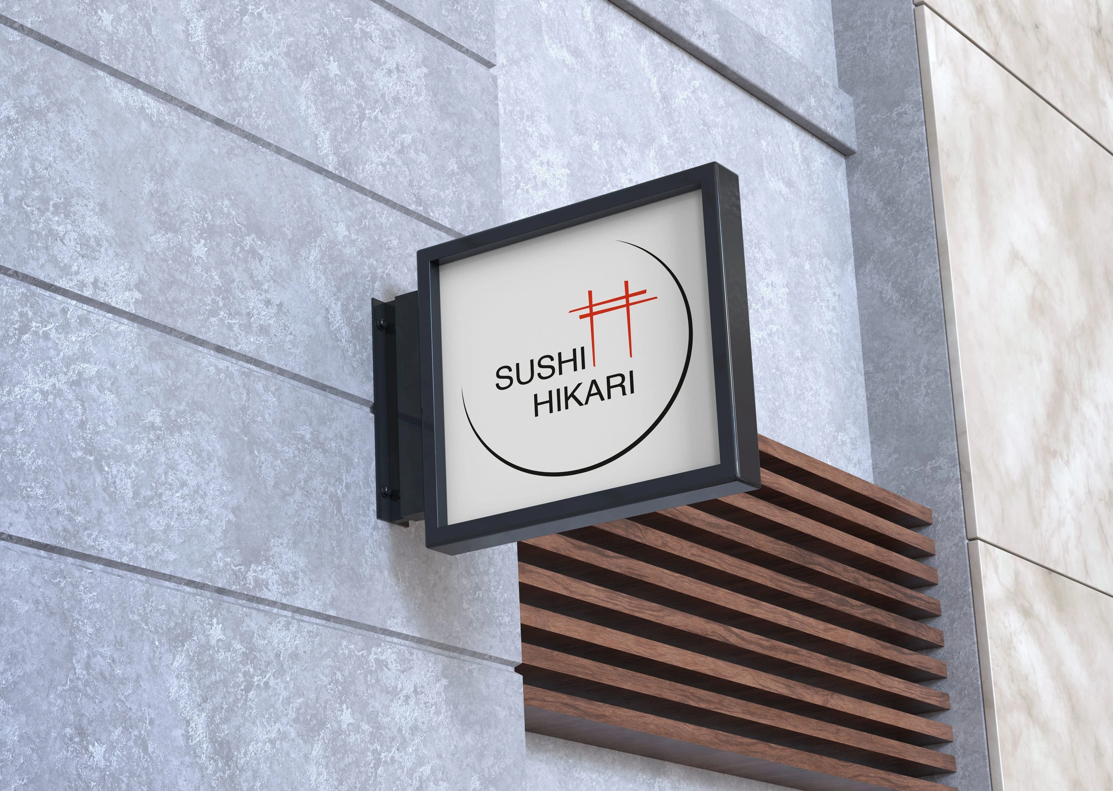
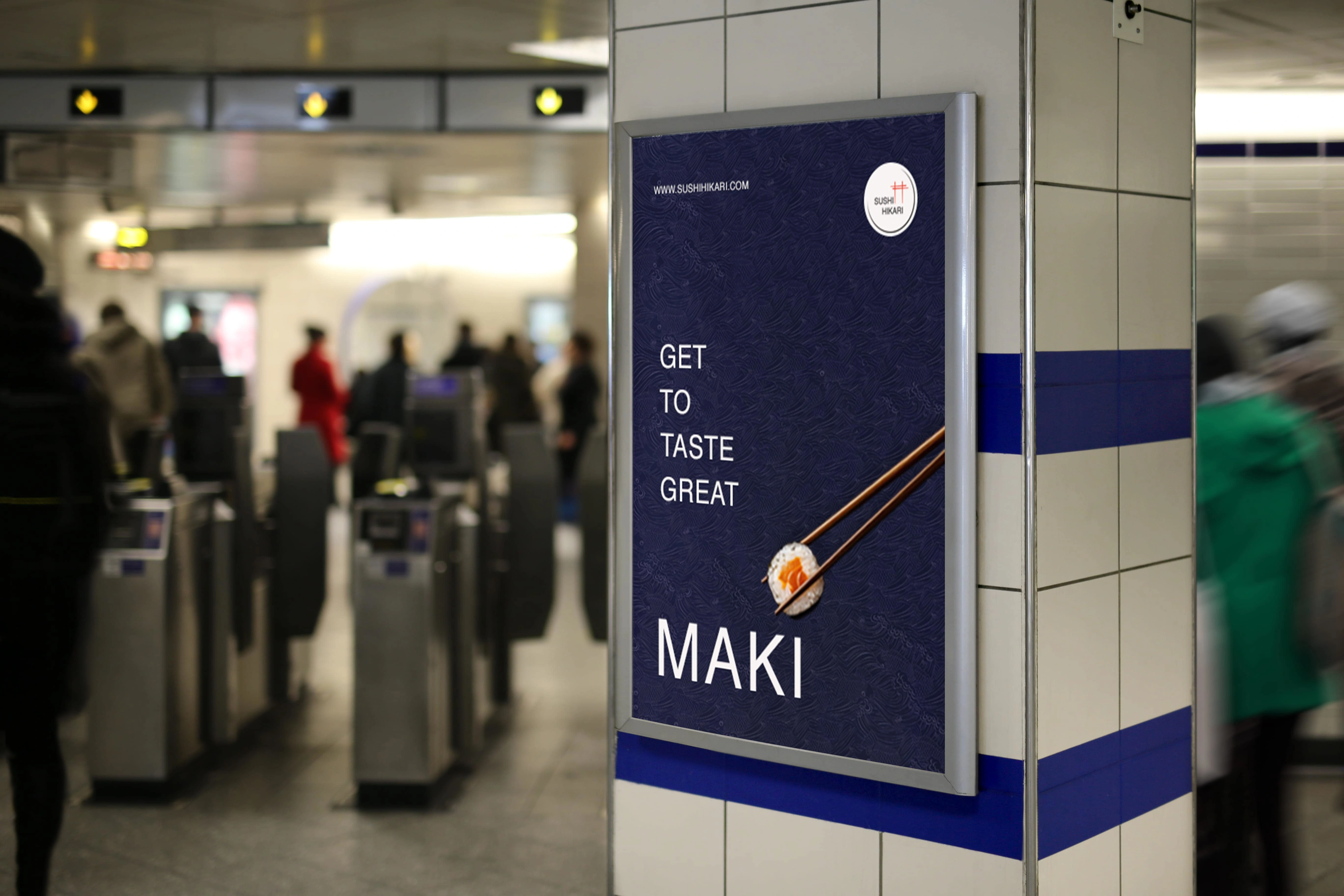
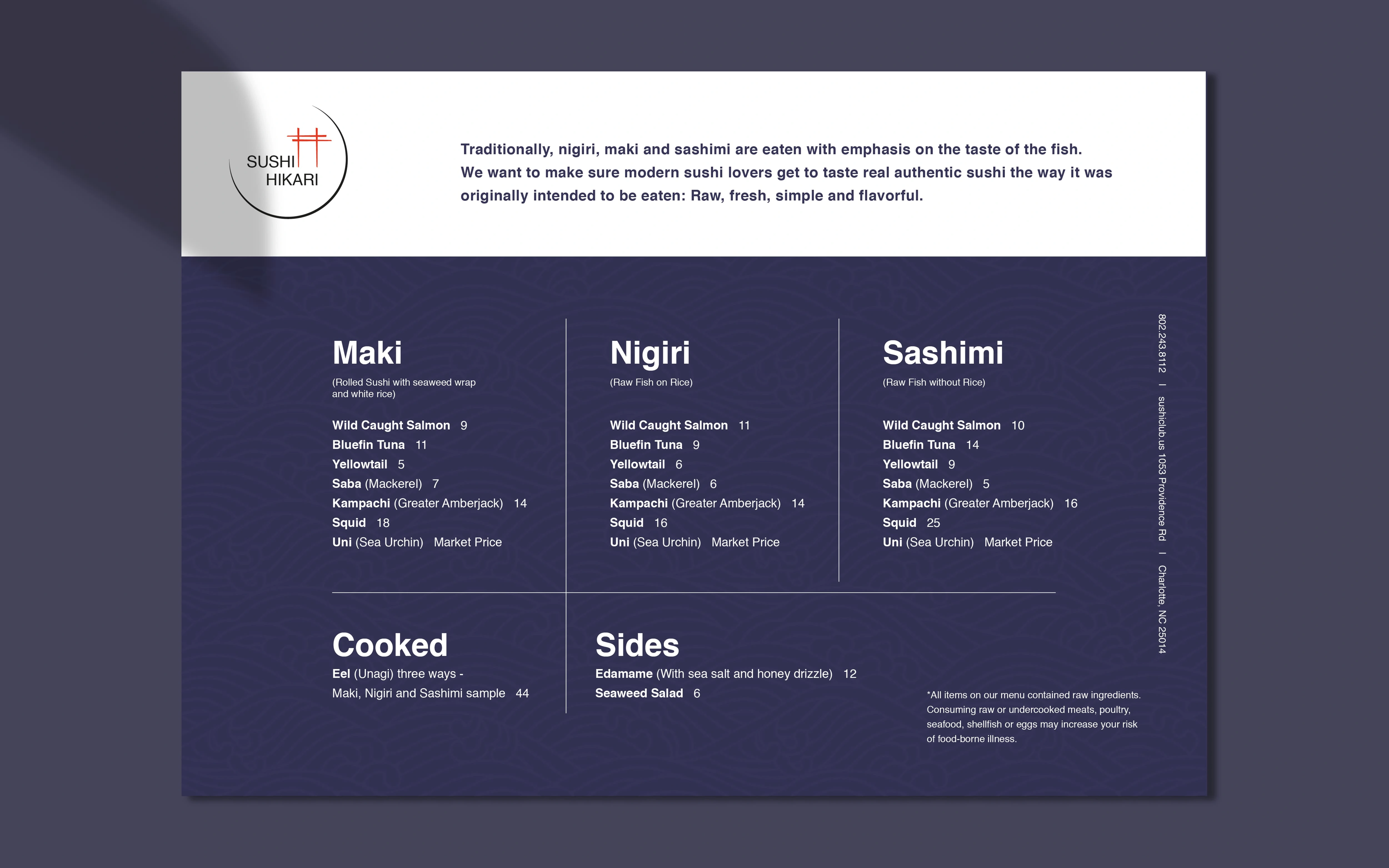
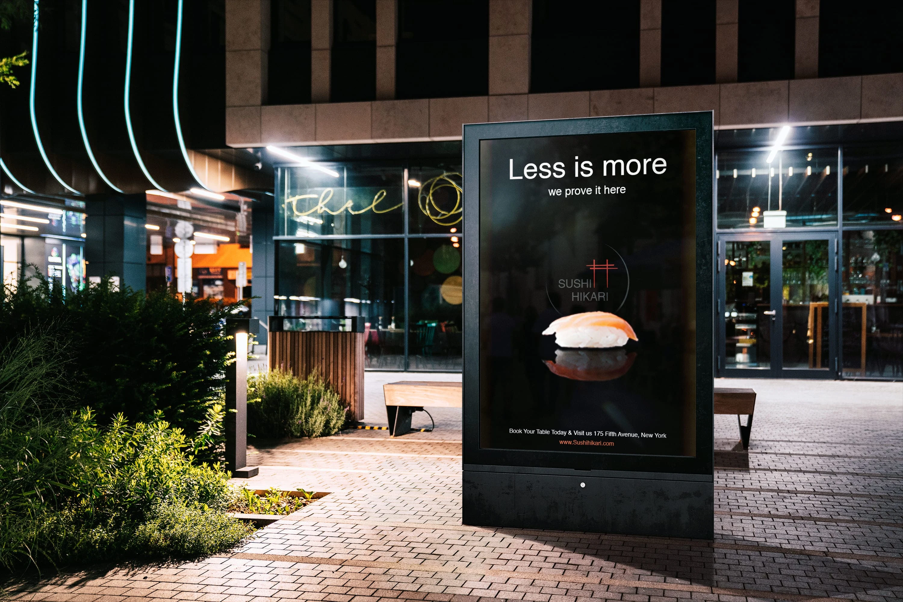
Sushi Hikari: The name 'Hikari,' meaning 'light' in Japanese, symbolizes the brand's commitment to authentic sushi. Initially starting as a delivery service, I expanded the visual identity to showcase its full potential.
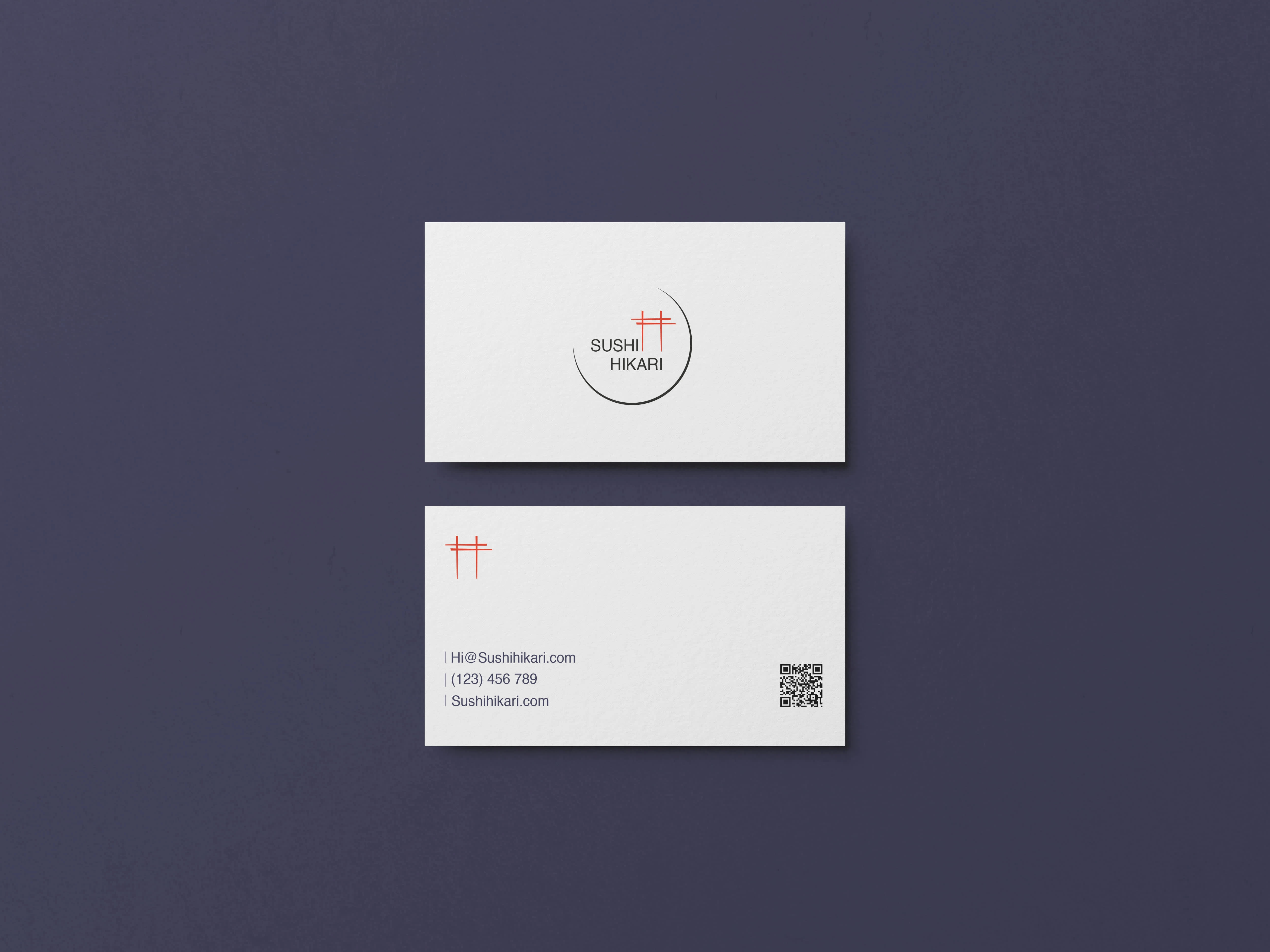
Through extensive sketching and testing, I crafted a strong logo that blends minimalism with clarity and impact.
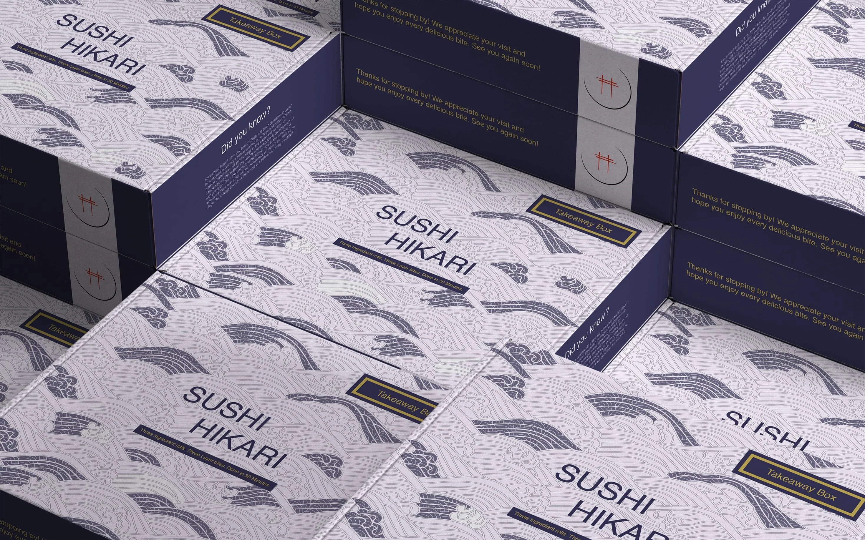
The curated color palette reflects the brand's roots, while the AI-generated images of the workers enhance the overall aesthetic. Each design element aligns with the brand’s focus on freshness and simplicity, conveying a high-quality feel.

Fully AI-generated image of a chef preparing sushi, created to visualize the brand's aesthetic and communicate its fresh, authentic tone.
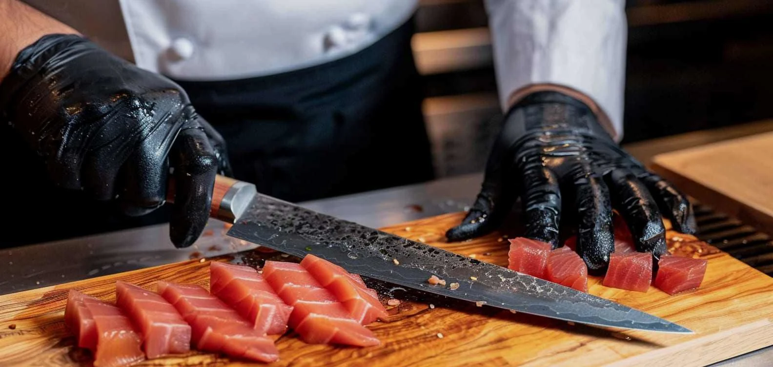
Fully AI-generated close-up image of a chef's hand slicing fish, designed to emphasize the brand's dedication to craftsmanship.
Like this project
Posted Oct 10, 2024
A vibrant visual identity emphasizing quality. The logo blends minimalism with hierarchy, featuring curated colors and AI-generated images that exude freshness.


