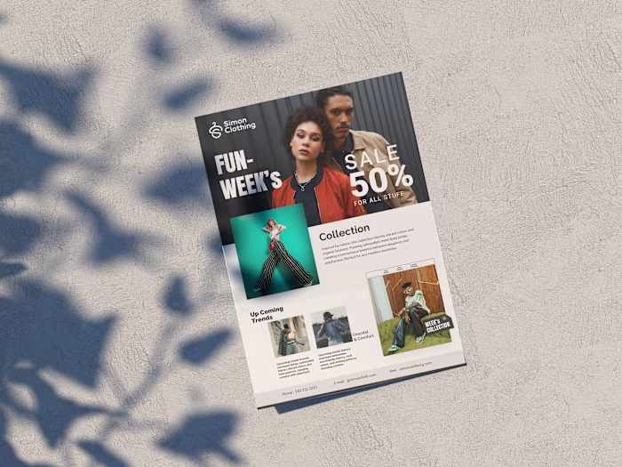
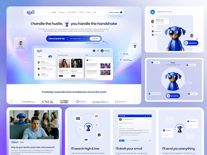
Comprehensive Packaging & Label Design for Consumer Products

Yusra Shoaib


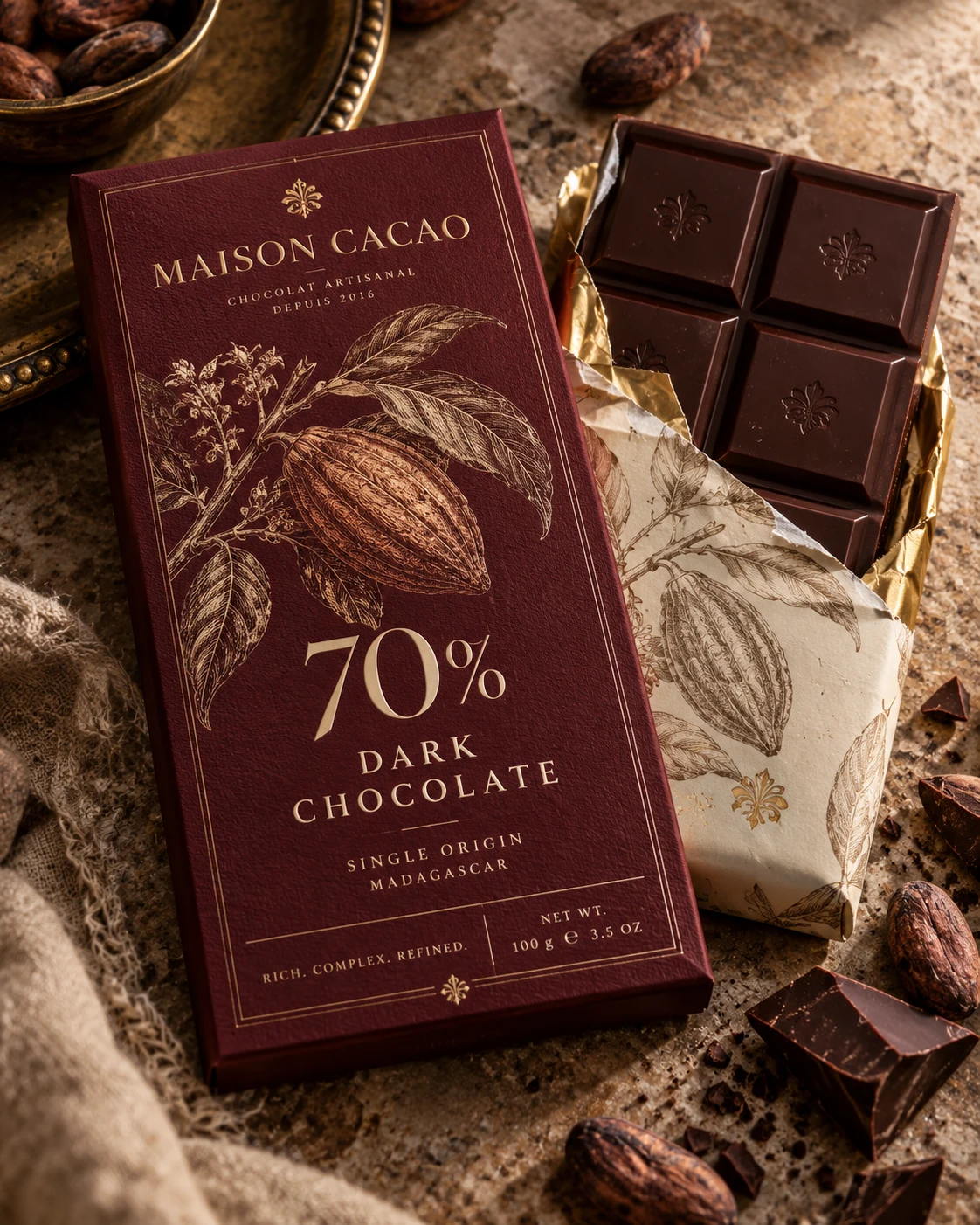
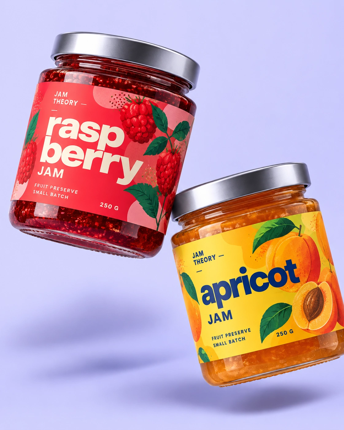
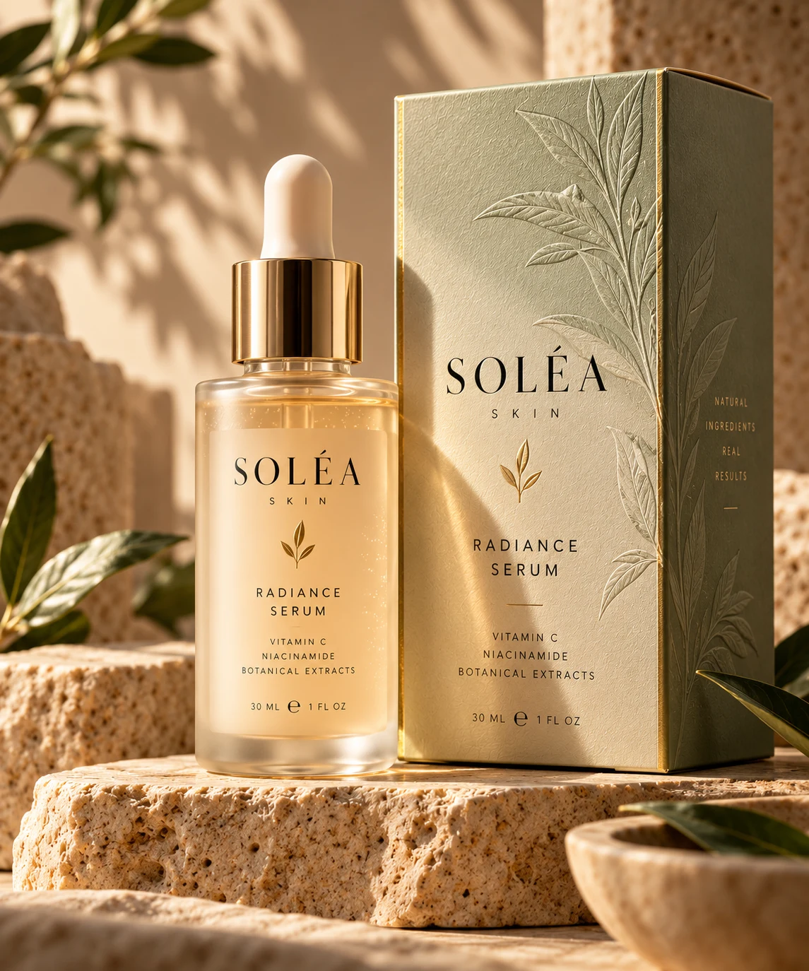
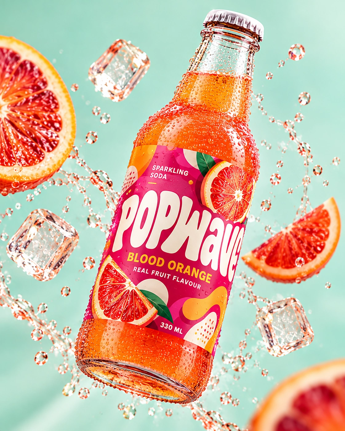
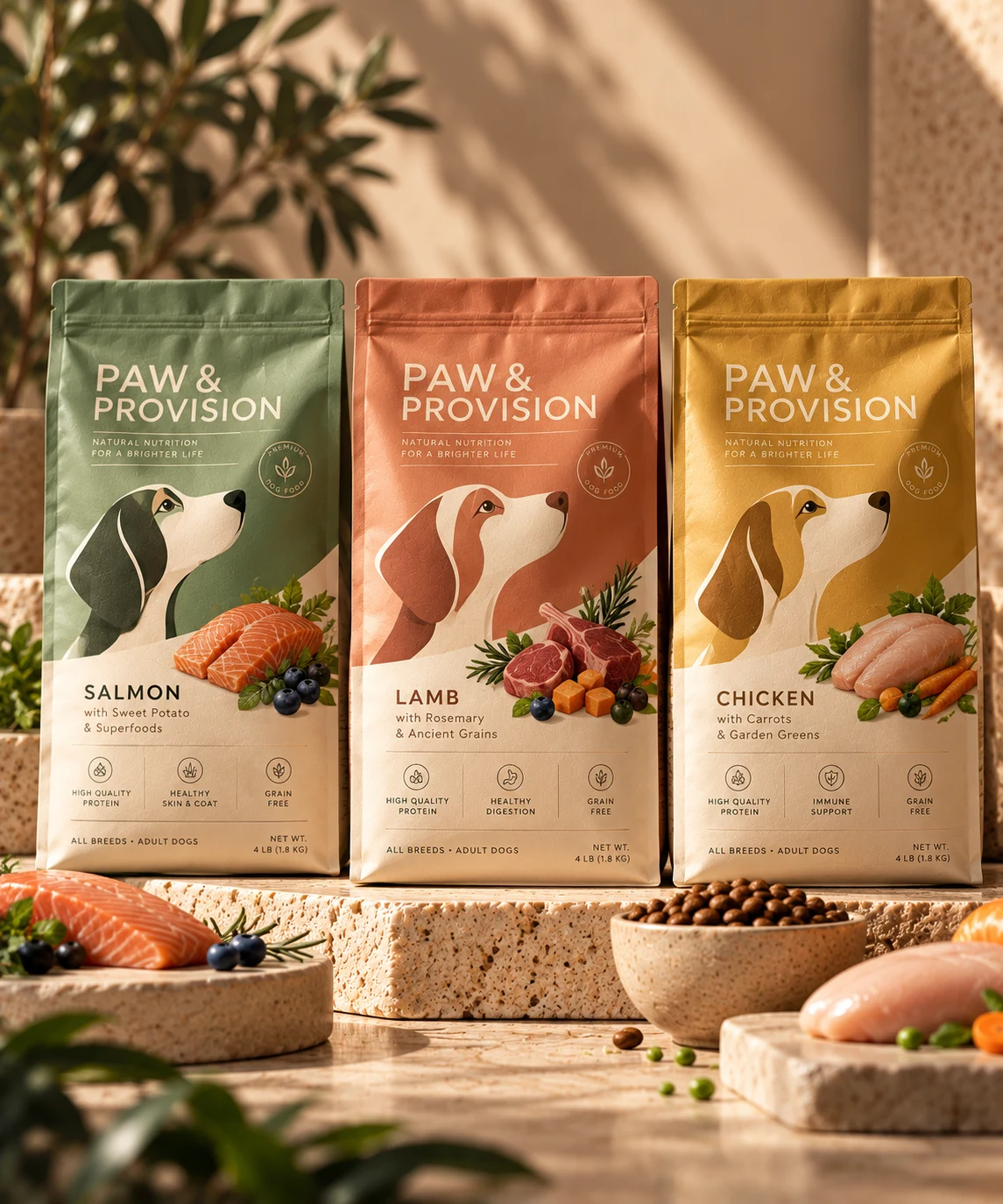
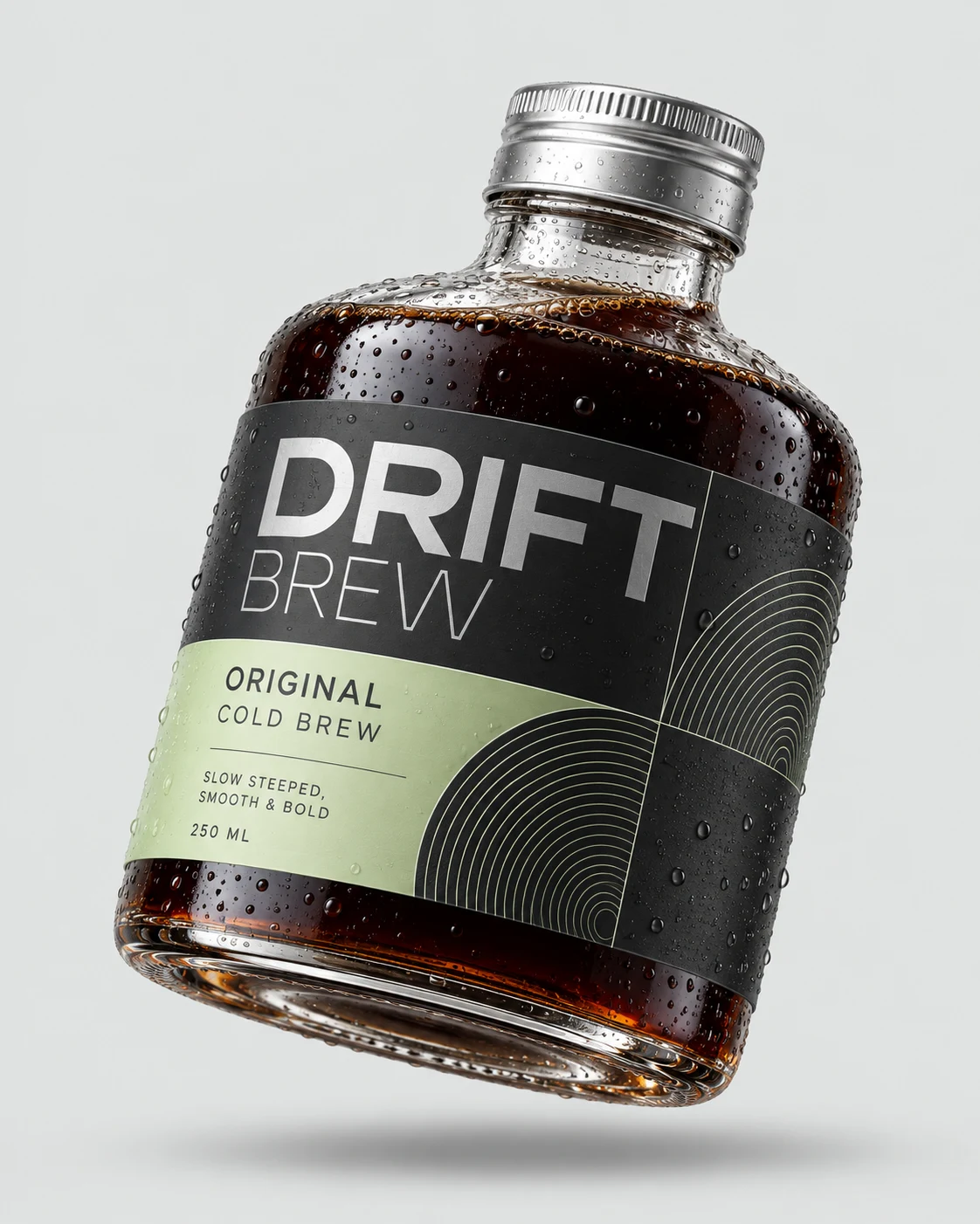
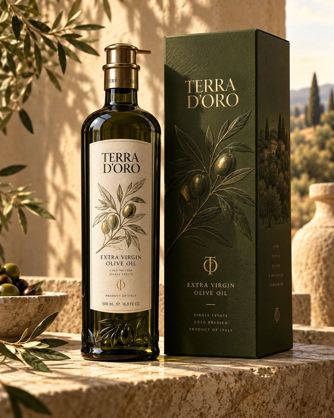
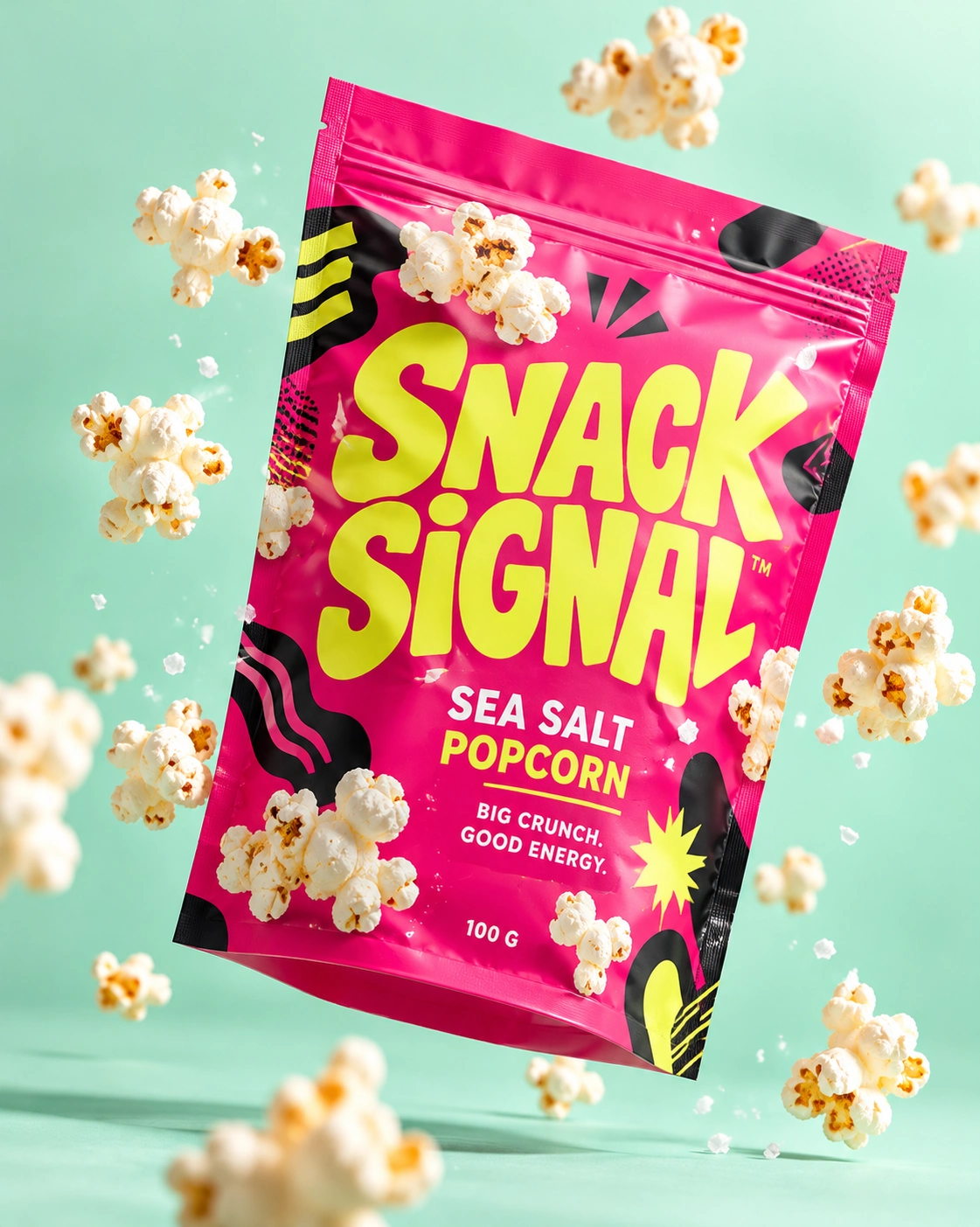
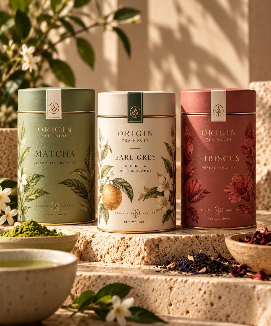
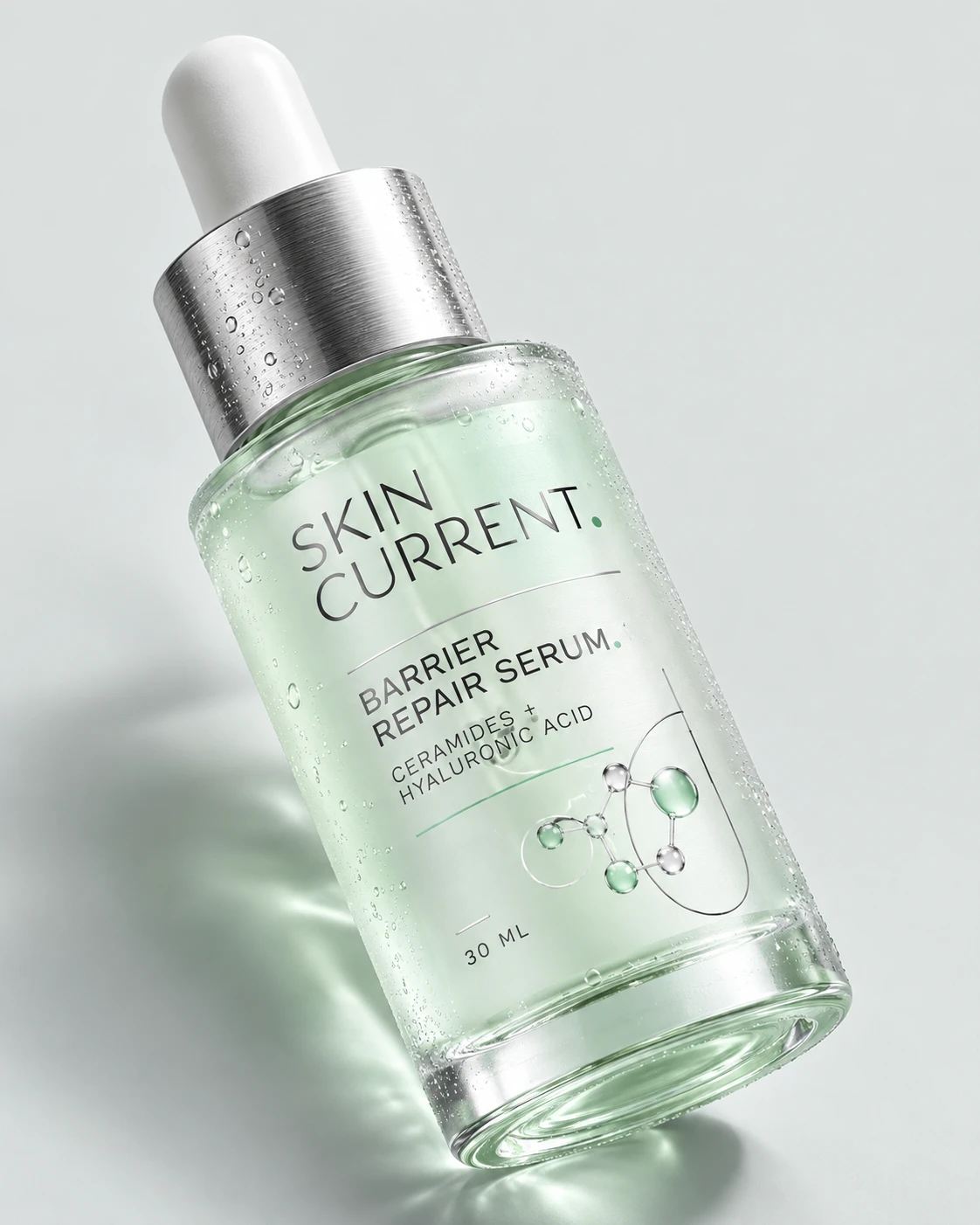
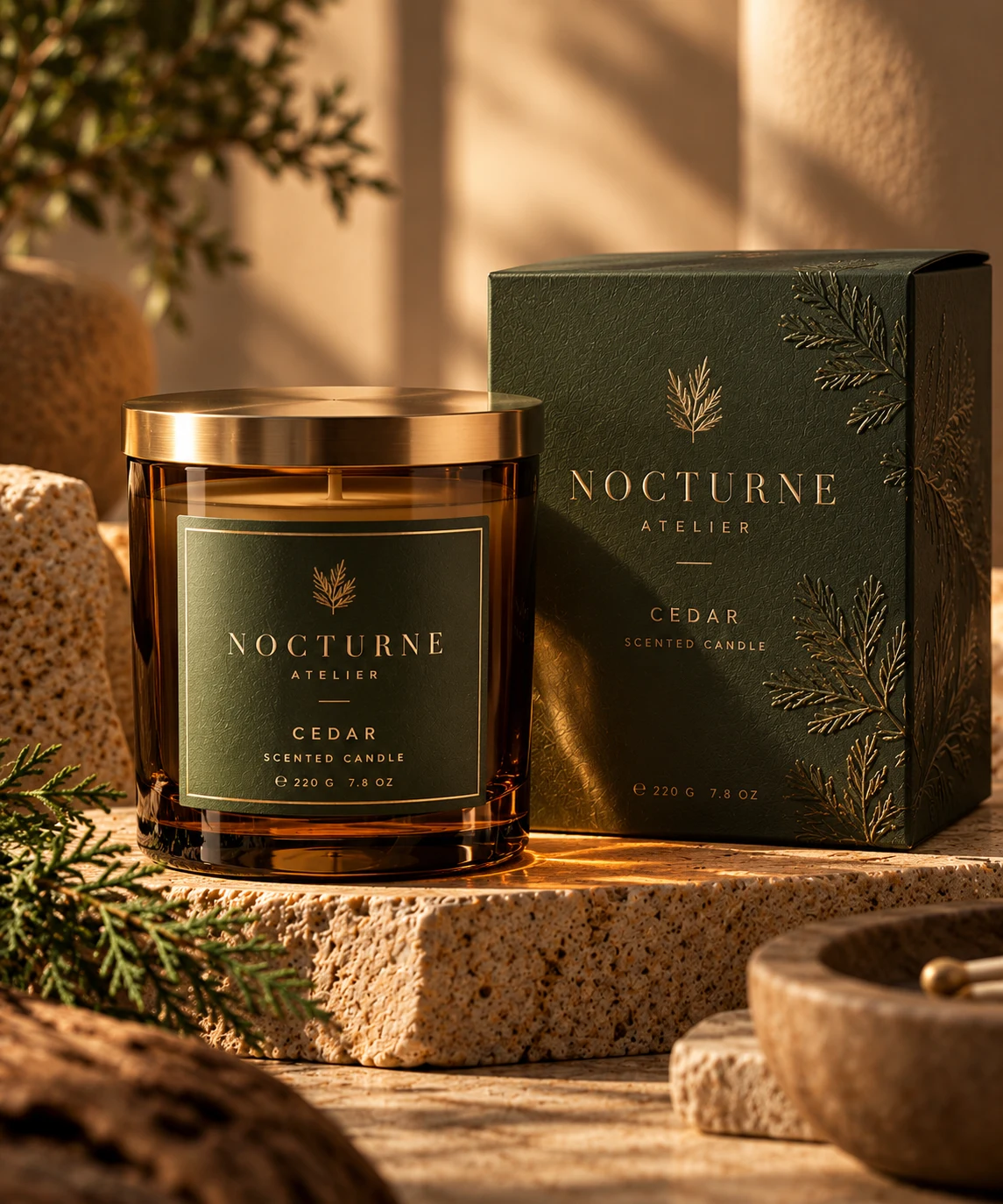
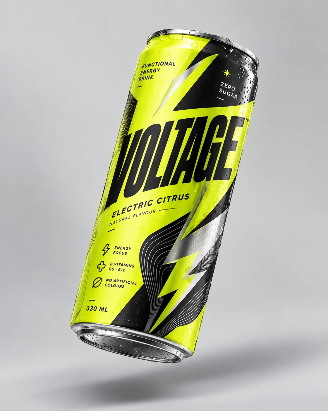
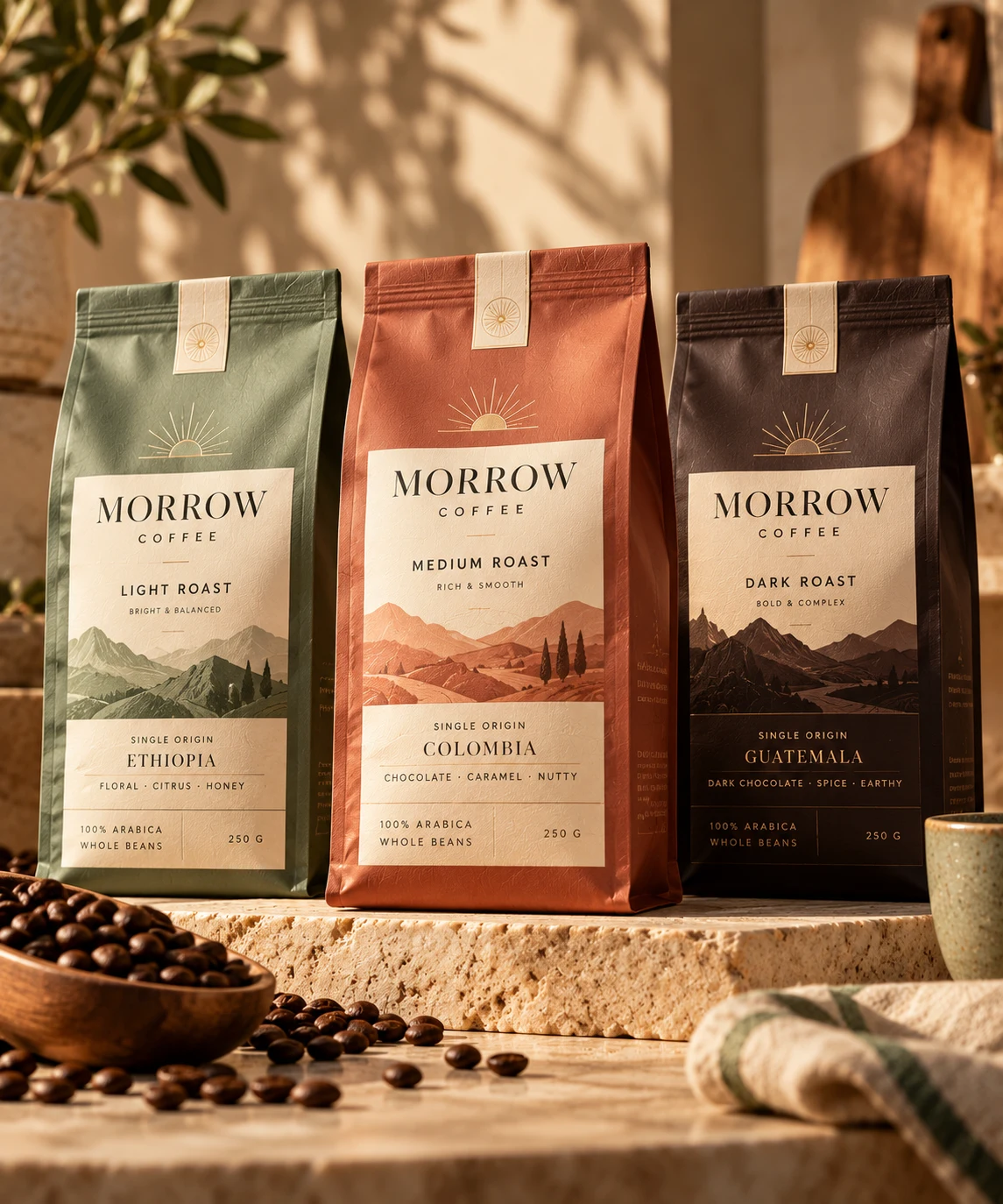
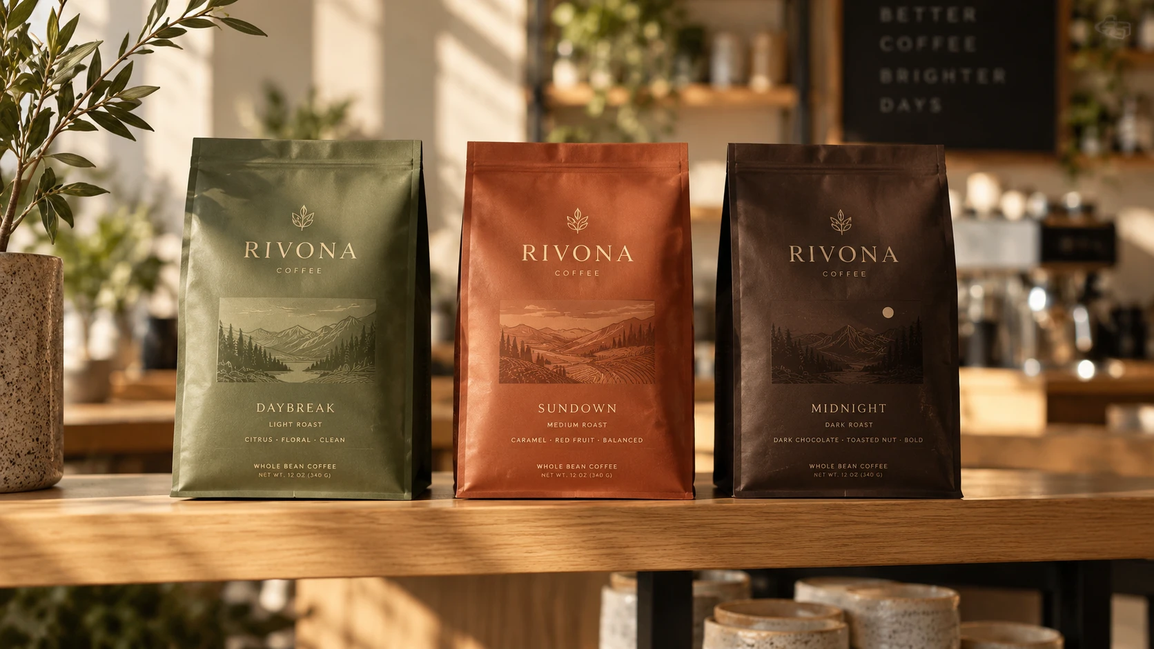

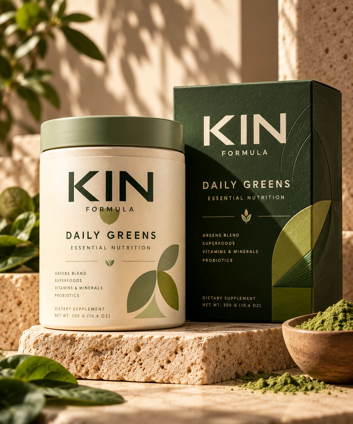
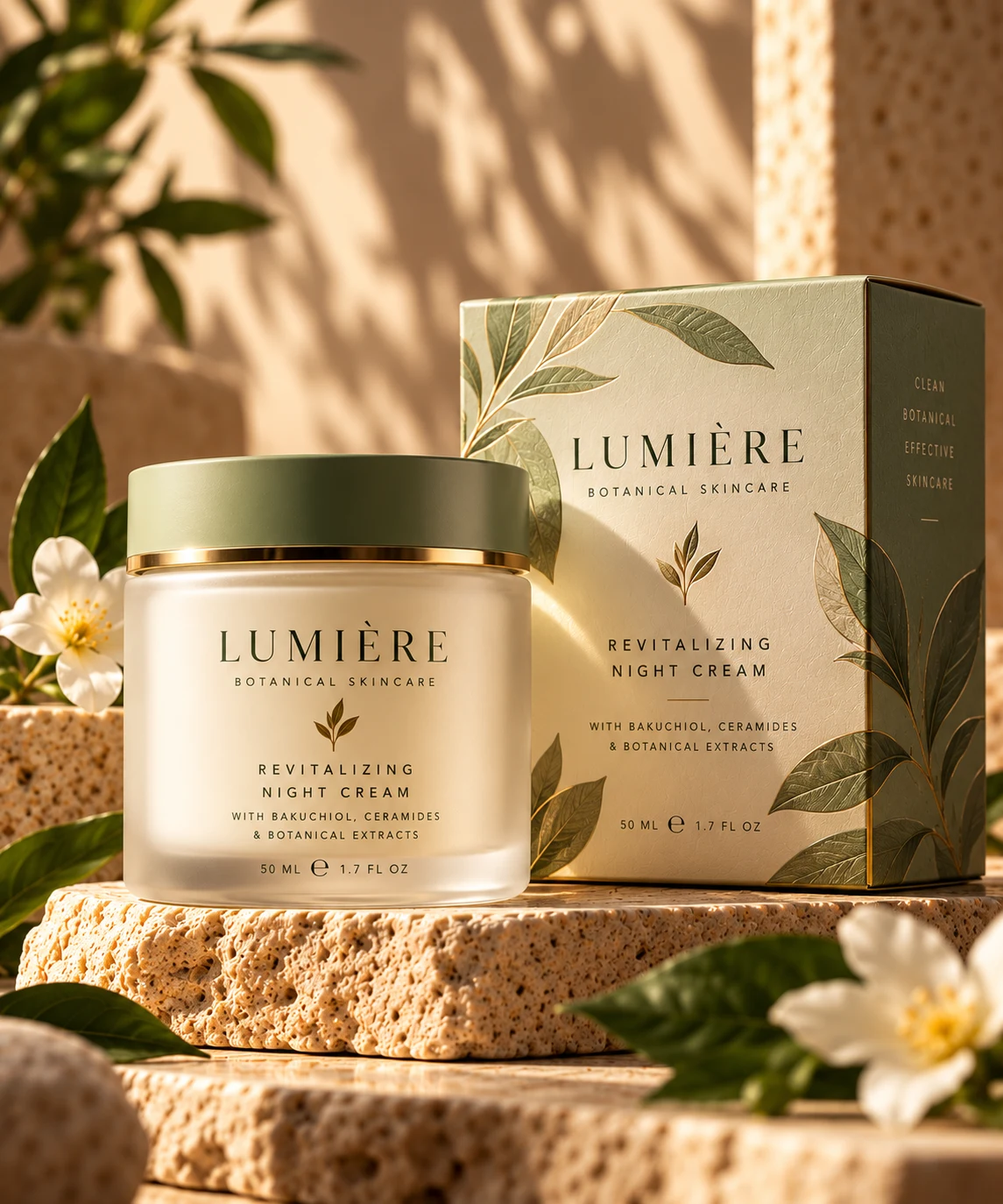
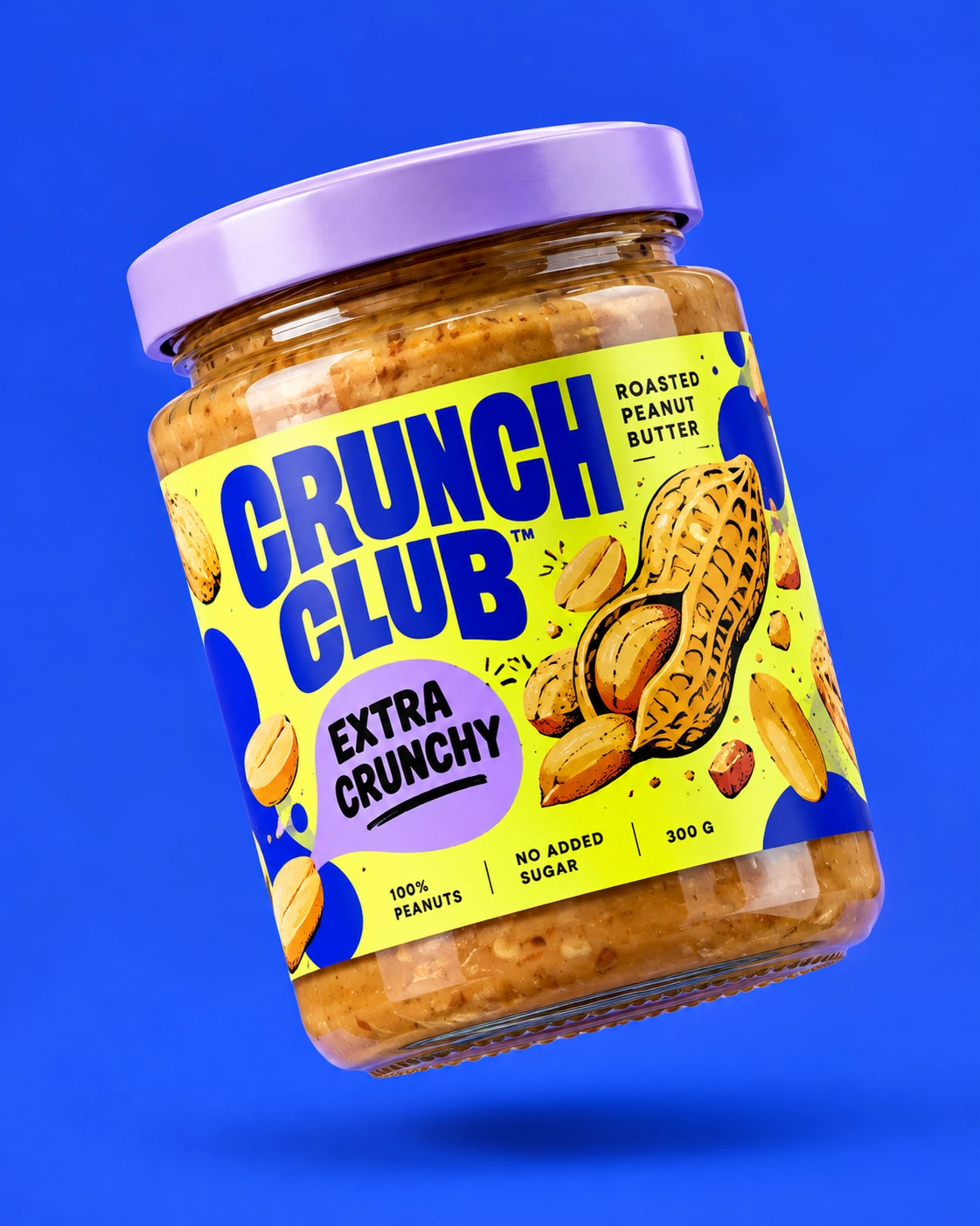

Packaging & Label Design That Helps Products Stand Out
Good packaging has to do more than look attractive. It needs to catch attention, communicate value quickly, feel right for the audience, and still work within real production constraints.
This project showcases a selection of packaging and label design work created for consumer products across food, wellness, beauty, lifestyle, and retail categories.
The Challenge
Packaging design often has to solve several problems at once.
The product needs to stand out on shelf or online, the hierarchy has to remain clear, regulatory or product information needs to stay readable, and the final result still has to feel distinctive enough to build recognition.
The goal across these projects was to create packaging that feels memorable and premium without sacrificing usability.
The Approach
I start by understanding the product, audience, positioning, competitors, and where the packaging will actually be seen.
From there, I develop the visual direction around typography, color, hierarchy, imagery, illustration, and layout.
Each design is considered as part of a broader system rather than a single label, so the identity can scale across different SKUs, flavors, sizes, or product variations.
Special attention is given to how the packaging reads from a distance, how quickly the product type and key benefit can be understood, and how the design translates from physical packaging to ecommerce thumbnails and marketing content.
What I Designed
The work includes:
Product labels
Boxes and cartons
Pouches and flexible packaging
Bottles and jars
Food and beverage packaging
Supplement and wellness labels
Beauty and personal care packaging
Multi-SKU packaging systems
Retail-ready packaging
Packaging mockups and presentation visuals
Design Principles
Strong hierarchy keeps the product name and key information immediately visible.
Typography gives each brand its own personality while maintaining readability.
Color systems help differentiate SKUs without fragmenting the overall brand.
Imagery and graphic elements are used intentionally to reinforce positioning rather than decorate the pack.
Layouts are built to stay consistent across product families, allowing new variations to be added without redesigning the system from scratch.
From Concept to Production
The process does not stop at the visual concept.
I also consider practical details such as dielines, bleed, safe areas, barcode placement, print legibility, color consistency, and production-ready file setup.
Where needed, I create realistic mockups to help visualize the design before production and make stakeholder review easier.
The Result
The final packaging systems feel clearer, more cohesive, and more distinctive across both physical and digital environments.
Each project is designed to help the product communicate faster, build stronger recognition, and create a more premium first impression at the point of purchase.
Services Included
Packaging design
Label design
Packaging redesign
Multi-SKU systems
Typography and color systems
Dieline artwork
Print-ready production files
Packaging mockups
Retail and ecommerce visual adaptation
Like this project
Posted Oct 20, 2026
Designed cohesive packaging for consumer goods enhancing product recognition.
Likes
0
Views
1