Built with Relume
Pathfinders Advisory - Webflow Business Site
Joshua Adegbite
Verified
Overview
Pathfinders Advisory is dedicated to empowering small and medium-sized businesses with real-time financial insights and expert guidance—helping them make smarter financial decisions while keeping more of their earnings. The firm blends technology with human expertise to bridge the financial gap between small businesses and large corporations.
For this project, I was responsible for translating high-fidelity Figma wireframes into a fully functional, conversion-driven website using Webflow. The goal was to create a seamless digital experience with intuitive navigation, simple interactions, and minimal yet effective animations—ensuring that the platform reflects Pathfinders' mission while maximizing user engagement.
Process & Tools
I kicked off the development by setting up a style guide in Webflow to keep everything consistent. From there, I built out the desktop version first, making sure it matched the high-fidelity wireframes as closely as possible. Once that was in place, I had a review session with the client to gather feedback, which helped refine the design and interactions before diving into responsive development. The mobile experience required a bit more tweaking to ensure smooth usability, and after another round of client testing and feedback, I made final adjustments. To wrap things up, I focused on SEO improvements to make sure the site wasn’t just visually strong but also well-optimized for search engines.
For Pathfinders Advisory, aside from sections I built from scratch, I made use of components from the Relume library and also followed the Client-first approach for the build.
Learnings
One big takeaway from this project was improving how I communicate. Working with the stakeholders, I realized how important it is to be clear and straight to the point—no overcomplicated explanations, just making sure everyone’s on the same page. It made the whole process smoother and more efficient.
Result
The project delivered a fully responsive and functional 7-page website, optimized for search engines and built to convert. The client was not only satisfied with the outcome but also shared great feedback, making it a rewarding experience overall.
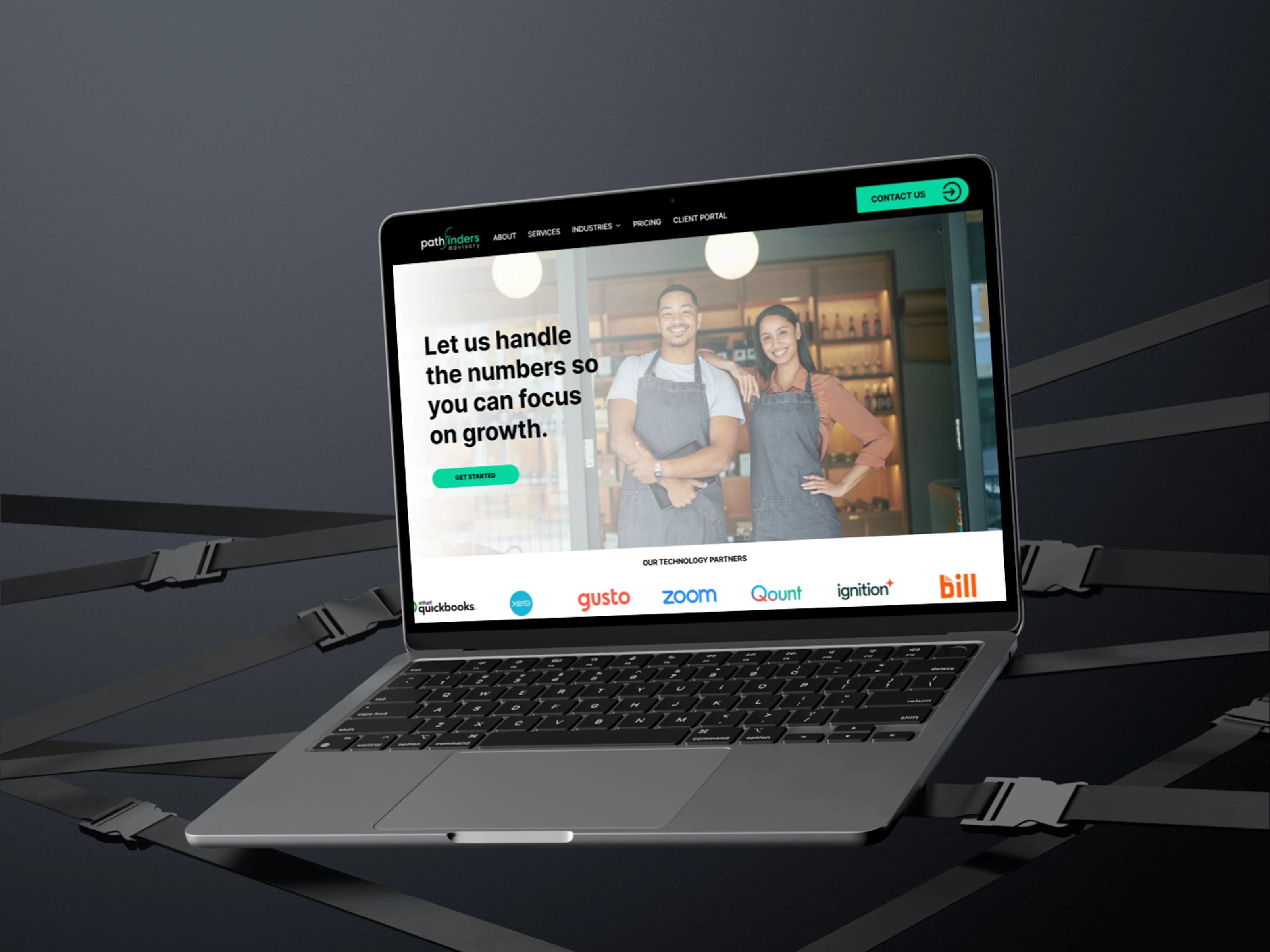
Mockup showing the hero section of Pathfinder Advisory's landing page.
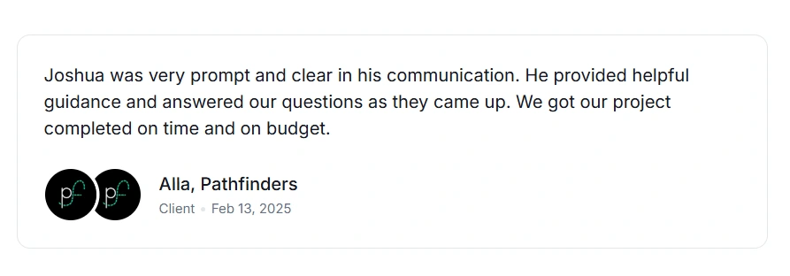
Client review on project completion 😊
Like this project
Posted Mar 7, 2025
Developed the homepage for Pathfinder Advisory, a financial service provider that helps clients and business manage their financial operations.
Likes
1
Views
65
Timeline
Jan 28, 2025 - Mar 5, 2025
Clients
Pathfinders