Rebranding a Technology Group
While working at Tellwell Story Co. + Studio as a Lead Graphic Designer, I lead the rebrand and website design for Lockstep Technology Group (LTG). The organization formed in 2022, when three separate companies, (Lockstep Education, Bridgetek, and Transformyx) joined together under the LTG name.
With a new name came the need for a new logo, a new website, and a consistent brand to take them into the future. I created the brand identity, collateral, and website design and development.
Thanks to the LTG team, especially Sean Sullivan and Nithya Jawaharlal on their collaboration during this project.
See the full project at the link below:
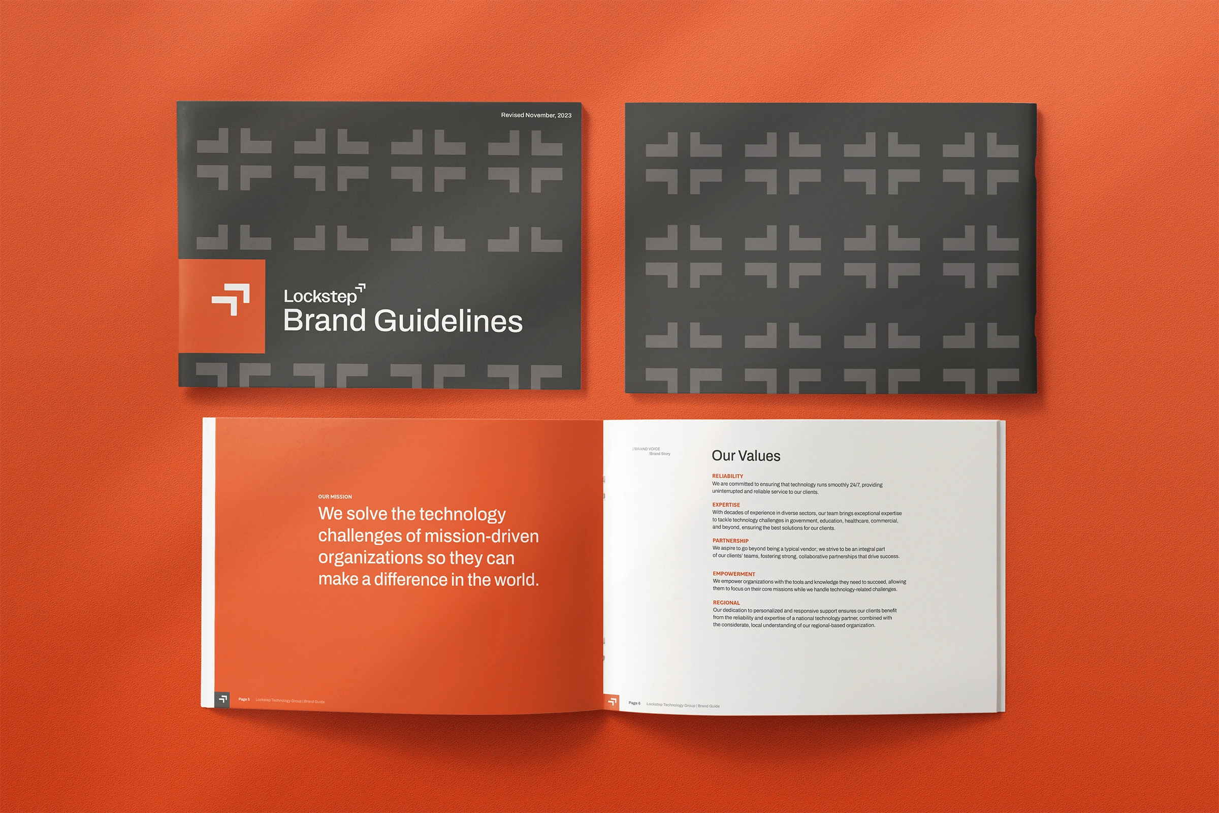
Brand Guidelines
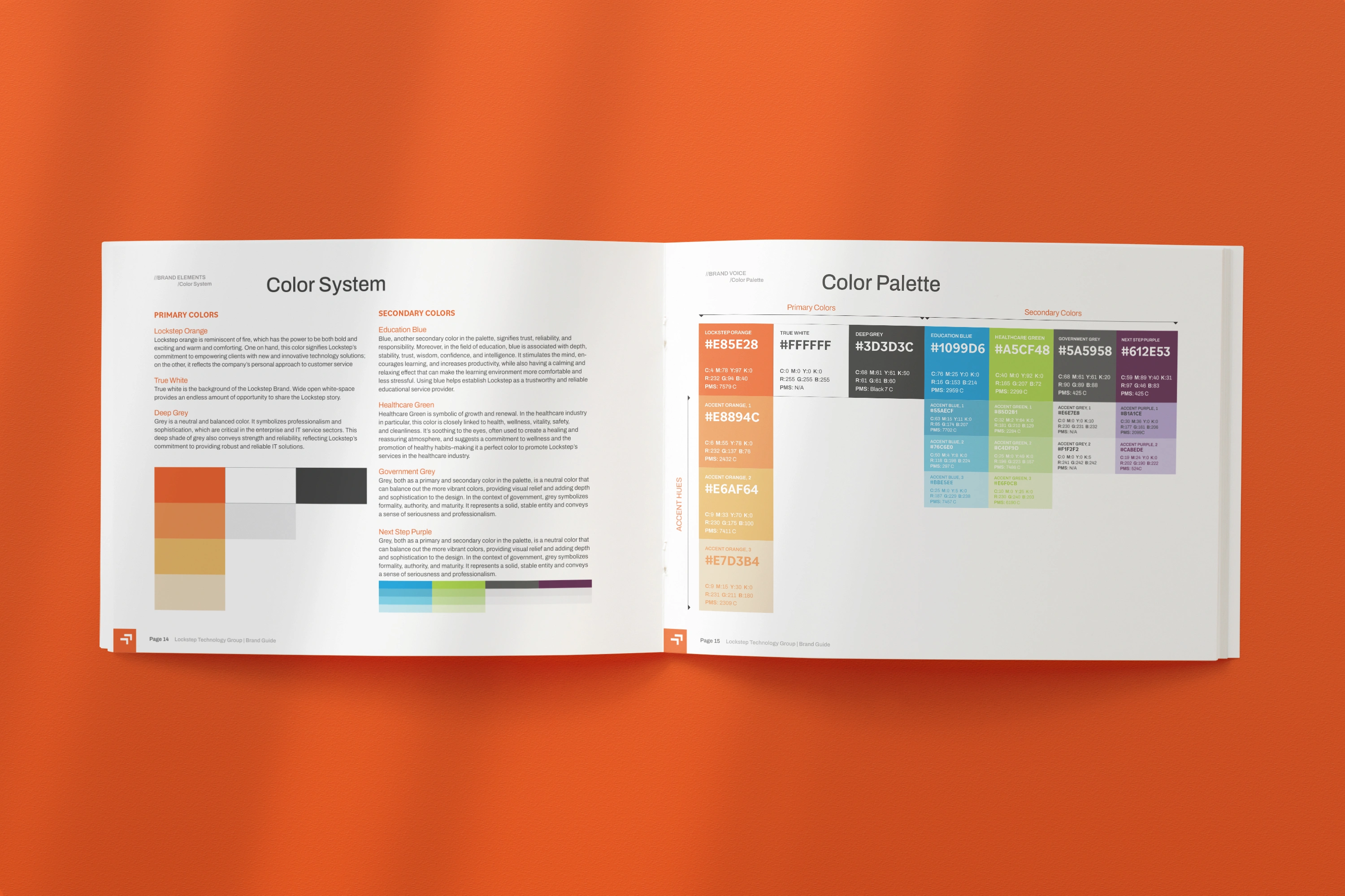
Brand Guidelines

Logo(s) Before And After
The new logo had to represent the three companies coming together. The name lockstep already illustrates this concept, as the defintion of lockstep is “is marching in a very close single file in such a way that the leg of each person in the file moves in the same way and at the same time as the corresponding leg of the person immediately in front of him” and/or “close adherence to and emulation of another’s actions.”
Their tagline, “A Step Ahead” influenced the stair-step icon that sits above the “p” in the new logo. This icon looks like a set of stairs going up, and is a pair of two to mimick the literal definition of walking in lockstep as a group.

Logo Design
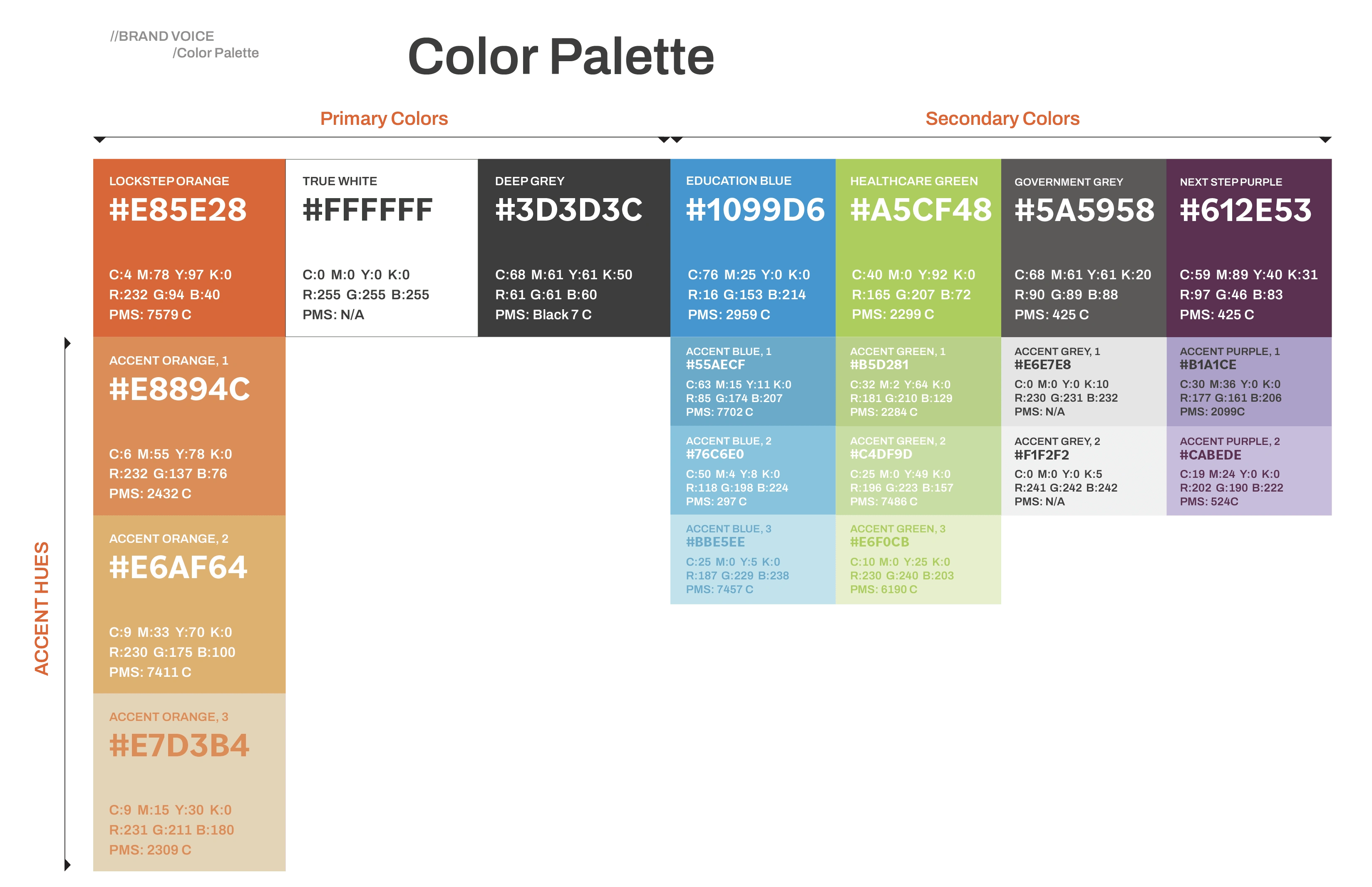
Lockstep Colors
COLOR SYSTEM
LOCKSTEP ORANGE
Lockstep orange is reminiscent of fire, which has the power to be both bold and exciting and warm and comforting. One on hand, this color signifies Lockstep’s commitment to empowering clients with new and innovative technology solutions; on the other, it reflects the company’s personal approach to customer service
TRUE WHITE
True white is the background of the Lockstep Brand. Wide open white-space provides an endless amount of opportunity to share the Lockstep story.
DEEP GREY
Grey is a neutral and balanced color. It symbolizes professionalism and sophistication, which are critical in the enterprise and IT service sectors. This deep shade of grey also conveys strength and reliability, reflecting Lockstep’s commitment to providing robust and reliable IT solutions.
EDUCATION BLUE
Blue, another secondary color in the palette, signifies trust, reliability, and responsibility. Moreover, in the field of education, blue is associated with depth, stability, trust, wisdom, confidence, and intelligence. It stimulates the mind, encourages learning, and increases productivity, while also having a calming and relaxing effect that can make the learning environment more comfortable and less stressful. Using blue helps establish Lockstep as a trustworthy and reliable educational service provider.
HEALTHCARE GREEN
Healthcare Green is symbolic of growth and renewal. In the healthcare industry in particular, this color is closely linked to health, wellness, vitality, safety, and cleanliness. It’s soothing to the eyes, often used to create a healing and reassuring atmosphere, and suggests a commitment to wellness and the promotion of healthy habits–making it a perfect color to promote Lockstep’s services in the healthcare industry.
GOVERNMENT GREY
Grey, both as a primary and secondary color in the palette, is a neutral color that can balance out the more vibrant colors, providing visual relief and adding depth and sophistication to the design. In the context of government, grey symbolizes formality, authority, and maturity. It represents a solid, stable entity and conveys a sense of seriousness and professionalism.
NEXT STEP PURPLE
Grey, both as a primary and secondary color in the palette, is a neutral color that can balance out the more vibrant colors, providing visual relief and adding depth and sophistication to the design. In the context of government, grey symbolizes formality, authority, and maturity. It represents a solid, stable entity and conveys a sense of seriousness and professionalism.
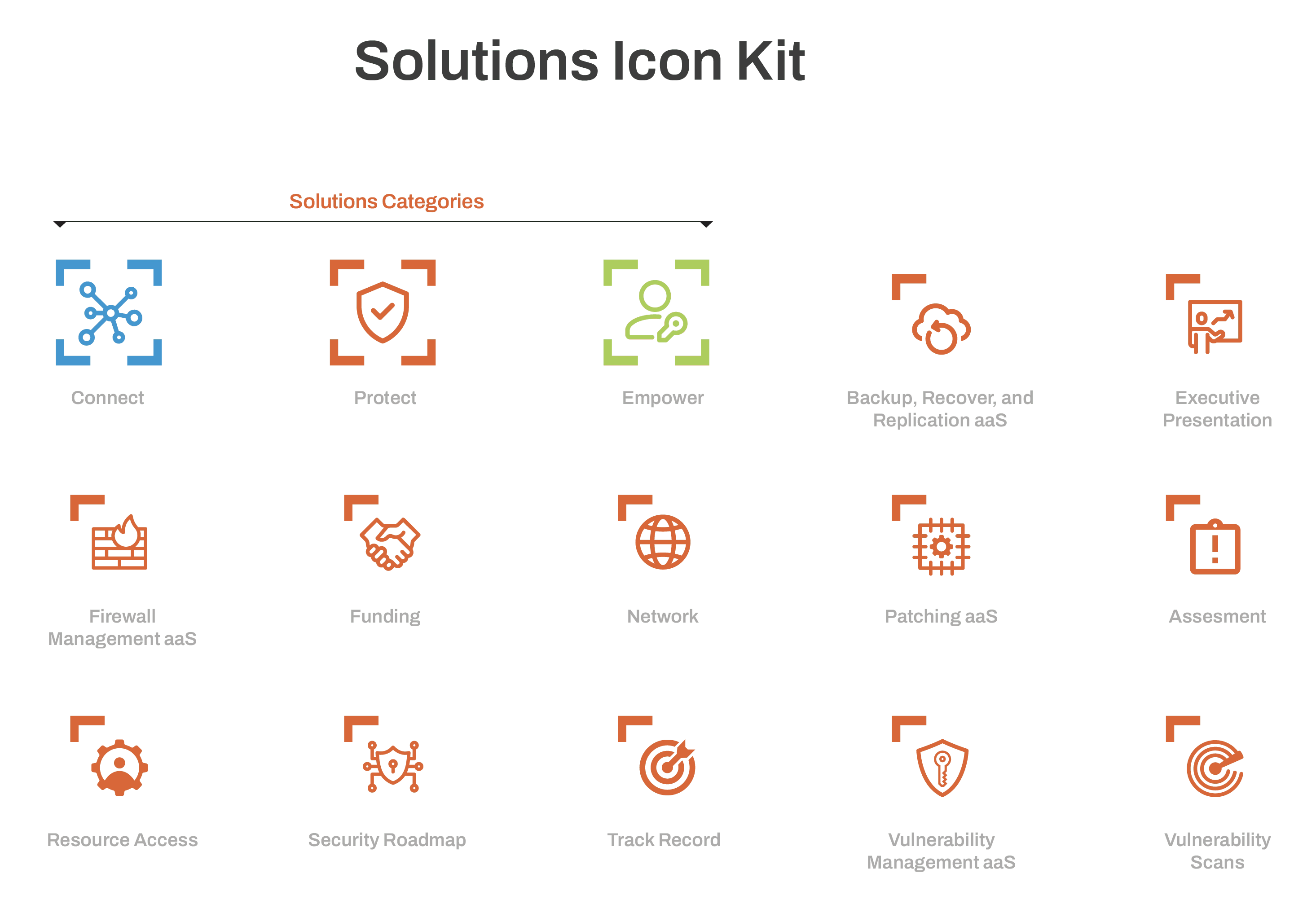
Icon System

One-sheeter Example
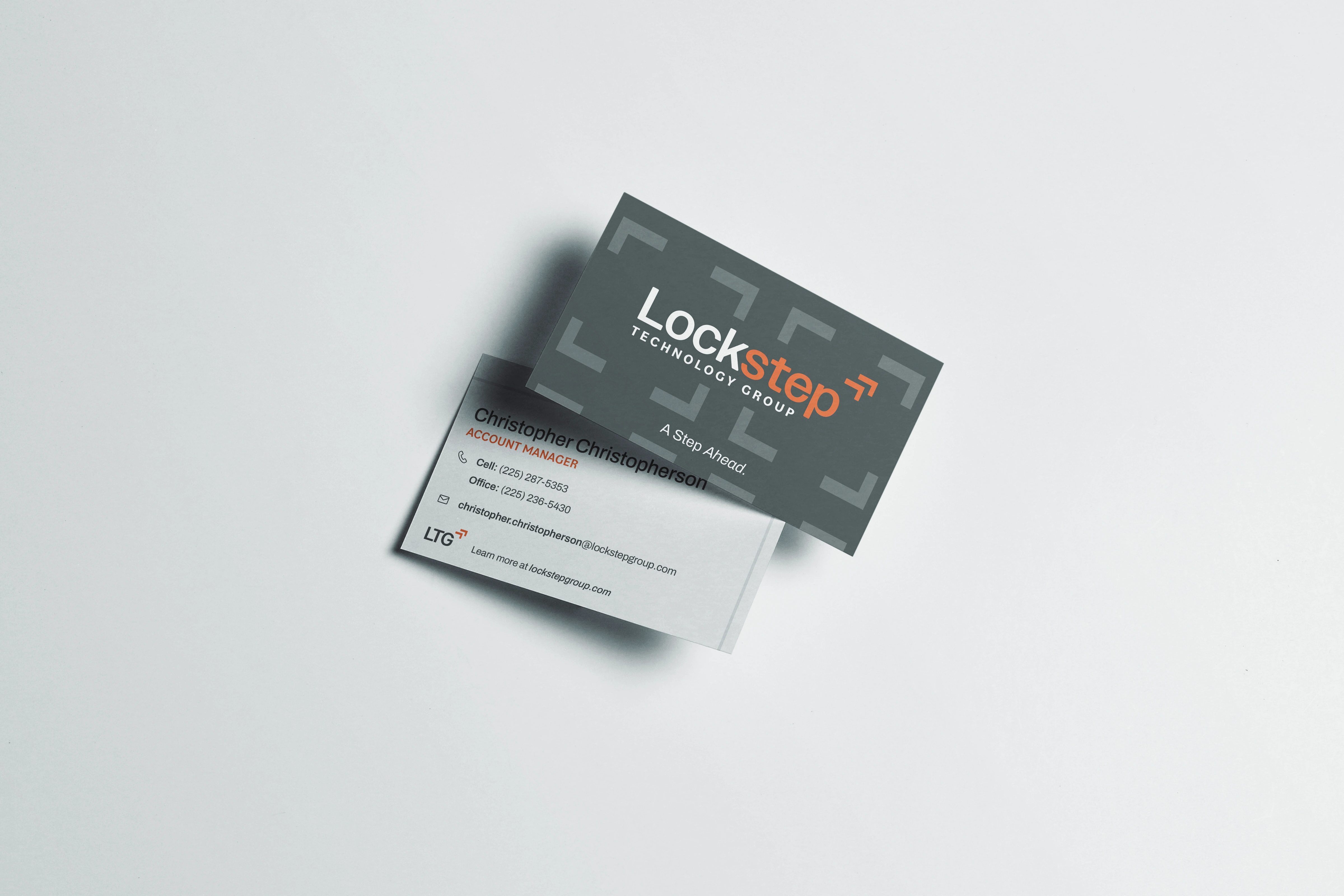
Business Cards
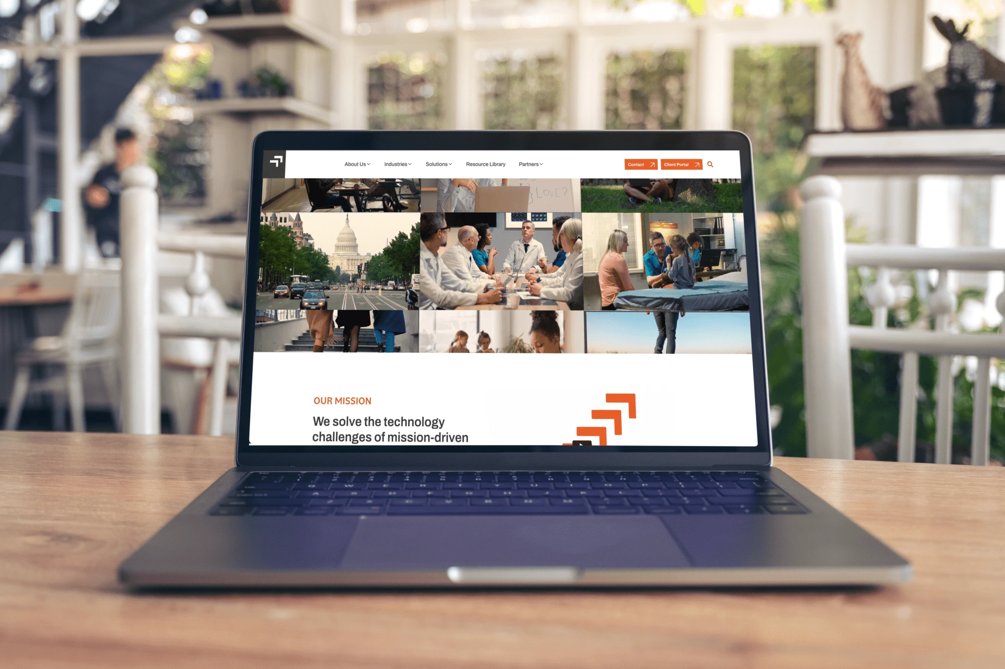
Website Homepage

Website homepage layout
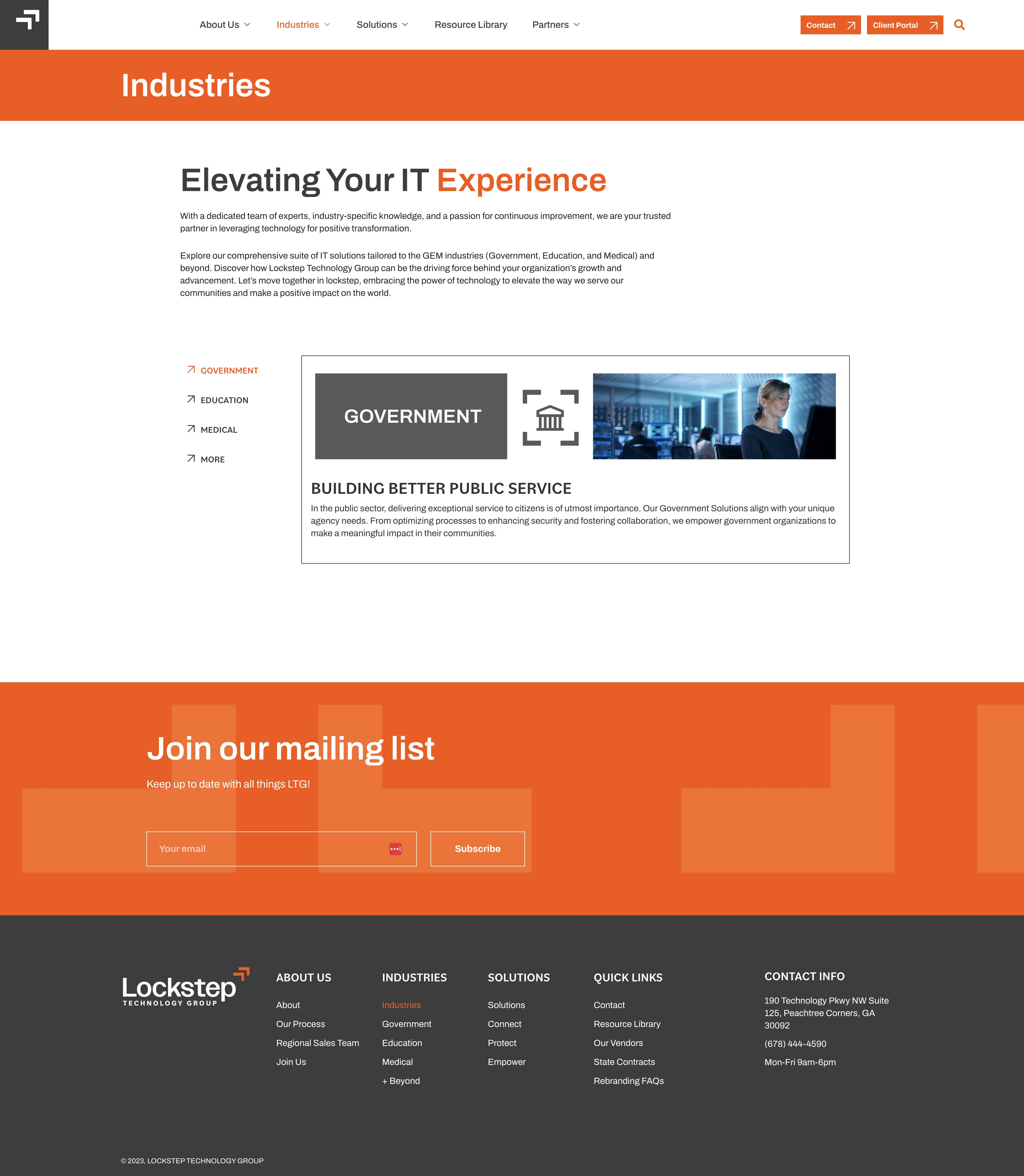
Website Industries Page Layout
Like this project
Posted Nov 25, 2023
Logo, Brand Identity, and Website design and build for a technology group who works with government, education, and healthcare clients.
Likes
0
Views
16
Clients
Lockstep Technology Group

