Burn Brand Identity
Flávia Jackeline
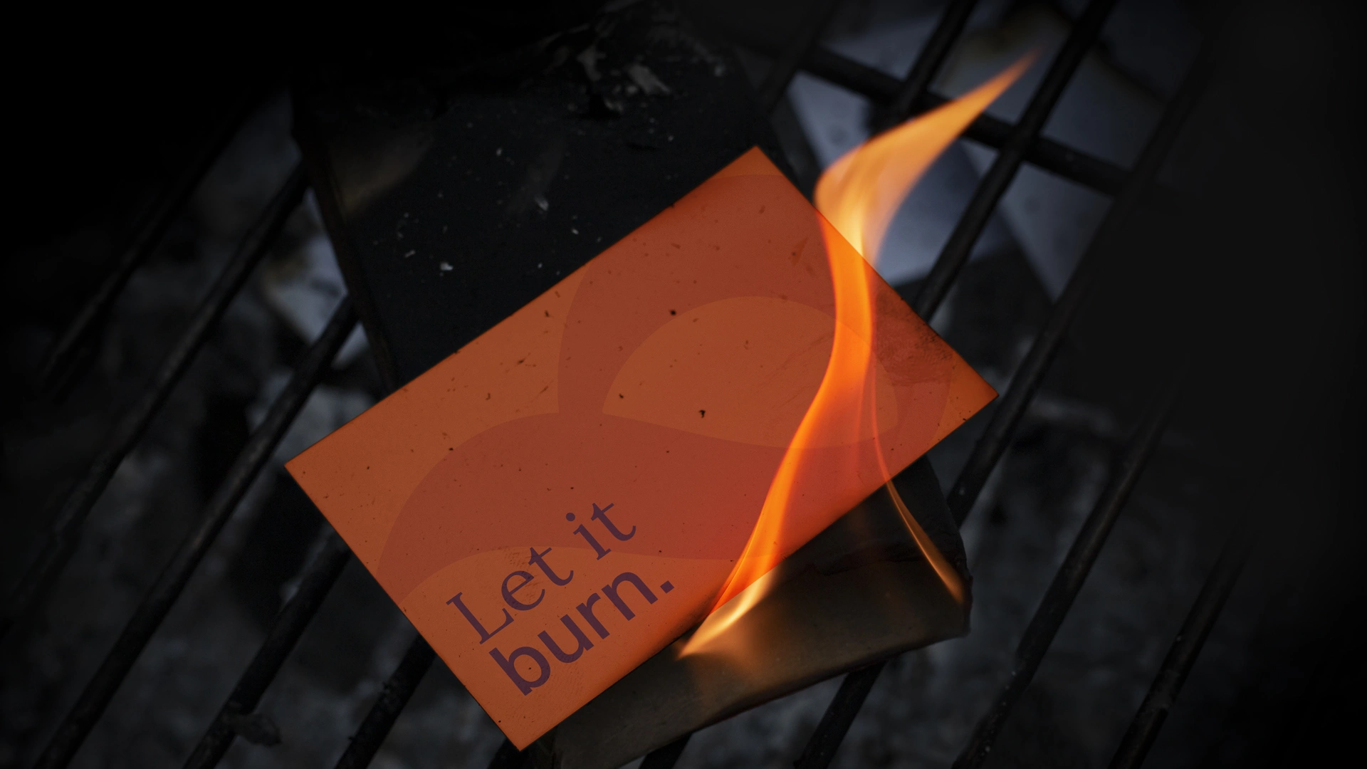
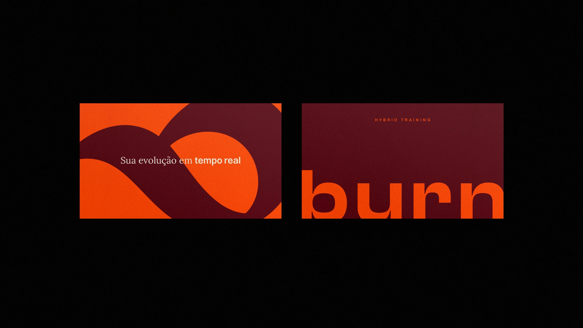
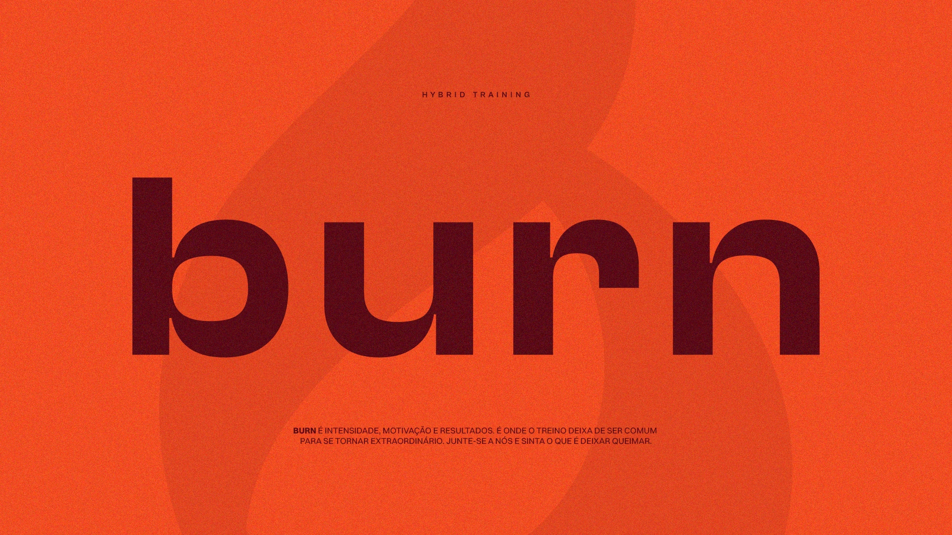
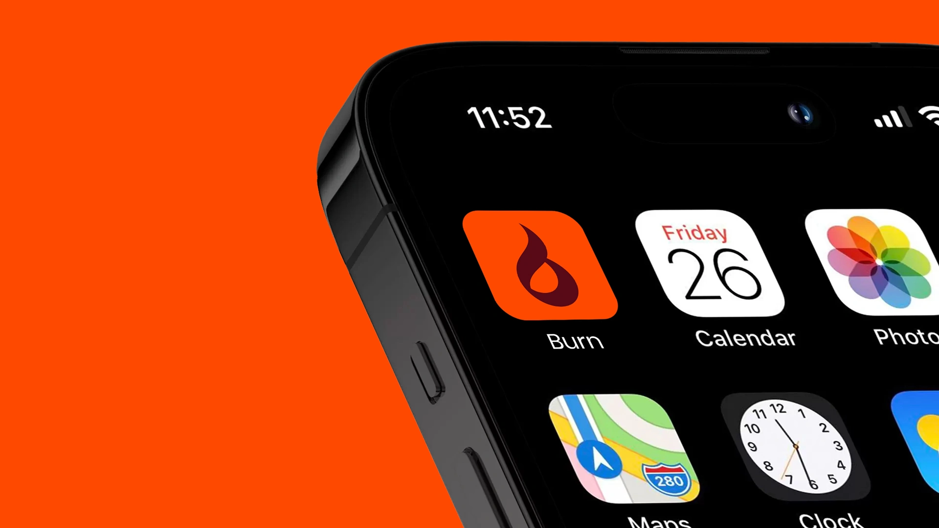
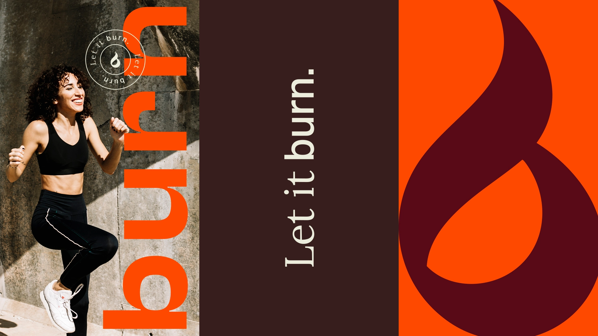
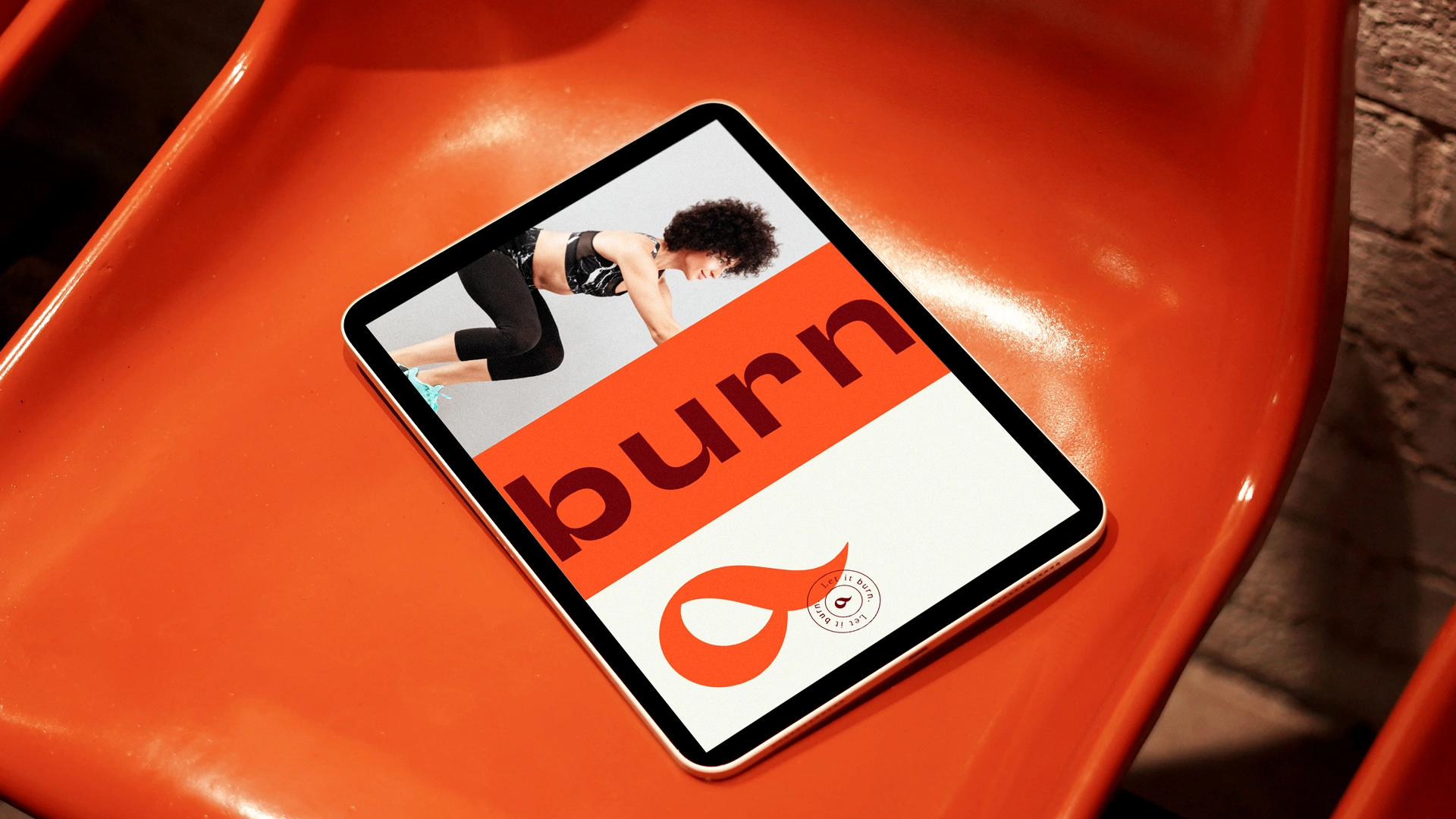
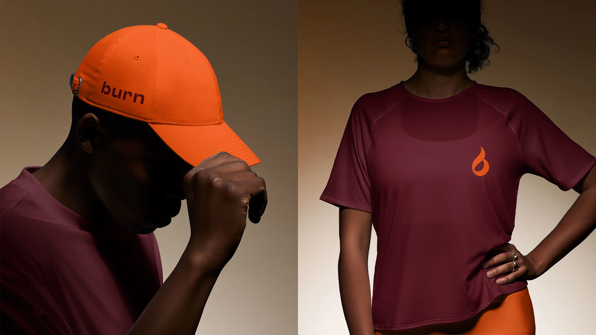
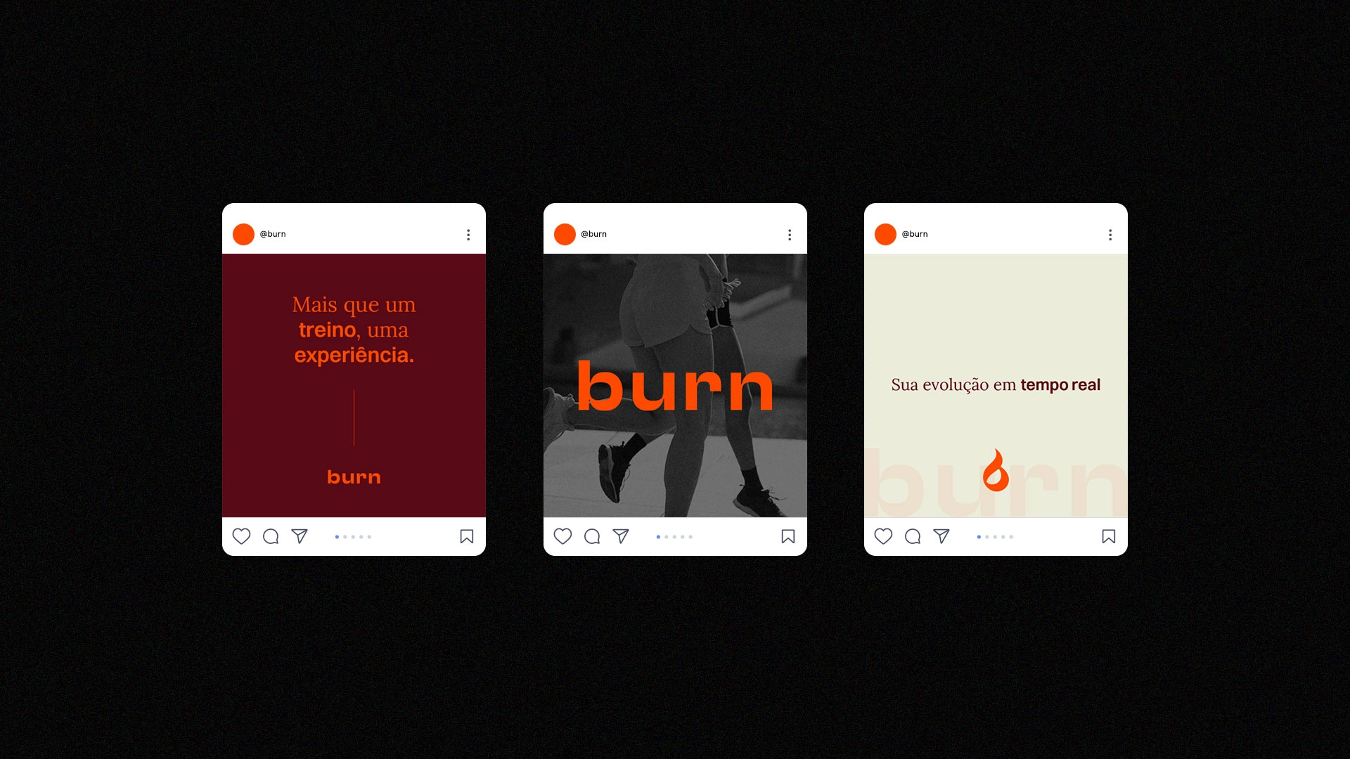
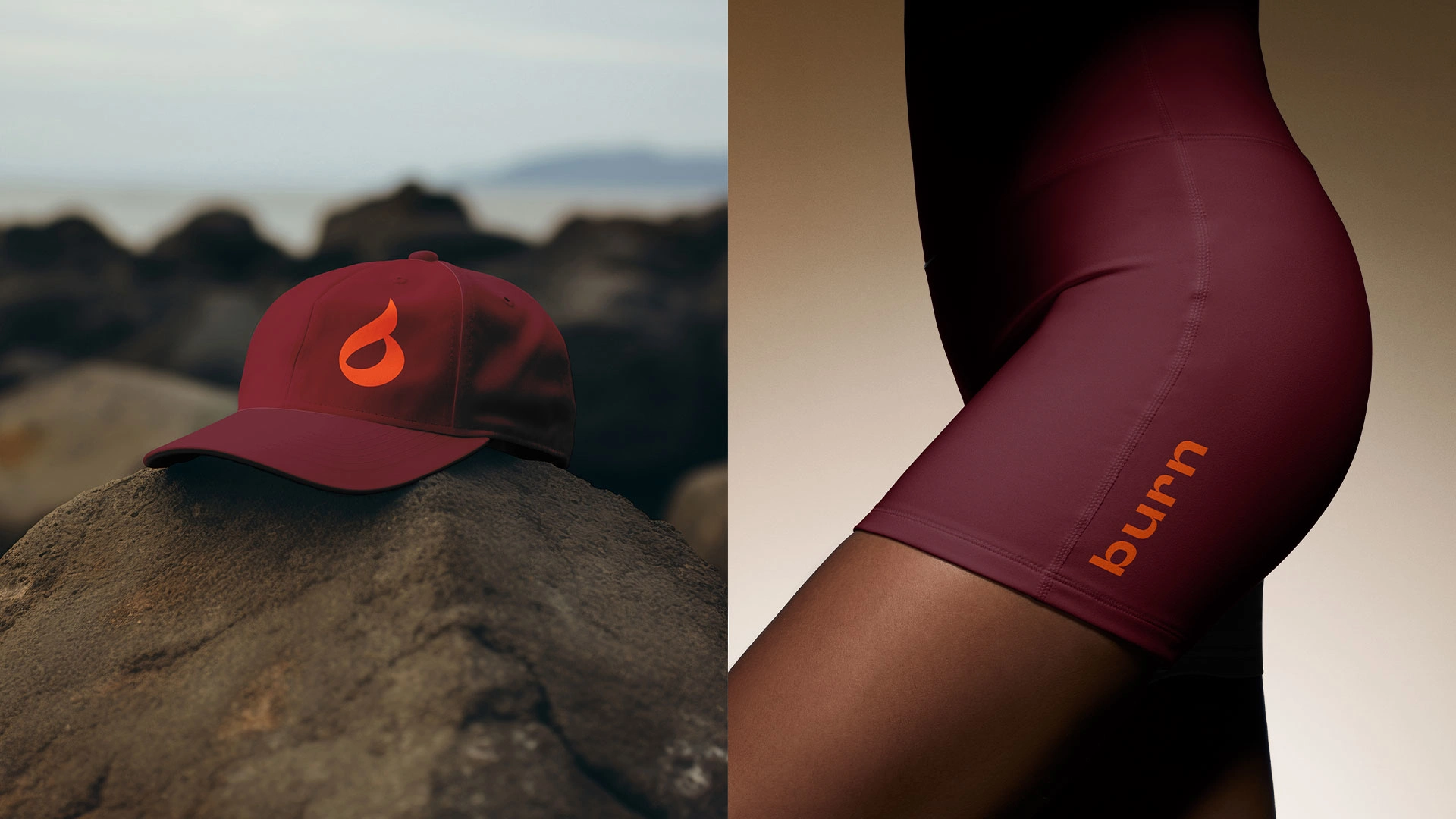
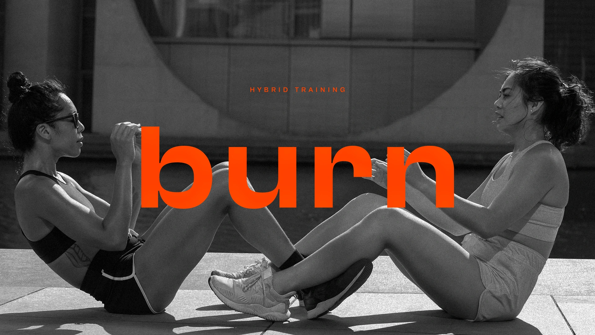
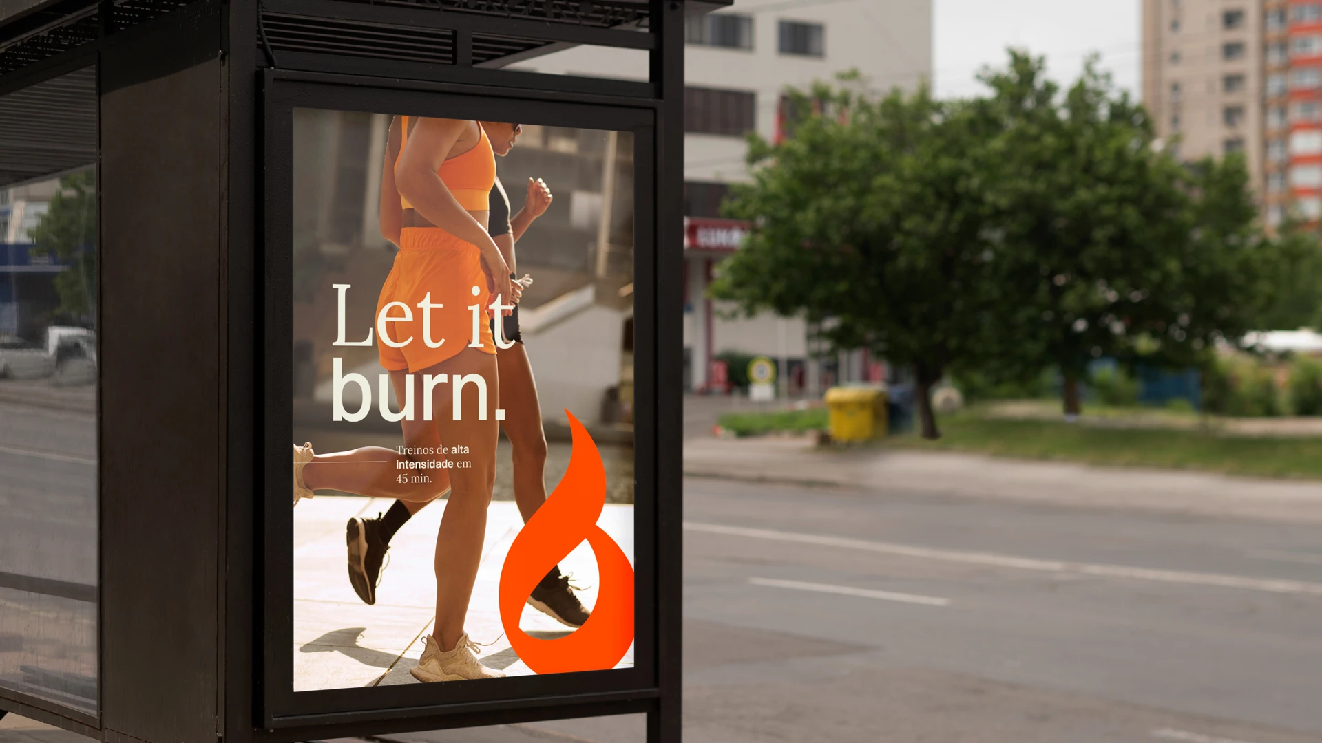
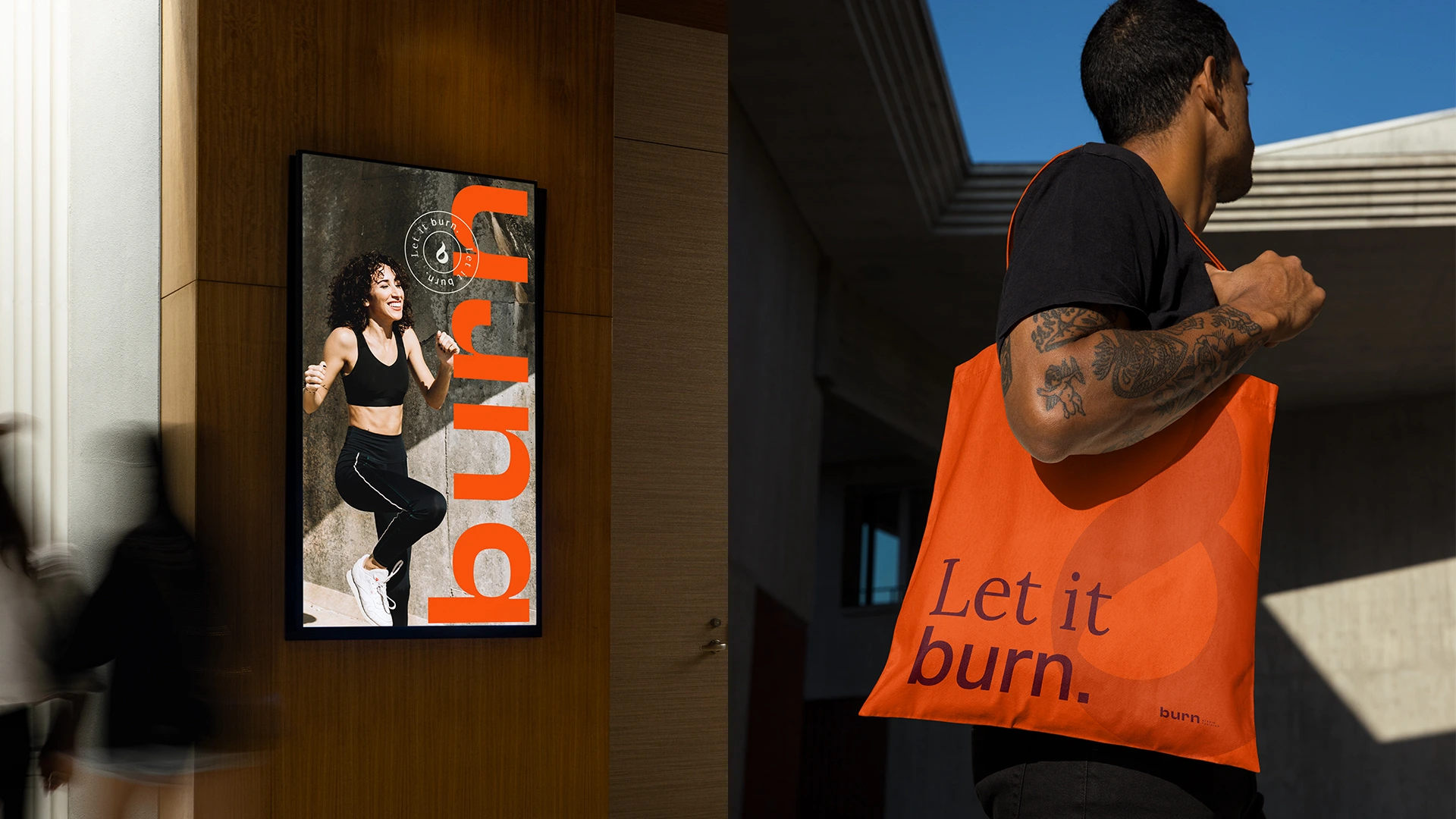
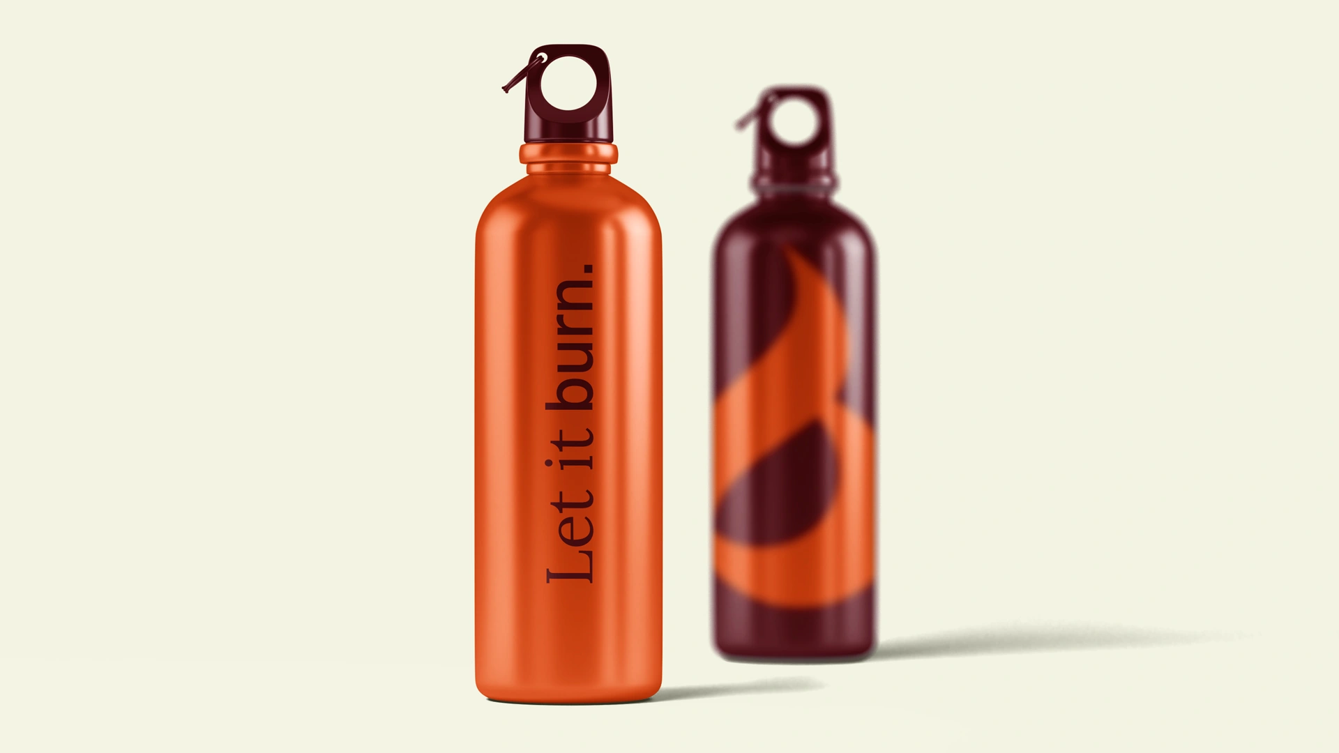
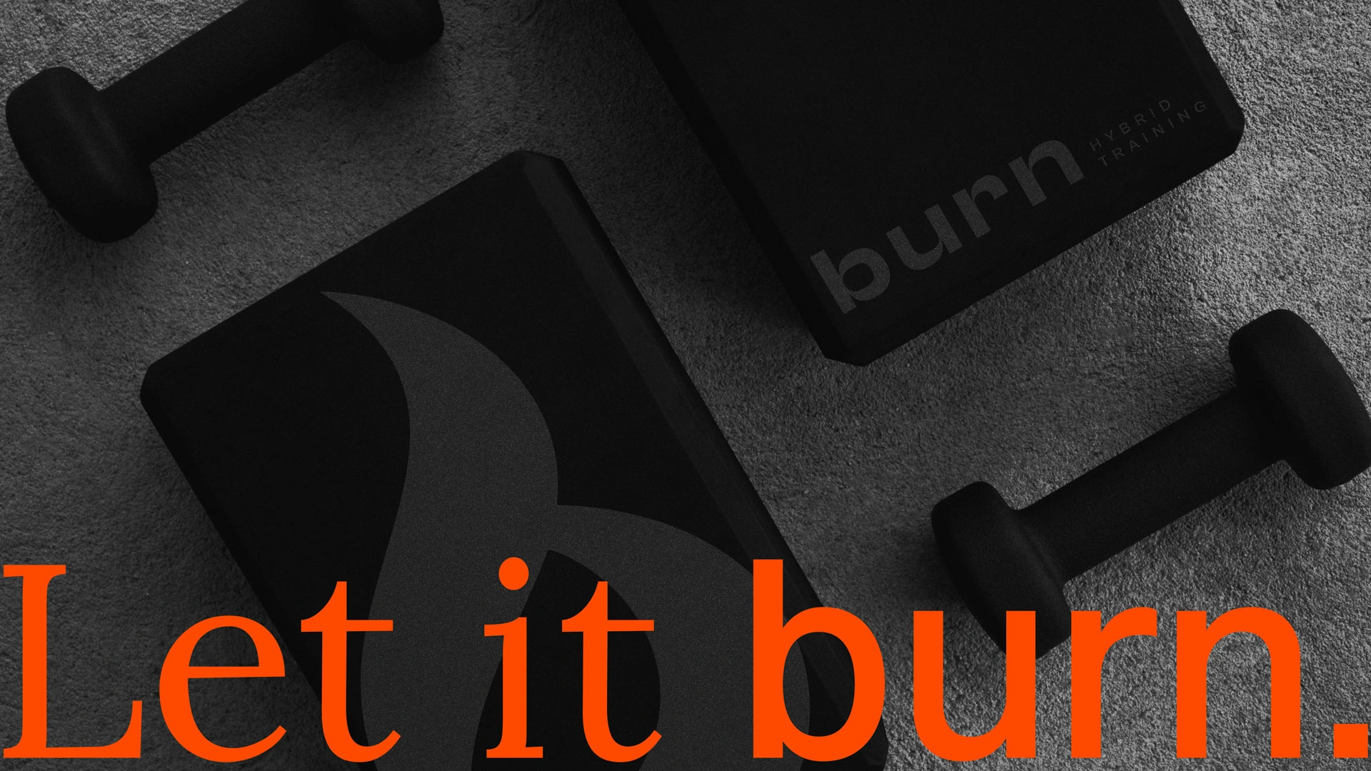
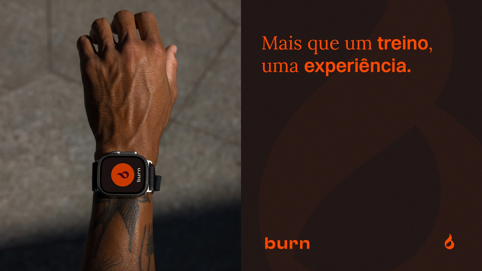
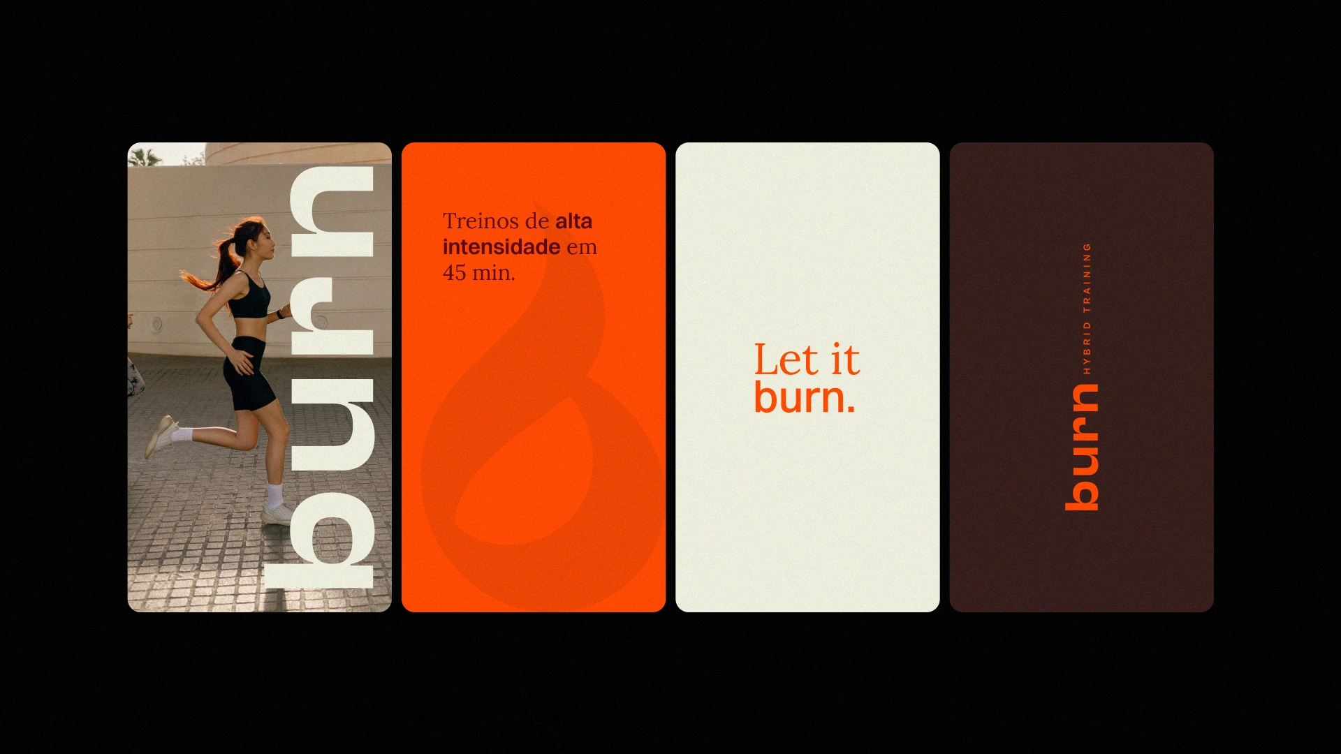
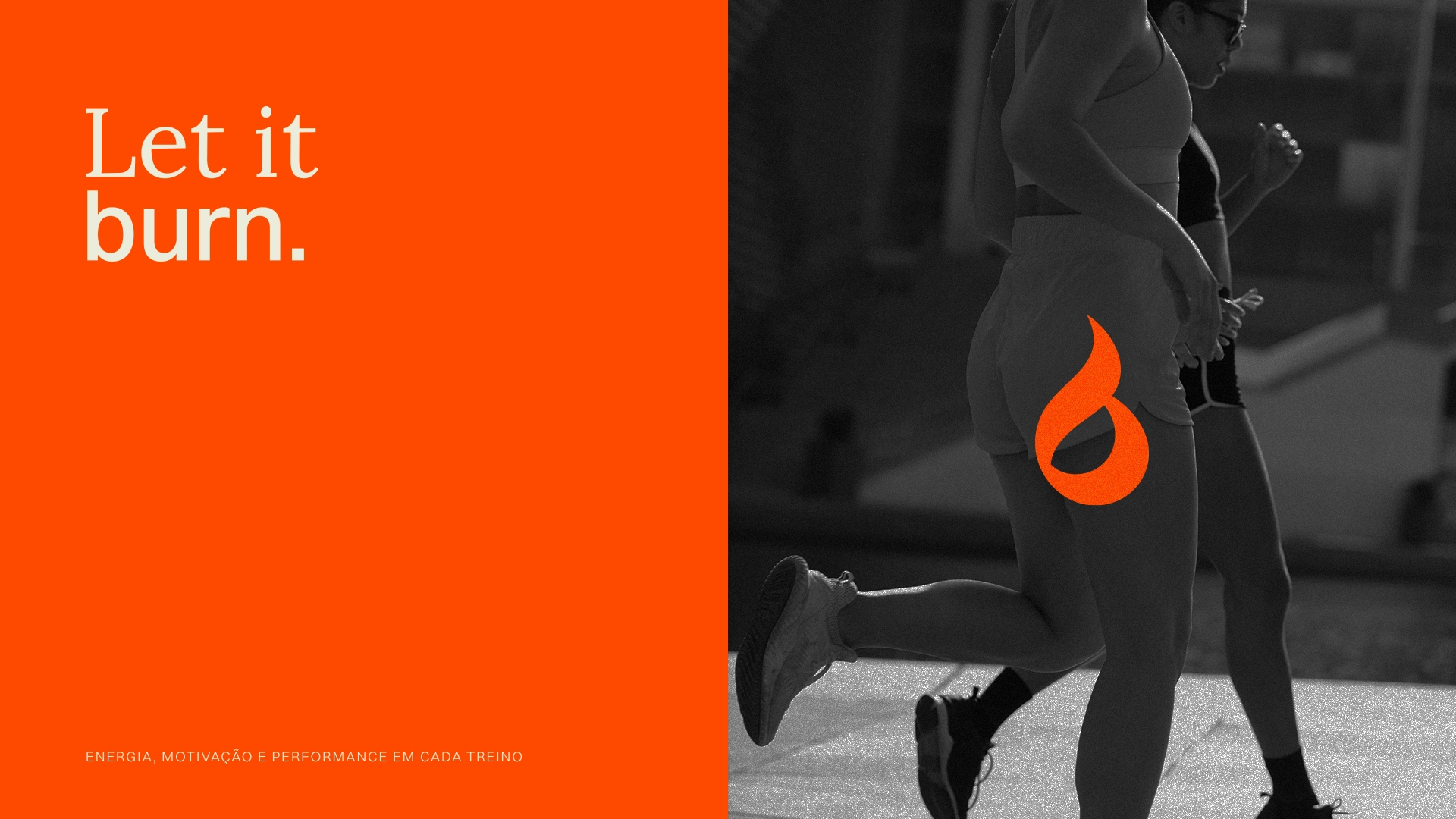
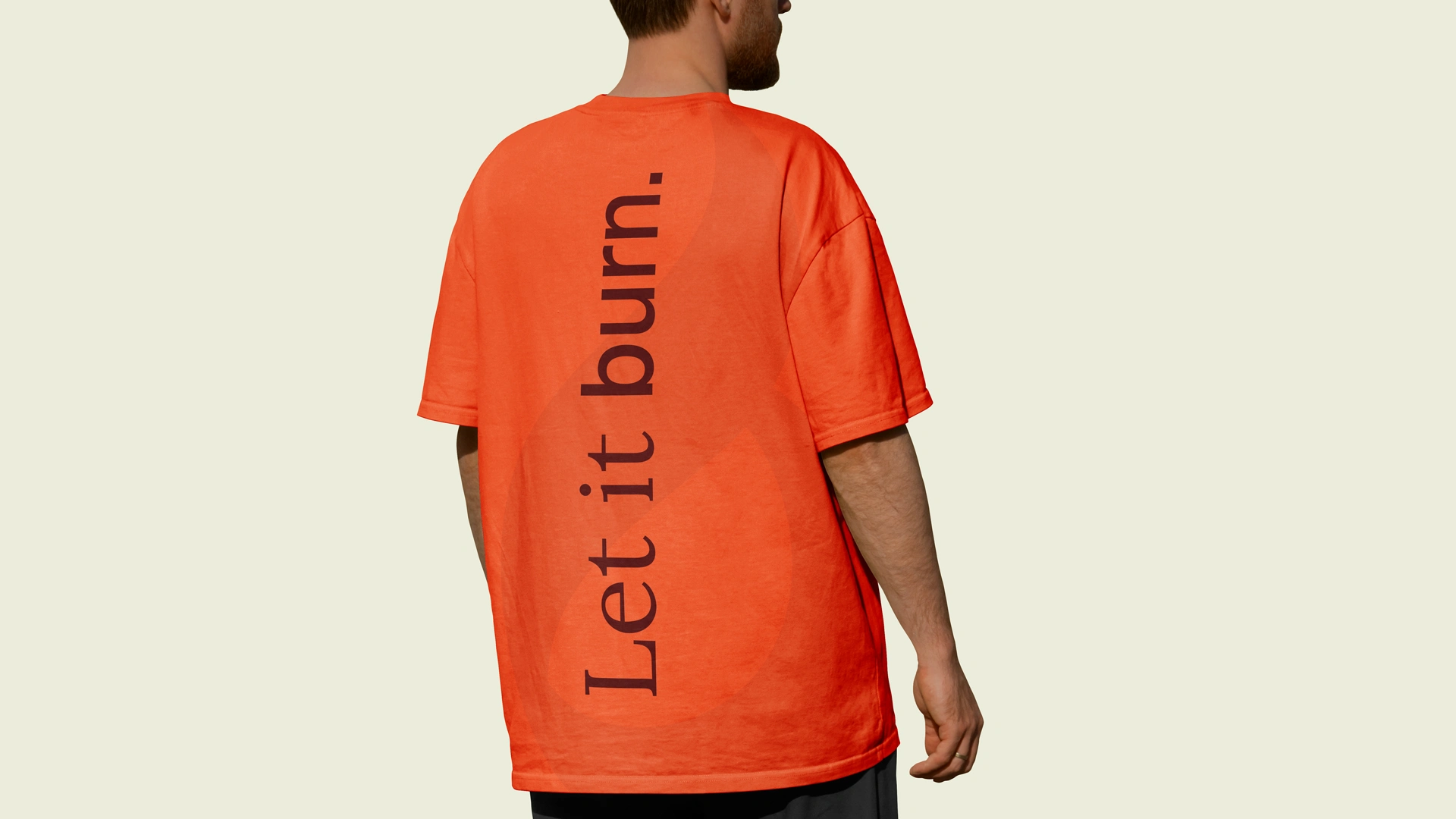
Florianópolis now has a training center that goes beyond the ordinary: technology, gamification, and a community connected through movement. The challenge was to translate this energy into a visual identity that feels modern, vibrant, and sophisticated. The symbol merges fire, movement, and the letter “B” — representing transformation, strength, and dynamism. The color palette balances energy and stability: vibrant orange, sophisticated burgundy, neutral beige, and grounded brown. Typography with sharp cuts, geometric shapes, and a strong presence reflects exactly what it means to live the BURN experience. A brand designed to inspire motivation, growth, and real results.

Like this project
Posted Nov 12, 2025
A bold, modern identity for a fitness brand that merges fire, movement, and transformation — designed to inspire energy, growth, and connection.
Likes
0
Views
4