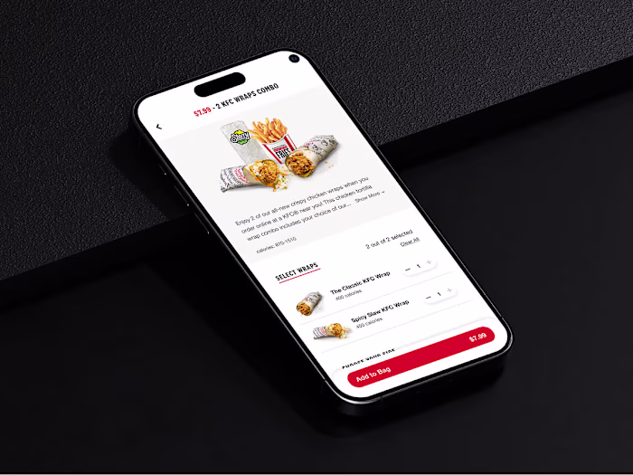
The KFC product detail page
Patrick Lopes
The KFC product detail page had a problem that's pretty common in high-traffic ordering flows.
It worked fine most of the time. But at the moment customers needed to make a decision like customizing a meal, confirming selections, adding to the cart, it introduced just enough confusion to slow things down or cause drop-off.
Three specific issues: the mobile layout buried key content below an oversized image, customization options were duplicated in a way that felt broken, and there was no clear view of selections before checkout.
The work focused on those three things only. No full redesign, no new features.
Result: 88% task success across platforms, 20% faster completion, and 90% of participants reported higher satisfaction.
Full breakdown on my portfolio: https://www.patlopes.com/case/kfc-pdp-redesign
Like this project
Posted Apr 17, 2026
The KFC product detail page had a problem that's pretty common in high-traffic ordering flows. It worked fine most of the time. But at the moment customers n...