Improving usability for a US executive search website
Andrew Kass
Client:
Client: Fulton Design (madebyfulton.com)
Project: Wittkieffer
The Task
Wittkieffer is a US consultancy firm in executive search industry.
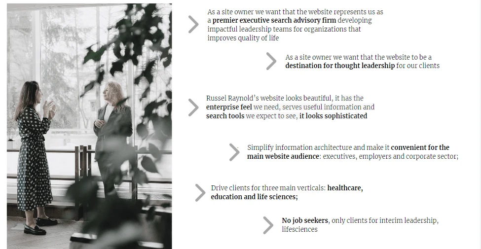
The company management wants to refresh a website, drive clients from priority verticals, reduce focus of unwanted audiences, clarify user goals, simplify information architecture and achieve better usability for priority clients;
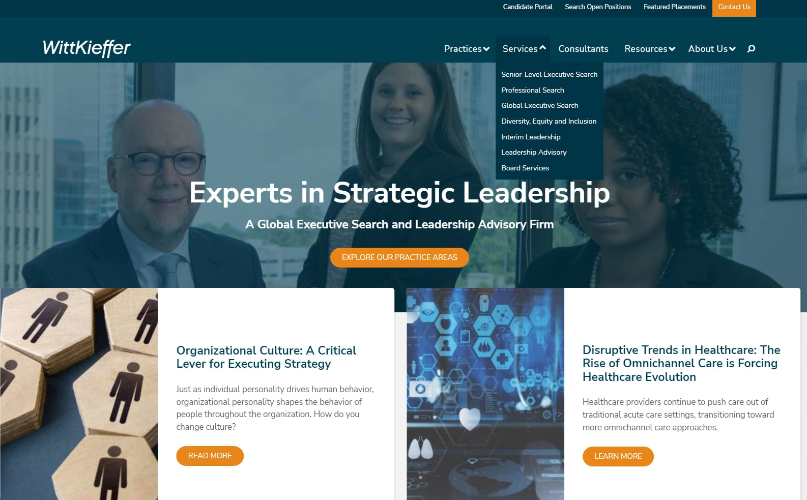
Before our work: complex in navigation, lots of articles, unclear user journey
Step #1: Sorting Requirements
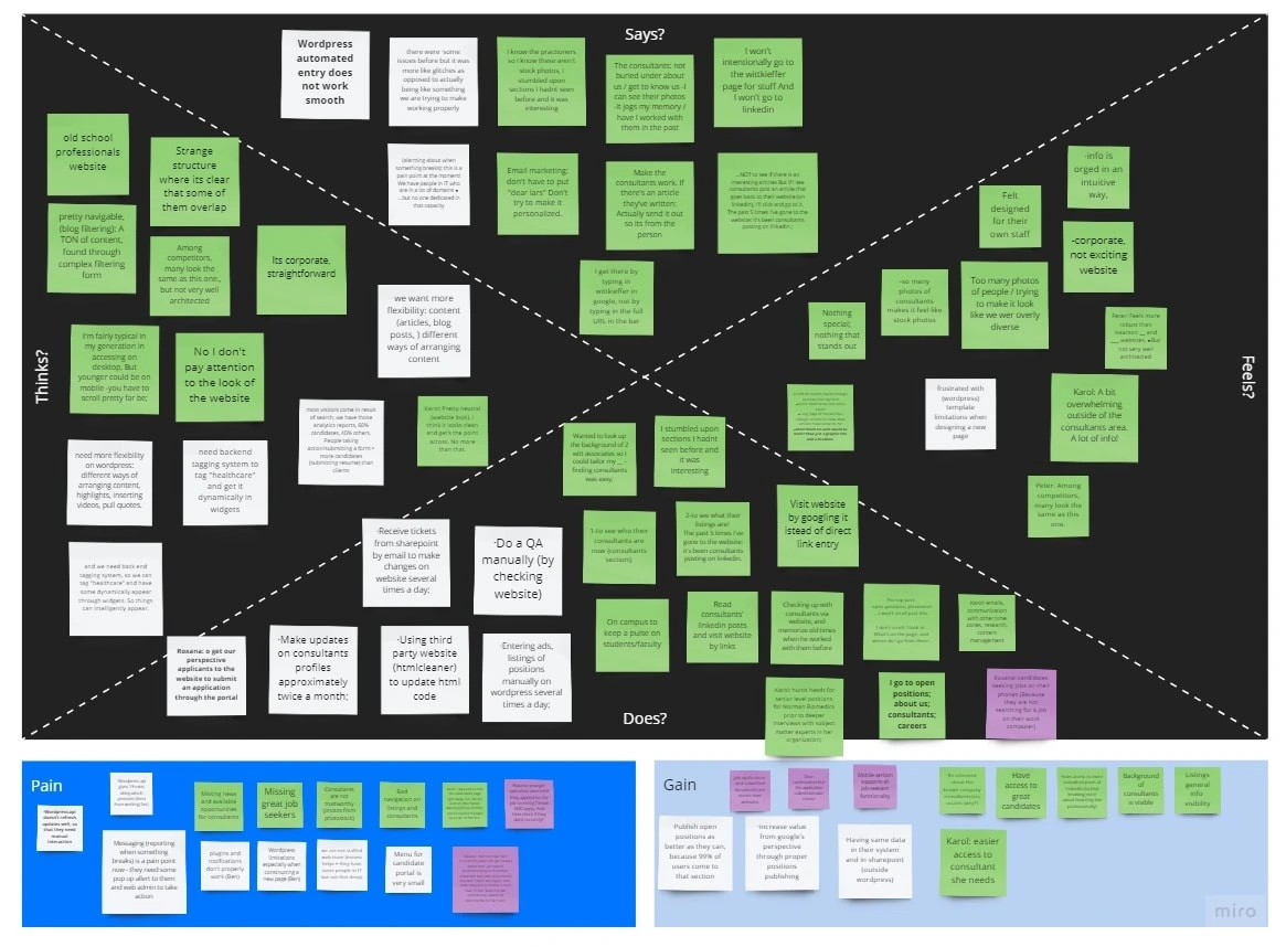
Empathy research helps to empathize with the users and map all gathered data. By having what users do, think, say and feel we identify solution gaps and think what to add;
It was identified, for example, that old customers come to see associate (consultant) profiles and remember old times when they were working together
Based on desired user audiences I produced user persona profiles:
User persona - a fictional users whose goals and characteristics represent the needs of wider group of users, with similar concerns or needs
A user journey shows how persona may navigate the website;
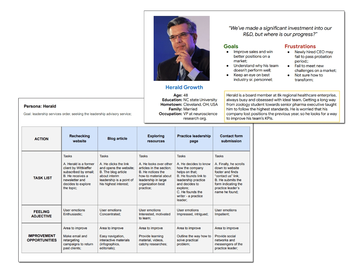
5W’s analysis is a way to imaging persona’s landscape and usage limitations:
Who? Karol is a healthcare executive;
What? She wants to get order in her recruitment efforts (both close search positions and support existing staff);
Where? She does it via constant meetings at her office, partially on desktop, partially on mobile;
When? She does it on normal business hours, when all team is more or less available for meetings;
Why? Karol has to many tasks and goals, she needs a consultant who helps both with flow of candidates and consultancy advice on crisis management;
How? Karol will be looking on HR associate at Wittkieffer’s website, via roaster and contacts them via website;

The competitive audit revealed that industry peers do not have significant advantages;
The flaws are pretty common in industry:
lack of clear user goals and interactivity;
limited means of communication;
chaotic and messy content;
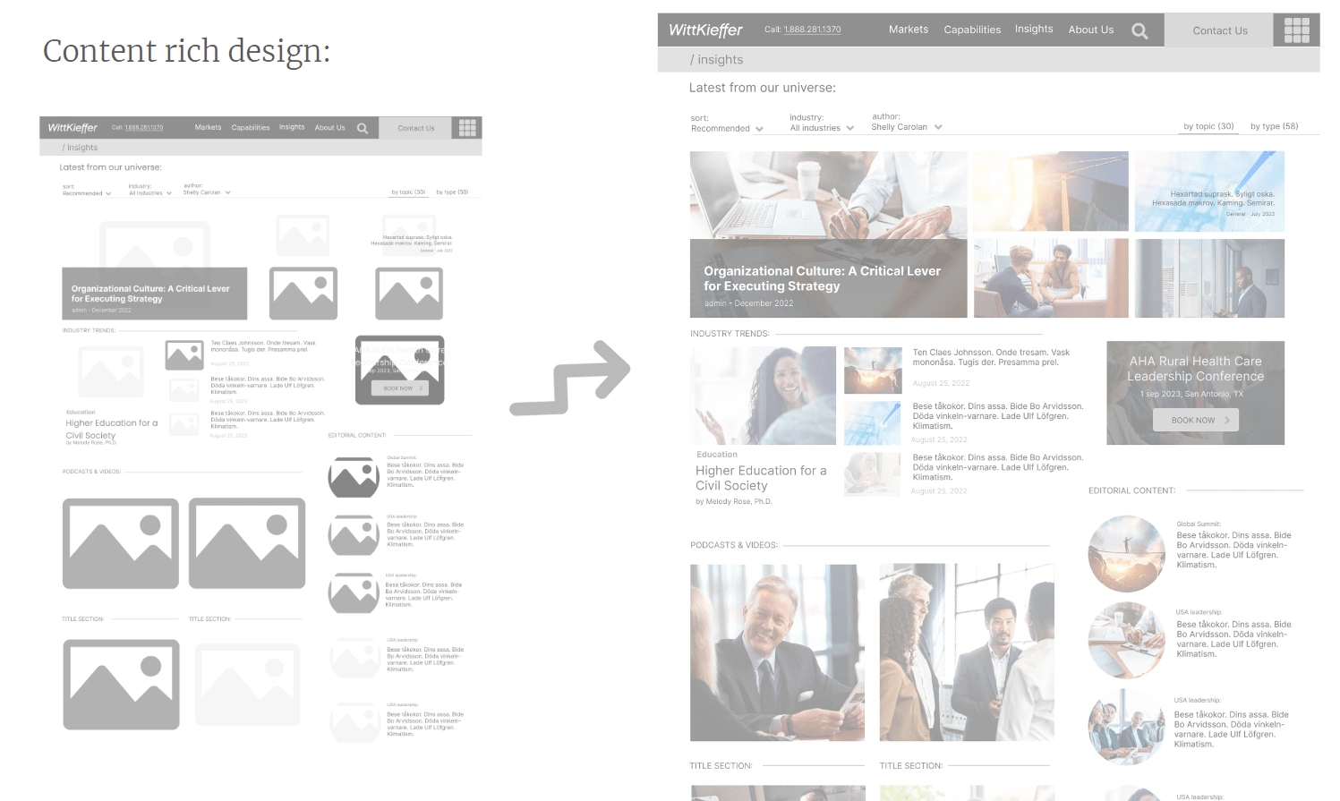
Obvious conclusion: rich content should become the primary focus for the new website;
Step #2: Information Architecture
IA is a part of work that shows the structure of website, it may include data and content modelling (for example, when we want to understand which content will a B2B marketplace contain in a database) or just a sitemap restructuring, with description of navbars.

Step #3: Low and Mid-Fidelity Wireframes
Wireframes in Figma with different detalisation is a preliminary work to negotiate with the client;
Step #4: Polished Wireframes
After discussions, the wires are detailed to make it closer to how the website will look. Still, no images and real content (some real copy may occur)
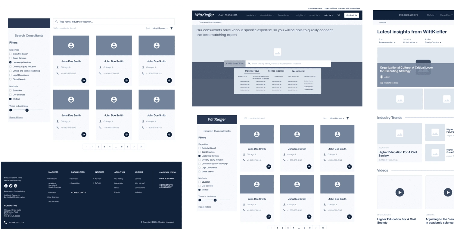
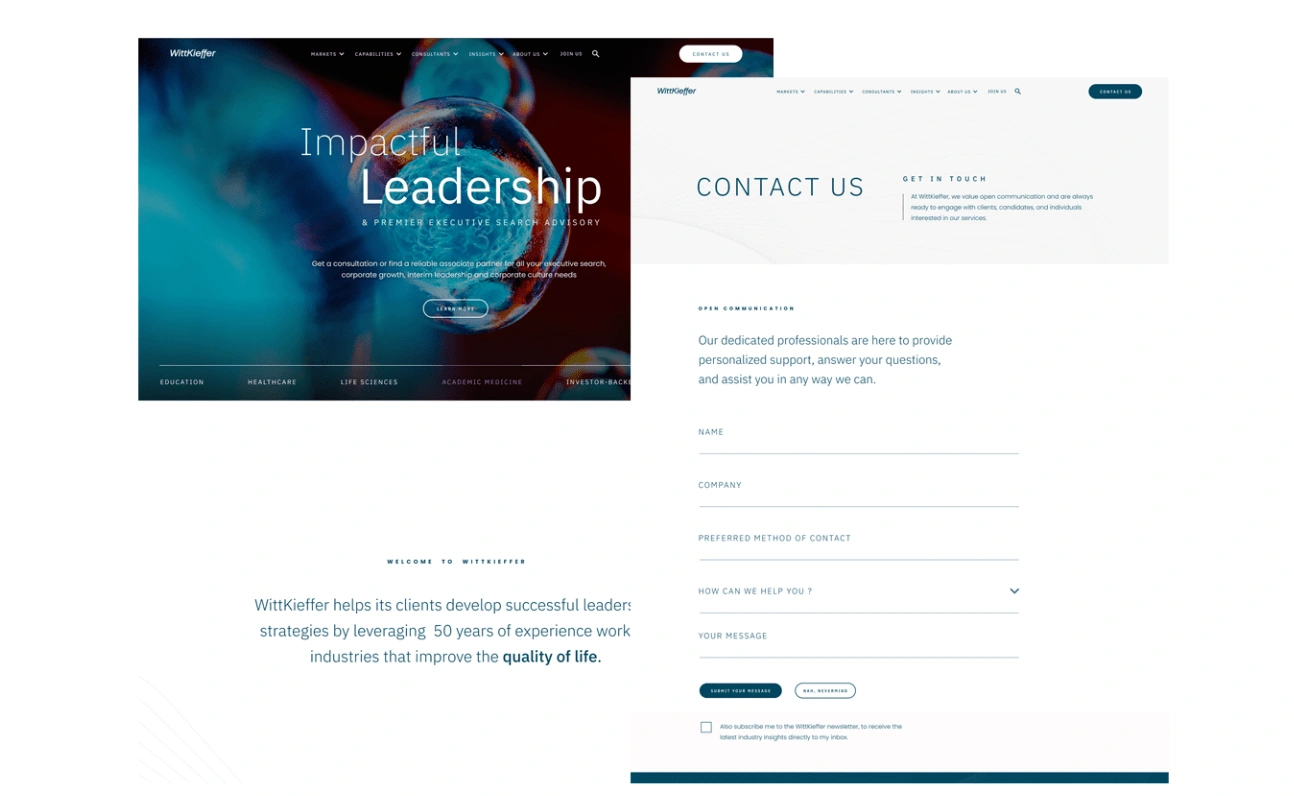
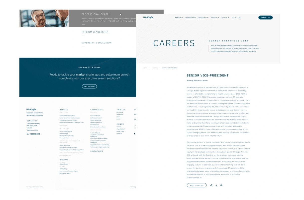
Step #5: Mockups
High-Fidelity design of pages will be provided to developers to realize into life:
Result
Refreshed design provides more clear focus for existing personas, improve user journey, refresh the style and vibe of the company, shows it's modern and innovative approach in business;
How I can help your startup
As a Google certified UX developer and a product manager trained at Alberta University, I can assist with the discovery stage of your startup. I can help conduct empathy and user research, clarify the problem and solution for your product, map user stories, identify new features, and manage your design workflow to achieve product-market fit. Within my agency, I can provide a UX/UI, product, and business development team.
Like this project
Posted Mar 27, 2024
Uncovering your product's potential through deep dives into product discovery, conducting UX research, and crafting intuitive wireframes in Figma.
Likes
0
Views
10