Designing the digital interface for a calibration device
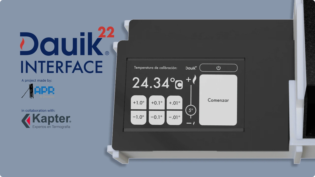
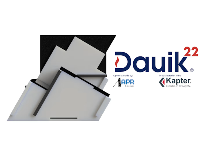
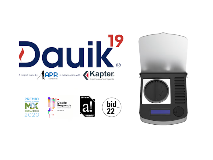
Dauik 22 is a calibration device designed specifically for ear thermometers used in lab settings, aiming to guarantee precise and accurate temperature readings.
Timeline:
November 2022 - April 2023 (6 months)
Responsibilities:
I was the product designer in charge of this project, executing the UX/UI Design.
Client:
Kapter (https://www.kapter.mx/)
Problem:
Designing the Hardware and the Digital Interface.
This project was designed based on the clients request, they wanted a new equipment that would enable them to explore innovative methods of calibrating ear thermometers, with a particular focus on reimagining the design of the blackbody component, which serves as the calibration reference.
In addition to meeting these technical requirements, we were faced with the challenge of developing a fresh visual language for the equipment. Also, we were entrusted with the task of designing an intuitive digital interface, ensuring a seamless and user-friendly experience for operators.
In summary, for this project we designed:
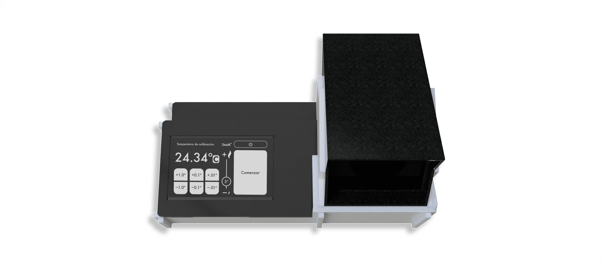
A Blackbody component.
Product hardware.
Product digital interface.
These aspects added an extra layer of complexity to the project, demanding meticulous attention to detail and a thorough understanding of both functional and visual design principles. Throughout the process, our team remained committed to delivering a solution that met the client's expectations while pushing for innovation in the field of calibration devices.
To read about the product design part of this project go to:
Process:
Creating a calibration interface that empowers laboratories through meticulous research, design, and fabrication.
During the initial phase, we embarked on an extensive research journey, collaborating closely with professionals and end-users in thermal laboratories and hospitals.
Through insightful conversations and feedback sessions, we gained valuable insights into their workflow, identified their specific needs, and pinpointed the challenges they faced in achieving precise calibration.
This comprehensive understanding formed the foundation of our design process, enabling us to create a solution that truly addresses their requirements.
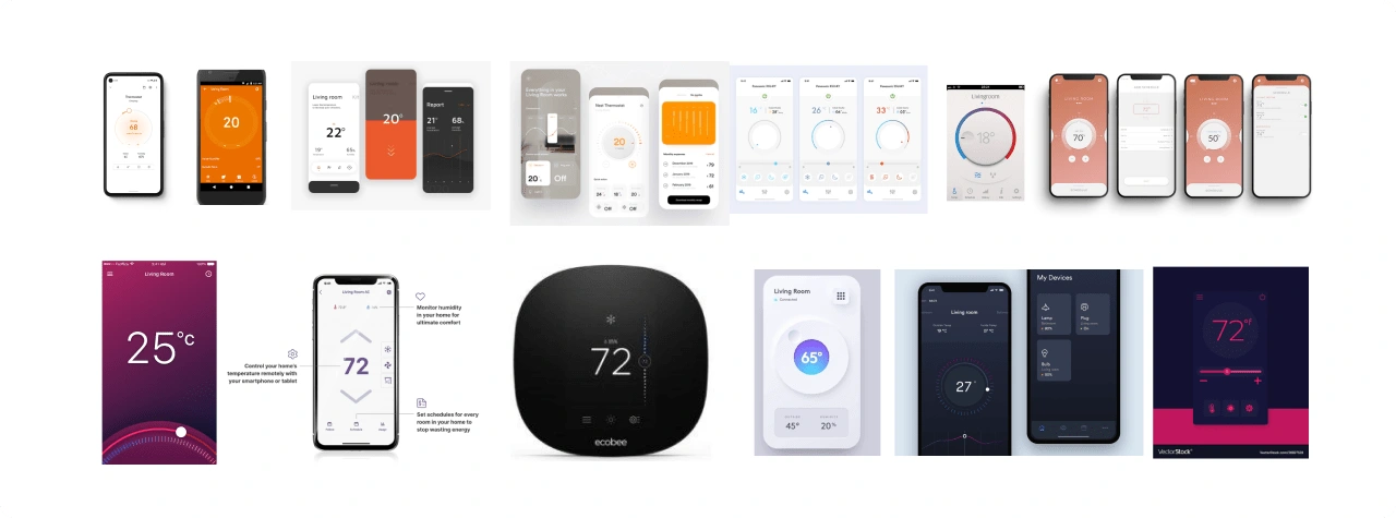
Inspiration board
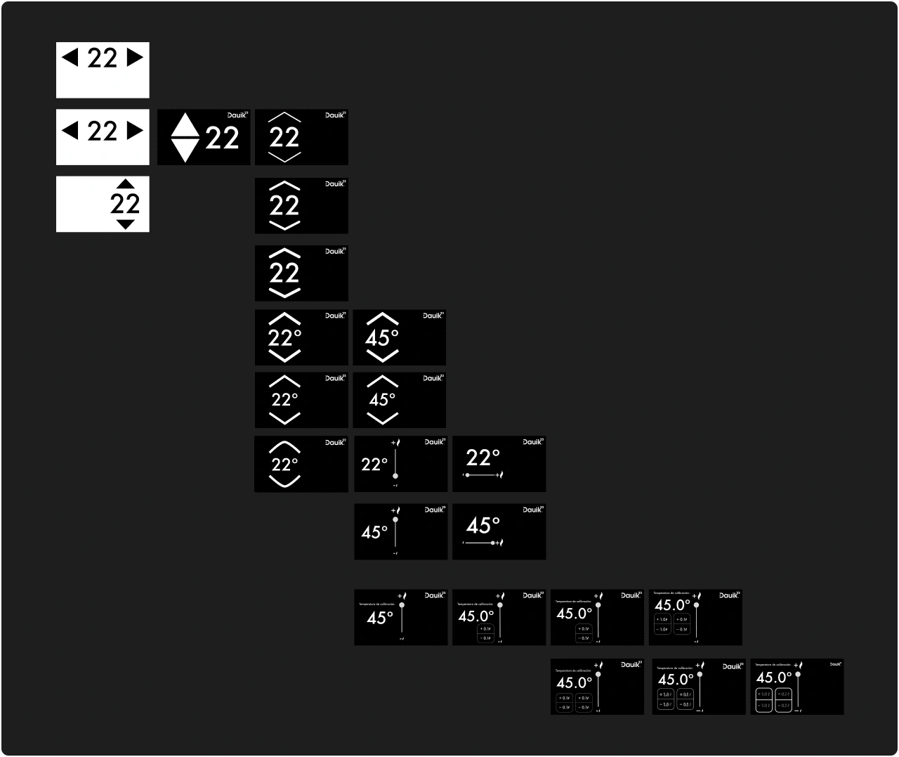
Ideation board
With a thorough understanding of user requirements, we proceeded to the design phase.
Collaborating closely with our stakeholders, we developed prototypes that underwent rigorous testing and iteration. This iterative process allowed us to refine the device's functionality to ensure optimal usability and ease of use.
Initial design
Intuitive on navigation, Effective visuals, Responsive feedback and a Consistent design language.
Based on the insights gained studying the workflow of end-users, we knew the interface should be:
Intuitive on navigation and control for ease of use, while allowing precision.
Effective in visual communication to convey information without excessive text.
Responsive with feedback mechanisms, providing real-time indications of system status.
Consistent with the design language, ensuring a seamless UX across screens.
high-fidelity design concept:

Welcome screen / Selection phase / Warming phase / Calibration phase / Cooling phase
The initial design presented to the client aimed to effectively communicate these key aspects. The proposed solution involved dividing the workflow into four distinct phases:
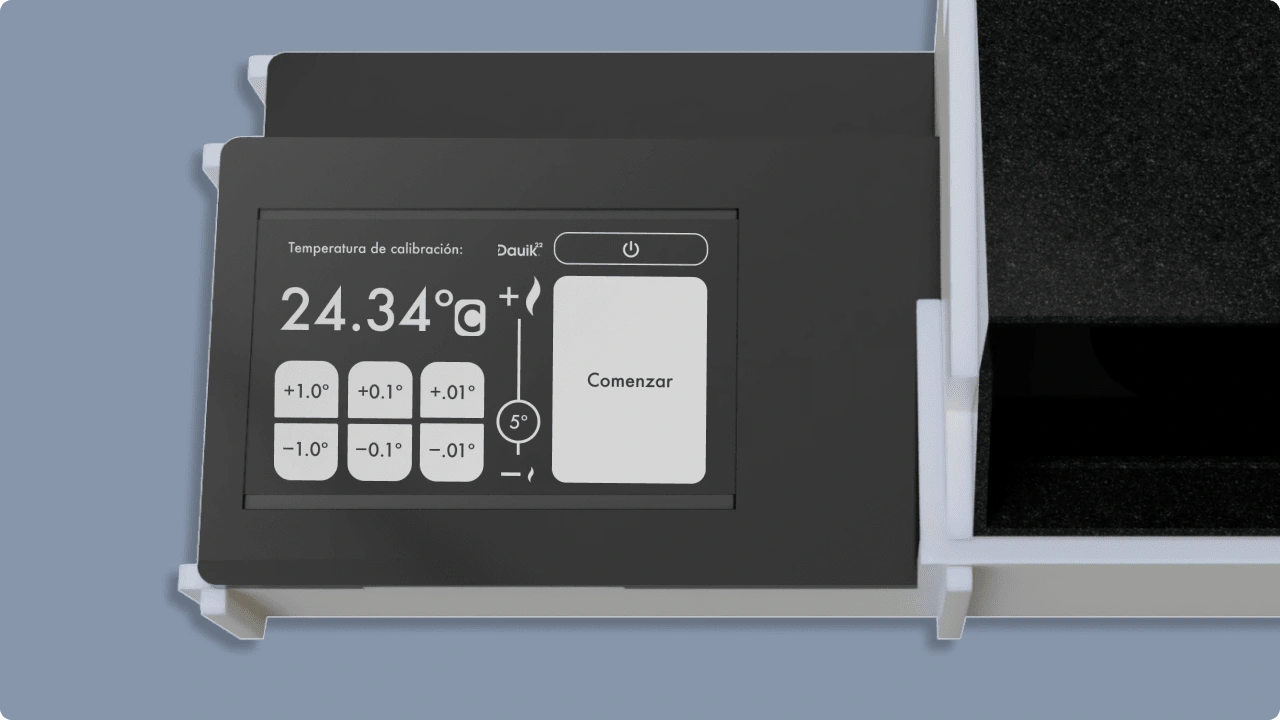
The selection phase, is where users designate the desired calibration temperature. This screen offers intuitive buttons for precise adjustments, a slider for larger increments which also serves as a visual indicator for the temperature limits. A dedicated button is provided to advance to the next phase when the user is ready.
The warming phase, follows the completion of selecting the desired temperature. During this phase, the screen turns red and you can see the temperature rising towards the desired value. An animated slider visually represents the progress, and a cancel button is available.
The calibration phase, tells the user that the product is ready to be used. During this phase, the screen turns green, displaying the desired value for comparison with the thermometers being calibrated. A button is provided to initiate the cooling process once the calibration is complete.
The cooling phase, advised the user to allow the product to cool down before turning it off. This screen serves as a visual waiting screen, indicating that the product is lowering its temperature to ensure safe shutdown.
Testing + Improvements
Constant iteration = Constant Improvement.
During this project, we constantly iterated to create the best possible interface. Here, we showcase the results of the two major improvement sessions, highlighting the significant changes thorough the interface design.
First round of iterations.
Following the presentation of the high-fidelity design concept, we engaged in a continuous process of seeking feedback and exploring ways to enhance the solution for our client and end users. As a result, several notable changes were implemented, including:

Increasing control and precision:
Enhanced precision from 0.1 to 0.01 by adding an extra row of buttons for finer control.
Introduced a "5" indicator on the slider for quick ±5º adjustments.
Included a clear ºC symbol to denote Celsius temperature units, later adding Fahrenheit options.

Clear waiting progress.
Numeric display adjusted to reflect new precision.
Confirming message indicating the goal temperature added.
Slider animation redesigned, inspired by brand logo.

The goal is not the end.
User feedback requested an option to make post-calibration temperature adjustments for verification purposes. As a response, a "+5º" quick action button was added.

A more recognizable final phase.
In response to client feedback during a meeting, there was a request to enhance the recognition of the final phase and create a clearer visual contrast. The client specifically requested a distinct color scheme for this phase.
Testing both physical and digital products.
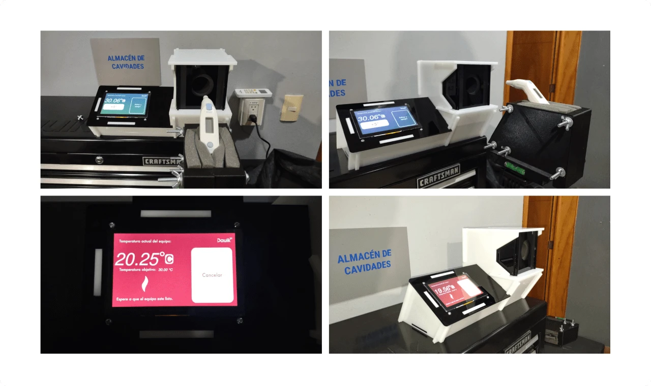
During the development of MVPs for the physical product, we conducted thorough testing of the digital interface.
Second round of iterations.
Based on feedback from lab tests, user evaluations, and client input, we refined the design to meet all stakeholder needs, key adjustments were made based on valuable input, including:

More control for post-calibration adjustments:
In order to enhance visual contrast between the interface and the background, we made adjustments to the color scheme.
We enhance the control for post-calibration adjustments following a user test session, it was observed that certain laboratory technicians preferred to perform calibration by using complex readings to ensure accurate results. For example, they opted to test the thermometer accuracy by selecting readings such as 43.21º.

A confirmation step before turning off the device
In order to enhance visual contrast between the interface and the background, we made adjustments to the color scheme.
In order to prevent accidental shutdown, we introduced a confirmation screen that allows users to verify their intention before proceeding with turning off the equipment. This additional step provides an extra layer of protection against unintentional actions.
Final screens
Final product
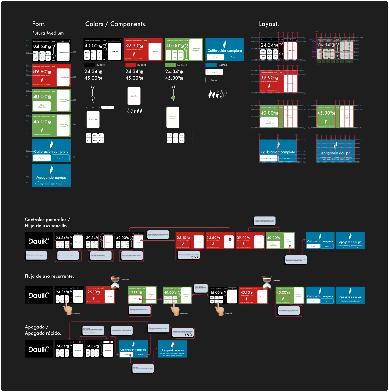
Style Guide / Design Handoff
Style Guide / Design Handoff
Reflections:
Reflections + What I would do differently:
Shadowing for real insight. Throughout the course of this project, conducting numerous user interviews proved invaluable. However, a pivotal moment happened when we adopted a more observational approach. Immersing ourselves in the lab environment alongside the end users and closely observing their work processes provided unparalleled insights that greatly informed the project.
Like this project
Posted Jun 26, 2023
Dauik 22 is a calibration device designed specifically for ear thermometers used in lab settings, aiming to guarantee precise and accurate temperature readings.
Likes
0
Views
22

