Resilience Atlas — Climate Data Made Clear

Jonathan Martinez


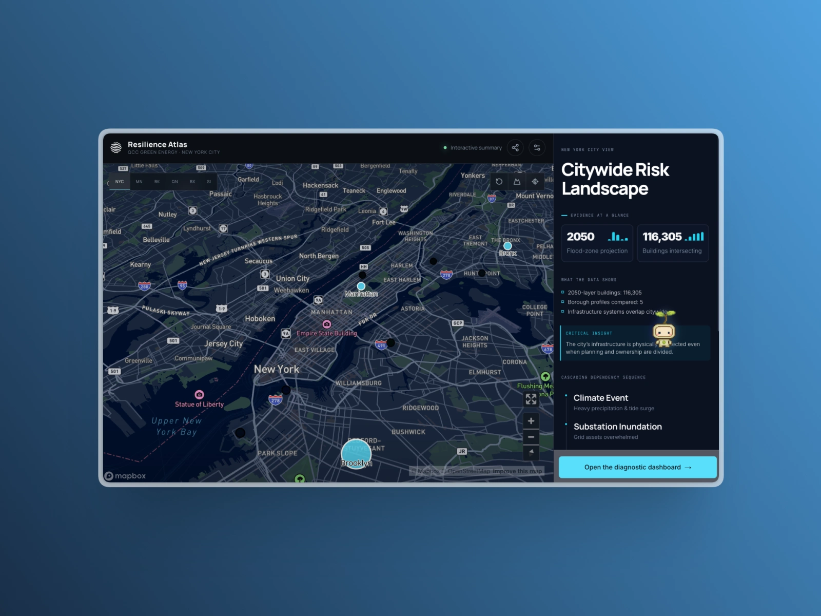
Turning fragmented climate data into a clear, usable experience
Climate risks overlap, but the evidence used to understand them often lives across separate datasets, tools, and institutional contexts. Our team created Resilience Atlas during a two-week QCC Green Technology Academy capstone to explore how public climate and infrastructure data could be connected and made easier to investigate across New York City.
The challenge
Flood exposure, extreme heat, infrastructure, neighborhood vulnerability, and service demand interact. When those relationships are reviewed separately, teams spend more time reconciling information and less time understanding what deserves attention.
The product needed to make complex evidence easier to explore without hiding uncertainty or presenting public data as more definitive than it is.
My contribution
Resilience Atlas was a team effort. I led the integration of the project’s problem framing, analytical structure, product experience, and public presentation.
I translated the team’s research into a map-first responsive web application, developed the supporting dashboard, and established clear boundaries around what the public data could support.
The design process
I first shaped the project context: the core questions, evidence requirements, interaction goals, constraints, and principles the experience needed to preserve.
That structured context guided an AI-assisted first design and accelerated exploration. I then refined the interface in Figma, improving the information hierarchy, typography, spacing, visual rhythm, and overall clarity before carrying those decisions into the working product.
This workflow kept AI in the role of an accelerator while preserving human judgment over what the experience communicated and how it behaved.
What I delivered
A map-first experience for exploring climate and infrastructure relationships across all five boroughs
Responsive evidence panels that connect locations, findings, source material, and limitations
A stakeholder dashboard that brings the most important findings forward while preserving a path to the underlying evidence
A coherent visual system spanning the map, data displays, supporting content, and public presentation
Clear research boundaries distinguishing exploratory screening from operational or asset-level claims
The result
The final prototype gives the team and its audience a shared environment for exploring locations, comparing conditions, inspecting evidence, and asking more specific questions.
Rather than presenting another static report, the experience turns the research into an interactive investigation.
What this demonstrates
This project reflects how I approach complex websites, applications, and dashboards: clarify the problem, structure the information, make the important relationships visible, and refine the interface until people can understand what to do next.
Like this project
Posted Jul 21, 2026
A two-week project turning fragmented public climate and infrastructure data into a clear decision-support experience for New York City.
Likes
0
Views
13
Timeline
Jul 6, 2026 - Jul 15, 2026