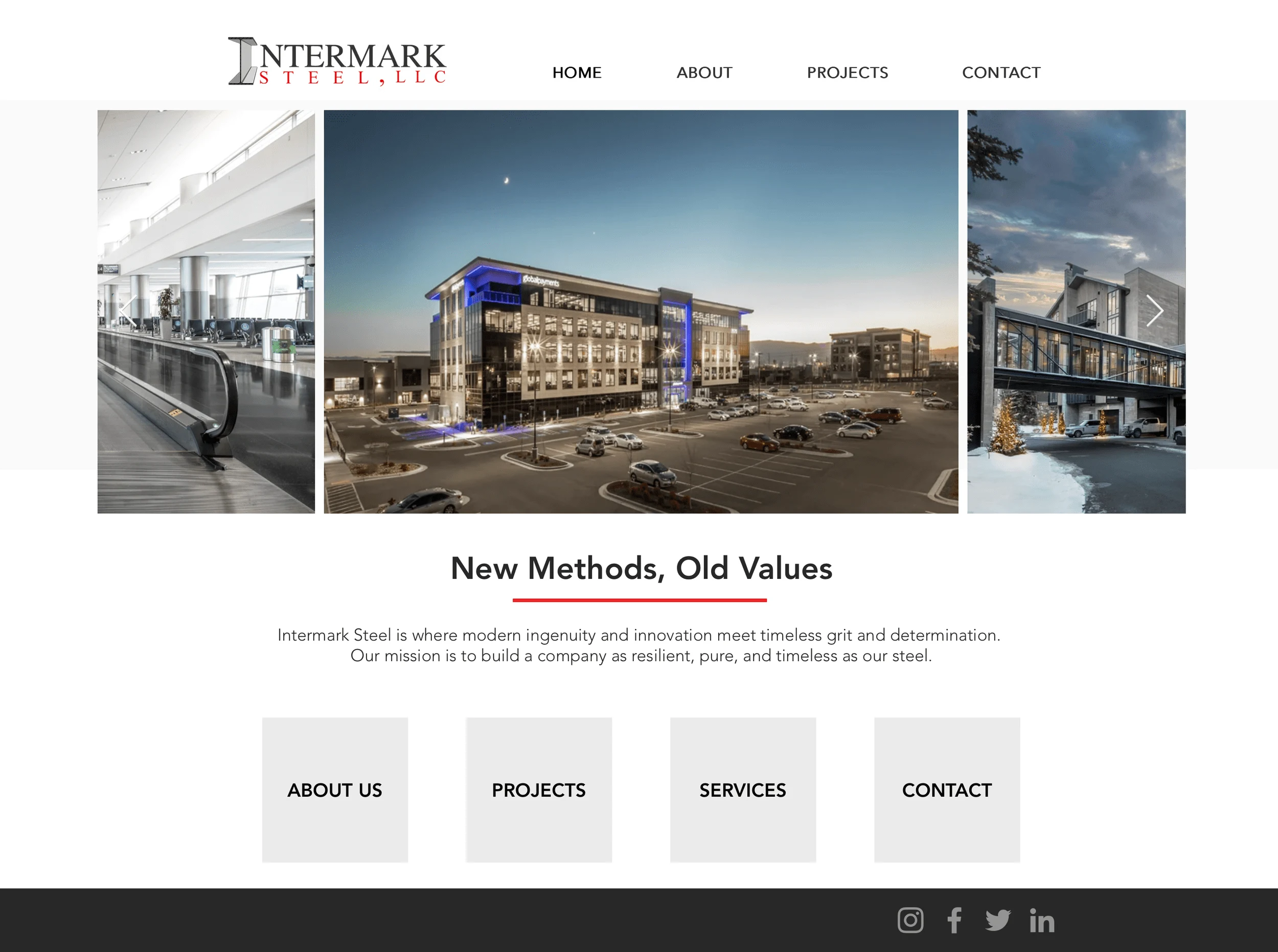
Custom Themed, Fully Immersive Website
Kayson Conlin
Intermark Steel: How User-Centered Design Brought 150% Growth in Revenue to An Unlikely Industry
Summary:
Client: Intermark Steel
My Role: Product Designer
Timeframe: 2 Yr
Services Provided: #UX Research, #User Testing, #Content Design, #Copywriting, #Webflow Development, #Branding, #Visual Design
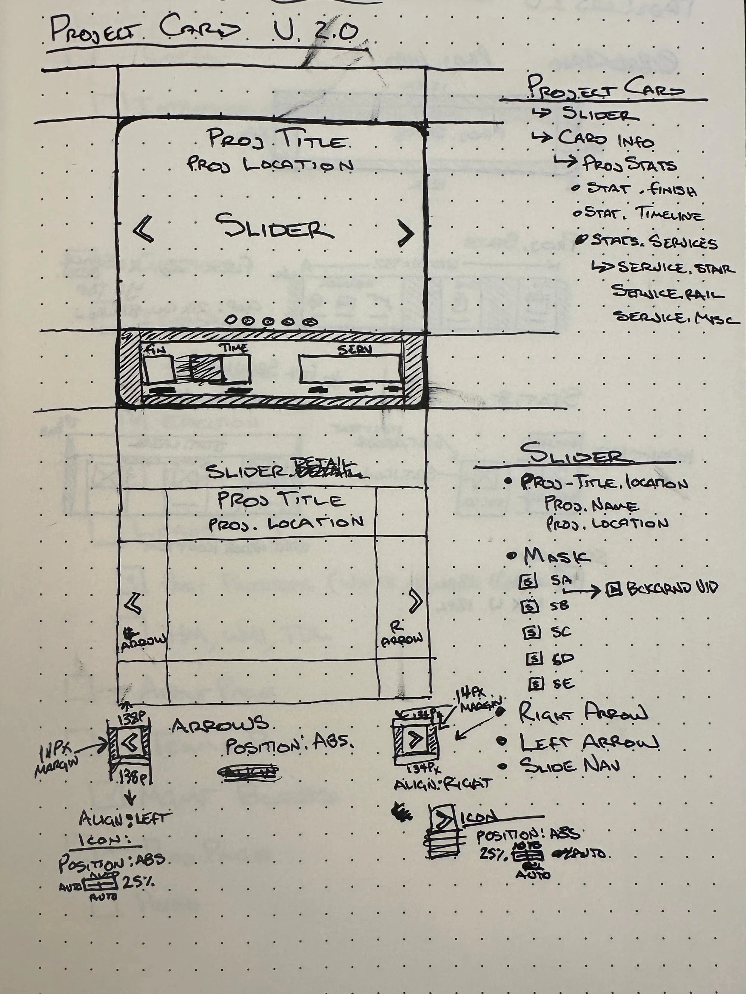
Research showed that users wanted stats and other useful information at their fingertips without having to parse through a bunch of text.
I created responsive cards that showcased portfolio photos on an image carousel, displayed relevant stats, and ran off a CMS.
While the project was cut, the website got fantastic reviews from both internal and external testers.
Background
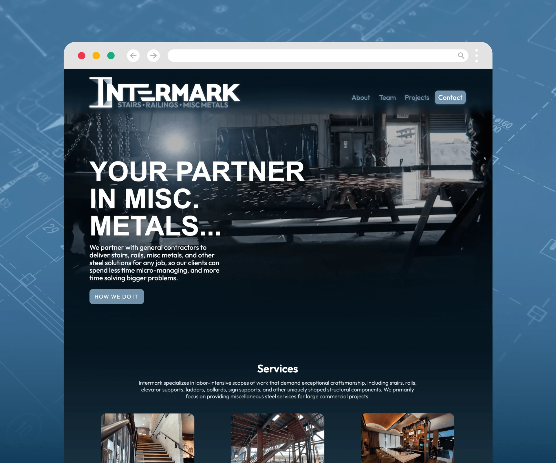
When I first partnered with Intermark Steel, I saw an opportunity to help a fast-growing steel fabrication company reflect its professionalism and innovation in its online presence. Their existing website didn’t match the company’s caliber or the high standards of their clients, including Amazon and Tesla. It was clear that Intermark needed a website that could visually communicate their expertise and streamline how potential clients, like project managers and superintendents, engaged with their services.
Challenges
The primary question I sought to answer was:
How do project managers and superintendents select subcontractors for jobs?
I needed to understand their decision-making process and pain points to create a design that aligned with their priorities.
Design Process:
1. Empathize and Research
I began by speaking with project managers, superintendents, and estimators-potential users of the website. These conversations revealed key insights: users wanted a site that was highly visual, easy to navigate, and focused on showcasing past projects and team expertise. Competitor analysis further emphasized the importance of simplicity, strong visuals, and concise information architecture.
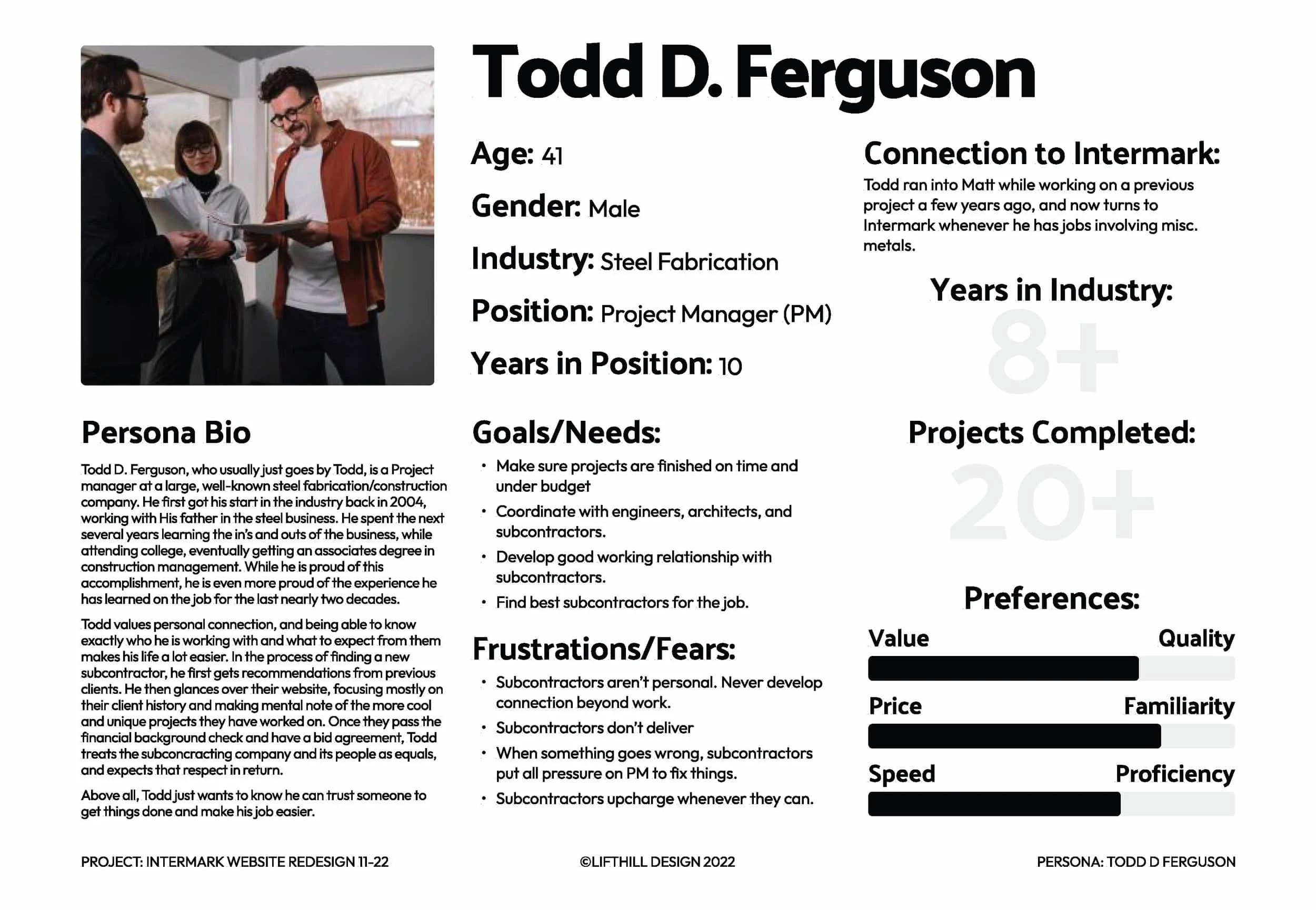
2. Define and Ideate
I crafted user personas and mapped their journeys, which highlighted that the site needed to prioritize two things: the portfolio (past projects) and the team. Inspired by this, I designed a system of cards for both projects and team members. These cards offered users a quick snapshot of essential information while linking to detailed pages for deeper exploration.

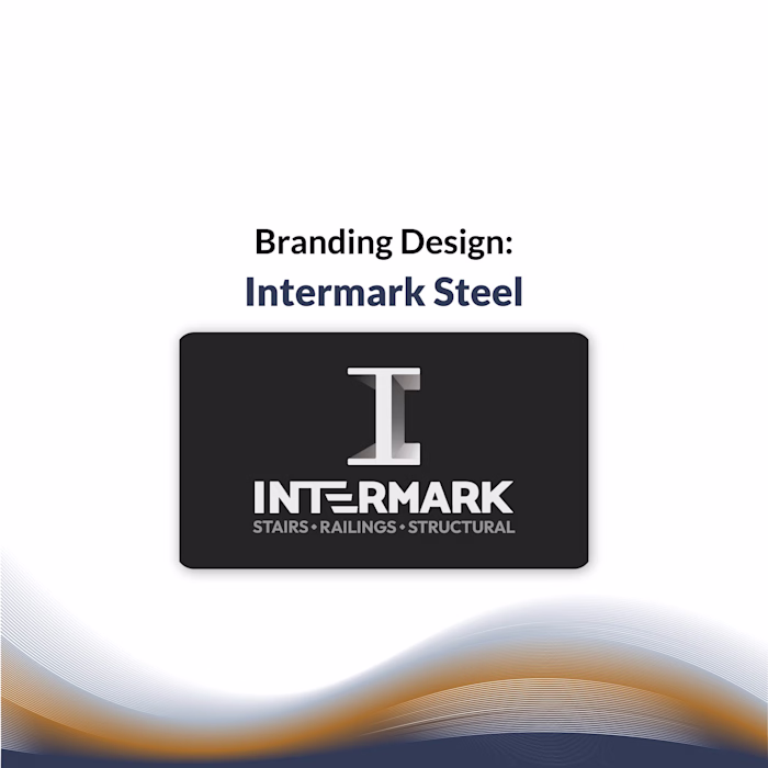
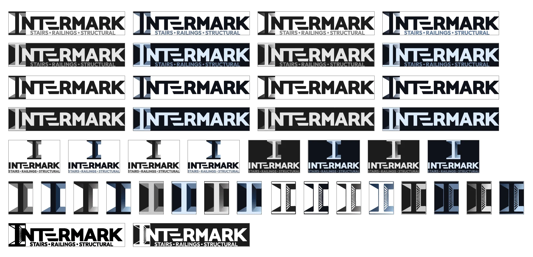
In tandem, I worked on branding and visual design, creating a cohesive style guide and UI kit that balanced a clean, professional aesthetic with engaging visuals.
3. Build and Test
A functional prototype was developed and tested with real users, including estimators and other professionals in similar roles. During testing, I observed two distinct user behaviors:
Methodical Seekers who navigated systematically and prioritized efficiency.
Sporadic Explorers who browsed more freely and focused on visuals.
Feedback during testing identified several areas for improvement. For example, users wanted larger images on the cards, more intuitive filters for finding projects, and a touch of vibrant color to make the design less monochromatic.
Development Process:
The Vision: An Immersive, Shop-Like Experience
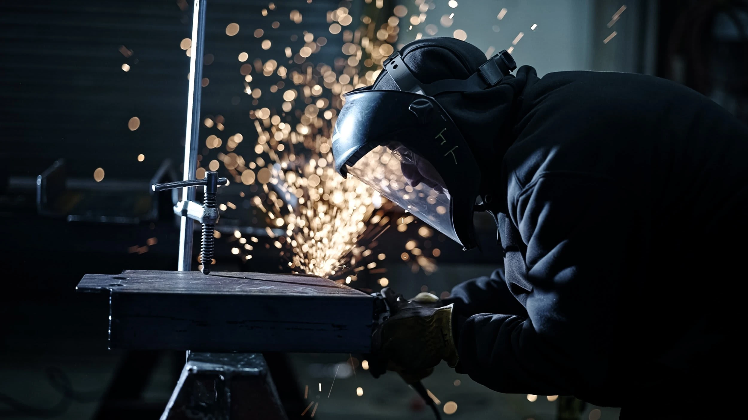
The new Intermark website is completely inspired by the heart of the business, the fabrication shop. Everything from the gritty backgrounds, to the subtle gradients, to the color choices was created with the shop in mind! The intent of the site is to help visitors (generally project managers and estimators from larger contracting companies) have an experience as close to being in the shop as possible. All pages, from the project page to the teams page was designed around this central concept.
An immersive experience puts everything under its own spotlight, allowing users to get a good taste of what Intermark is about, from the talented team members, to the incredible projects.
Meet the Heart of the Operation:
Intermark takes pride in its skilled and experienced shop workers, and what better way to introduce them than showing them in action! This was not an easy solution to execute, as it not only involved convincing a munch of camera-shy shop guys to perform, but also involved a host of technical issues. However, the end result is far more accurate and meaningful that a typical headshot and bio.
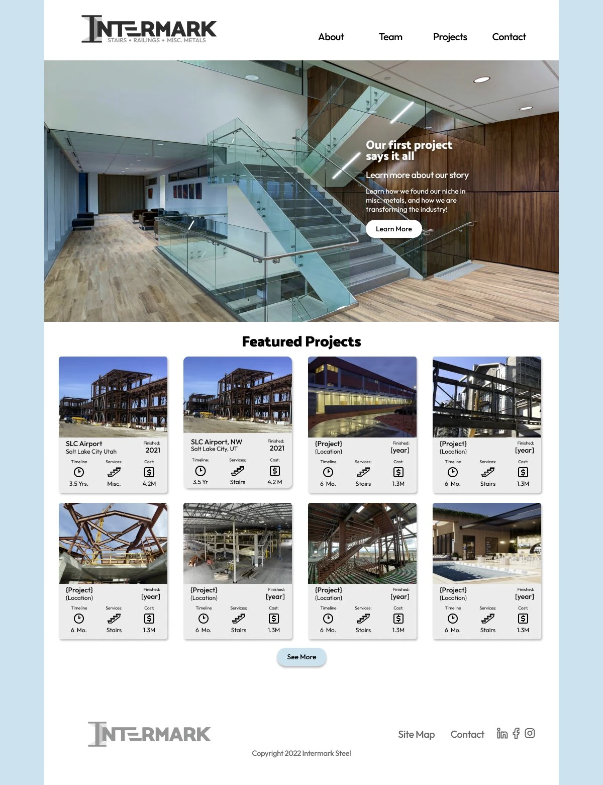
Awesome projects demand awesome presentation.
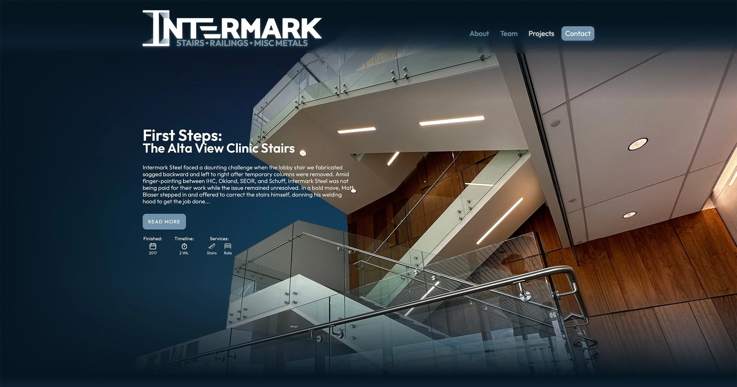
The layout for the projects page puts Intermark’s fine craftsmanship front and center, in an immersive layout that brings projects to life!
Project Info That Matters
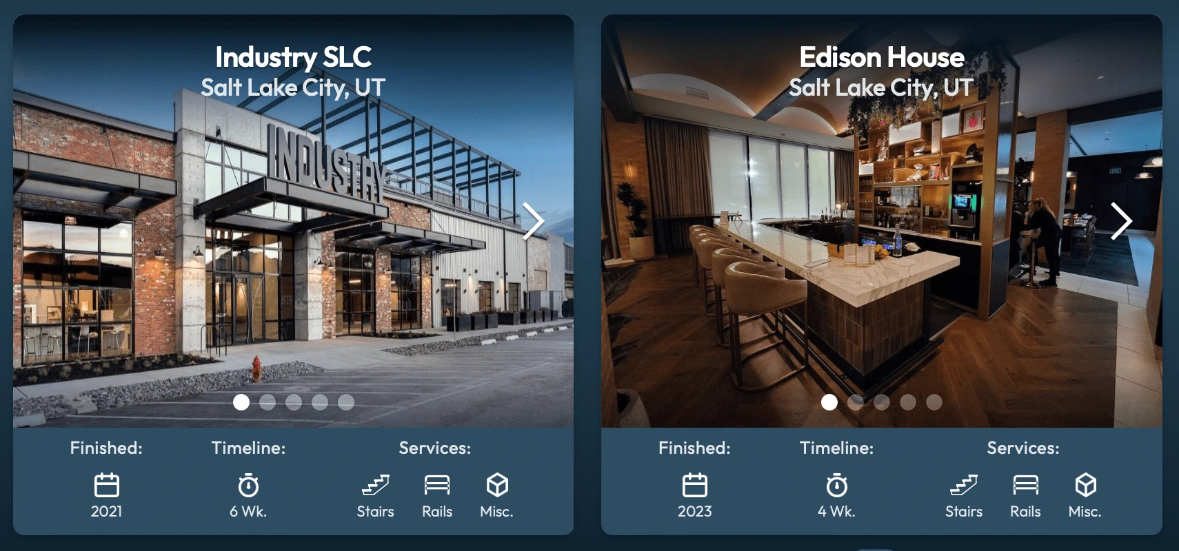
Rather than combing through paragraphs of info for each project, the most vital stats are presented in an easy-to-grasp, visual format.
These include:
Finish Year
Timeline
Services Provided
Outcome
Due to unforseen financial cuts, this product was never launched. However, based on the feedback I received, it is likely that the redesigned website would have transformed Intermark Steel’s online presence. The new design was clean, modern, and responsive, delivering a seamless experience across devices. It focused on what mattered most to the users: showcasing the company’s expertise through a visually rich portfolio and connecting them to the right people within the team.
Reflections and Next Steps
While the product was never fully launched, all was not lost! This project taught me the value of iterative testing and staying flexible when implementing user feedback. While the website successfully addressed the primary goals, I identified future opportunities, such as refining search and filter functionalities and conducting further usability research should this project be restarted in the future.
Like this project
Posted Mar 28, 2025
A custom themed, fully immersive website with an innovative team page and simplified project portfolio cards. https://www.lifthilldesign.com/intermark-website
Likes
0
Views
9
Timeline
Apr 17, 2023 - Aug 12, 2024
Clients
Intermark Steel