Ghuttie Snack - Brand Identity and Packaging Design

Silvia Riva


Brand Identity
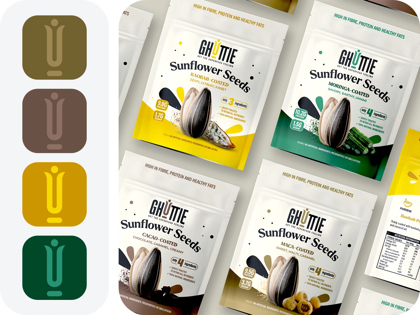
I built a bold, geometric wordmark made for shelf presence — then broke it with one detail: the "U", reimagined as a figure rising, light and weightless. I carried its warm gold tone through the whole packaging system, tying the mark to a healthy product line. Solid enough to lead. Light enough to float.
Color Palette
Packaging Design
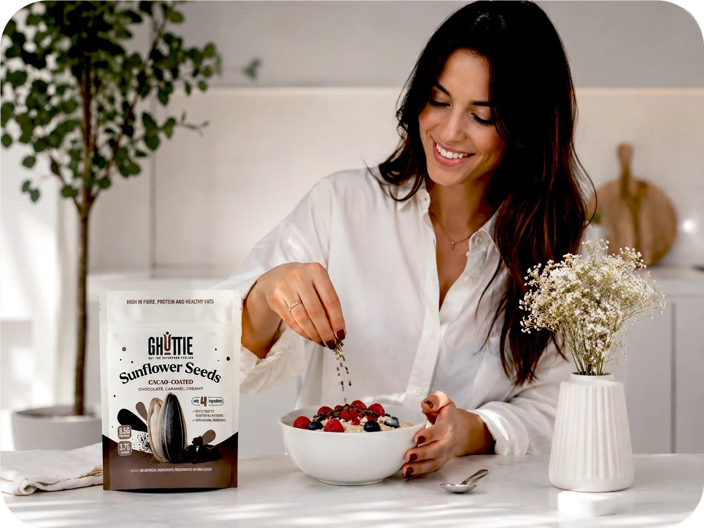
I designed a packaging system built around a simple idea: let the seed tell the story. Each pack features a sunflower seed split open to reveal the coating inside — cacao, maca, baobab, moringa — turning the product concept into a single, instant visual. I gave each flavor its own color identity, so the full range reads clearly on shelf even from a distance, while nutritional callouts and protein/sugar badges keep the key facts front and center. The system stays consistent across every variant, letting the brand feel cohesive as a line while each pack keeps its own distinct personality.
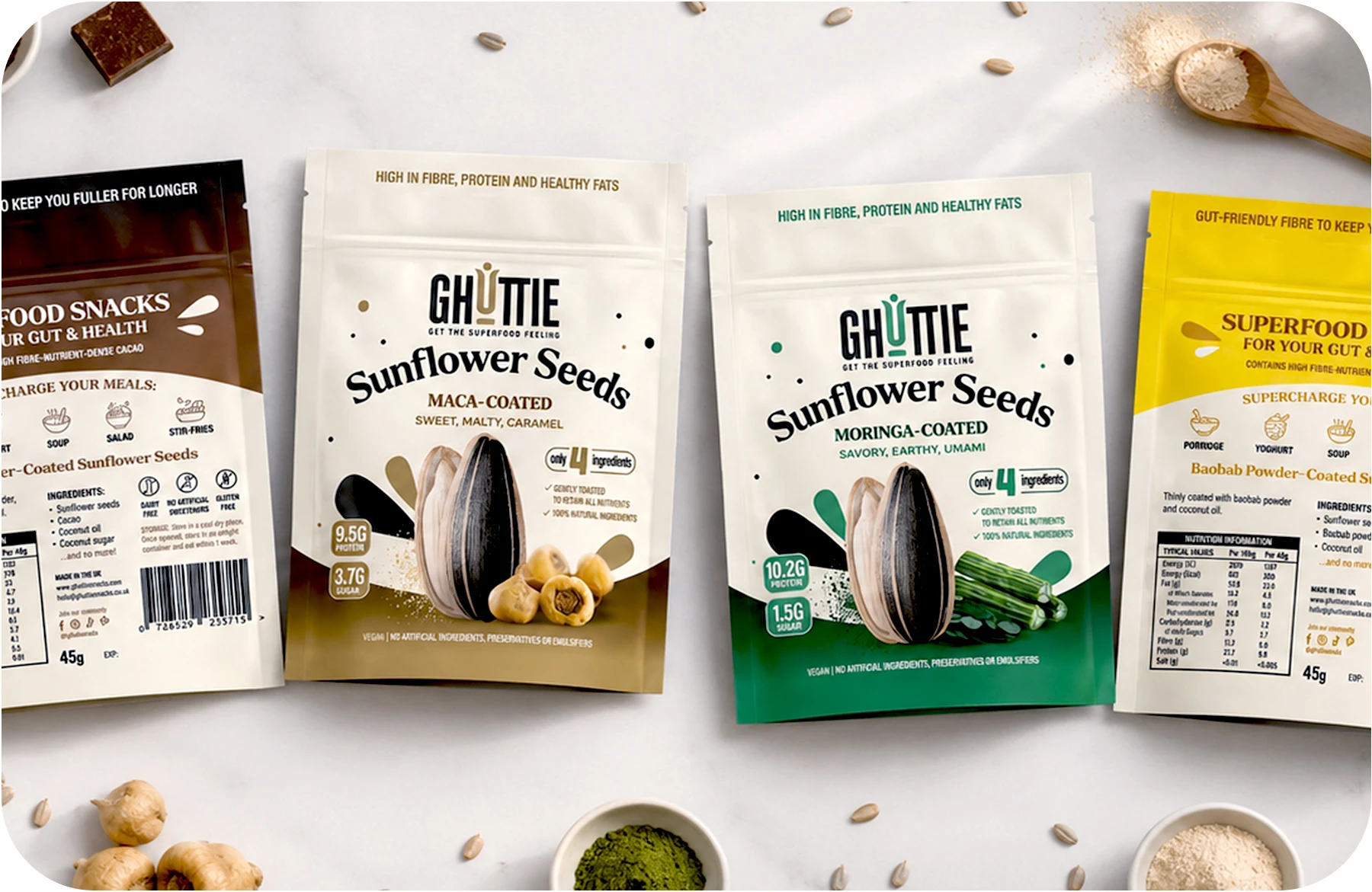
Let the seed tell the story.
Like this project
Posted Jul 6, 2026
Superfood snacks that don't need to shout. I designed the brand identity and packaging system for Ghuttie. Bold enough to stand out. Light enough to feel real.