OfferUp | Mo Sharaf
Mo Sharaf
Deliver crystal clear messages to people in a noisy world
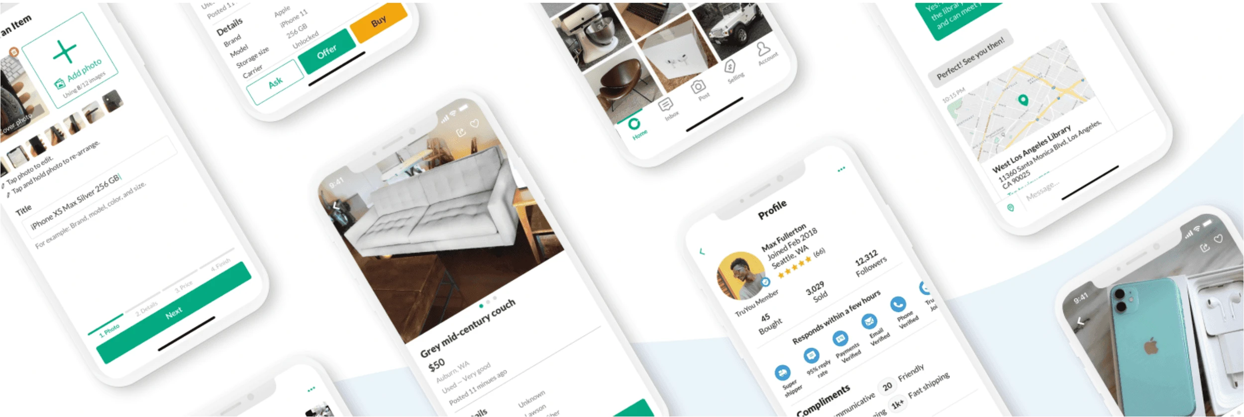
OfferUp is the largest mobile marketplace in the US with 20 million monthly active users.
I was part of the biggest design refresh for Similar app like OfferUp. My part was inbox redesign.
Starting point
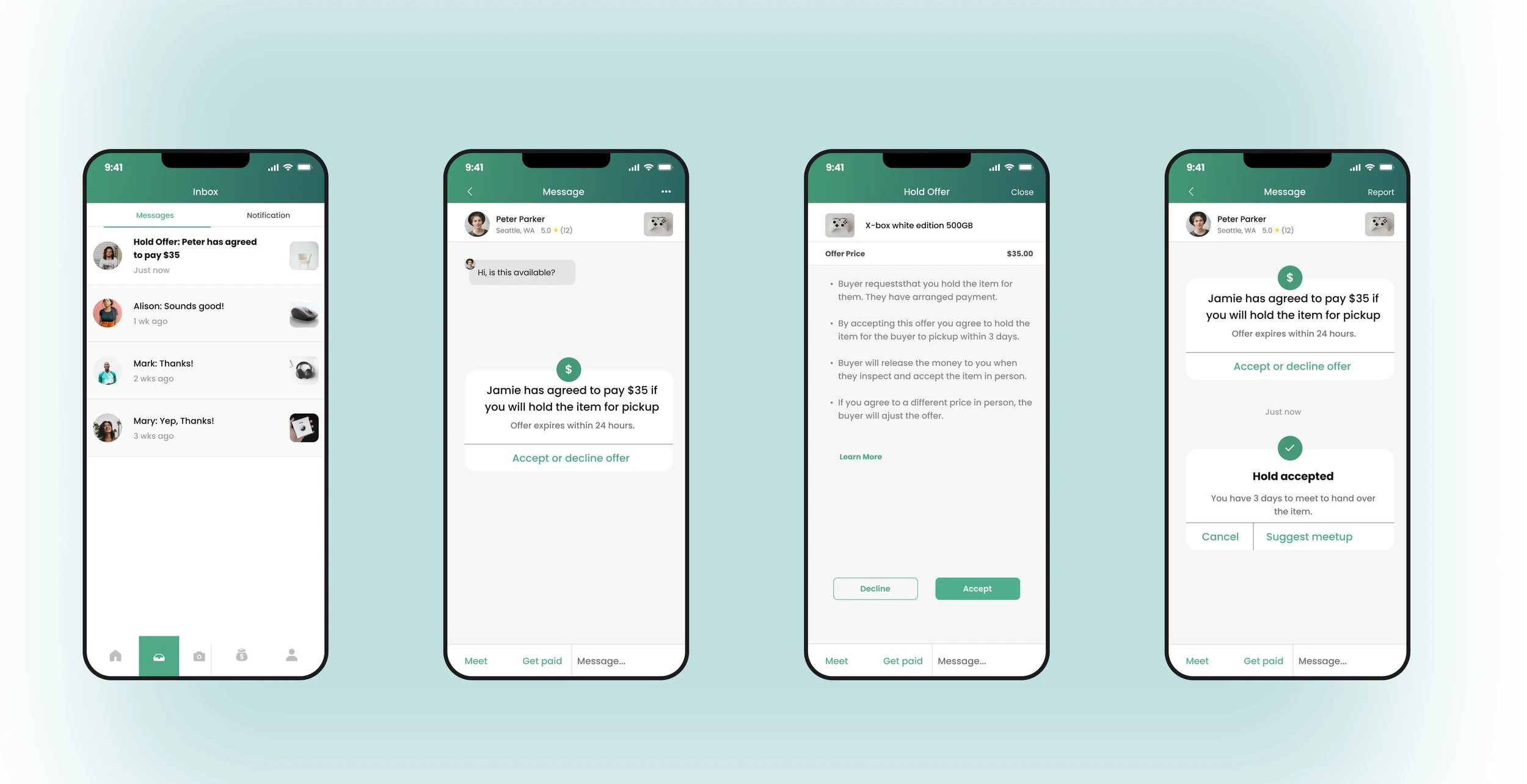
Sellers didn’t see the value of in-app payment and didn’t know how it works
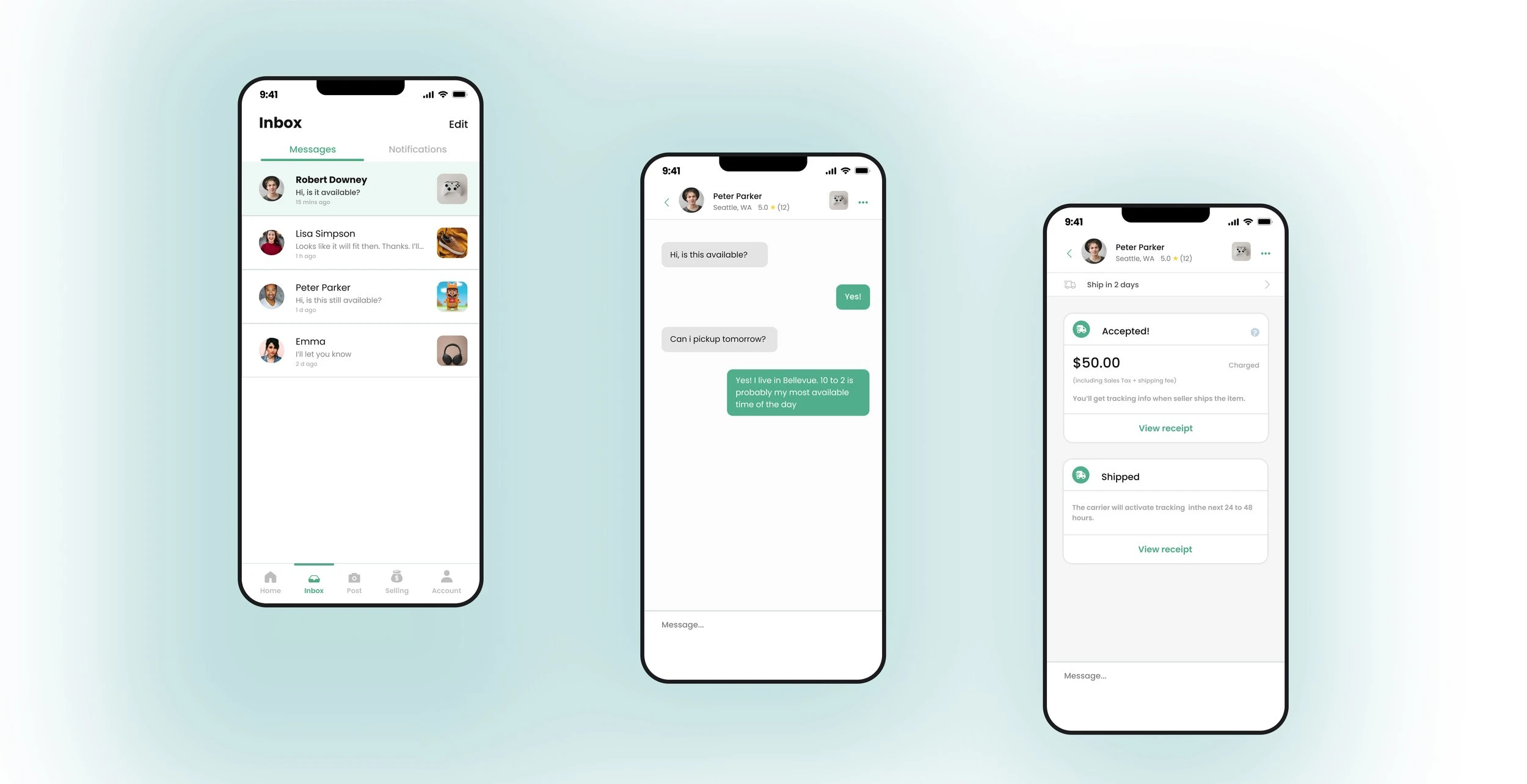
Seller accepts offer
Reframe the problem
Buyers and sellers are having problem of understanding how pickup and shipping work when payment involved
Although the project started with a request from our PMs: to update the single system message that sellers receive. But the more I discovered, the more I think the problem is the design system problem. It’s not the single system message problem. It’s our whole app design system. Luckily, other designers in our team felt the same. So we quickly came up with a design refresh plan and push it to our leadership team.
My role
I’ve been in charge of end-to-end experience for both buyers and sellers locally. I worked with other 3 designers come up with the overall design system. I worked with PM to prioritize features.
What I did
Defining the vision & strategy
Running user testings
Feature presentation
Coordinating broader design system
Writing proposal
Information architecture for app + desktop web
Delivering a clean, clear, and simple design system
Consistency
The design system for chat should be consistent with the whole app and website we have. For both visual, and the Information architecture, users are experiencing very similar flows no matter what devices they are using.
Simplicity
In order to reduce cognitive load, and let the content shine, we push for simplicity, which means reduce color usage, reduce the number of font styles and button styles, remove any excessive decoration.
Scalability
To fit future needs and new business initiatives, the design system is designed to scale.
Accessibility
In order to serve our 44 million of users, we made our design system more accessible. Not only for special-needs users, when people are meeting outside under the sunlight, they should be able to read the screen clearly. So we updated the color to pass WCAG, remove tiny font sizes from our system, and reduce the usage of any grey tiny texts.
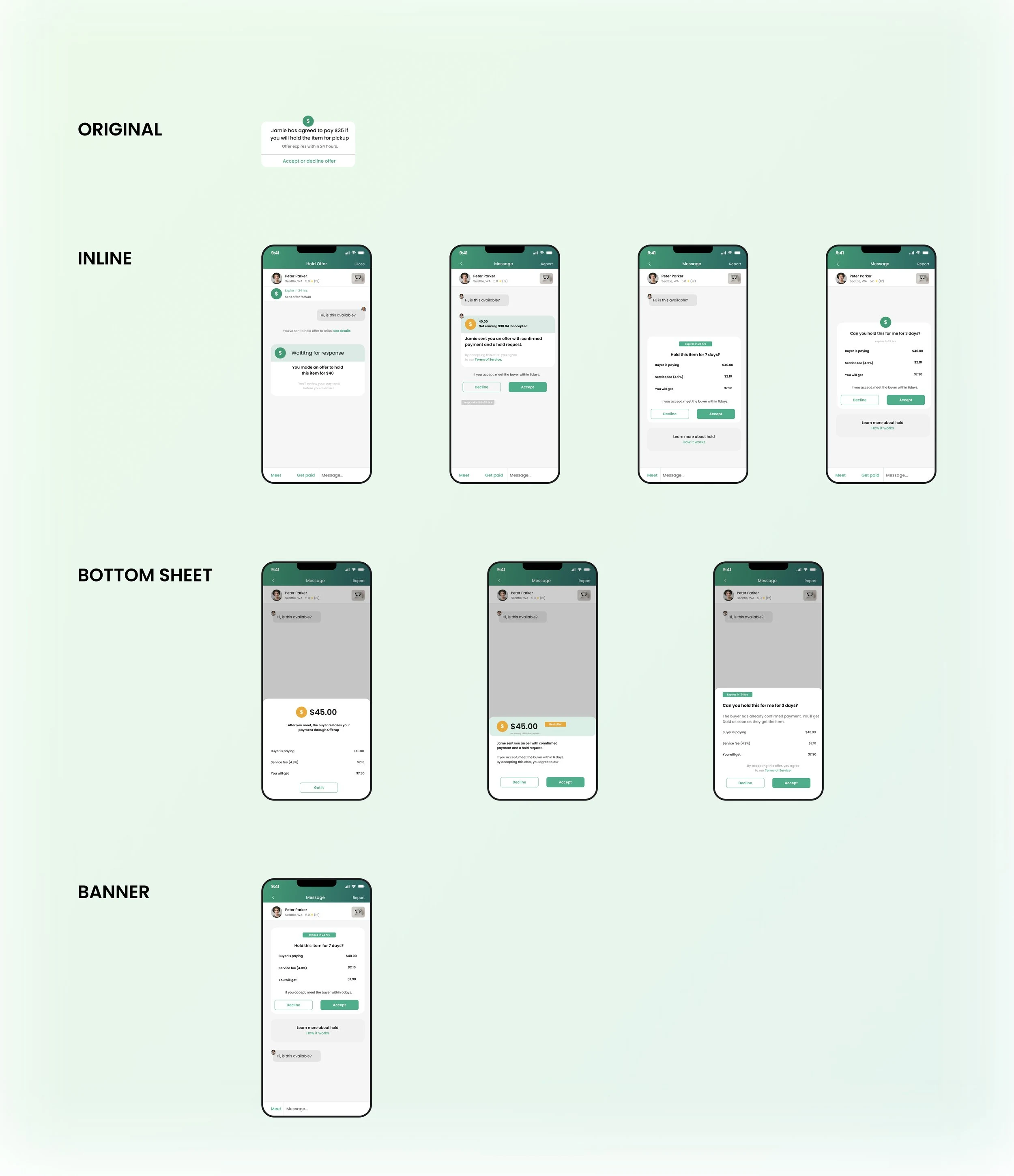
In order to choose the right component, I tested different options for more than 20 rounds.
There are millions of patterns I can use. The best way to learn is from our customers. So I ran into a quick feedback to iteration process. Which means:
I design options
I launch different options on usertesting.com. Asking 5 people each time to accomplish simple tasks and see how effectively they understand the message.
I get my results back within 1 day then I watch all videos.
I choose the most effective option then test another sets of variations.
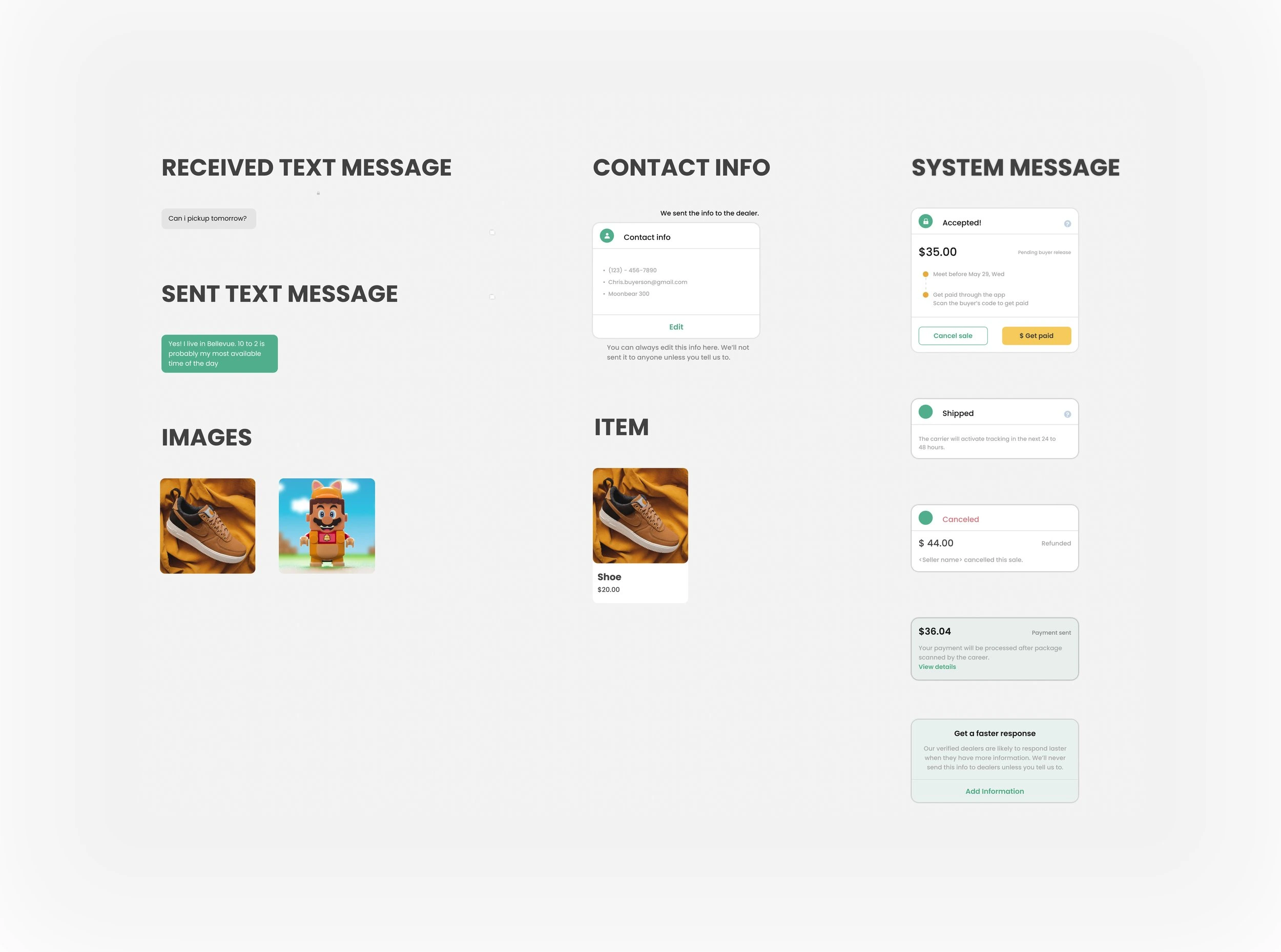
The picture below includes all major options I tested. The most efficient solution is inline based on my research. Because when users are looking at system messages within the context, they understood the message easily and faster.
But magic won’t happen overnight
In order to help our stakeholders to understand priorities from UX perspective, I did these things to communicate my ideas:
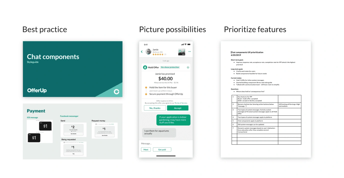
Showing examples from other products and helping our engineers and PMs to see what are the best practices in the world
Showing different options and variations so they can understand the scalability and flexibility of the framework
Document a list of priorities and explain why I recommend the plan.
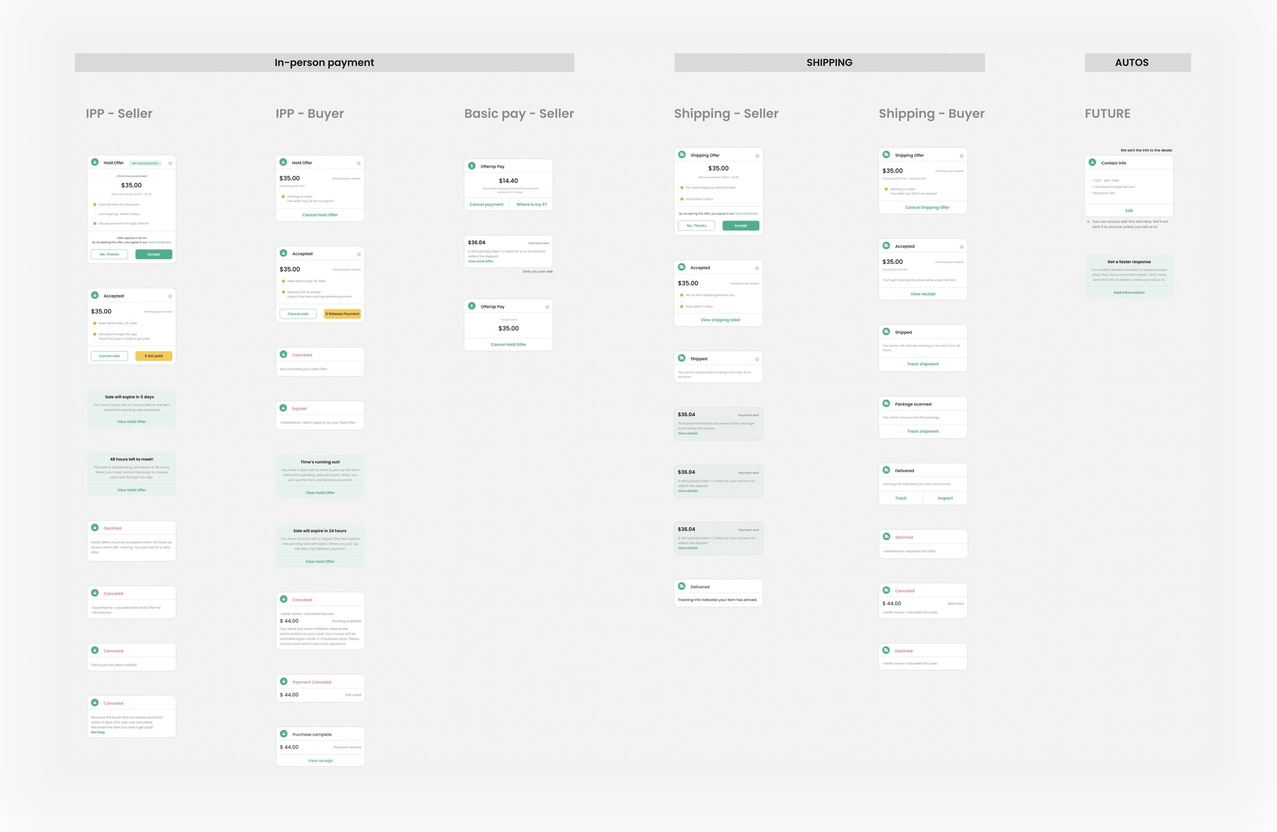
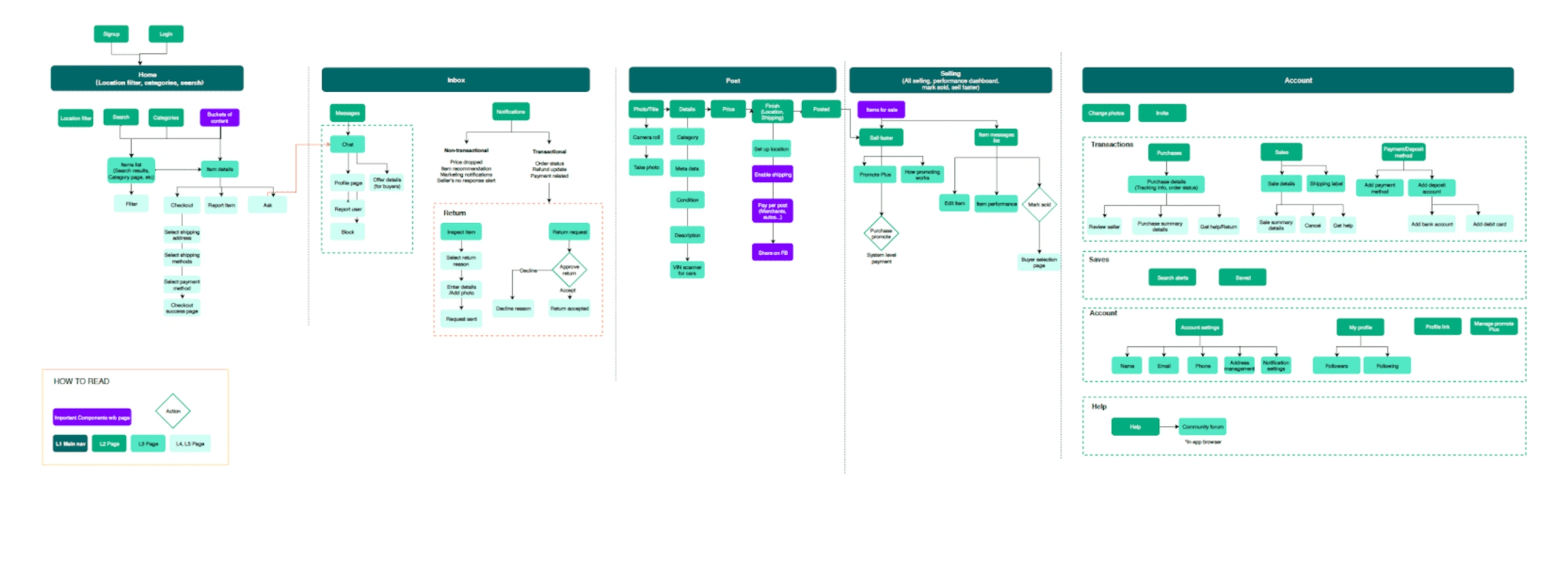
Information Architecture
To help our partners to get a bigger picture of our product, so they can live in the dream that our designers have, I create the following information architecture diagram to help our engineers understand the scope of refreshing design system.
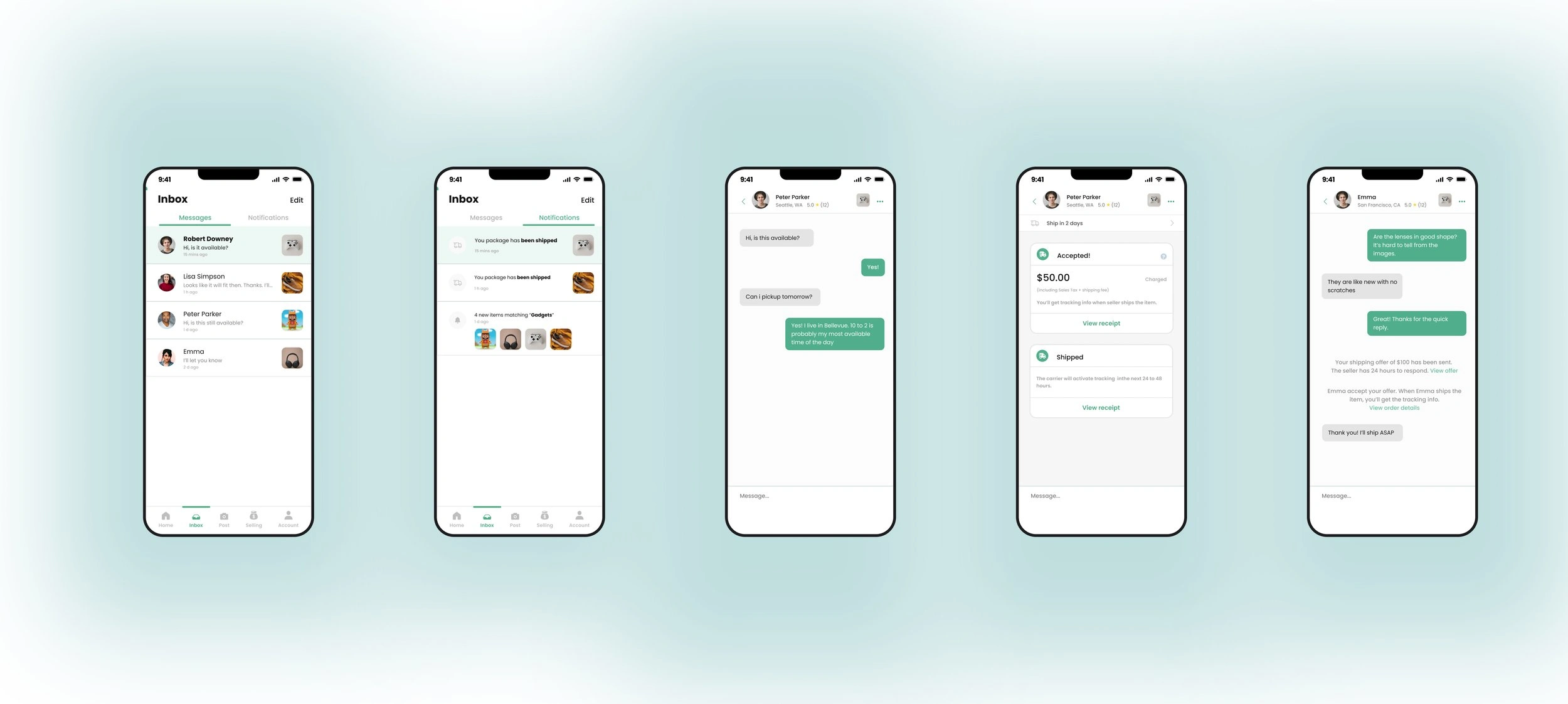
Final design
Takeaways
Customer insight is the king.Making people to believe the new vision is not an easy task. My previous manager said they proposed a couple of visual refresh but it didn’t happen. Leadership teams have emotional attachment for the green header in our older app because they want people to notice OfferUp from 1m away. After we brought up strong evidences from customers and explaining how easy it would be for our engineering team, they started to believe this is the right thing to do.
Be strategic with changes.Things won’t happen overnight. Illustrating the future excites people , but showing the progressive way of doing it helps to make it happen. So our team is not overwhelmed with too much efforts. I found as a designer, I have the power of visualizing the progress for the team, which will help everyone to dream the same dream.
Visual is not just about dribbbling.I used to believe that visual is just visual appealing. In fact, it is not! It’s also about team efficiency, psychology, interaction, system thinking.
Like this project
Posted Mar 21, 2023
Capture is a modern portfolio template designed for photographers, videographers, and creatives. Featuring a clean, minimalist layout, it highlights your best …
Likes
0
Views
4