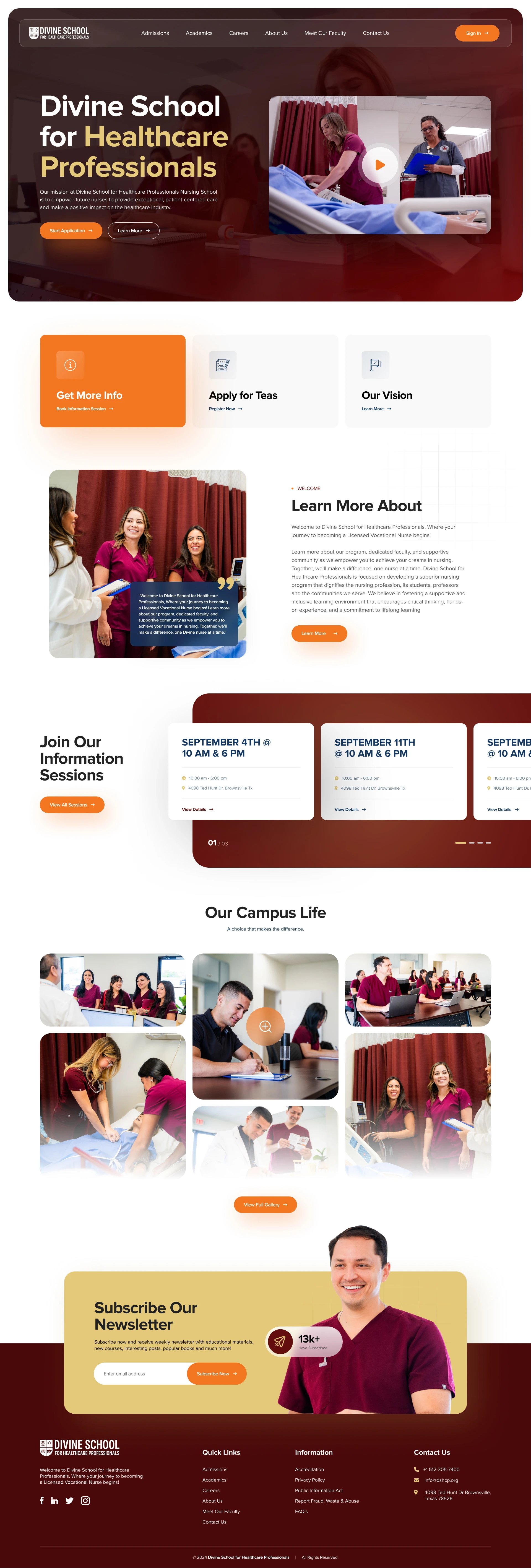
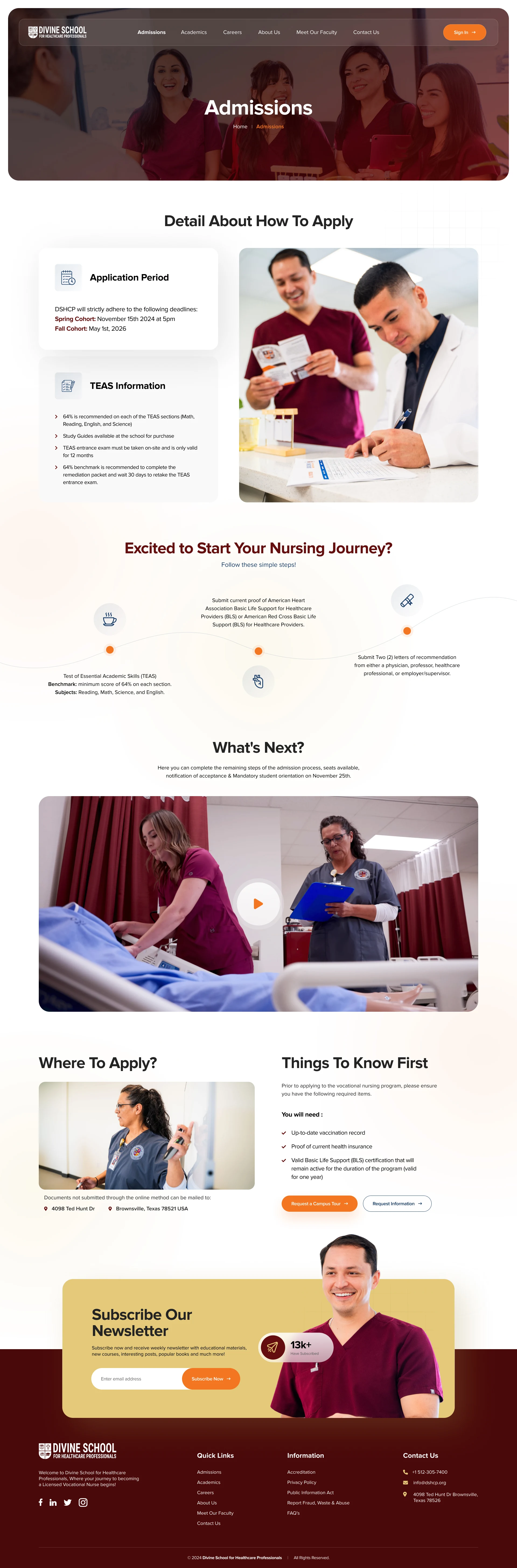
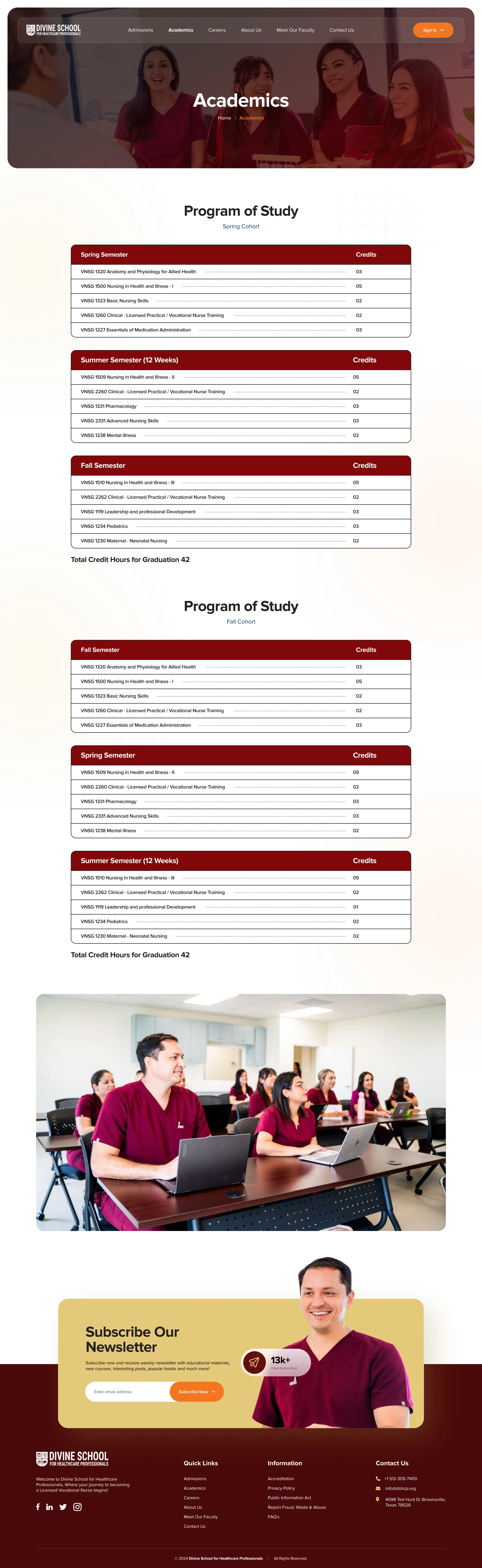
🏥 Healthcare Platform Full Branding, UX/UI Design & Web Development (End-to-End Execution)
This project represents a complete transformation of a healthcare digital experience—where I led everything from brand identity, UX strategy, UI design in Figma, to full-scale website development and visual production.
The goal was not just to “design a website,” but to rebuild trust, clarity, and usability from the ground up—something most healthcare platforms fail to achieve.
🚨 The Core Problem (What Was Broken)
Most healthcare websites suffer from the same systemic issues—and this project was no different at the start:
❌ Outdated and cluttered design that immediately reduces trust
❌ Confusing navigation flows during critical actions (booking, contact, services)
❌ No visual hierarchy, making information overwhelming and hard to scan
❌ Weak or non-existent branding, making the platform feel generic
❌ Low-performance and poor SEO structure, limiting visibility
❌ Emotionless interfaces—no human connection in a human-centered industry
In healthcare, these aren’t just “design issues” they directly impact user trust, engagement, and conversion.
If users don’t feel confident within seconds, they leave.
🎯 The Objective (What Needed to Be Achieved)
The vision was to create a premium, modern healthcare experience that:
Builds instant credibility and authority
Feels clean, calm, and easy to navigate
Simplifies complex information into clear, digestible flows
Drives user action (appointments, inquiries, contact)
Performs well technically with SEO + speed optimization
Scales into a complete digital system, not just a static site
🧠 My Strategic Approach (Beyond Just Design)
I approached this as a full product + brand ecosystem, not a page-by-page design task.
🎨 1. Brand Identity & Visual Foundation
I started by building a strong healthcare brand identity from scratch:
Designed a clean, professional logo aligned with medical trust standards
Created a color system focused on trust, clarity, and calmness
Defined typography that enhances readability and authority
Established a consistent visual language across the entire platform
👉 The goal: when a user lands on the site, it should immediately feel credible, safe, and premium.
🧩 2. UX Strategy & User Flow Mapping (Figma)
Using Figma, I structured the entire experience around real user behavior:
Defined clear navigation paths (Homepage → Services → Action)
Removed friction from key journeys like:
Appointment booking
Service discovery
Contact & inquiry
Prioritized clarity over complexity
Every section was designed to answer:
👉 “What does the user need to know next?”
✨ 3. UI Design System (Modern, Minimal, Scalable)
Instead of designing random pages, I built a scalable UI system:
Clean grid system + consistent spacing
Strong typography hierarchy for easy scanning
Reusable components:
Cards
Buttons
Forms
CTAs
Minimal, distraction-free layout with intentional whitespace
👉 This ensures consistency, scalability, and faster future expansion.
💻 4. Full Website Development (Performance + Precision)
I translated the design into a fully functional healthcare website, focusing heavily on:
🔍 SEO Optimization (On-page, structure, performance)
🖼️ Image Editing & Visual Direction
🧩 Branding & Logo Design
📱 Responsive Web Design
⚡ Performance Optimization
💡 Final Reflection
Healthcare is one of the few industries where design directly influences trust, and trust influences decisions.
This project was about more than aesthetics, it was about:
👉 Making complex information feel simple
👉 Making users feel confident and safe
👉 Turning a generic website into a credible digital healthcare experience
From branding to development, every detail was crafted to ensure the platform feels:
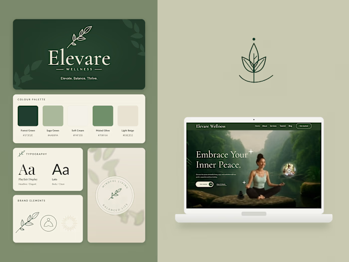
This project involved designing and developing a modern, trust-driven healthcare website for a psychiatry and mental wellness platform focused on delivering a calm, human-centered, and conversion-oriented digital experience.
From branding and visual identity to UX strategy, UI design in Figma, and full website execution, I handled the entire process end-to-end ensuring every element supports clarity, empathy, and user trust, which are critical in the mental health space.
🌿 The Vision
The goal was to create a healthcare platform that doesn’t feel clinical or intimidating—but instead feels:
💚 Warm and human
🧘♀️ Calm and reassuring
🧠 Clear and easy to navigate
🏥 Professional and trustworthy
Unlike traditional healthcare websites, the focus here was to blend emotional connection with structured usability—so users feel comfortable taking action.
🚨 Key Challenges & Pain Points
Healthcare—especially mental health—comes with unique UX challenges:
❌ Users often feel anxious or overwhelmed when browsing
❌ Complex services are hard to understand quickly
❌ Most sites feel too clinical or impersonal
❌ Poor hierarchy leads to confusion and drop-offs
❌ Lack of trust signals reduces conversion (appointments)
❌ Mobile experience is often neglected
👉 The challenge was to remove friction while maintaining professionalism.
🧠 UX Strategy & Structure (Figma)
I structured the entire experience to feel guided, not overwhelming:
🏡 Hero Section (First Impression Matters)
Clean headline: “Care that works, delivered with compassion”
Soft color palette to reduce anxiety
Clear CTAs: Book Now / Learn More
Visual storytelling using real, relatable imagery
👉 Immediate goal: build trust within 3–5 seconds
🧩 Services Section (Clarity Over Complexity)
Card-based layout for easy scanning
Each service presented with:
Visual context
Simple, digestible copy
Covers key offerings like:
Medication management 💊
Therapy & counseling 💬
Depression treatment 🌿
Virtual appointments 💻
👉 Users can quickly understand what’s offered without thinking too hard
👨👩👧 Audience Targeting Section
Clearly communicates care for:
Children
Adolescents
Adults
Personalized messaging to increase relevance and connection
💬 Testimonials & Social Proof
Smooth, flowing layout with organic line visuals
Patient stories positioned to build emotional trust
👉 Critical for healthcare people trust people
⚡ Access to Care (Trust + Convenience)
Highlights key benefits:
Fast appointments ⏱️
Insurance coverage 🛡️
Balanced with a strong visual doctor profile card
👉 Reinforces both credibility and ease
🧑⚕️ Doctor Profiles (Humanizing the Brand)
Clean, structured clinician cards
Focus on:
Expertise
Professional image
Trust-building details
👉 Makes the experience feel personal, not corporate
❓ FAQ Section (Reducing Friction)
Answering key concerns like:
Insurance
Treatments
Appointments
Accordion-style layout for clean UX
👉 Removes hesitation before conversion
🎨 Visual Design & Branding
The design direction was carefully crafted to balance medical professionalism with emotional warmth:
🌿 Soft green palette → symbolizes healing and trust
A perfect blend of design, psychology, and performance.
Like this project
Posted Apr 16, 2026
Designed and developed a healthcare from the ground up covering branding, UX/UI, & web development focused on improving user clarity, trust, & engagement.