Landingpage Design For NeuraX

Oreoluwa Fagade

When I designed the landing page for NeuraX, I knew the challenge was making something as complex as a decentralized AI assistant feel simple, powerful, and trustworthy.
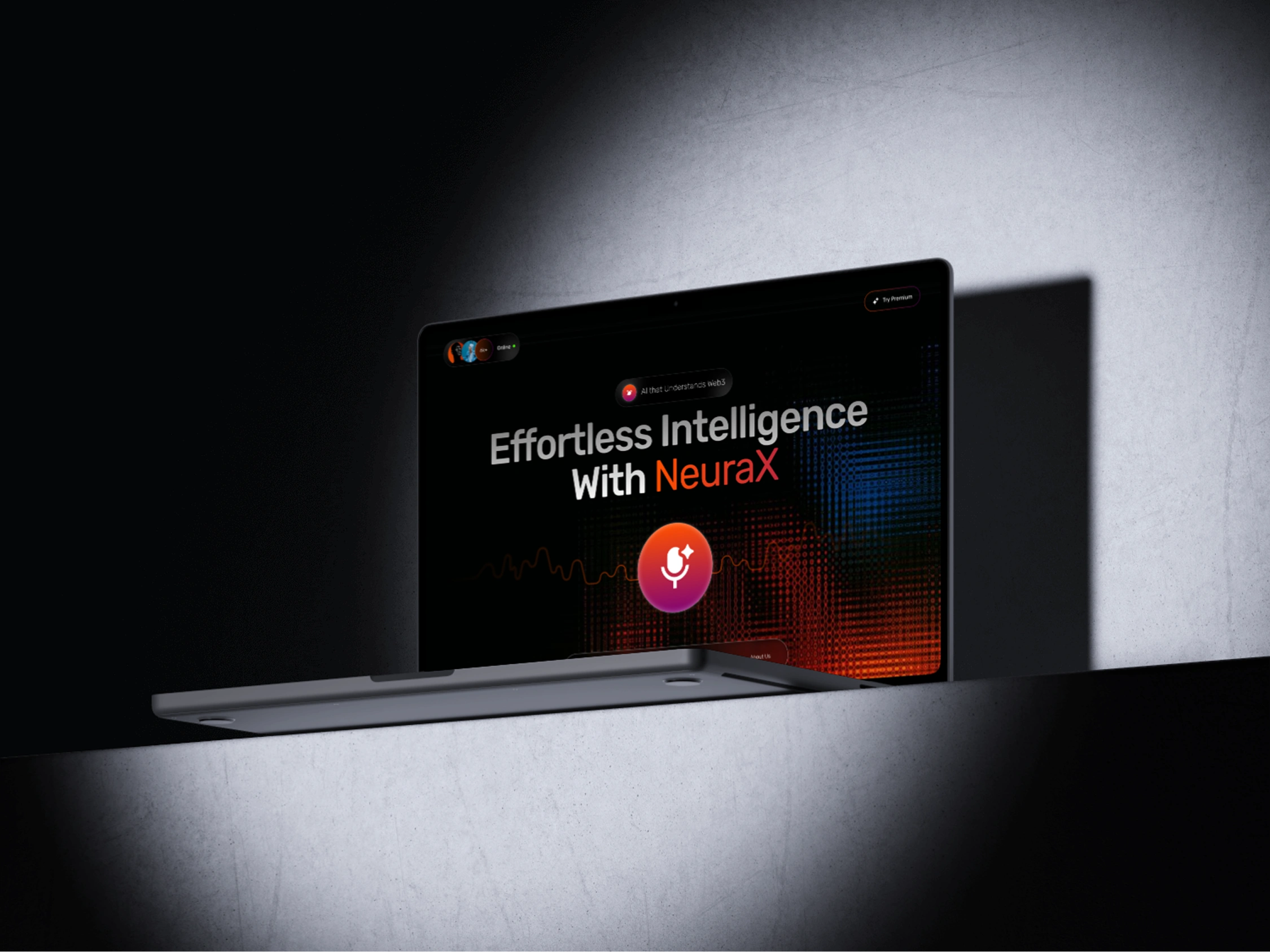
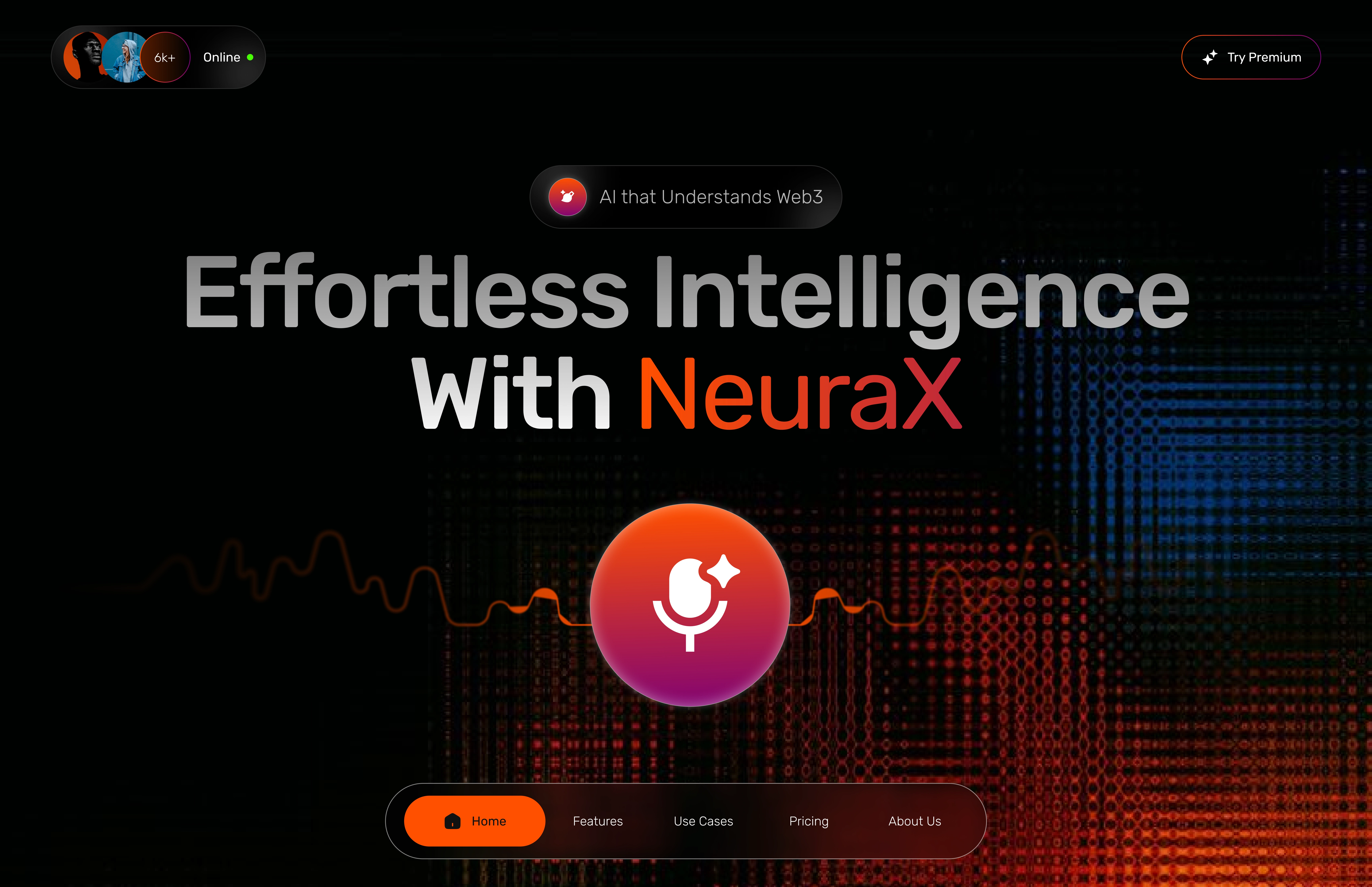
I started with a bold hero section that instantly communicates what NeuraX is all about “Effortless Intelligence with NeuraX.” I paired that with strong visual elements like a glowing pulse line and a central call-to-action button. This created an immediate sense of energy and innovation.
→ That will lead to stronger engagement right off the bat users knew they were looking at something futuristic and AI-driven.
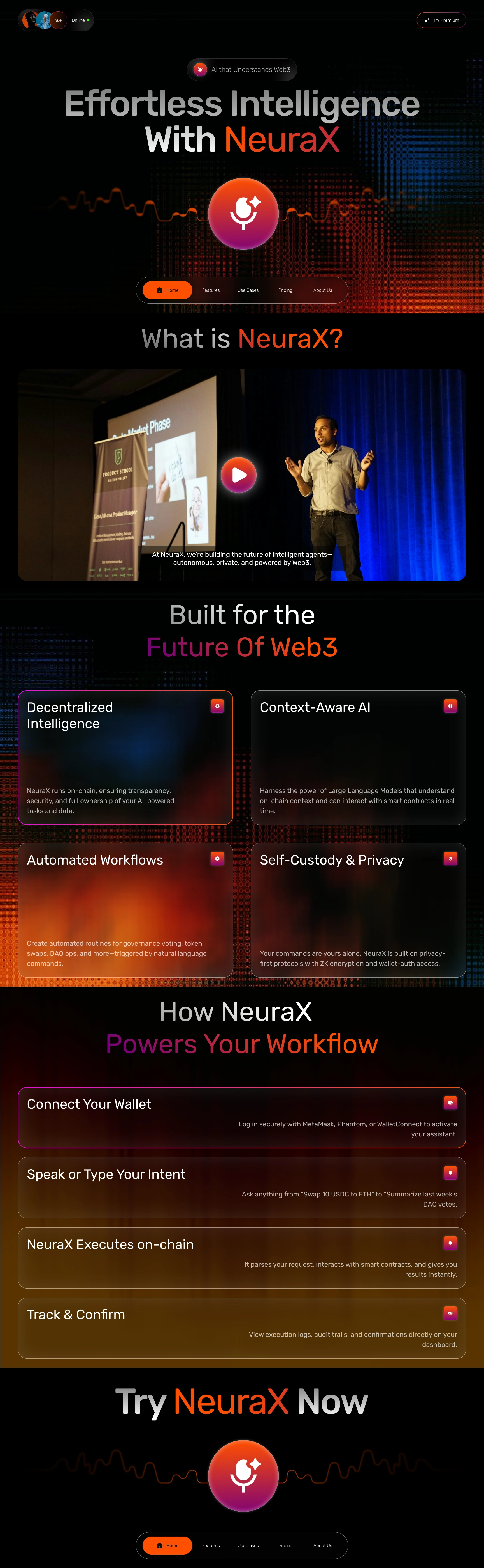
I then broke down the tech-heavy concepts into four core features decentralized intelligence, context-aware AI, automated workflows, and self-custody & privacy. I used glowing cards with short, scannable text to keep it digestible.
→ That made it easier for users (even non-devs) to quickly understand what NeuraX does and why it matters.
To help people visualize the experience, I mapped out a step-by-step workflow connect wallet, speak or type, NeuraX acts on-chain, and you track results.
→ This gave potential users confidence and clarity, reducing friction and drop-offs before signup.
I also included an explainer video to add credibility and a human touch.
→ That helped bridge the gap between high-tech and real-world application, making the project feel grounded and trustworthy.
Like this project
Posted May 20, 2025
The NeuraX landing page balances visual storytelling, technical clarity, and user guidance.
Likes
0
Views
0
Timeline
Apr 1, 2025 - Apr 7, 2025


Aflexa - Smart BTC Staking Dapp Platfrom

Crypto Finance Landingpage design