PROPOS Brand Identity and Logo Design
Artisticore Agency
PROPOS — Brand Identity & Logo Design Case Study
Overview
PROPOS is a modern, tech-forward brand built to reflect clarity, innovation, and structured thinking. The goal was to craft a bold and memorable identity that feels both premium and highly functional across digital environments.
This project focused on creating a distinctive logo system, a scalable color palette, and real-world brand applications that communicate confidence and simplicity.
The Challenge
The primary challenge was to design a brand identity that:
Feels modern without being generic
Works seamlessly across multiple platforms (web, mobile, product UI)
Has strong visual recall
Maintains clarity even in minimal or monochrome formats
Additionally, the brand needed flexibility to expand into sub-brands without losing consistency.
Concept & Direction
The direction behind PROPOS was rooted in precision and structure.
The name itself suggests:
Proposals
Forward-thinking ideas
Logical frameworks
This led to a visual system that emphasizes:
Clean geometry
Balanced spacing
Strong typographic presence
The identity avoids unnecessary complexity and instead leans into clarity as a design principle.
Logo Design
The PROPOS logo is built using a custom wordmark that blends:
Sharp, geometric forms
Subtle futuristic styling
Balanced negative space
Key characteristics:
Highly legible across sizes
Works in both light and dark environments
Strong silhouette for brand recall
Designed for digital-first usage
Multiple variations were created to ensure adaptability across contexts, including:
Primary logo
Inverted versions
Minimal/monochrome applications
Color System
The color palette is anchored in a bold purple gradient, supported by deep neutrals.
Core Palette:
Vibrant Purple → Represents innovation and creativity
Deep Black → Adds contrast and authority
Soft Gray → Balances the system for UI usage
The gradient plays a key role in:
Creating visual depth
Enhancing digital presence
Making the brand feel alive and modern
Sub-Brand System
To support scalability, a structured sub-brand color system was introduced.
Each sub-brand uses a distinct color while maintaining:
Consistent typography
Shared visual language
Unified layout principles
This allows PROPOS to expand into multiple verticals without losing brand cohesion.
Brand Applications
The identity was tested across real-world applications to ensure versatility:
Web Interfaces
Clean UI mockups demonstrate how the brand integrates into product environments.
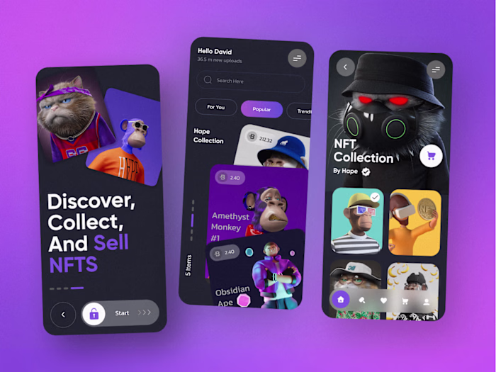
Mobile App Icons
The logo adapts seamlessly into compact formats without losing clarity.
Digital Assets
Consistent use of gradients and typography ensures a cohesive presence across platforms.
Outcome
The final result is a strong, scalable brand identity that:
Feels modern and premium
Works across multiple digital touchpoints
Maintains consistency across variations
Supports future growth through a flexible system
PROPOS now has a visual foundation that communicates confidence, clarity, and innovation.
Key Takeaways
Simplicity can create stronger brand recall than complexity
A flexible system is essential for scalability
Consistency across applications builds trust and recognition
Like this project
Posted Apr 23, 2026
Modern, scalable brand identity for PROPOS bold wordmark, purple gradient system, and versatile applications across web and mobile platforms.