truLOCAL Subscription Box Redesign

Emanuel Picatto


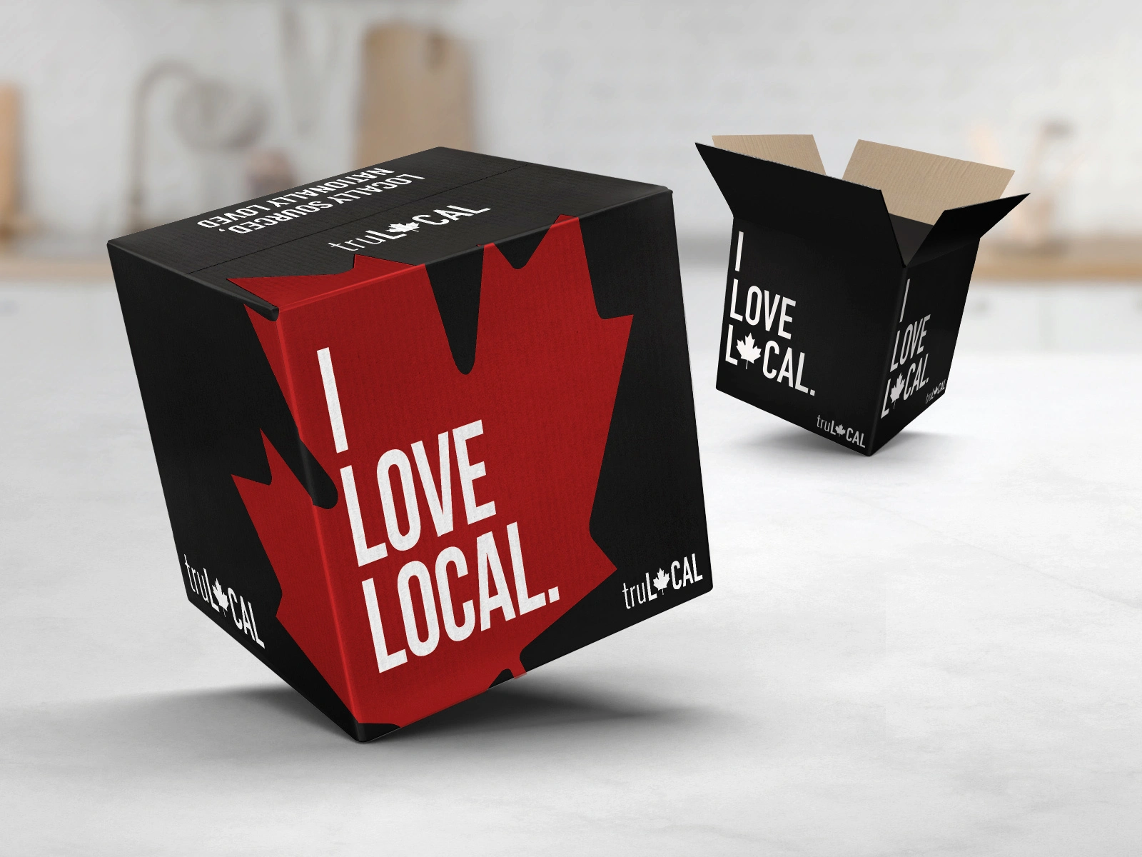
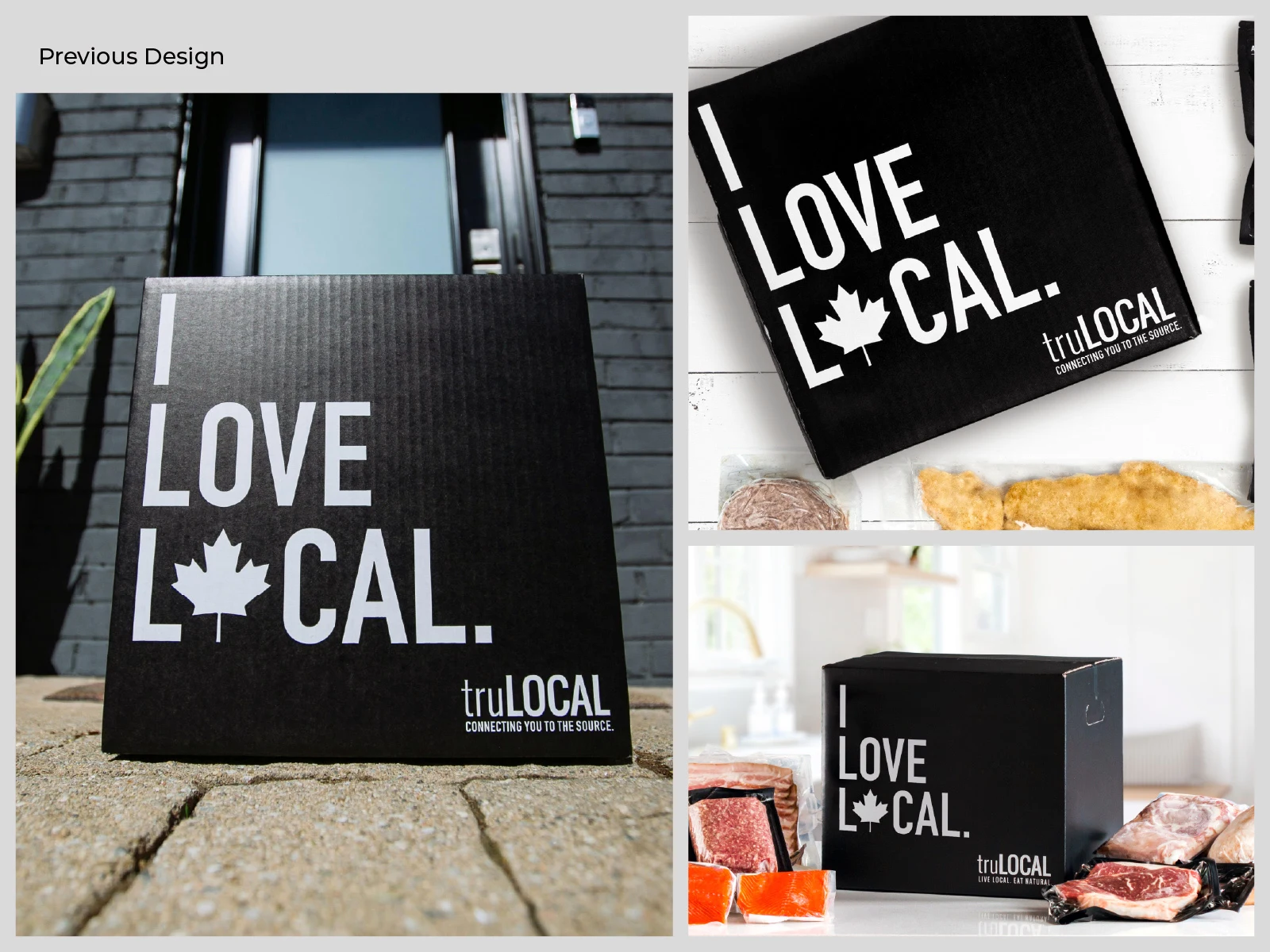
The client truLOCAL is a Canadian subscription service that delivers locally sourced meat and seafood straight to people's doors. I've been working with the brand as their graphic designer for about four years, and the box is one of its most important touchpoints: it's the first thing customers see when an order arrives.
The challenge The brand had just refreshed its identity, and the packaging needed to follow. The previous box was all black, with "I LOVE LOCAL." in white and a small maple leaf replacing the O. It was clean, but very quiet: on a doorstep or in a photo it read as a generic dark box, and the Canadian origin depended on one small icon. The goals were to:
Bring the box in line with the updated identity.
Make it more distinctive and recognizable at a glance.
Put the Canadian origin of the products front and center.
The approach
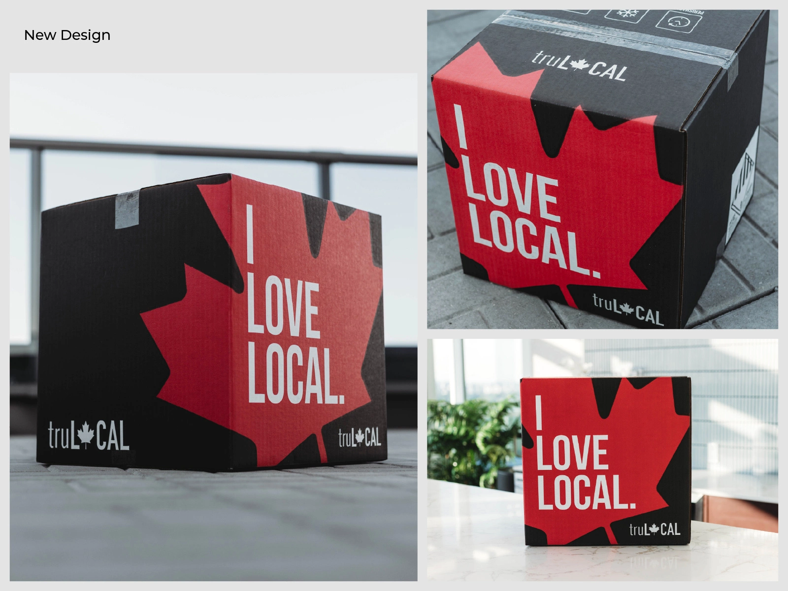
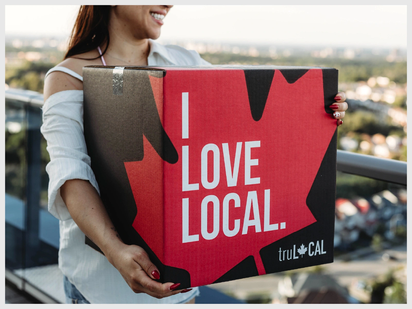
The maple leaf as the hero. Instead of a small icon, a large red maple leaf now wraps around the corner of the box and spans two faces, so it reads from almost any angle: on the porch, in a customer's hands or in a photo.
Red and black. The black base keeps continuity with the previous box, while the red brings energy and a direct connection to Canada.
A clearer message. "I LOVE LOCAL." is now spelled out in full over the leaf, so the headline is easier to read, and the maple leaf moved into the updated truL🍁CAL logo, repeated on several faces.
Brand line on the lid. "Locally sourced, nationally loved." on the top panel reinforces the idea that the products are from Canada and for Canadians.
Like this project
Posted Nov 4, 2026
A bolder subscription box for truLOCAL that carries its refreshed identity and makes the Canadian origin of every product impossible to miss.
Likes
0
Views
0
Clients
truLOCAL