🌿 Experimenting with a Different

Md Yeasin Arafat


🌿 Experimenting with a Different SaaS Hero Direction
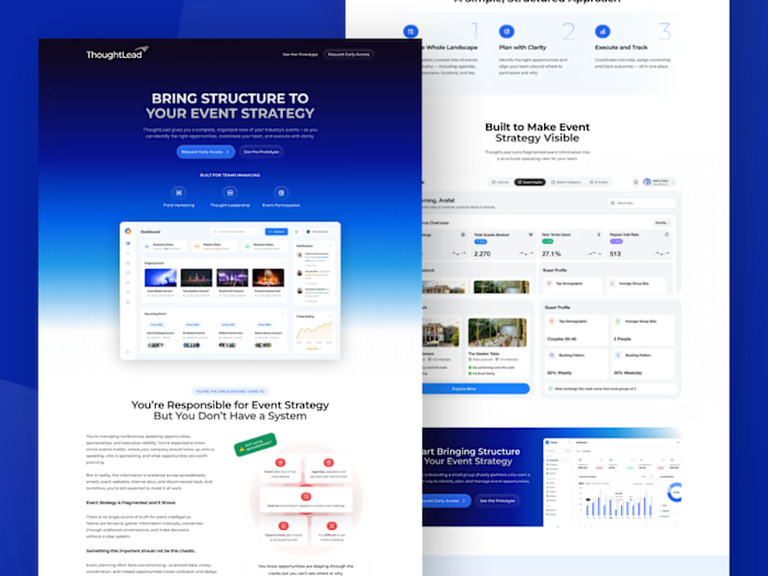
Most B2B SaaS websites lean heavily on abstract gradients and geometric shapes. I wanted to explore a cleaner, more refreshing approach by introducing natural elements into the hero section.
This concept combines:
• Green trees and a subtle landscape background
• Minimal, modern UI with plenty of whitespace
• Enterprise-focused dashboard preview
• A professional B2B aesthetic without sacrificing visual warmth
• A layout designed to stay consistent across the entire landing page
The goal wasn't to make it feel like a nature website—it was to create a trustworthy, calm, and premium first impression while keeping the focus on the product.
I'd love to hear your thoughts: Would you consider this style for a modern B2B SaaS brand, or do you prefer the more traditional gradient-based approach?
Like this project
Posted Jul 3, 2026
🌿 Experimenting with a Different SaaS Hero Direction Most B2B SaaS websites lean heavily on abstract gradients and geometric shapes. I wanted to explore a c...
Likes
0
Views
5