Offering a frictionless & accessible user experience| Web design

Leslie A Teta


Exploring strategies for optimizing Abbey Cats Adoption website to offer a frictionless user experience- A UX case study
Abbey Cats Adoption responsive website re-design

Project overview
With the non-profit of our choice our team explored UX/UI strategies that could help optimize the ACA adoption website offering a seamless user experience and increase user engagement by implementing a modern, responsive website.
Scope: 3 weeks
Role: UX/UI designer, Project manager
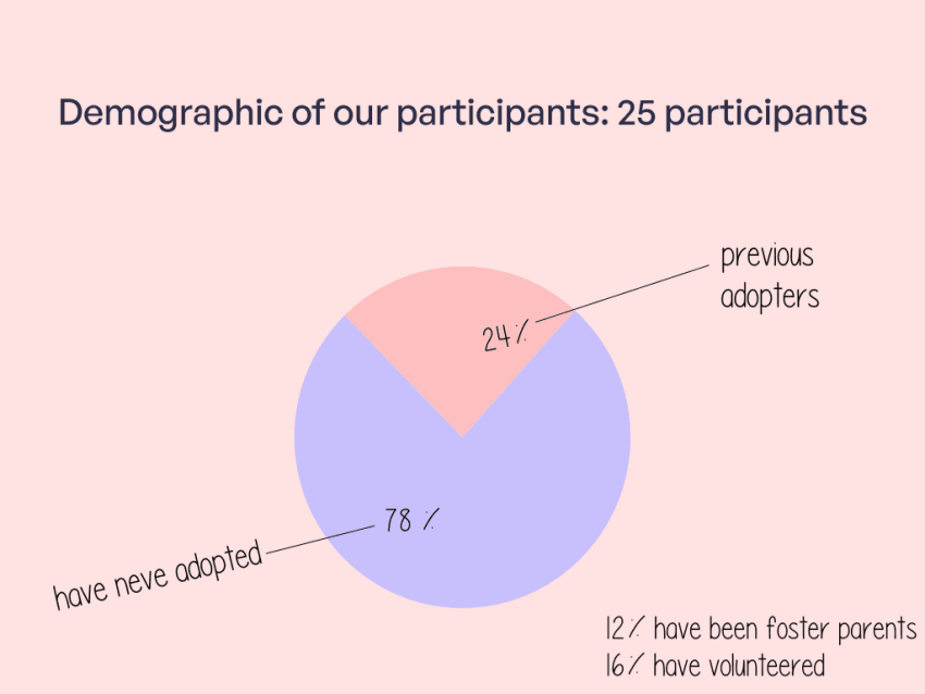
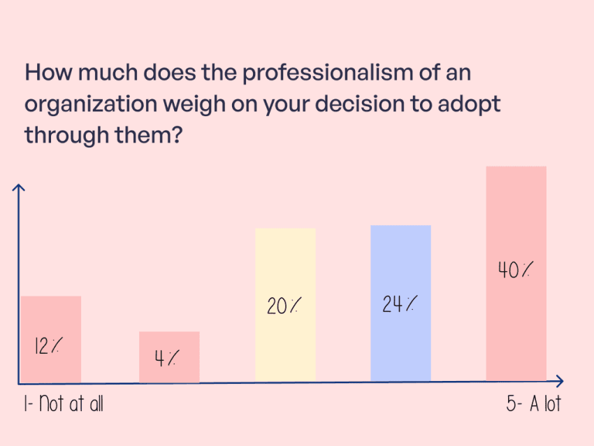
Survey participants consider the professionalism of the non-profit while adopting though them
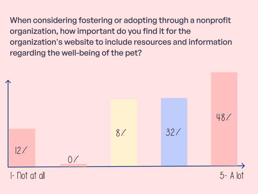
We started our research by conducting a quantitative user survey. User survey participants were randomly selected via social media platform X to collect diverse perspectives about adopting from a nonprofit from a broad population sample within the Greater Toronto Area.
Users are unable to navigate properly the website from their mobile phones
To better understand user constraints, our team had 1 on 1 interviews with 3 users between the ages of 18-45 and we asked these users to conduct various tasks in order to gain their feedback regarding:
- The navigational aspects of the existing site
- Ease of finding information and conducting tasks.
- Their overall impression of the site
We further organized these insights and notes from the interview into an affinity diagram which helped out determine which constraints to prioritize during the re-design.
The website looks outdated and not reliable, hence would not use the site
- User
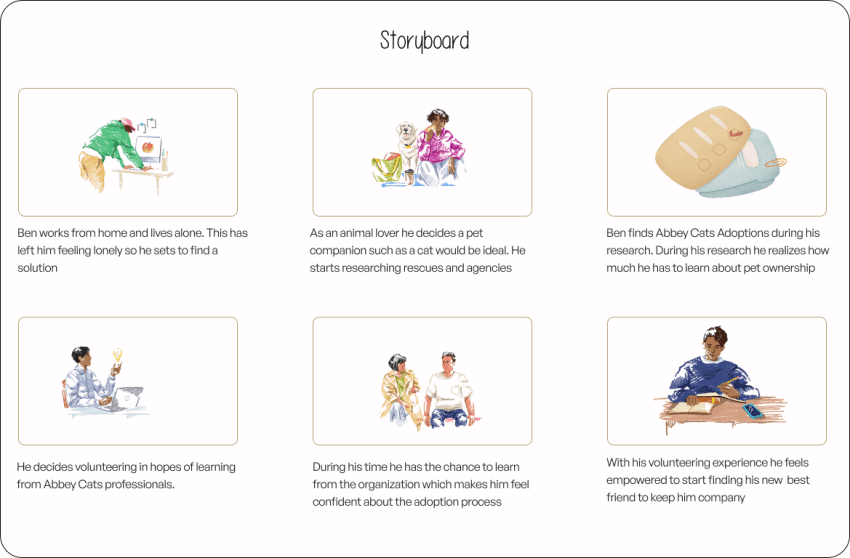
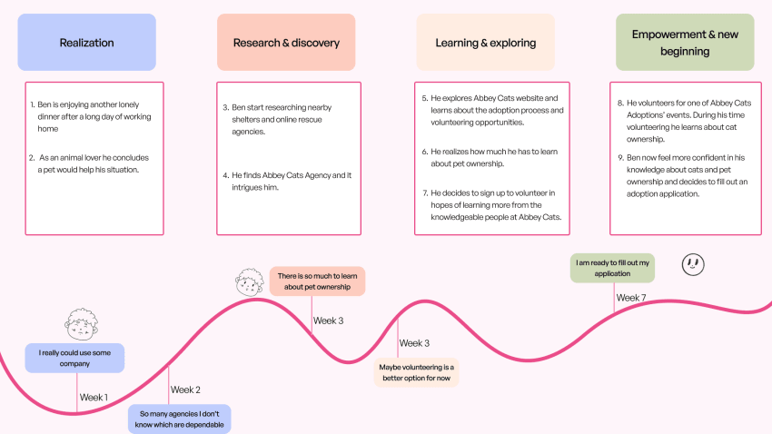
The persona: Ben Carter a lonely graphic designer looking for a companion
Ben works from home and lives by himself, which can be lonely. So, he is looking to adopt a cat for the first time. He loves all animals, but he thinks cats are great companions as they are also low maintenance. Hence, this would make it easy for him to balance having a pet while working from his home office.
Goal: an animal companion that is low maintenance and loving
Pain point: Ben is new to pet ownership and is need of a reliable and trustworthy agency
How might we enhance ACA website to provide a seamless and user friendly experience?
Users like Ben face obstacles due to the outdated and non-responsive Abbey cats website. Its poor aesthetics and navigation affects his ability to efficiently explore the website. To address Ben's frustrations and enhance the user experience, Abbey cats should implement a modern and responsive design to ensure accessibility across various devices.
Ben's user journey
In this step of the process, we created a user scenario, a story board and journey map to further empathize with the user.
What we observed in competitors
Our team assed 2 direct competitors and one indirect competitor, we observed ; intuitive navigation, ample use of white space, hero banners and mobile responsiveness. Although these are industry standards and/or practices, Abbey Cats Adoption was lacking these practices.
Redesigning the information architecture
We started by doing a heuristics evaluation which helped us determine which parts of the redesign was important (prioritizing). Given that ACA's website did not have a intuitive navigation, our team went through card sorting to create an new site map. Which later helped us create a footer (which the site did not have) with a modern horizontal drop down menu. This step of the process we made a user flow that followed a user searching for adoptable cats, volunteering information and the process to adopt.
Wireframing
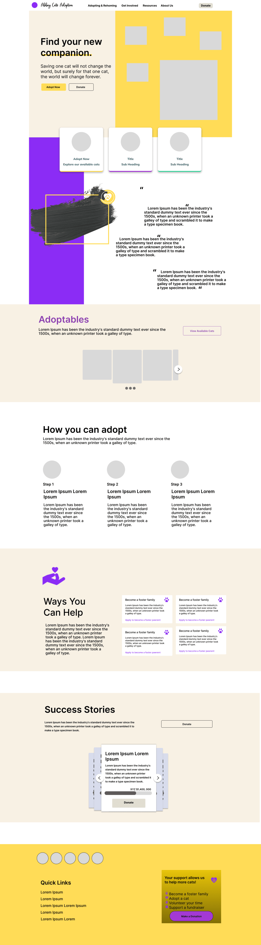
Our team created individual wireframes to explore more ideas for the visual design. The visual design was inspired by standard practices such as common colors used and common navigation that was observed on the competitor sites.
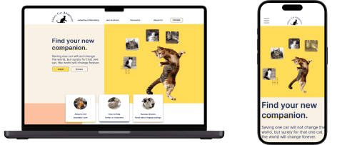
Project Gallery: The final look
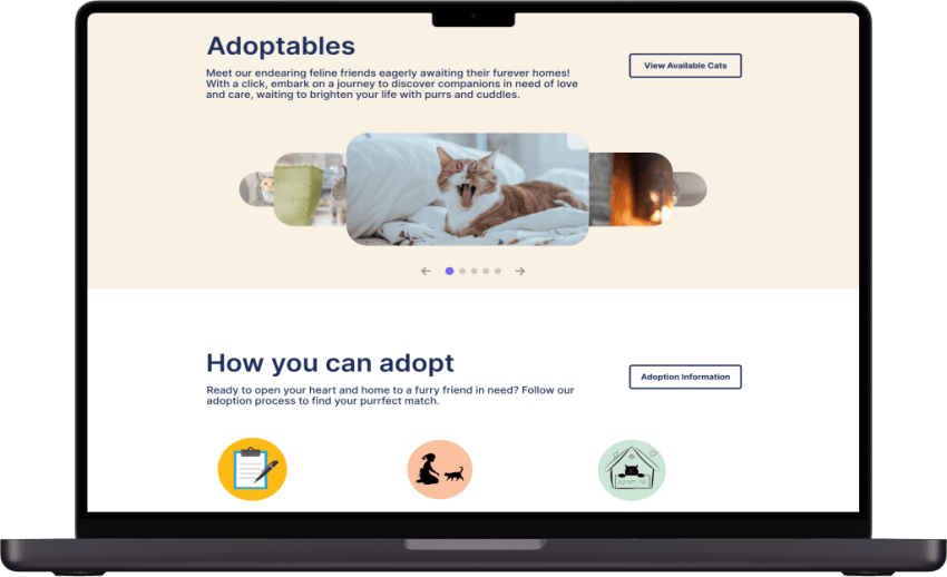
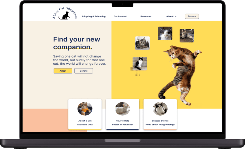
Mobile View