Project Overview
Government websites are an integral part of everyone's lives, every once in a while you need information about a topic, a concern or need to file your taxes for the first time. As a UX designer I was given a prompt to redesign a government website by identifying user constraints and applying my skills to identify and solve this issue. This project follows research and a visual revamp of the CRA that was done throughout three weeks.
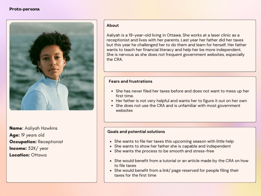
The target user: A first-time user
Given a prompt of revamping a government website (the CRA), my thoughts went to first time users trying to learn about taxes and filing their taxes for the first time. My assumption with this demographic was that they might encounter more issues compared to habitual users and given that I had users close to me that are international students or users who only started filing their taxes recently, I wanted to create a comparison. I created a proto-persona, Aaliyah Hawkins, a 19-year old filing for her taxes the first time.
Identifying the user web path
To identify the user goal I created a web path and a wire flow, the goal was for first time users to familiarize themselves with the site. This step of the process determined the page to focus on while re-designing and testing.
User scenario: Aaliyah is visiting the CRA to learn how to file her taxes. She wants to familiarize herself with the website and the overall process before the upcoming tax season.

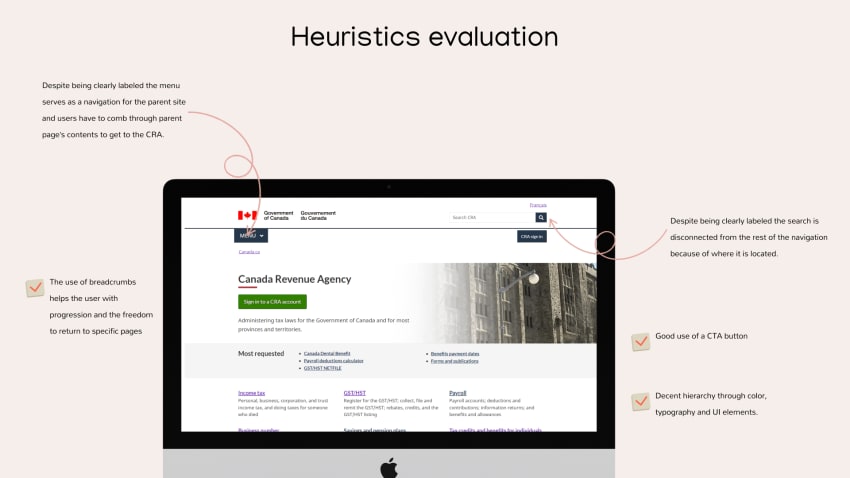
Evaluating the design heuristics
In this step of the process, I evaluated the CRA’s design to see if it is accessible, it’s learnability and how it adheres to industry common practices. This allowed me to find focus areas for the re-design such as the menu and the search bar.
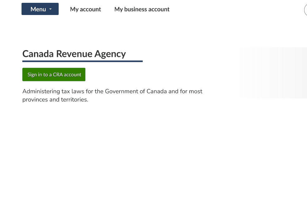
The findings:
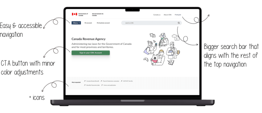
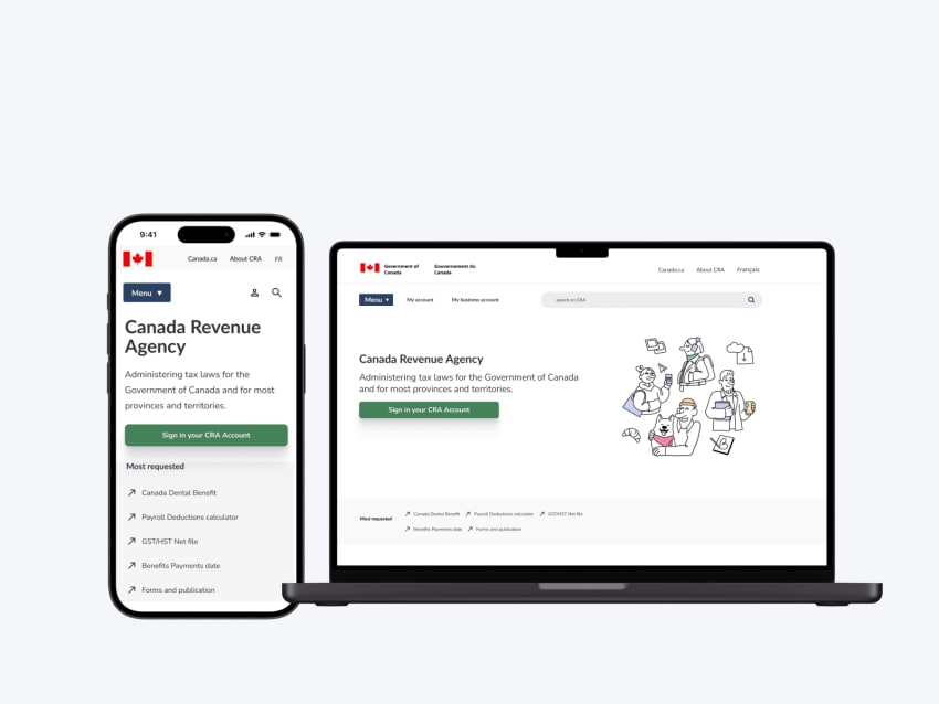
I wanted to focus on the navigation primarily the menu and the search bar. I found the search bar to be disconnected from the rest of the navigation. Aligning the search with the menu was my first approach. The second part of the navigation was the menu, the menu is more of a global navigation for it's parent site. I wanted to revamp the menu for users to easily find what they need on the CRA about the CRA without combing through the menus of other webpages. Lastly I focused on the footer. The CRA has a section just before the global footer (of theCanada.ca) that looks like a footer. Since the webpages already has a global footer that is functional, removing that section was part of the re-design as well. The two footers seemed repetitive this would be done by adding any elements found in the first footer to the global footer. I found the CRA was a good use of the CTA button, use of color and decent hierarchy.
First time users are overwhelmed, habitual users prefer to use other sites
"They have a lot of random links that you don’t need. I think they should be at the bottom as you have to go past them to get to what you want to do”- user
User interviews
I interviewed 5 users between the ages of 18-45 from Montreal. 3 out of them were first-time users and all of them were non-native English speakers. They were intentionally selected as I wanted to focus on first time users and their constraints while still gaining insights from habitual users. The tasks focused on navigation and account access.
The findings
Most first time users were overwhelmed while habitual users managed the tasks in a timely manner. 4 out of 5 found the website too wordy and 1 expressed using other sites to file their taxes instead and when they need information they seek it elsewhere. Through navigation usability testing I found that most users use the search bar instead of the menu one user said "the menu would take me more time".
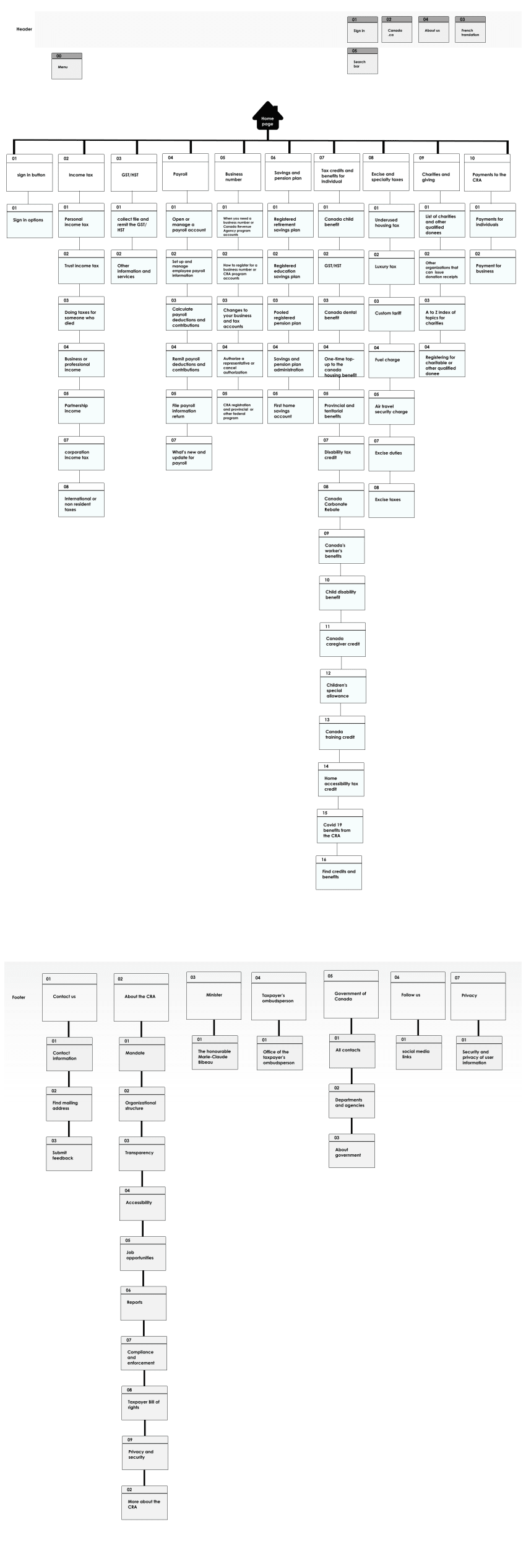
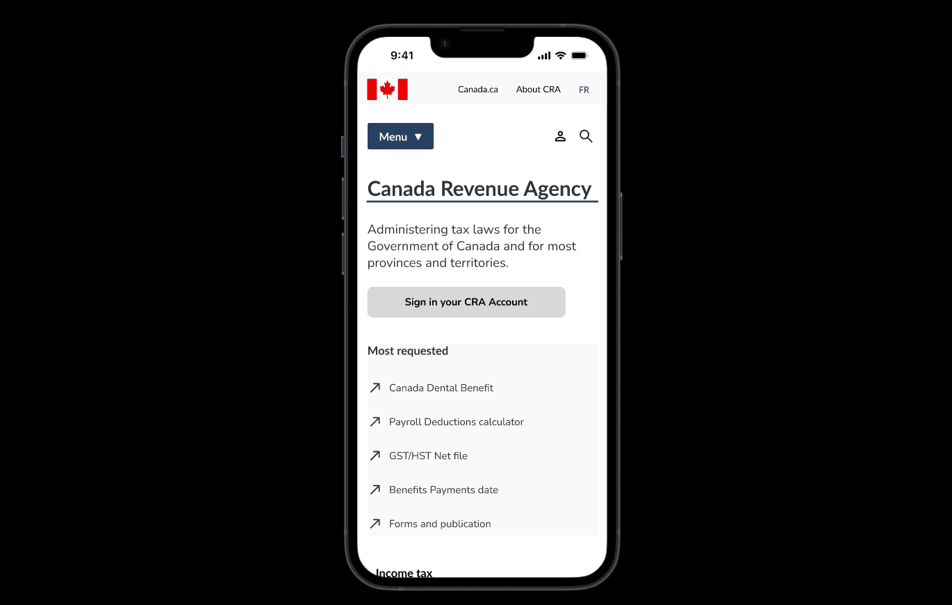
Redesigning the informational architecture
The sitemap helped me create a new navigation bar for better accessibility. The new navigation aims at solely focusing on CRA content/ webpages as well as a tab to connect the CRA to it's parent page Canada.ca.
Prototyping
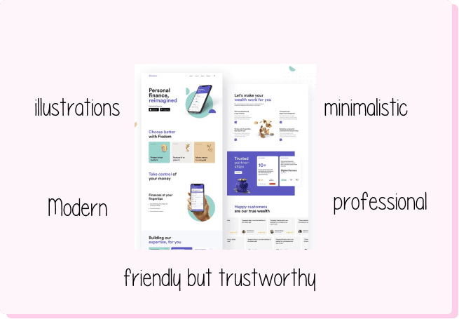
Turning user insights into inspiration
For the redesign my goal was to make to make changes that would contribute to a brand voice that is friendly but trustworthy. Another objective was to declutter the page while maintaining the information. User problems that I wanted to solve were accessible navigation, decluttering, hierarchy and minor font adjustments.
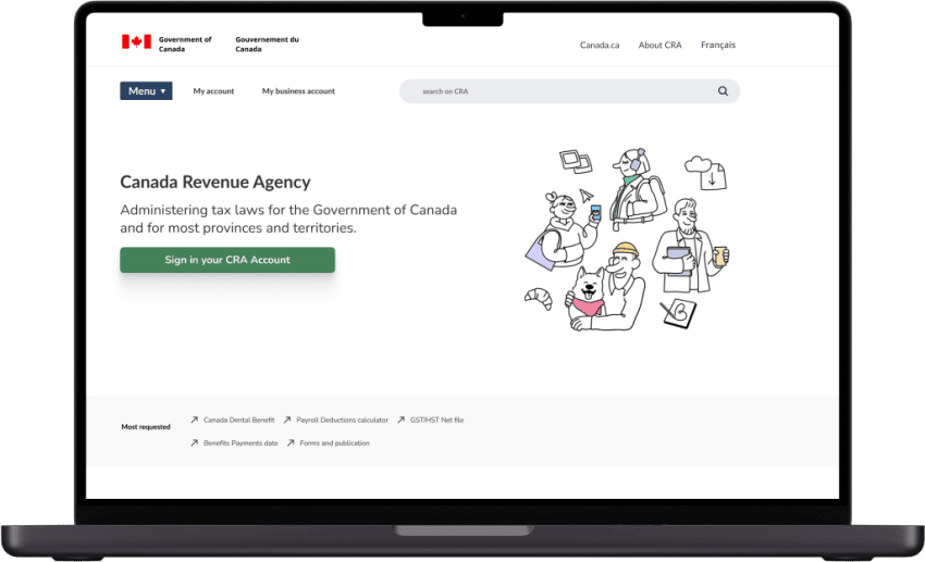
First iteration
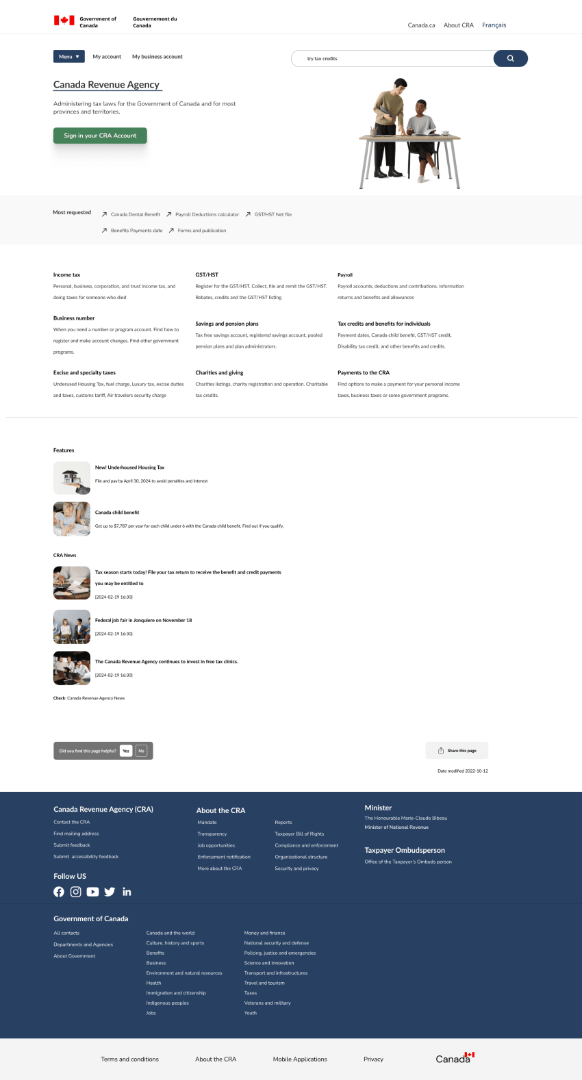
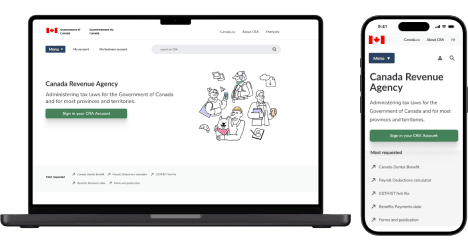
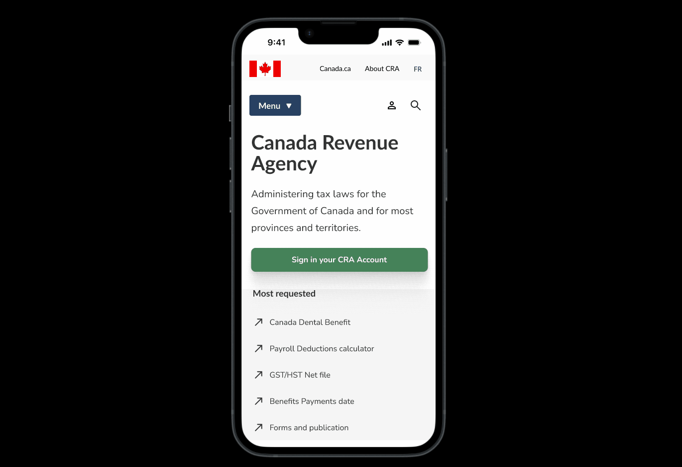
Final look
Validating the choices made with user testing
I evaluated the usability of my design through a five second test where I showed a user the main page and had them describe it. The user described the home page as “clear.” I made final adjustments for pictures and interactions while finalizing the new design system. The second round consisted of a non-moderated navigation test, with the testing I was able to see click maps which helped me understand users thought process.
The findings
Users averaged 3-9 secs for a 1-2 minute test. This showed me that users were navigating the site in a timely manner and the labeling of the navigation is clear and concise.