UX/UI Redesign for E-commerce Platform
Muhammad Tayyab
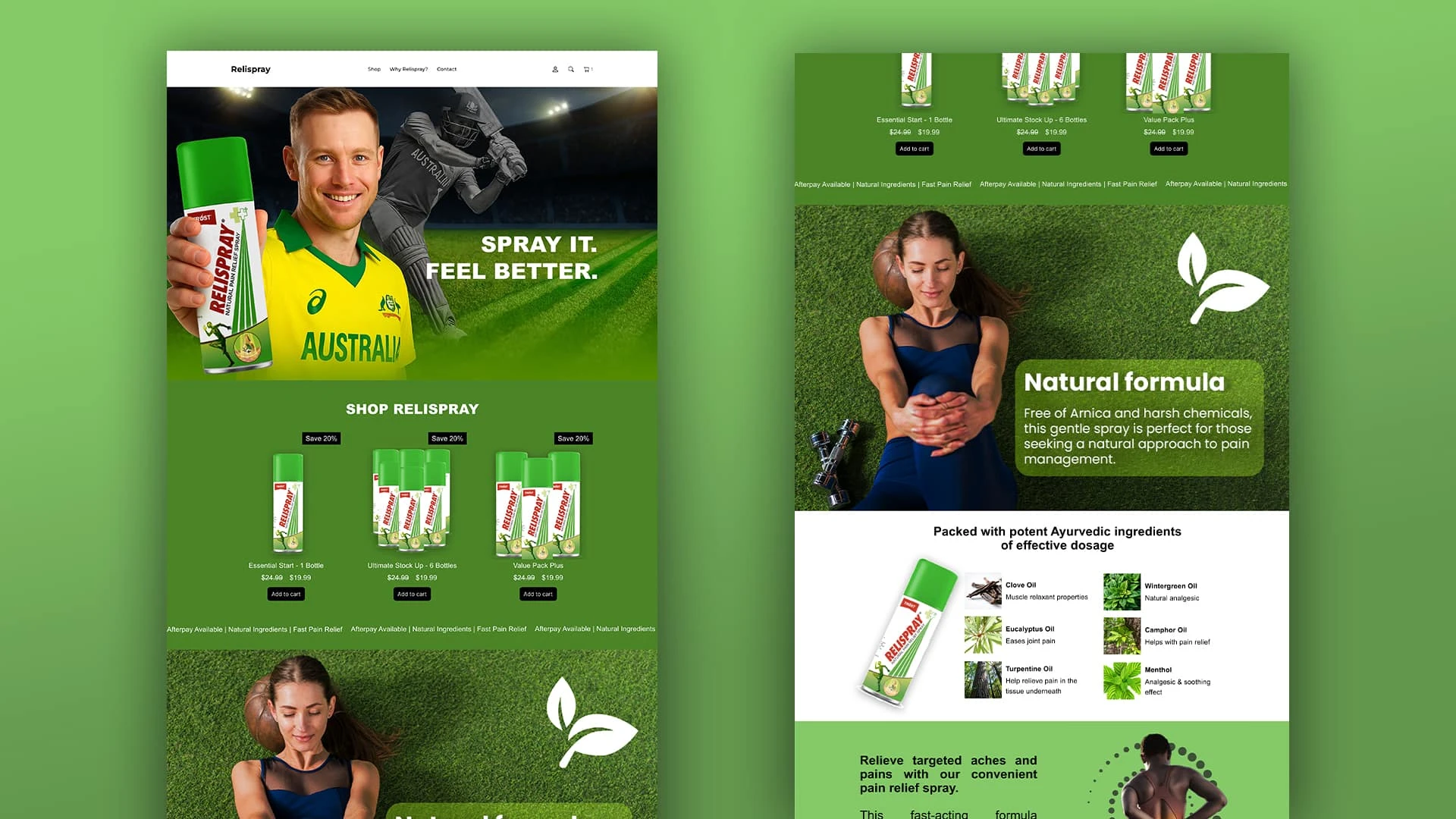
Relispray UX/UI Redesign
1. Research
Talked to the team about goals: sell more, lift order size, cut bounce rates.
Surveyed 200 customers and watched 15 people use the old site.
Noticed users struggled to find bundle deals, ingredient info, and had slow mobile checkout.
2. Planning
Created three user types: casual athlete, pro athlete, and health-focused buyer.
Streamlined menu to “Shop,” “Why Relispray,” and “Contact.”
Set clear targets:
+25% overall sales
+15% average order size
–20% product-page bounce
+30% mobile checkouts
3. Design & Prototype
Sketched layouts showing one-bottle, six-pack, and value bundles.
Built a clickable prototype with Figma for desktop and mobile.
Used big green buttons, clear “Save 20%” badges, and simple ingredient icons.
4. Testing & Tweaks
Ran 12 remote tests: tasks included finding best deal and checking out.
Added a sticky note bar: “Afterpay Available | Natural Ingredients | Fast Pain Relief.”
Darkened buttons on green backgrounds for better contrast.
5. Launch & Results (30 days)
+28% more users bought something
+18% bigger average orders
–22% fewer bounces on product pages
+35% more mobile checkouts
6. ROI Snapshot
Monthly sales before: $75 K → after: $96 K (+$21 K)
Redesign cost: $5 K
Yearly extra revenue: $252 K → 1,300% ROI
Key Takeaway:
By making the site simple and clear, we helped shoppers find deals, learn about ingredients, and check out faster, boosting sales and almost immediately paying back their costs.
Like this project
Posted May 4, 2025
Muhammad redesigned the user interface and experience for an e-commerce platform, resulting in a 30% increase in conversion rate.
Likes
1
Views
3