Interactive Notification Panel - Enhanced UX
Enhancing Notification Management with an Interactive Side Panel
·
4 min read
·
Mar 10, 2025
--
Notifications are an essential part of any digital product, helping users stay updated on important tasks and actions. However, when not designed properly, they can become overwhelming, leading to clutter and inefficiency. This case study explores how we redesigned a notification panel to improve readability, prioritization, and actionability, ensuring a seamless user experience.
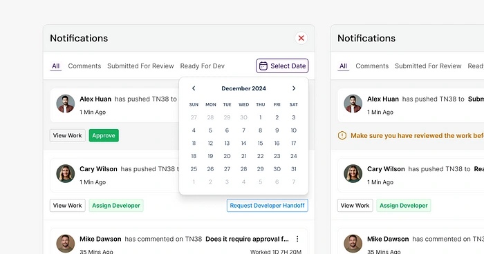
The Problem
Challenges Faced by Users
Cluttered Notifications — Users often struggle with an overwhelming number of updates, making it hard to identify critical tasks.
Lack of Categorization — Important notifications get lost in a sea of less relevant ones.
Inefficient Actions — Users must navigate to different pages to approve, assign, or respond to notifications, increasing cognitive load and workflow disruption.
Poor Visibility of Past Updates — Limited ability to access and review past notifications leads to missed tasks and reduced productivity.
User Research Insights
We conducted user interviews and behavior analysis to identify pain points in the notification management process. Key insights included:
80% of users preferred an inline action system rather than being redirected.
Users wanted filtering options to separate comments, approvals, and pending tasks.
A date-based retrieval system was necessary to access past notifications efficiently.
The Solution: An Interactive Side Panel
To address these challenges, I designed an interactive notification side panel that focuses on clarity, efficiency, and engagement.
Key Features & UX Decisions
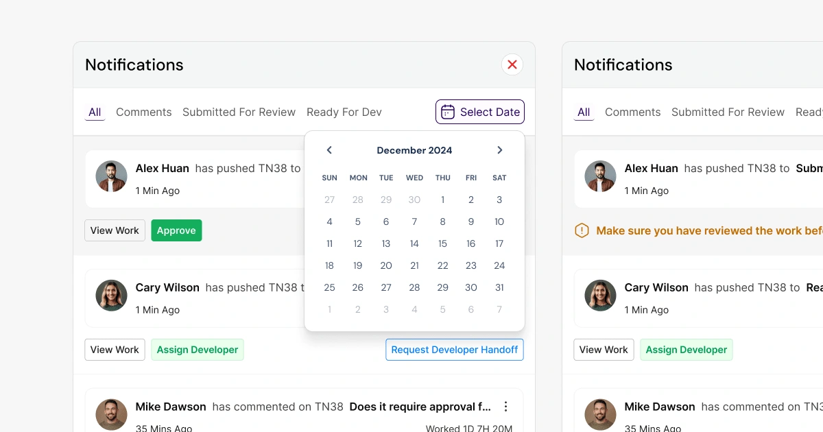
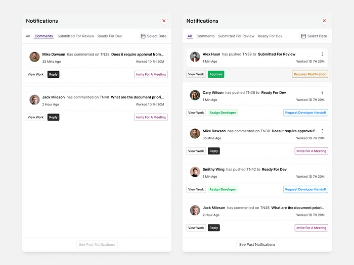
Categorized Filters 📌
Tabs for different notification types (Comments, Submitted for Review, Ready for Dev)
Allows users to quickly access relevant updates without scrolling endlessly.
Inline Actions ⚡
Users can approve, assign, reply, or schedule meetings directly from the panel.
Reduces time spent switching between different pages.
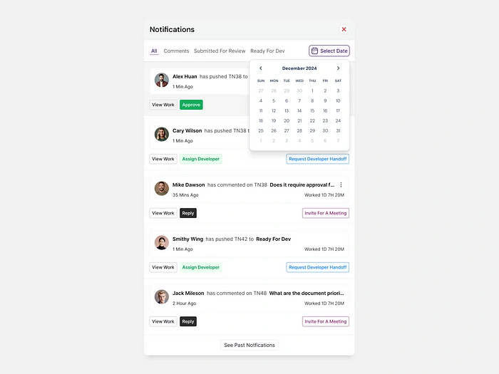
Date Selection for Better History Tracking 🗓️
Users can retrieve past notifications effortlessly, making it easier to track pending or past updates.
Improves task follow-ups and project monitoring.
Improved Visual Hierarchy & Readability 👀
Bold typography highlights important actions.
Color-coded buttons for clear distinction (Green: Approve, Blue: Assign, Pink: Meeting Invite, etc.).
Interactive hover states ensure users understand actions before clicking.
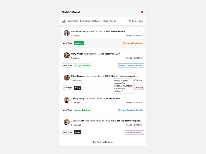
Comment Tooltip on Hover 💬
When users hover over a notification, if there’s a comment, a tooltip appears showing the message preview.
This prevents users from having to open the full notification to check comment details.
Reduces unnecessary clicks and enhances information visibility.
Design Process
We started with low-fidelity wireframes to test different layouts, ensuring: ✅ Easy navigation between filters.
✅ Smooth transitions and micro-interactions.
✅ Efficient use of space within a compact panel.
Once the wireframes were validated, we created a high-fidelity interactive prototype in Figma, incorporating micro-interactions and real-time feedback animations.
User Testing & Iteration
We conducted usability tests with 10+ target users and refined the panel based on:
Quick scan time: Users identified key notifications within 3–5 seconds.
Action efficiency: Inline actions reduced task completion time by 40%.
User satisfaction: 90% of users preferred this system over the previous design.
Comment accessibility: 85% of users found the new hover tooltip for comments useful in reducing unnecessary clicks.
The Outcome & Impact
✅ Reduced cognitive load — Users can focus on the most relevant notifications effortlessly.
✅ Increased productivity — Inline actions cut task-switching time significantly.
✅ Higher engagement — Users interact more with notifications due to a cleaner, action-oriented UI.
✅ Scalability — The panel design can be adapted for different workflows and notification types.
✅ Faster comment access — The tooltip preview feature reduced unnecessary navigation by a lot.
Final Thoughts
This redesign transformed the notification experience, making it smarter, faster, and more intuitive. By combining categorization, inline actions, improved hierarchy, and tooltips for comment previews, we enhanced how users engage with updates.
What’s Next?
We plan to iterate further by adding:
Personalized notification settings for even better customization.
AI-based prioritization to highlight the most urgent updates dynamically.
How do you prefer managing notifications in digital tools? Drop your thoughts !
Like this project
Posted Mar 18, 2025
Notifications are an essential part of any digital product, helping users stay updated on important tasks and actions.
Likes
2
Views
11
Timeline
Feb 10, 2025 - Mar 2, 2025

