Eisy Global Website Redesign

Dominion Ogbaji


Overview
Eisy Global is a cutting-edge fintech platform that empowers businesses and individuals to seamlessly manage cryptocurrency transactions, virtual dollar cards, and global money transfers.
Goal
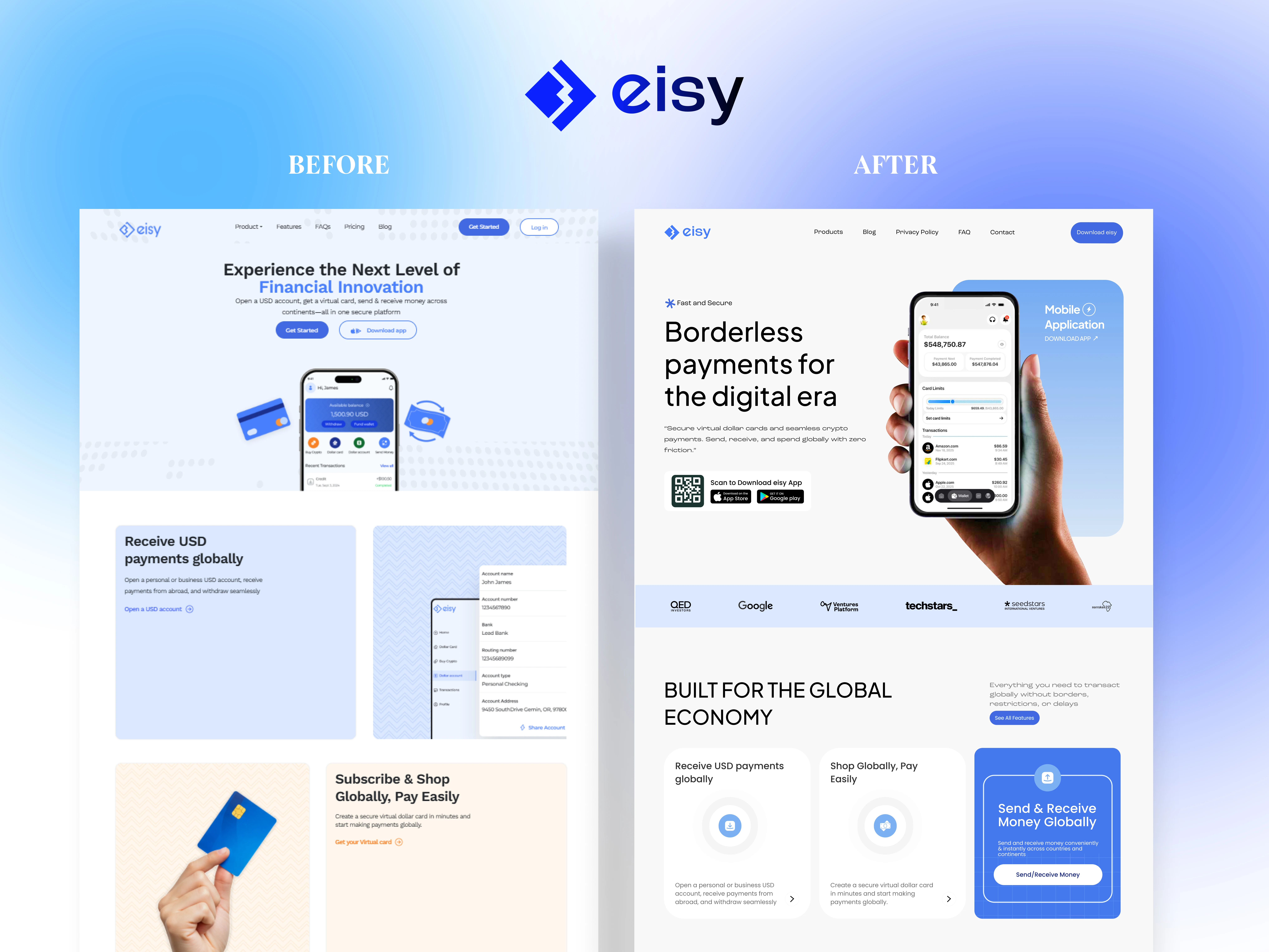
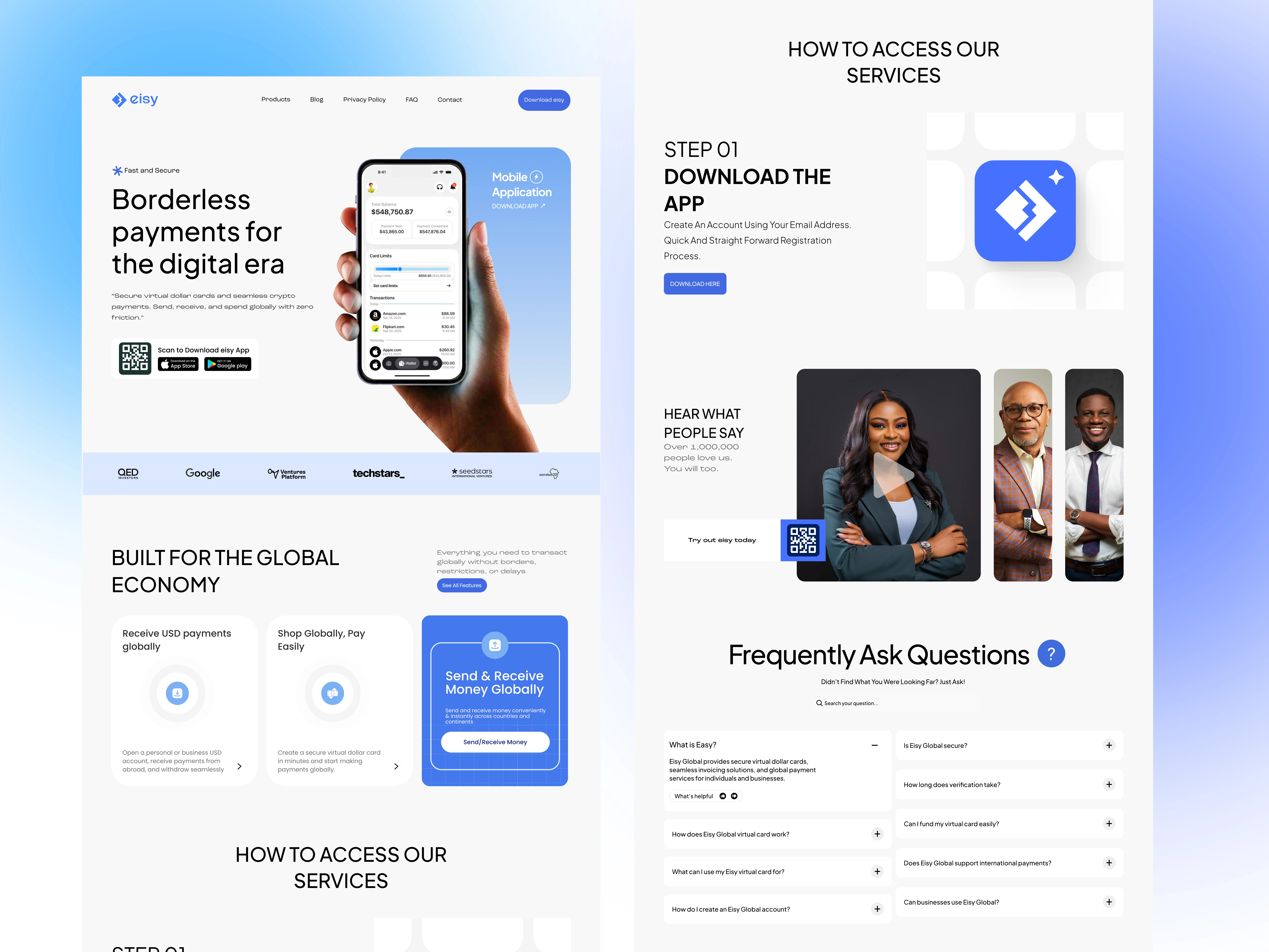
The primary goal of the Eisy website redesign was to transform the digital presence from a generic fintech landing page into a world-class, conversion-focused platform that clearly communicates Eisy's unique value proposition: "Borderless payments for the digital era."
Specific objectives included:
Establish immediate trust and credibility through modern, professional design
Simplify the user journey from awareness to app download
Highlight key differentiators (no KYC, instant virtual cards, crypto integration)
Showcase social proof through partner logos and testimonials
Create a mobile-first experience that reflects the product's mobile nature
Challenges
Complex Value Proposition: Eisy offers multiple interconnected services (virtual cards, crypto payments, USD accounts, global transfers), which makes it challenging to convey everything without overwhelming visitors. The original design suffered from information overload and lacked a clear hierarchy.
Trust Barrier: Operating in the fintech/crypto space targeting emerging markets where financial scams are prevalent meant users needed immediate reassurance. The previous design lacked credibility signals and looked too generic to inspire confidence in handling financial transactions.
Global vs. Local Balance: Needed to appeal to both local markets (Nigeria, Africa) facing specific payment challenges, while maintaining a global, premium aesthetic that works for international partnerships and users.
Design Solutions Implemented:
Hero Section Transformation: Created a bold, benefit-driven hero section with the headline "Borderless payments for the digital era" that immediately communicates the core value. Integrated prominent app store download buttons with QR code for instant mobile access.
Visual Hierarchy & Storytelling: Restructured content into a clear narrative flow—moving from problem (borderless payments) to solution (how Eisy works) to proof (partner logos). Each section now has a singular focus with compelling visuals.

Business Impact:
Increased Conversions: The redesign resulted in a significant improvement in app download rates by 39% due to clearer CTAs and reduced friction in the user journey
Enhanced Brand Perception: Positioned Eisy as a premium, trustworthy platform rather than just another fintech startup
Better User Understanding: Simplified messaging reduced confusion about what Eisy offers, leading to more qualified sign-ups
Competitive Advantage: The distinctive design language helped Eisy stand out in a crowded marketplace
Scalable Foundation: Created a design system that can grow with the product as new features are added
Key Learnings:
Clarity trumps comprehensiveness: Even with multiple features, focusing on one core benefit (borderless payments) created a stronger impact than listing everything
Check out the live site here
Like this project
Posted May 21, 2026
I redesigned Eisy's website, transforming a generic fintech presence into a compelling, conversion-focused platform, increasing app download conversions by 39%.