TECHIIA
Daria Shaina
What's the purpose?
Techiia is a Ukrainian word meaning "Water stream" and symbolizes constant motion forward, flexibility and strength. The main goal was to convey the idea of a synergy between technology and nature in a single visual device.
What's the meaning?
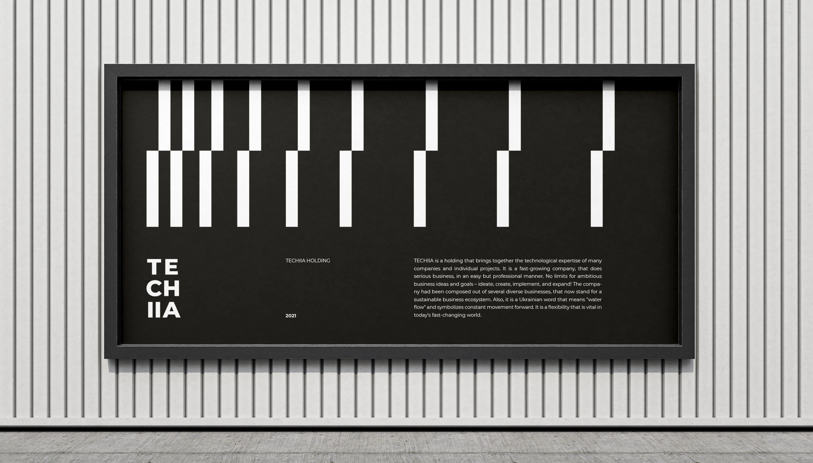
The identity is based on the Doppler effect idea (the phenomenon of the change in frequency of a wave in relation to an observer who is moving relative to the wave source).

Doppler Effect visualisation
This effect shows the meaning of Techiia as a constant movement forward. So, this effect became a basis in the grids and patterns of the brand identity.

A grid that based on the Doppler Effect
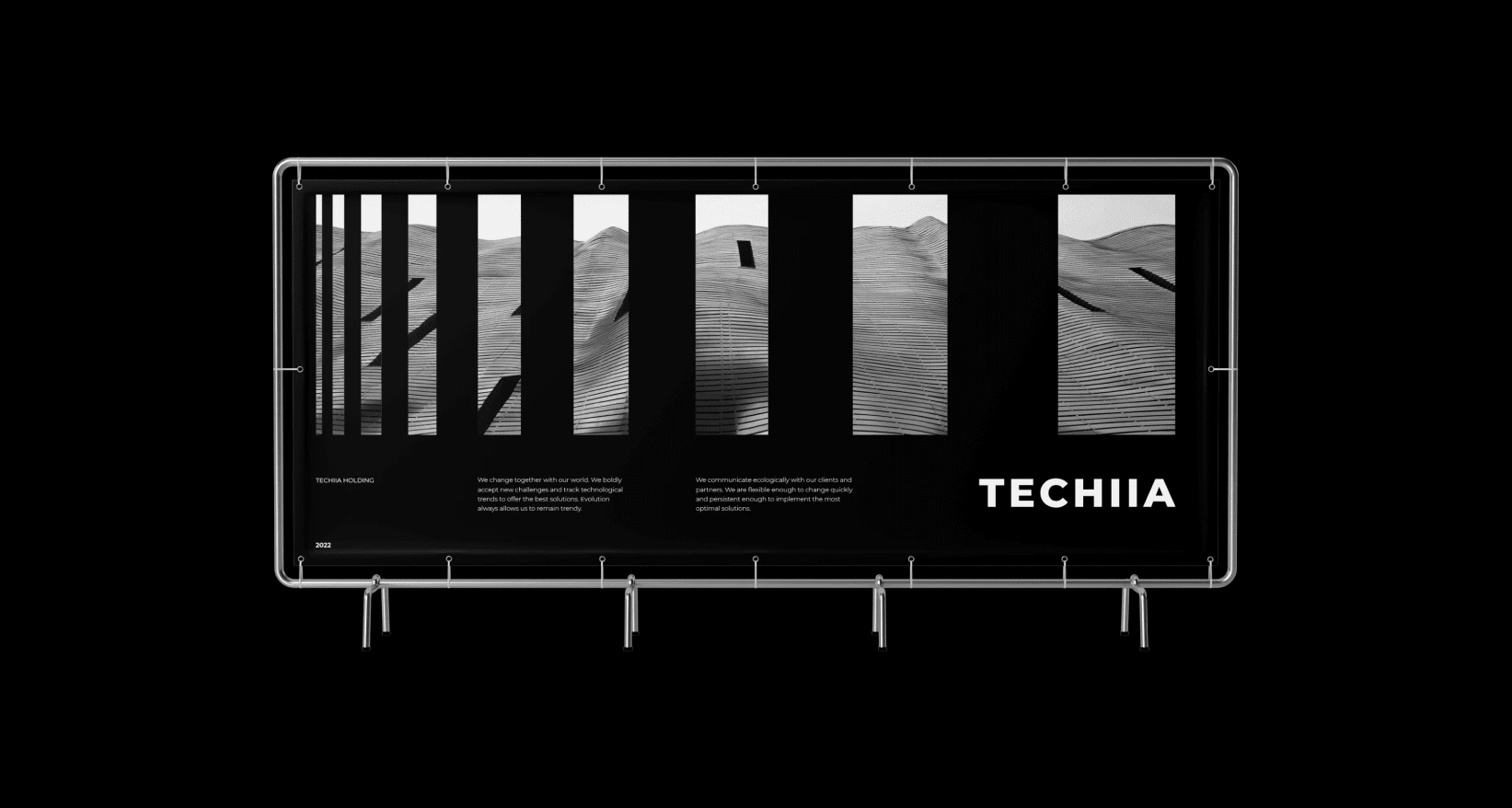
Stationary materials
A variety of stationary materials have been created and printed for Techiia Holding. The collection of printed materials includes business cards, forms, banners, posters, and others. Each item has been carefully crafted to reflect the company's values, mission, and visual identity.


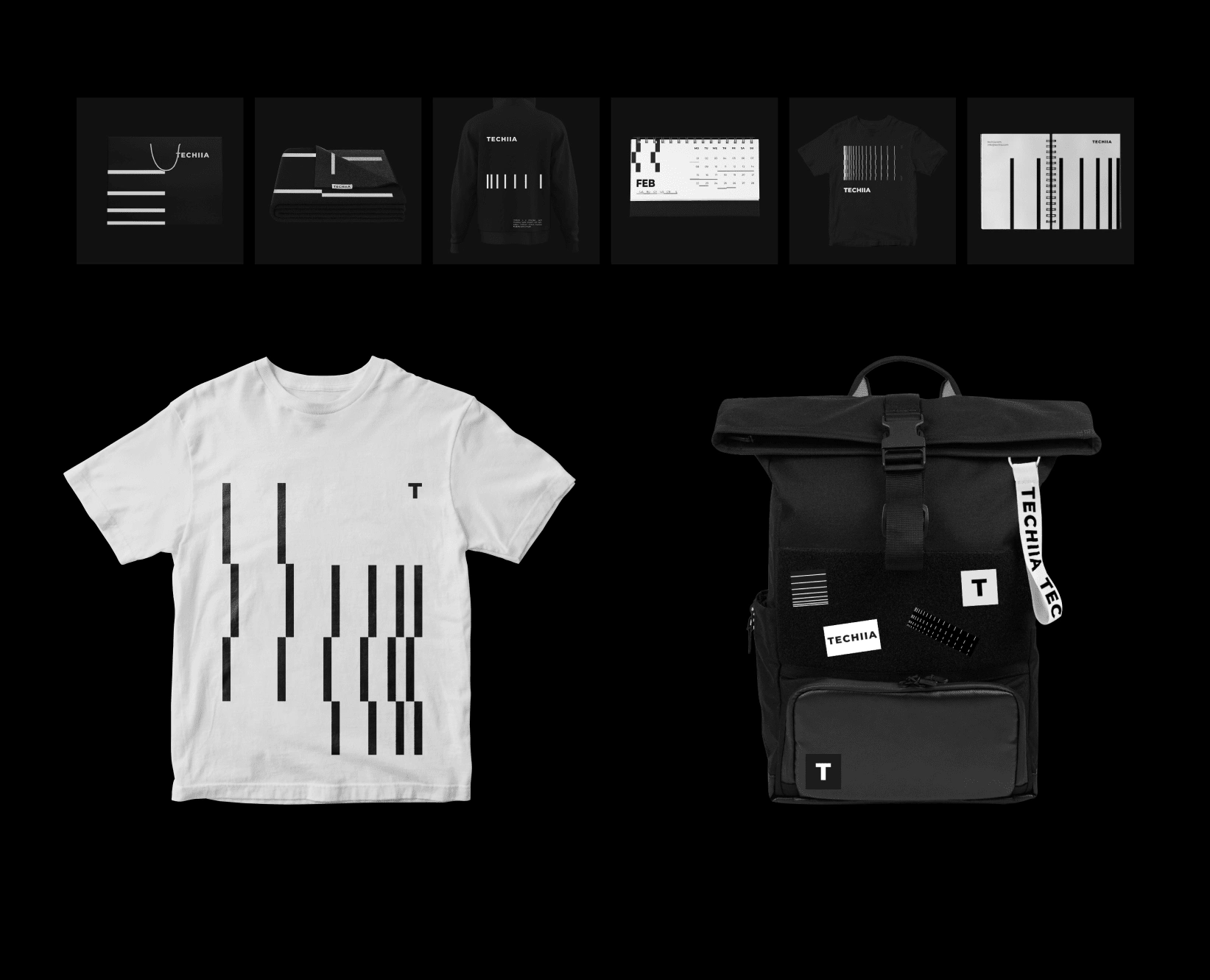
Merchandise
Below you can find branded merchandise layouts that were done during the work with the brand identity.
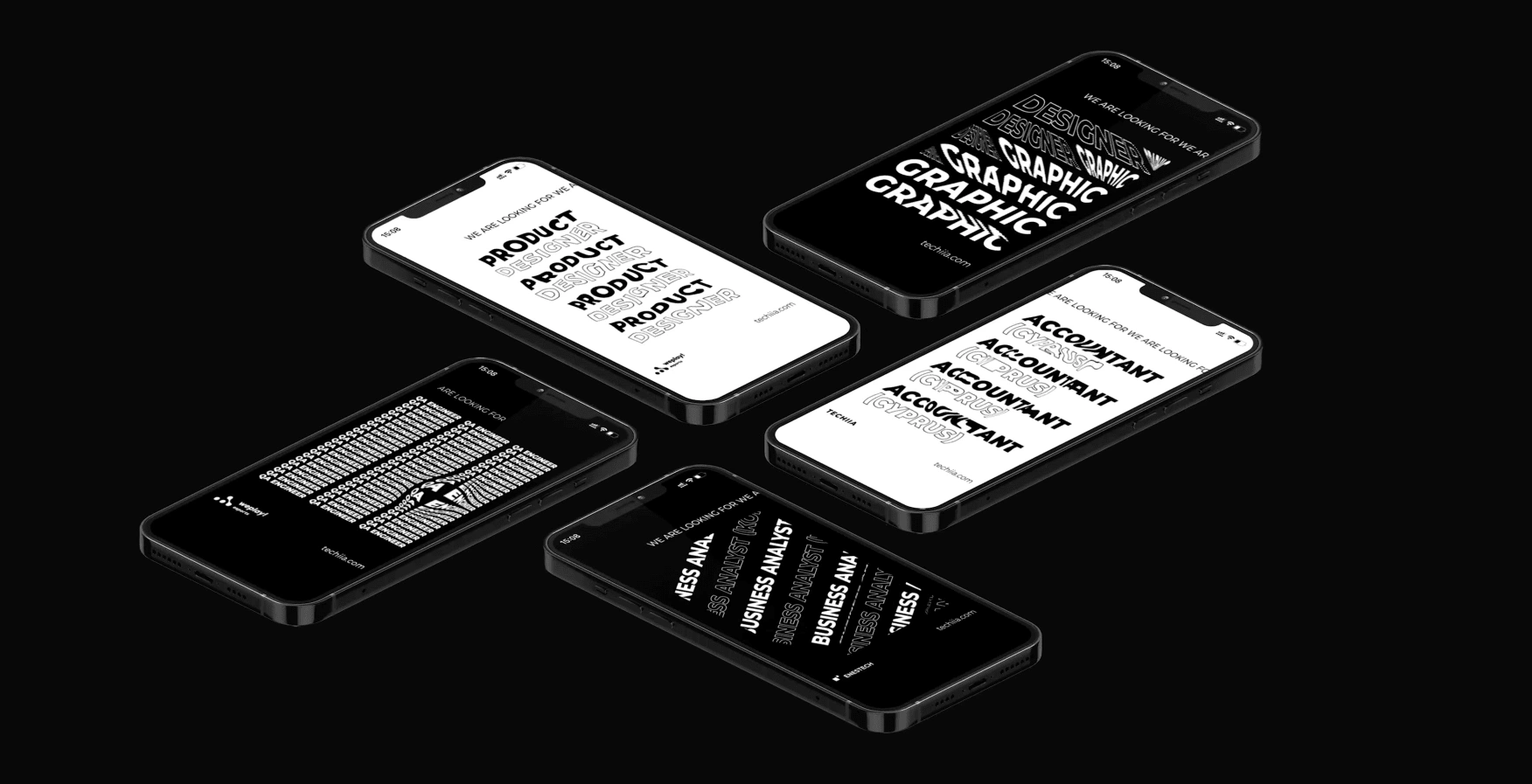
Social media
During the work on this brand identity, an exciting range of branded social media materials was developed that combined animated patterns and kinetic typography. Such a style creates a dynamic and captivating visual experience for your online audience.
Do you want to see an animated version? Click here:
🏅Awards:
Red Dot 2021 award. Check here
ADC*UA 2021 awards
2022
Like this project
Posted May 17, 2023
Developed various print materials such as brochures, flyers, and business cards for an international corporation. Utilized the company's existing brand guide
Likes
0
Views
6
Clients
TECHIIA Holding