D.Luxe Aesthetics: Premium Clinic Website Redesign

Talia Przybyszewski


D.Luxe Aesthetics
The Brief
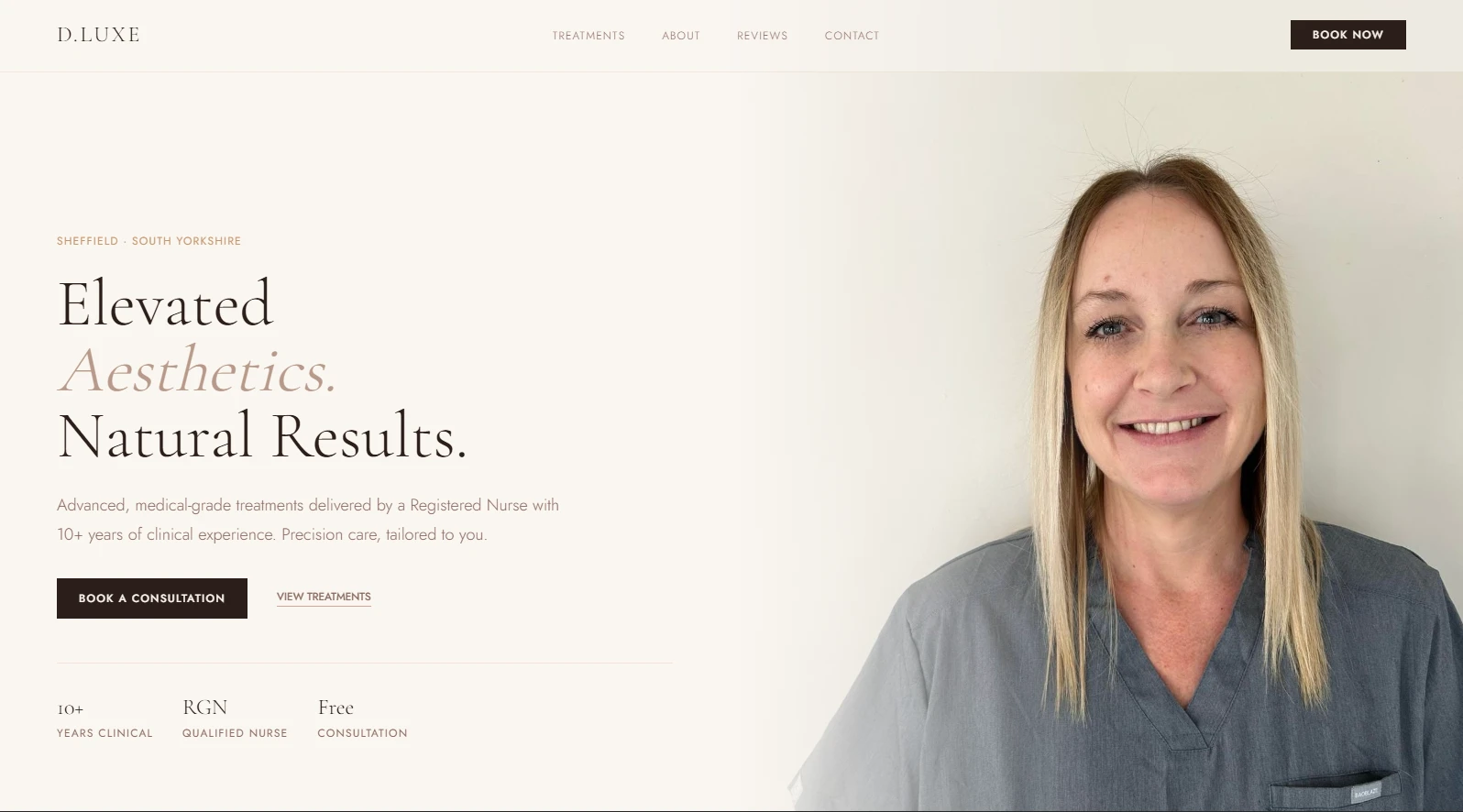
D. Luxe Aesthetics needed a digital presence that felt more aligned with a premium, modern clinic experience.
The goal was to create a site that balanced trust, luxury, and clarity — helping potential clients quickly understand treatments, feel confident in the brand, and move naturally toward consultation or booking actions.
A key challenge in aesthetics is that websites can often feel either overly clinical or overly generic. The aim here was to create something that felt warm, elevated, and premium while still remaining approachable and conversion-focused.
The site needed to communicate professionalism, reinforce trust, and better reflect the quality of the in-person brand experience.
The Problem / Goal
Primary goals were:
Improve overall online brand presence
Create a more premium and trustworthy first impression
Present treatments more clearly
Make navigation simpler and calmer
Increase booking confidence through stronger UX and CTAs
Better position the clinic as a modern aesthetics brand
My Process
I approached the redesign through both design and frontend engineering.
1. Brand-led UI Direction
The interface was designed around a softer luxury aesthetic:
Clean whitespace
Warm neutral tones
Refined typography
Calm visual hierarchy
Premium but approachable interaction patterns
The aim was "modern London aesthetic lab" rather than generic salon styling.
2. Conversion-Focused UX
The site structure was designed to reduce friction.
Clear pathways were created for:
Treatments
Trust signals
Clinic information
Consultation CTAs
Contact flow
The goal was to help users move from discovery → reassurance → action.
3. Scalable Frontend Build
The project was developed as a responsive frontend experience with reusable sections, smooth interactions, and a polished mobile-first layout.
This helped maintain long-term flexibility for updates and content growth.
Design Decisions Worth Calling Out
Soft luxury palette instead of harsh medical whites
Spacious layouts to reduce visual clutter
Premium motion and micro-interactions
Strong CTA hierarchy
Trust-first content positioning
Responsive across breakpoints
Clear treatment grouping for usability
Tech Stack
Next.js
React TypeScript
Tailwind CSS
Responsive frontend systems
Outcome
Because this was a real client-facing project, the biggest outcome was creating a stronger digital identity that better reflected the premium nature of the clinic.
It improved:
Overall online presentation
Brand consistency
User trust
Mobile experience
Service clarity
Conversion-focused structure
It also gave the client a more polished and scalable foundation for future growth.
Like this project
Posted May 25, 2026
A premium clinic website redesign focused on trust, calm UX, and stronger conversion-led digital presence.
Likes
0
Views
17
Clients
D.Luxe Aesthetics