UPS Brand Packaging design
Kartik Sisodiya
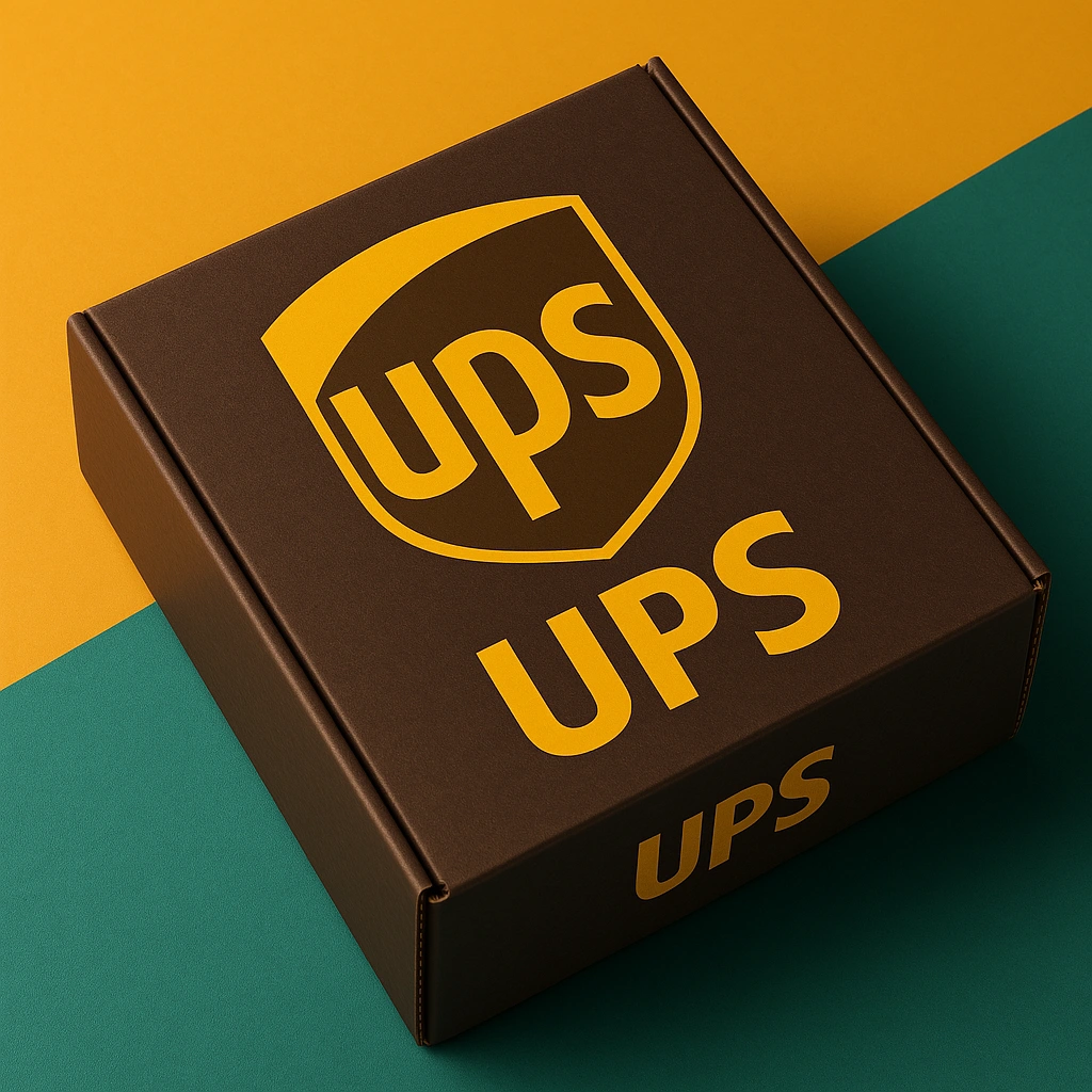
📦 Brand Packaging Design – UPS Conceptual Showcase
👉Overview:
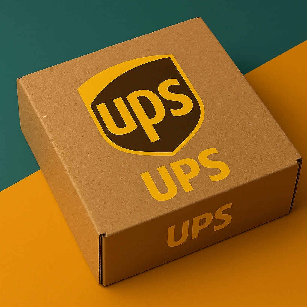
This design explores the timeless strength and recognizability of the UPS brand.
✓The visual features a sturdy brown cardboard box prominently adorned with the iconic UPS shield logo.
✓The logo, rendered in a bold yellow typeface, is enclosed within a sleek, dual-tone shield—symbolizing trust, speed, and reliability. Below the shield, the brand initials are reiterated for emphasis, enhancing instant brand recognition.
👉Design Highlights:
✓Color Palette: Deep brown and golden yellow—a nod to tradition, dependability, and logistics heritage.
- Structure & Layout: Balanced, minimalistic presentation that keeps the focus on brand identity and clarity.
✓Background Styling:
A diagonally split, mustard yellow and teal green backdrop adds vibrancy while drawing attention to the core packaging design.
✓The colors contrast subtly with the brown package, creating visual interest without overpowering the main subject.
👉Purpose & Aesthetic Direction:
This piece was crafted to reflect clean, professional branding within a real-world application—showcasing how classic logos adapt to modern packaging standards.
✓Perfect for highlighting reliable service and brand integrity, this concept celebrates functionality through simplicity.

Like this project
Posted Aug 31, 2025
Do you need Logo Design for your Business, please contact me on the message through.
Likes
1
Views
1
Timeline
Aug 24, 2025 - Aug 26, 2025