Tinder
Introduction
During my time there I worked on the Revenue team and Growth team and worked on a wide variety of projects ranging from a new subscription tier to a notification center to a multiplayer swipe experience. I was also promoted from a Product designer to Senior Product designer where I began to manage junior designers, play a crucial role in the feature ideation phase with the product team, and larger design team activities.
Tinder Platinum
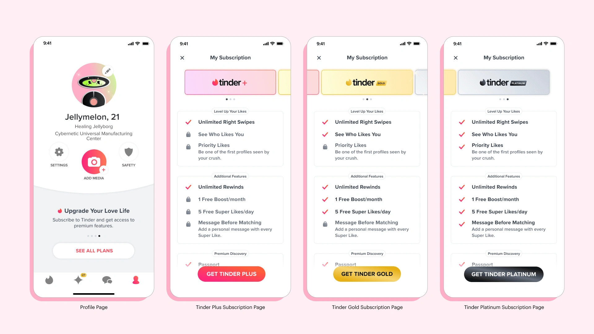
The first project I worked on at Tinder was building a brand new subscription tier called Tinder Platinum. We wanted to provide a premium service for some of our highest intent users who, might otherwise, still struggle on the app. We created a new set of features that would level up the most crucial actions a user could take on Tinder to help lead to a higher success rate at meeting up with your matches in real life (which was what our users expressed to us as being the most important thing for them).
We interviewed users and conducted large scale research of our paying members in order to understand demographic information, what part in the journey users were struggling, and what they wanted help with the most. We looked at the number of matches users received, the number of two way conversations between matches, and how much users were spending and what products they were buying.
Subscription Merchandising Page
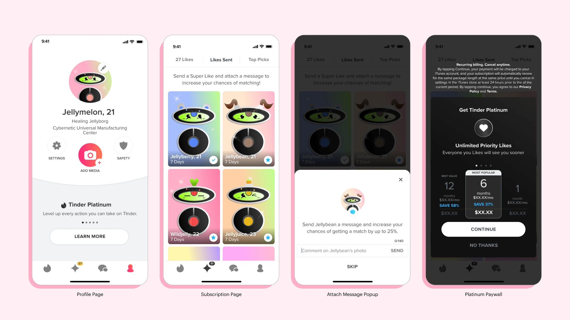
Users had expressed that they were confused about what the difference was between our subscription tiers and didn't know what features came with each tier. This led to them not knowing which subscription was best for their specific needs. With the addition of Tinder Platinum, that confusion only grew. To solve for this issue, we created a new way for users to view all of our subscriptions in a side-by-side comparison clearly laying out the benefits of each tier.
We began by auditing all of our listed benefits and dividing them by subscription tiers. Then further categorizing them into coherent groups making it easier to digest all of the information. Then after categorizing the features we listed them based on importance as expressed by our users in surveys we conducted.
We saw an increase in subscriptions of our higher tiers and revenue after launching this project. An added benefit internally, was the proof that creating experiences focused on user education could have significant revenue benefits, as well as, customer satisfaction.
Notification Center
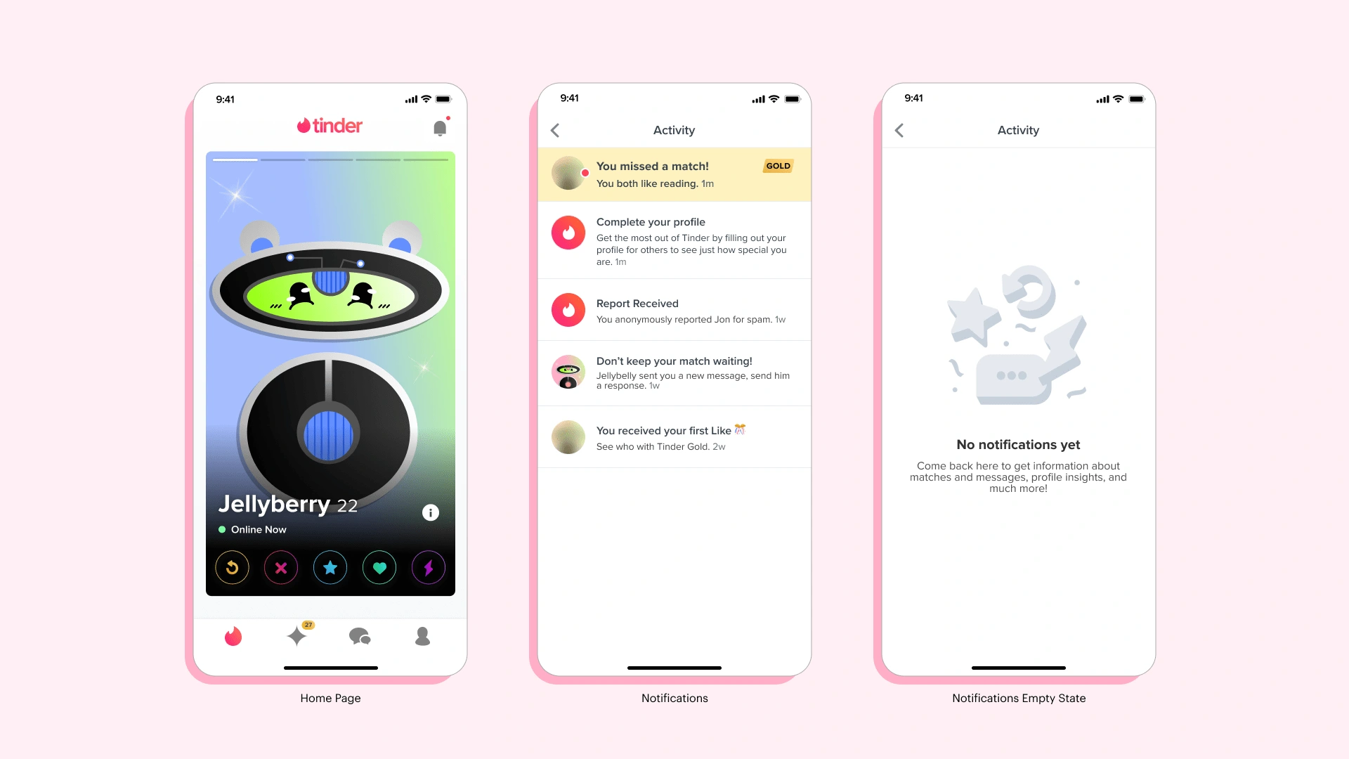
We created a Notification Center to help users navigation all in app communication around Likes, Matches, Messages, Features, and Profile insights in a central location.
Swipe Party
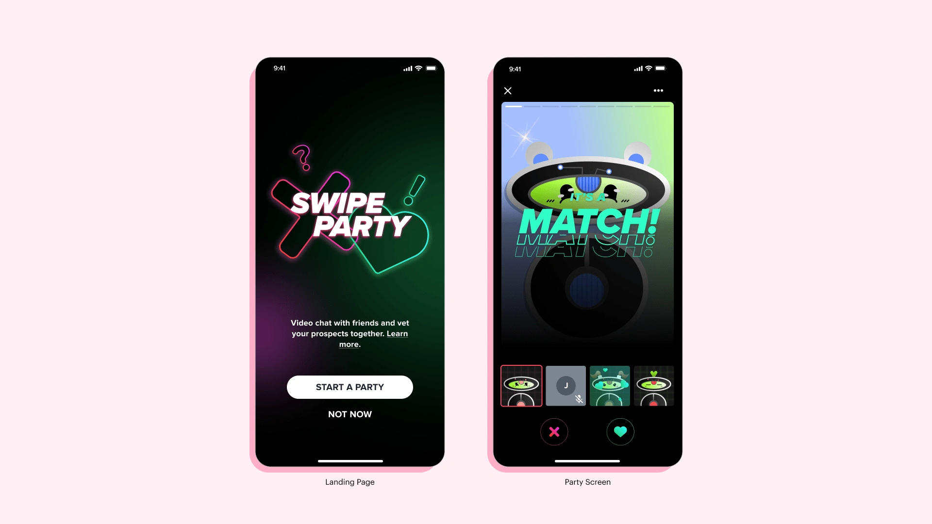
An important part of finding the right match can be getting the approval of your friends. Based on interviews, we knew that people would often show their friends profiles they had recently matched with to get their opinions. We even heard that some users would allow their friends to swipe for them. Because of this, we created a novel feature for groups of friends to bring this experience into the app itself. Swipe Party would allow the host to invite up to three friends who could all video chat together while viewing the host’s recommended profiles. Friends could also send reactions to have an interactive role in the experience. This was also part of expanding the Explore Page to provide users with unique ways of swiping on Tinder based on their specific needs and goals. [This feature was only tested among a small number of users.]
Like this project
Posted Aug 30, 2023
Senior Product Designer at Tinder.

