Website Redesign: Enhancing The Website Experience For Pay4Me
Overview
Pay4Me is a Fintech company that helps international students make seamless cross-border payments.
Their current website design is outdated and lacks intuitiveness & proper information architecture, so customers who get to their landing page, find it difficult to under what exactly the business offers.
Redesign Goals
Enhance Information Architecture
Improve Content Clarity
Enhance User Interface
Enhance Overall User Experience
Visual Journey
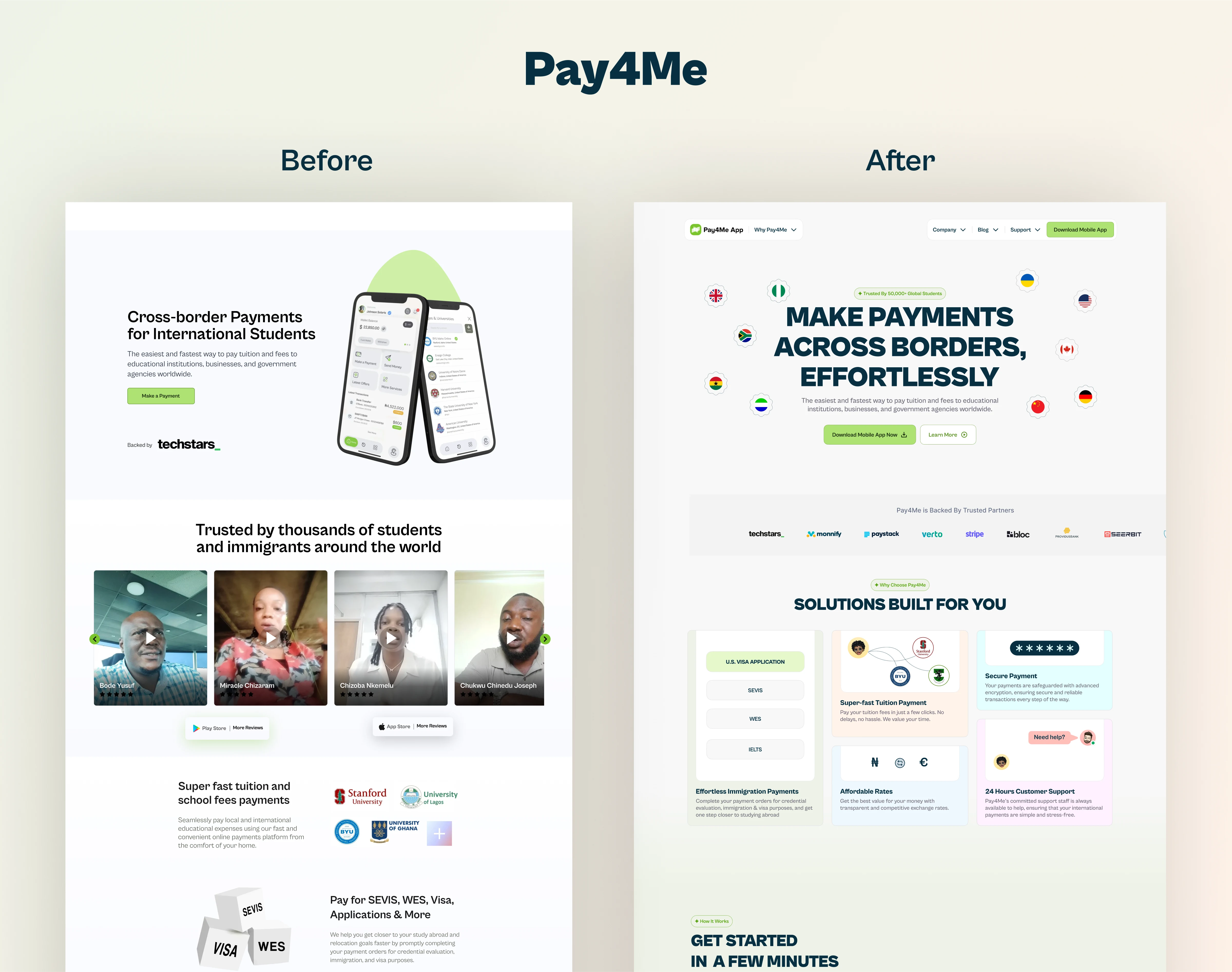
Old Design
Here is a snippet of what some of what the old landing page designs look like before the revamp

New Designs
Let me walk you through my redesign process and justify my design choices:
Hero Section
I wanted this section to grab attention immediately. The headline is bold and straight to the point, telling users what Pay4Me is all about. There’s also a subheading to elaborate, plus two CTAs: one to download the app and the other to learn more about Pay4Me.
To make the global payments focus visually clear, I added country flags alongside the hero visuals.
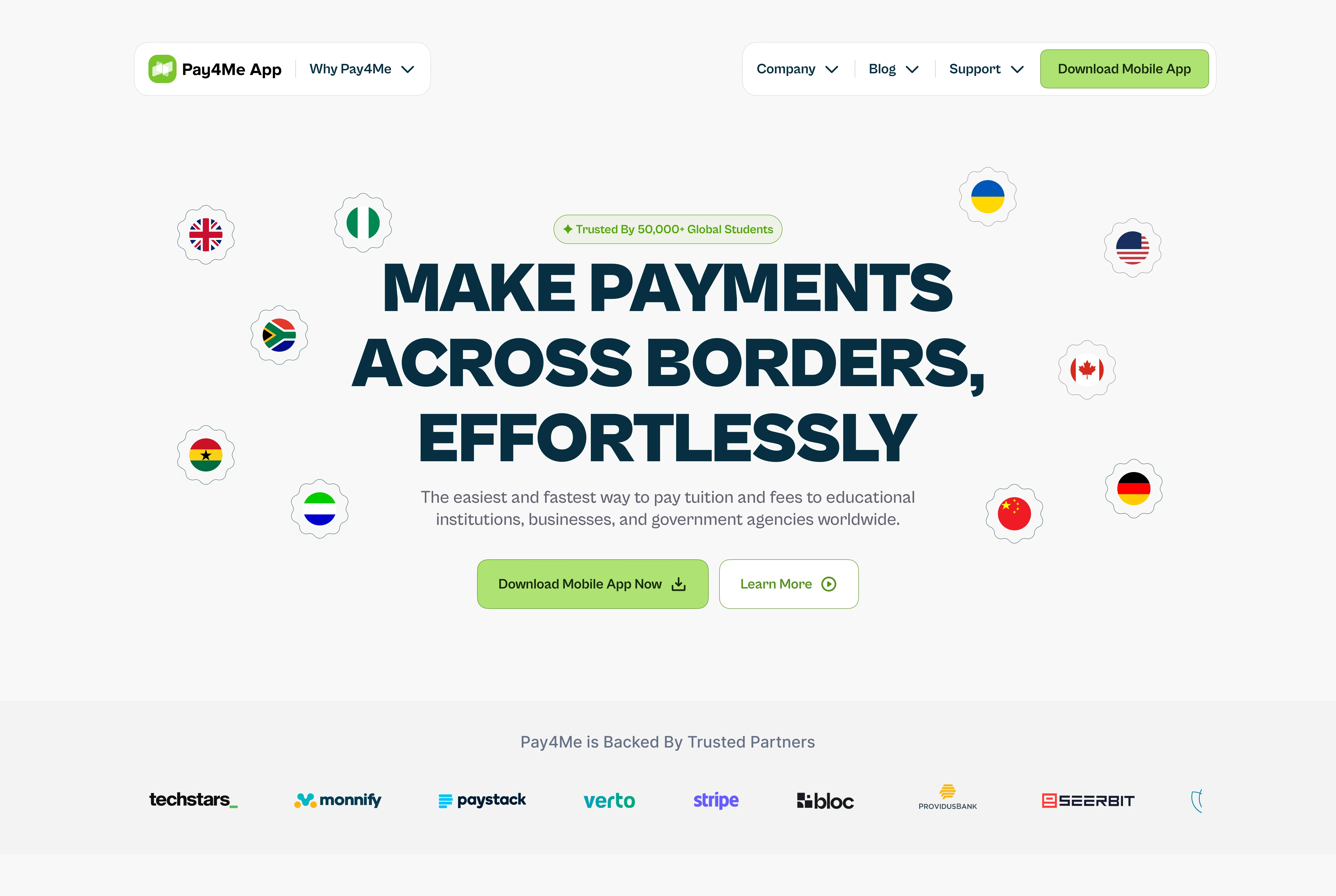
Featuring the “Trusted Partners Section” which is a small section but an important one. I moved logos of trusted partners upfront because users are more likely to trust a company when they see recognizable names associated with it.
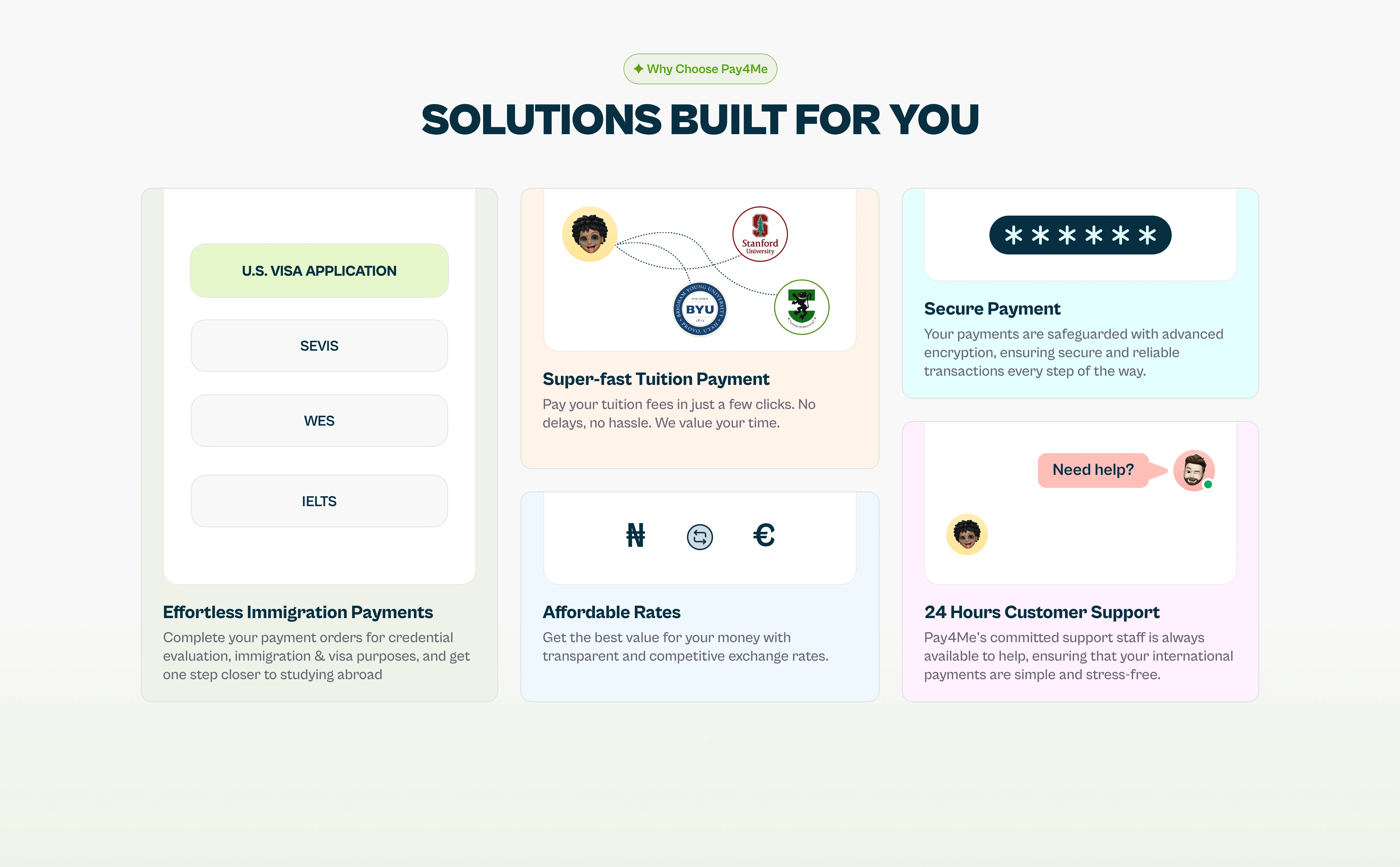
Why Choose Pay4Me?
The heading reads “Solutions Built Just For You,” and this section highlights key features like. To avoid overwhelming users with too much text, I kept the copies short and used animated cards to make the section interactive and engaging.
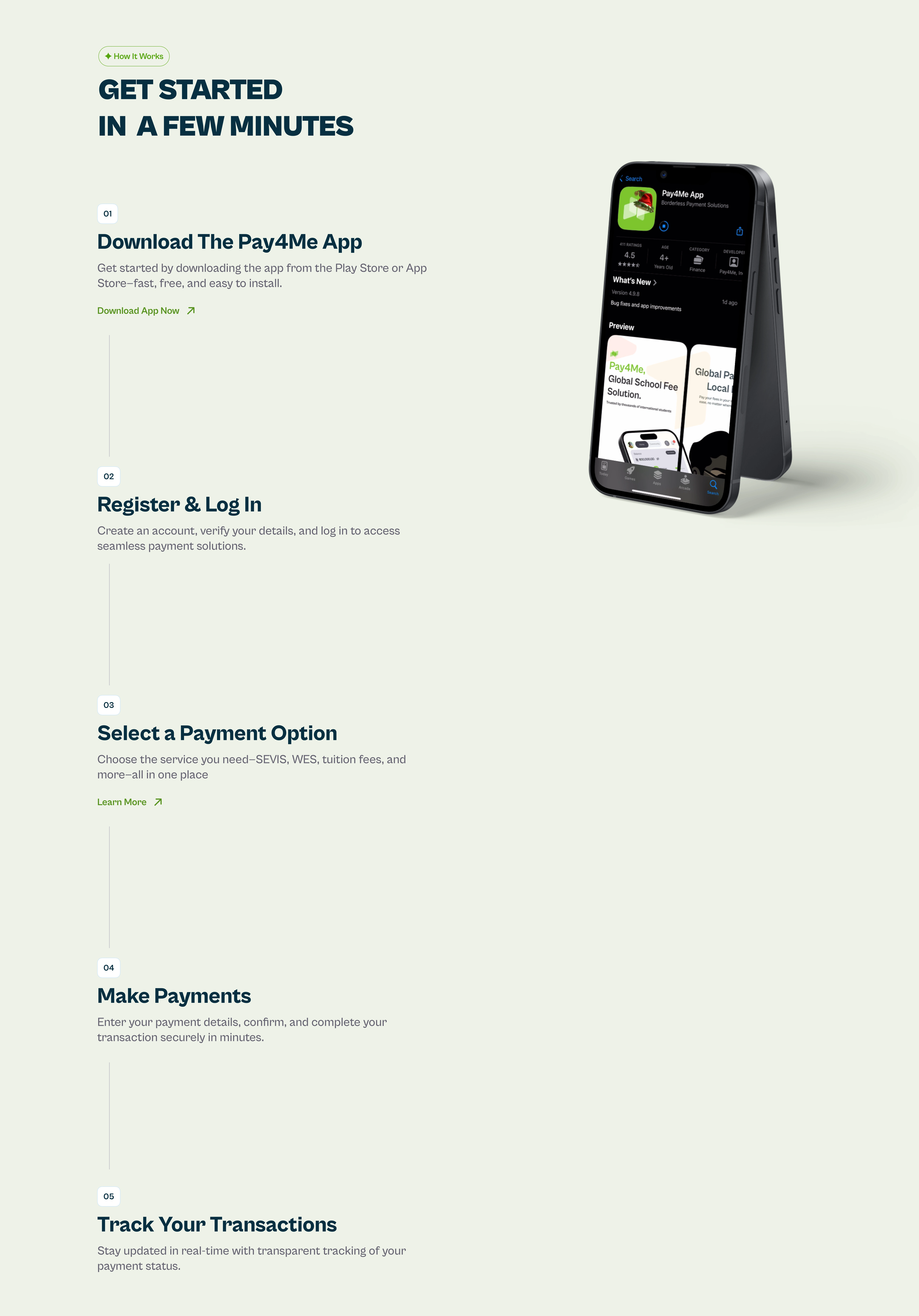
How It Works
The subheading, “Get Started In A Few Minutes,” introduces a step-by-step guide on how to use Pay4Me. Each step is paired with short text and a visual—an animated scroll with a mobile app mockup on the side.
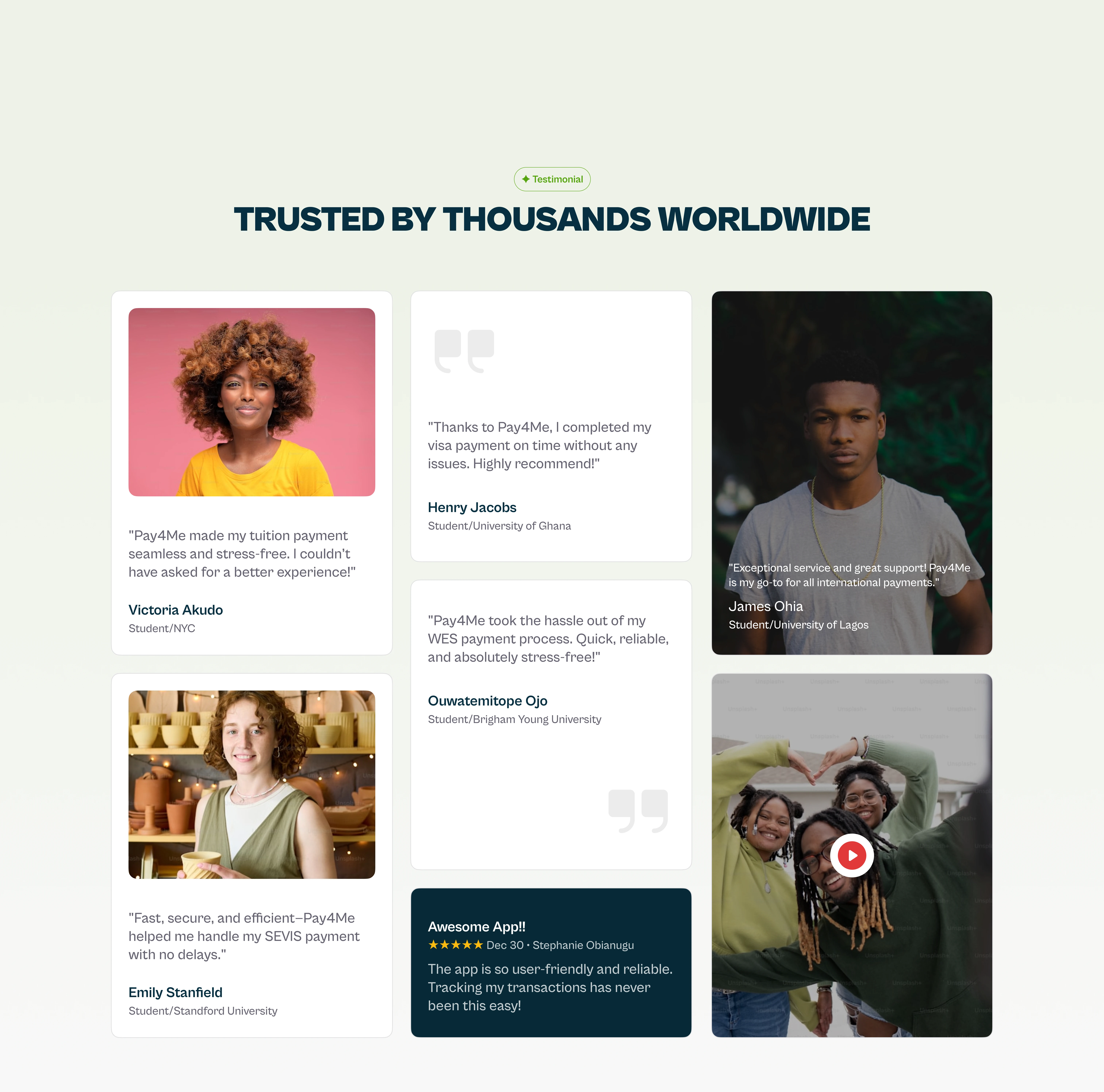
Testimonial Section
The heading is “Trusted by Thousands Worldwide.” I included different types of testimonials: plain text, text with photos, a highlight from the App Store, and even a video testimonial. This variety adds credibility and relatability.
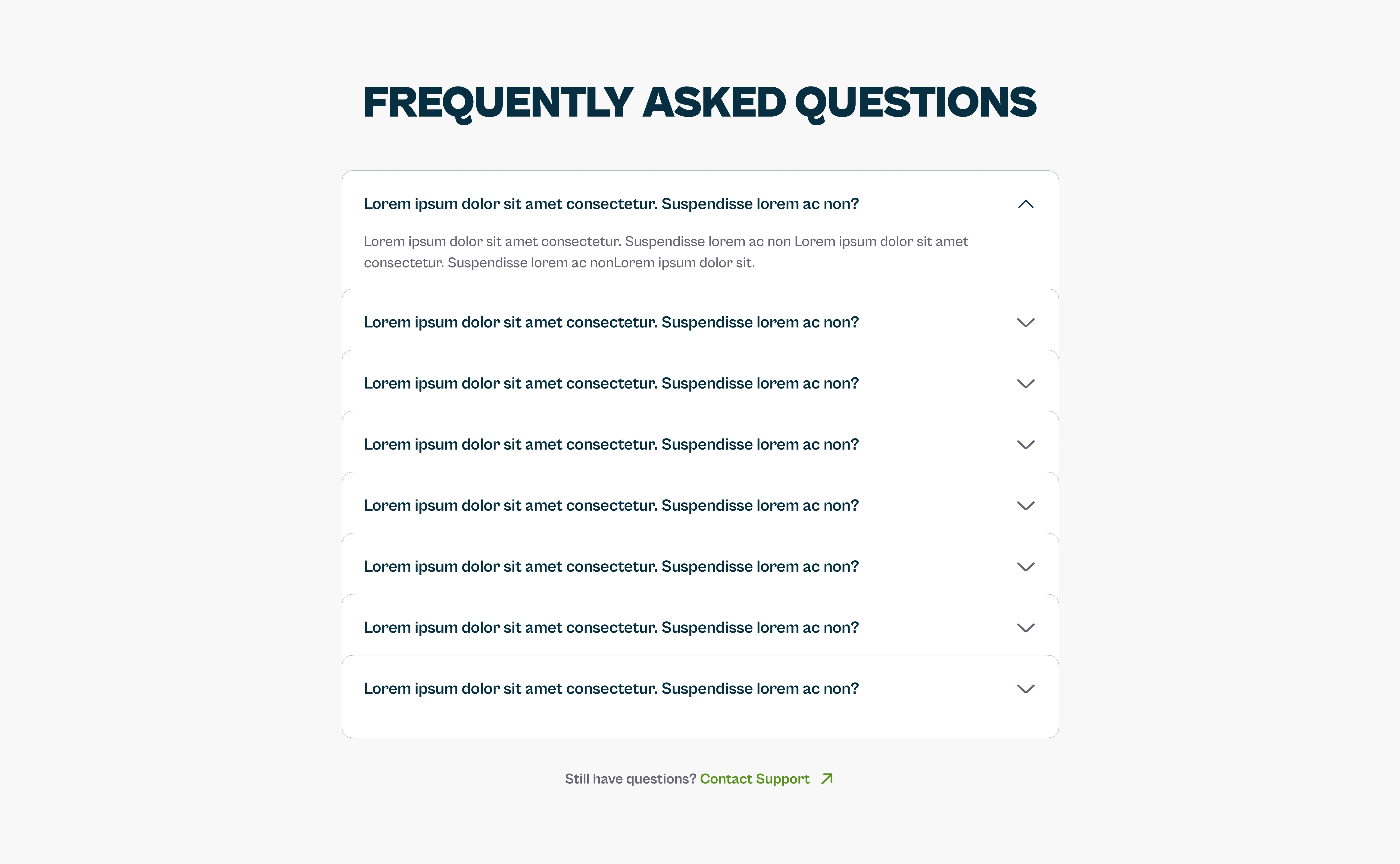
FAQ Section
This section lists common questions users might have and ends with a button saying, “Still Have Questions? Contact Support.”
CTA Section
This is a simple section encouraging users to download the app. It features a QR code and App Store buttons.
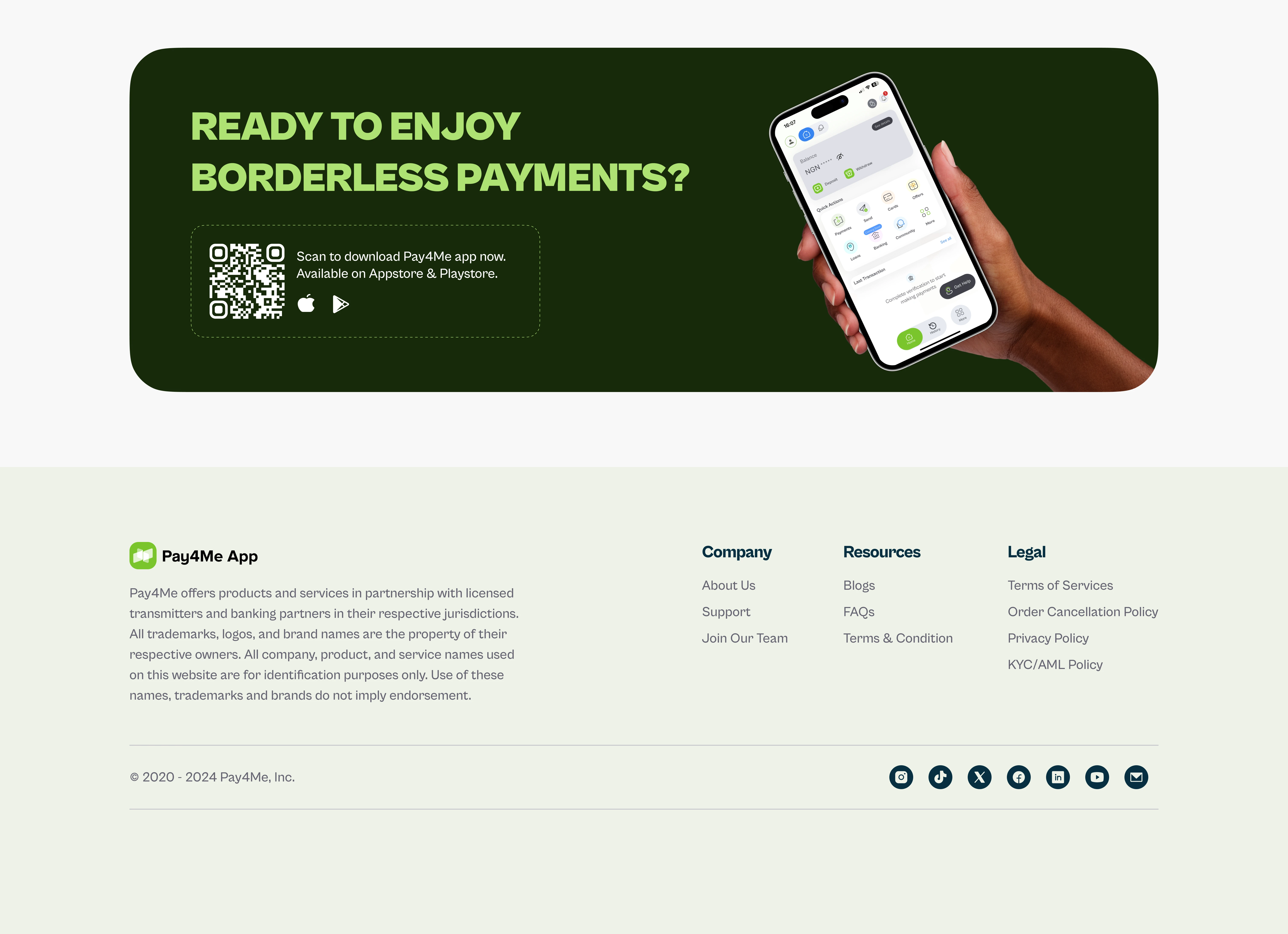
The footer includes all necessary links like About Us, Support, and Legal.
Check out the prototype with cool animations here: Prototype Link
Like this project
Posted Mar 3, 2025
Redesigned the Pay4Me website to improve information architecture, user experience, and aesthetics, leading to better engagement and higher conversions.
Likes
2
Views
9
Timeline
Dec 29, 2024 - Dec 31, 2024
Clients
Radius, formerly Pay4Me App

