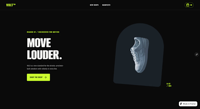
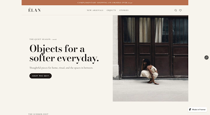
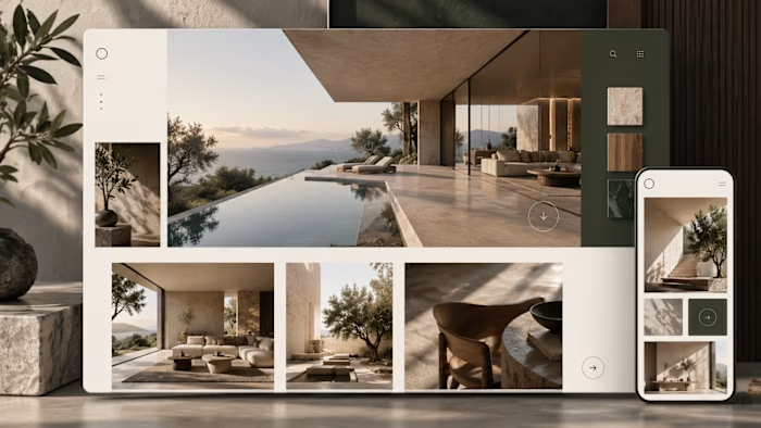
Framer UX/UI Design for Créaté AI UGC Platform

Abdul Rehman


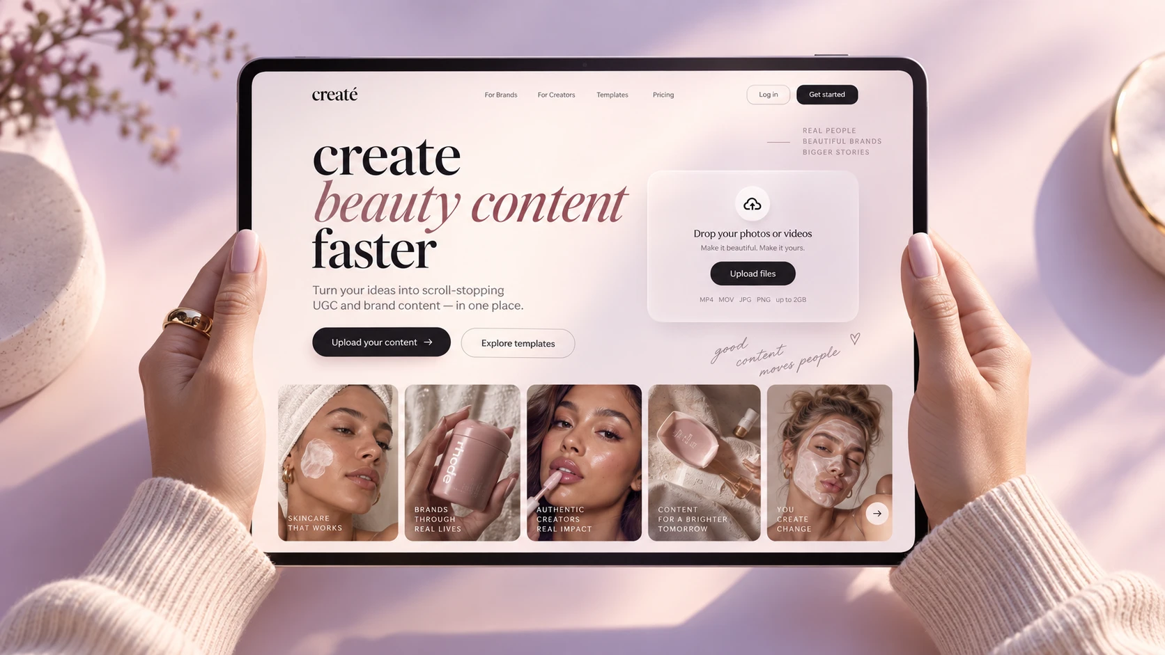
Créaté — Framer UX/UI Design for an AI UGC Platform
Framer Website & Product UX/UI for an AI UGC Platform
Summary
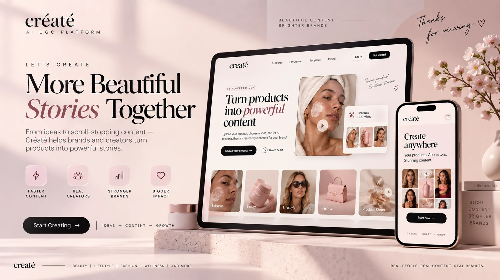
Designed and built Créaté in Framer, focusing on a premium UX/UI experience for an AI-powered UGC platform. The goal was to make complex AI-driven content creation feel simple, visual, and easy to understand for brands and creators.
Overview
Créaté is an AI UGC platform that helps brands turn product photos and videos into creator-style social content.
My work focused heavily on the Framer website experience, product presentation, responsive UX, and UI system. The interface was designed to communicate the value of the platform quickly while maintaining a premium beauty and creator-economy aesthetic.
The website experience was built around a clear journey: understand the product, explore examples, upload content, and start creating.
UX/UI Challenge
AI products can easily feel technical or confusing. The challenge was to present a sophisticated content-generation platform without exposing users to unnecessary complexity.
From a UX perspective, the experience needed to:
Explain the product within seconds
Make the upload flow immediately understandable
Showcase realistic UGC examples visually
Reduce friction between browsing and creating
Work smoothly across desktop, tablet, and mobile
Maintain a premium brand feel without sacrificing usability
Framer Design & Development
The website was designed and implemented in Framer, allowing the experience to combine strong visual design with responsive layouts, smooth interactions, and polished animations.
I structured the site using reusable Framer components and responsive breakpoints so the design remains consistent across different screen sizes.
Key Framer work included:
Responsive page design
Reusable component system
Interactive buttons and hover states
Smooth section transitions
Scroll-based interactions
Responsive typography
Image and content galleries
CTA sections
Product mockup presentation
Mobile optimization
Visual hierarchy and spacing system
UX/UI Approach
The UI was intentionally kept clean and editorial.
Instead of overwhelming users with feature lists, the experience relies on strong visual examples, large typography, simple calls to action, and clear content hierarchy.
The main interaction pattern is straightforward:
Explore → Upload → Create → Preview
This keeps the AI experience feeling familiar and reduces the learning curve for first-time users.
Visual Design Direction
The interface combines:
Soft pink tones · warm neutrals · editorial serif typography · modern sans-serif UI · lifestyle photography · minimal cards · subtle gradients · generous white space
The visual system was created to feel closer to a premium beauty brand than a traditional SaaS dashboard.
That distinction was important because the target audience is highly visual and content-focused.
Key UX/UI Features
Premium Framer landing page
Responsive desktop and mobile layouts
Clear product upload flow
Visual content discovery
Creator-style campaign gallery
Strong CTA hierarchy
Minimal navigation
Product-focused hero section
Template exploration
Consistent design system
Interactive states and animations
Mobile-first usability improvements
My Role
Framer Designer / UX/UI Designer / Framer Developer
I worked across the complete experience, including:
UX Strategy · UI Design · Framer Development · Responsive Design · Wireframing · Visual Hierarchy · Component Design · Interaction Design · Prototyping · Product Presentation
Result
The final Framer experience presents Créaté as a polished, premium AI product while keeping the user journey extremely simple.
Rather than making AI the center of the interface, the UX focuses on what users actually want to achieve: creating better branded content faster.
Tools
Framer · Figma · UX/UI Design · Responsive Design · Prototyping · Interaction Design · Component Systems
Like this project
Posted Sep 17, 2026
Designed a premium UX/UI in Framer for an AI UGC platform, enhancing user content creation ease.
Likes
0
Views
0