
Most maternity product pages look soft
but still leave shoppers unsure which option is best.
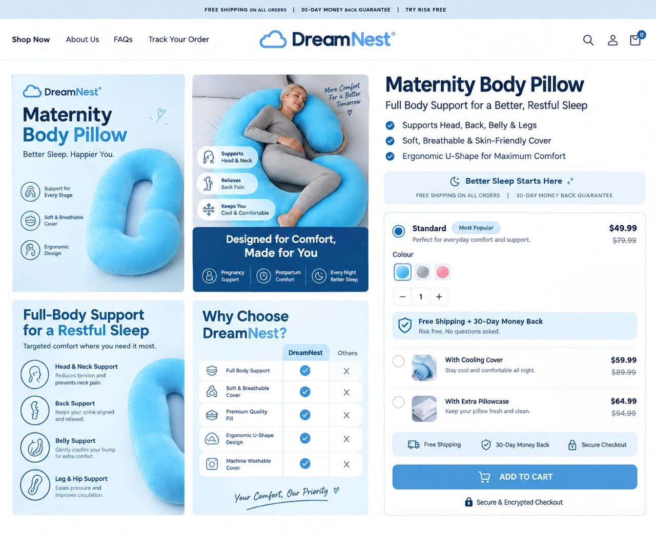
I redesigned this DreamNest Maternity Body Pillow PDP so the value and best choice feel clear.
Here’s what I focused on:
→ Strong lifestyle imagery
showing real comfort and support
→ Clear benefit-led messaging
(head, back, belly & leg support)
→ Comparison table that
positions DreamNest as the superior choice
→ Simple Standard / Cooling Cover / Extra Pillowcase options with “Most Popular” labeled
→ Savings clearly shown on every variant
→ Trust signals (free shipping, 30-day money-back, secure checkout) placed right under the CTA
→ Clean hierarchy so the decision feels easy
Pages structured like this typically see: • Higher add-to-cart rates from clearer options
• Better average order value from upsells
• Lower hesitation because risk is removed near the buy button
The page doesn’t just show a pillow.
It makes the buying decision feel obvious and low-risk.
If your product page is getting traffic but conversions feel lower than they should…
Comment your link or DM me “AUDIT”.
I’ll show you exactly where it’s leaking sales and how I’d fix it.
#DTC #Ecommerce #CRO #ProductPageDesign #ConversionRateOptimization #Shopify #Maternity #EcommerceDesign
0 likes · 1 view · Sep 8, 2026
Most maternity product pages look soft but still leave shoppers unsure which option is best. I redesigned this DreamNest Maternity Body Pillow PDP so the v...


