Roamer Brand Identity and Website Development

Al Iman


The brief
Roamer's pitch to travelers is simple but unusual: skip the endless tabs of comparison sites. Tell us where you want to go and what you can spend, and we'll find the quiet, brilliant window when top resorts are hungry for bookings — then get them to compete for you with perks, not public discounts. The brand and product needed to feel as confident and editorial as the trips it sells, while making a genuinely novel booking flow (reverse-auction style, three curated offers) feel effortless.

Roamer's logo
What we did
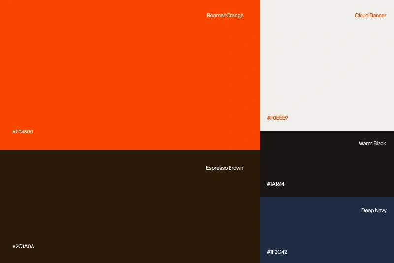
We built the identity from a single mark — a sun dipping into water, doubling as a wave — rendered in a warm, saturated orange against deep navy and warm neutrals. It's paired with an editorial serif for headlines (borrowed from travel-magazine layouts) and a clean sans for UI, so the brand reads equally well as a hero image caption or a form label.
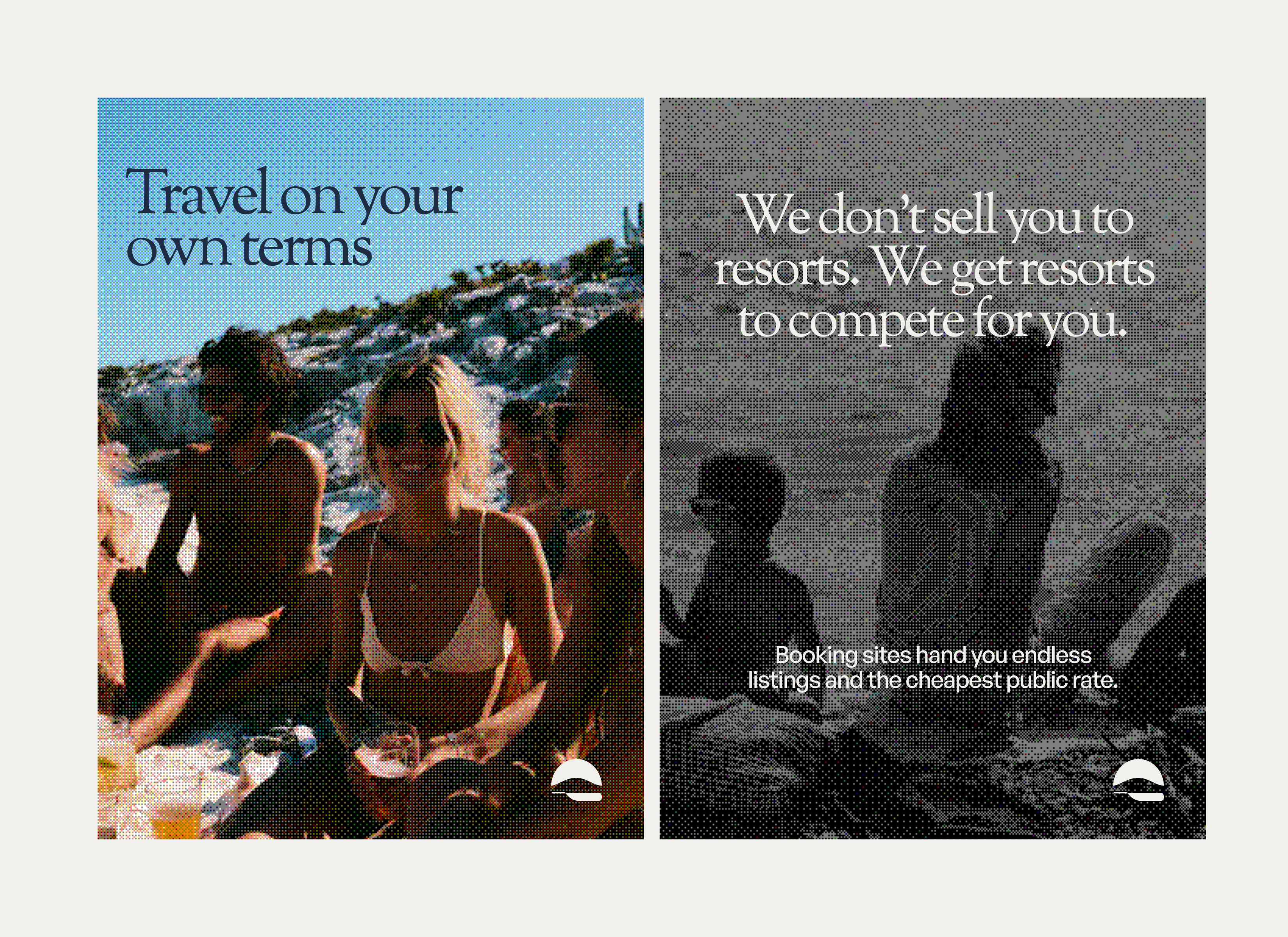
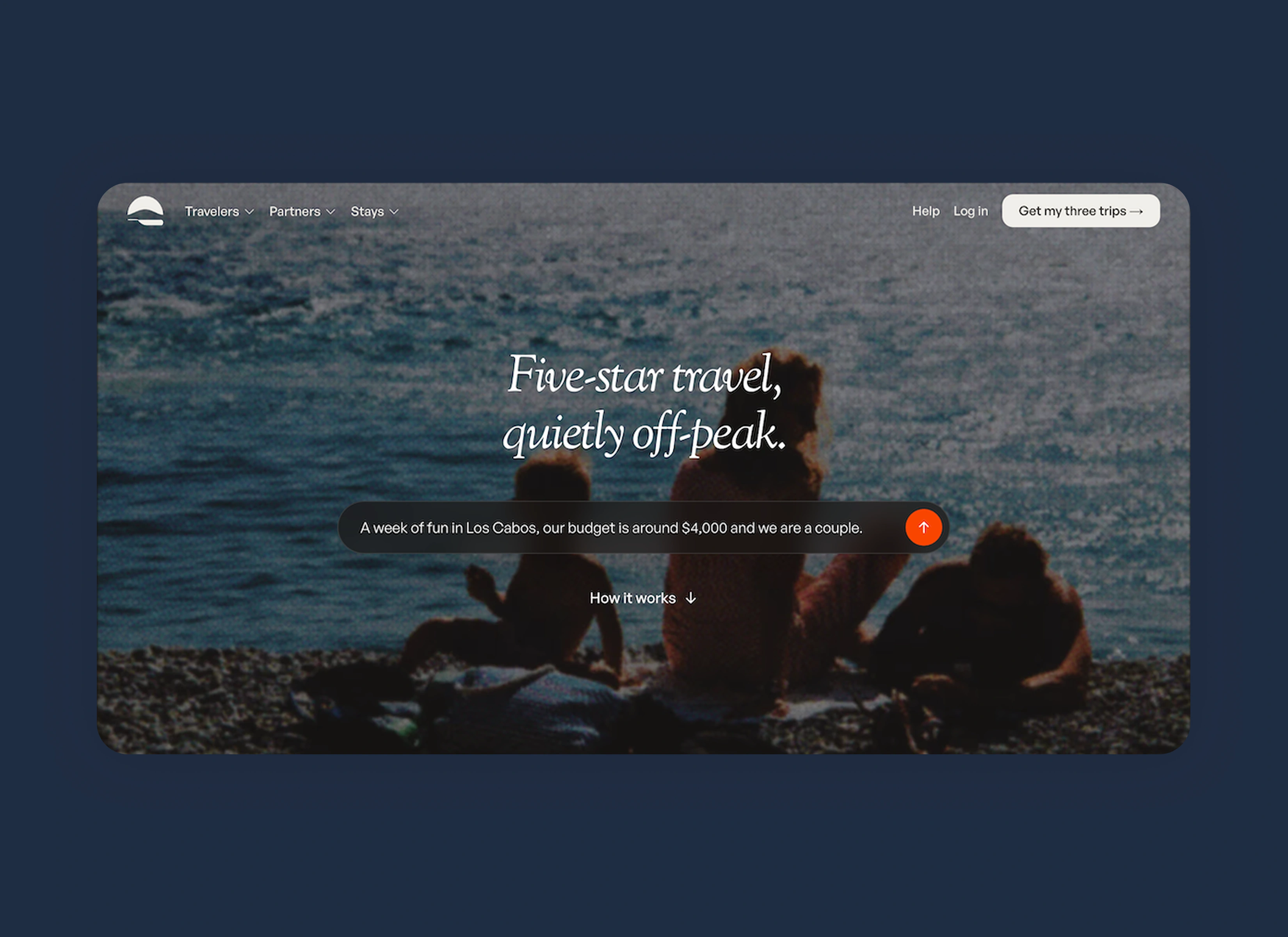
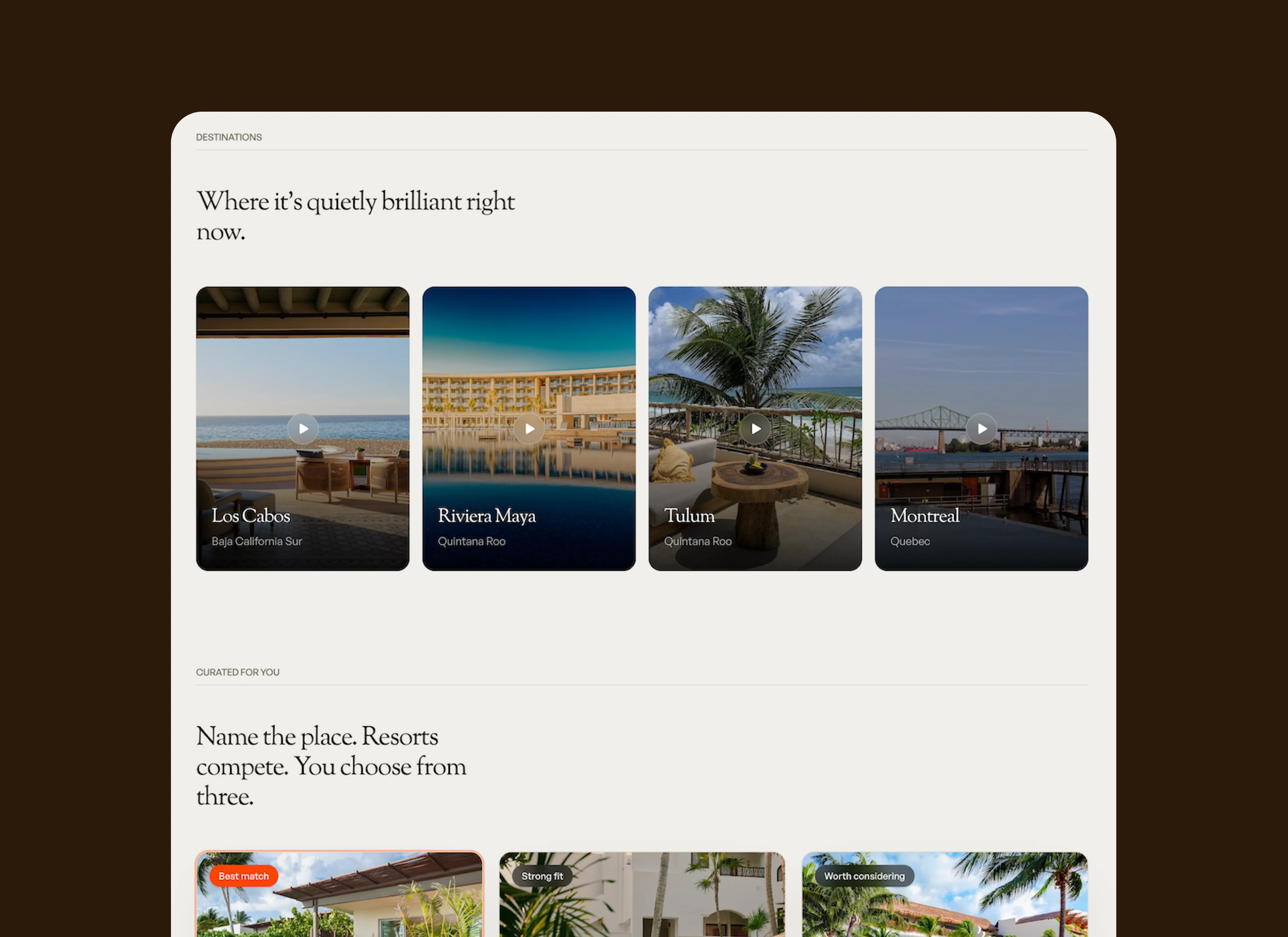
For the site, the priority was making the "name a place, get three offers" flow feel like a conversation rather than a form. The homepage leads with a single prompt field instead of a search form. Destination and offer cards use a magazine-style grid, and the three-offer comparison (Best match / Strong fit / Worth considering) borrows patterns from editorial curation rather than typical e-commerce filtering, reinforcing that this is selection, not searching. A textured, halftone treatment ties marketing pages, social templates, and the product UI back to the same visual world.
Deliverables
Full identity system (logo, type, color, photographic and textural direction), marketing site design (homepage, destinations, how-it-works), core product flows (trip request, offer comparison, booking confirmation), and a set of social/ad templates for launch.
Like this project
Posted Jul 2, 2026
Developed brand identity and website for Roamer's unique travel booking service.
Likes
0
Views
11
Timeline
Apr 15, 2026 - May 15, 2026
Clients
Roamer