LUSSO | Logo Design & Branding
PROJECT DESCRIPTION
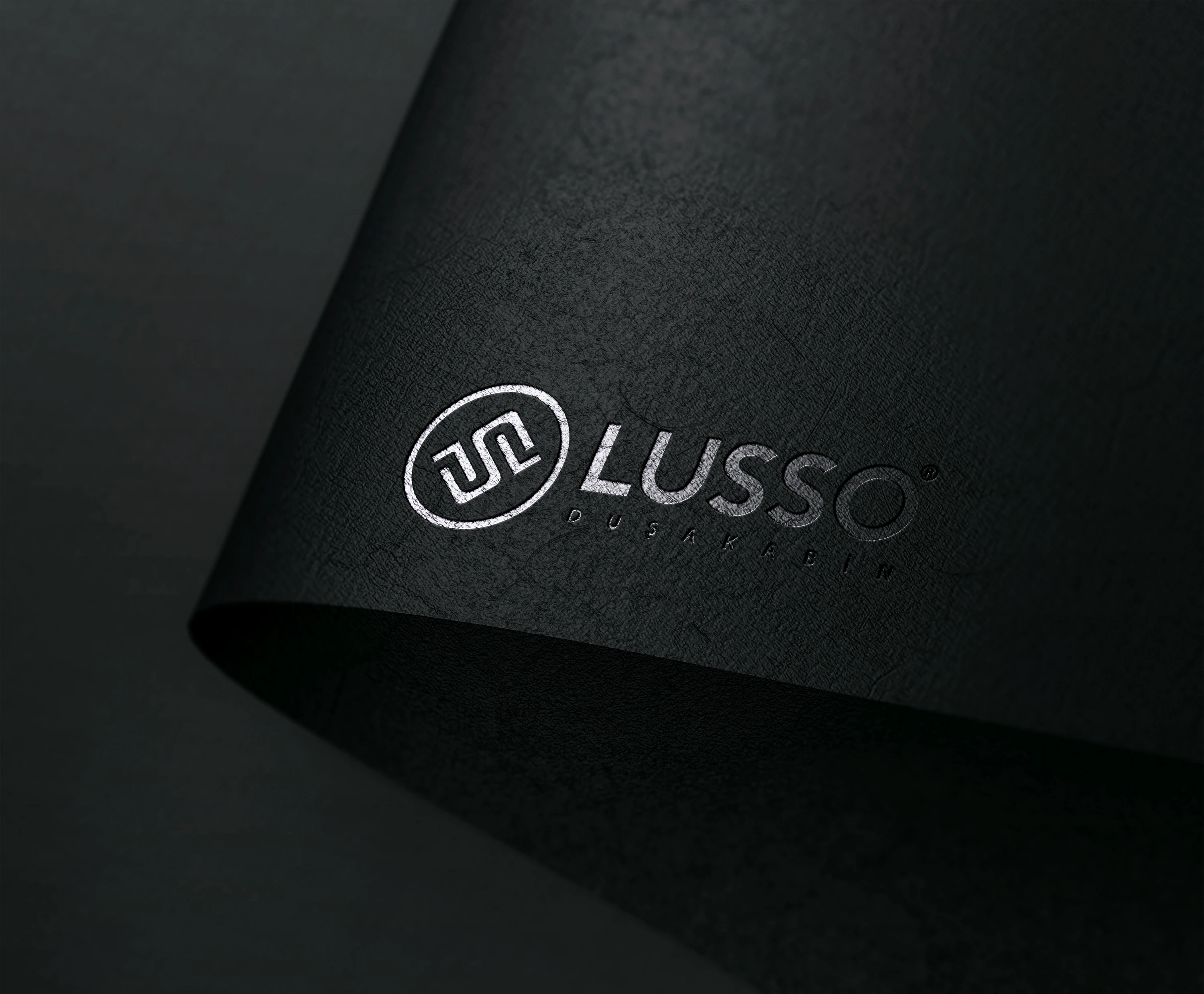
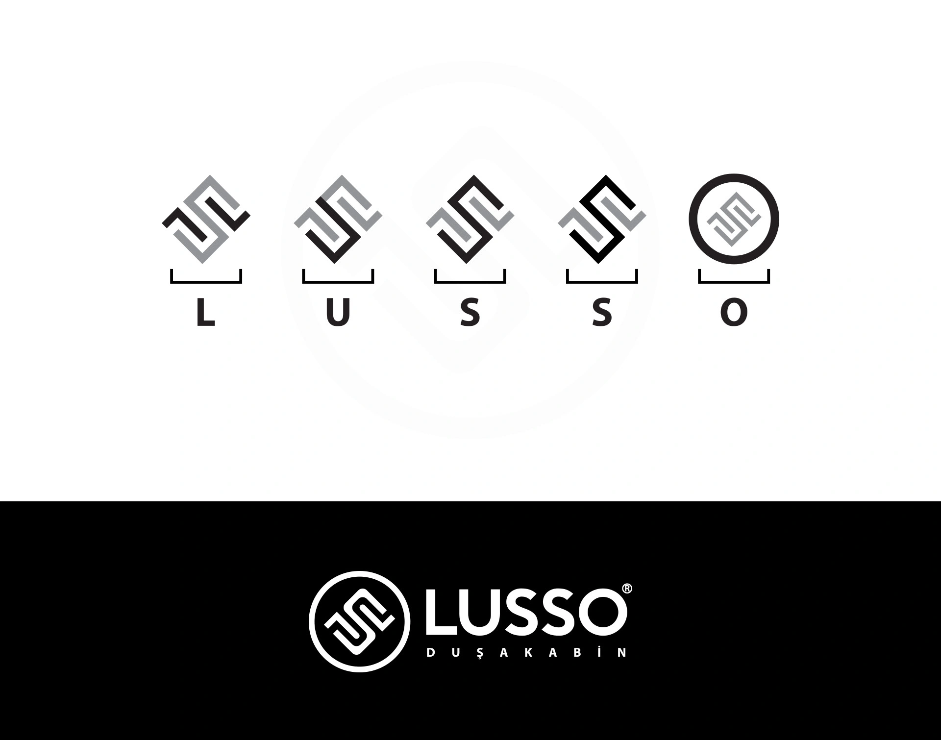
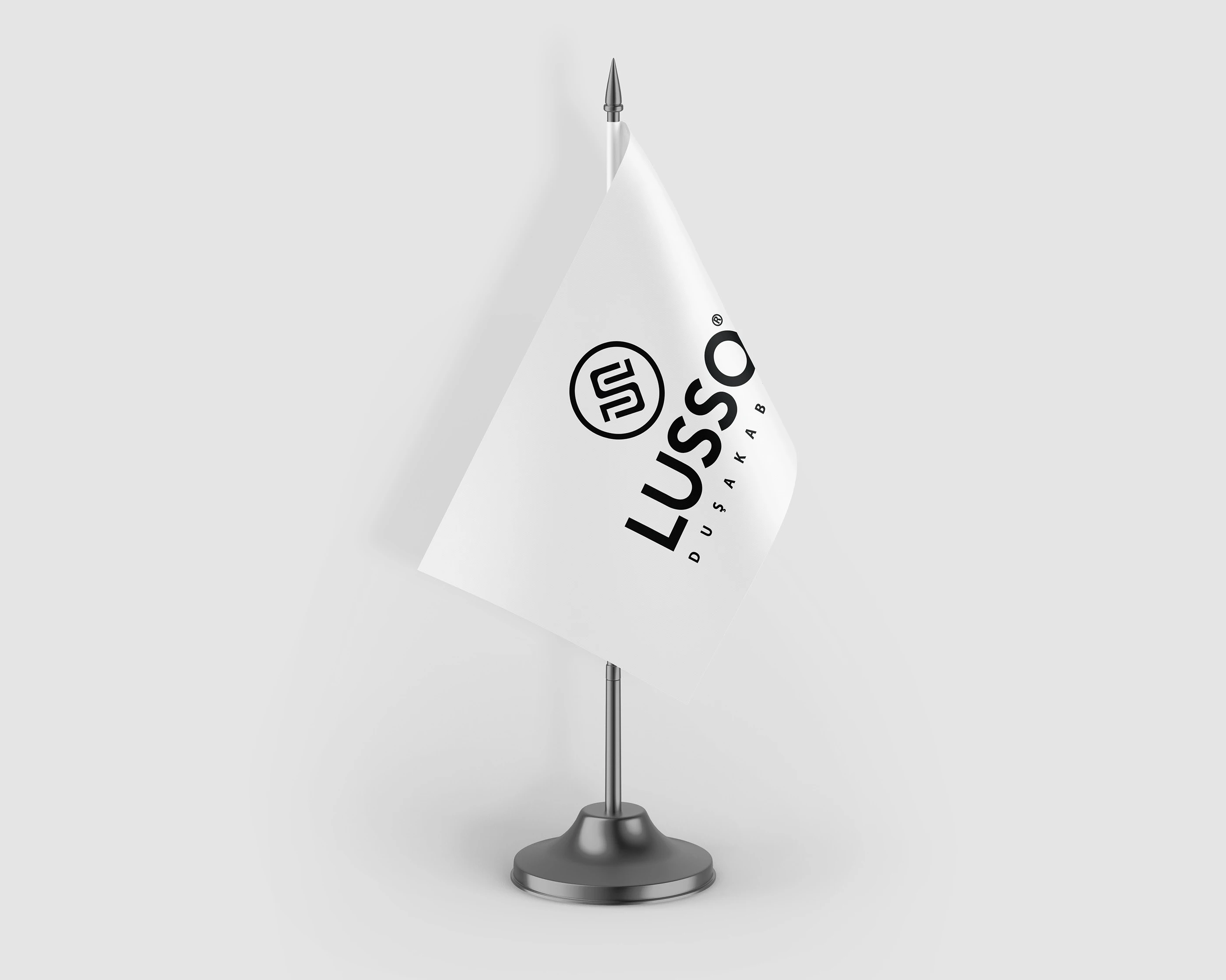
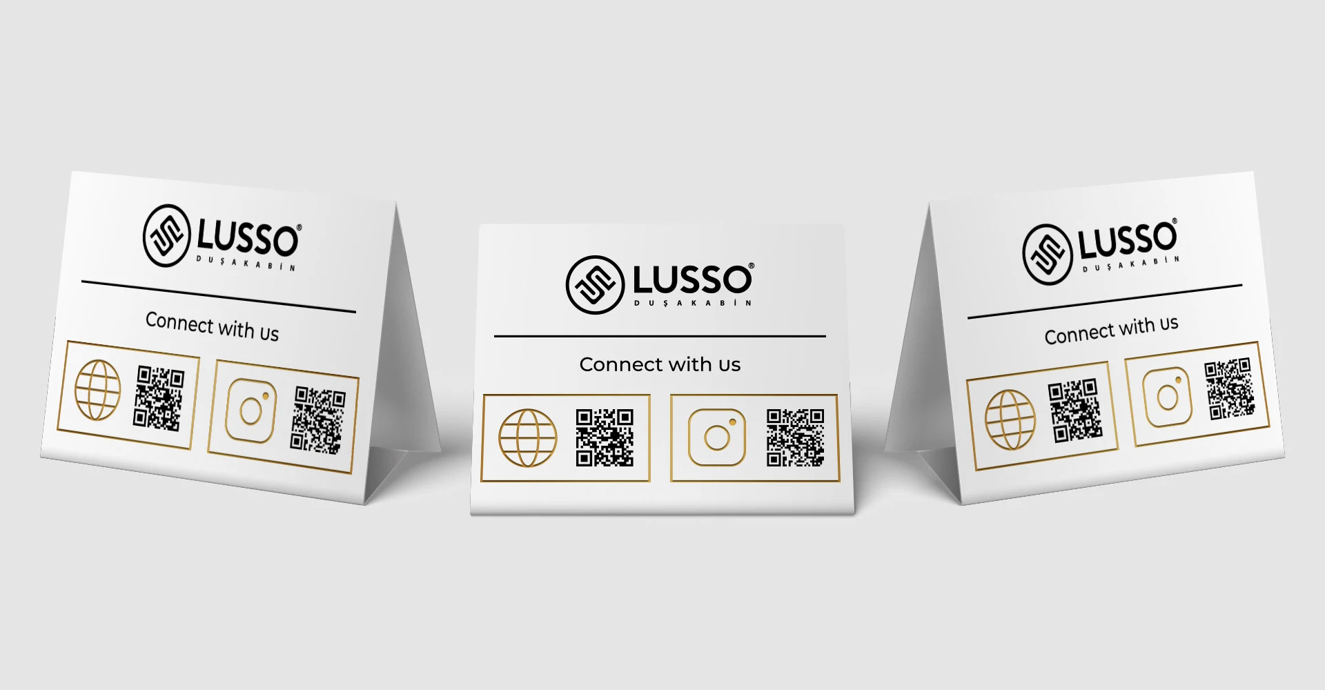
In this regard, all the letters of the brand were brought together in the simplest and most harmonious way possible, creating a memorable emblem for the brand. The bold character used in the logo was chosen to create a simple and powerful effect that is not tiring to the eye.
Black and white colors were preferred in the corporate identity. Although the use of black may evoke a traditional association, it is preferred by brands aiming to reflect both simplicity and sophistication, as it represents power and elegance. White was chosen because it is the universal color of purity and peace.
With this update, the Lusso brand has achieved a modern, sophisticated, and refined appearance, making it more strongly represented in the aesthetic field.



Like this project
Posted Feb 29, 2024
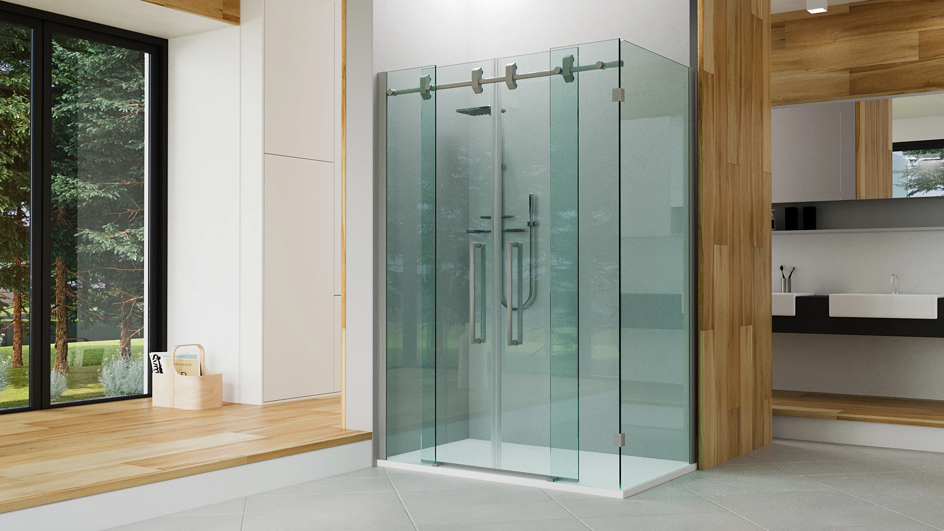
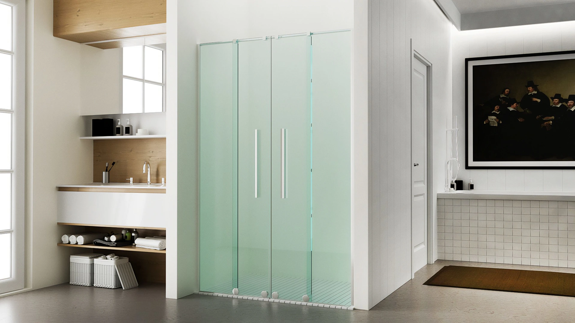
Lusso brand specializes in decoration and shower cabin solutions for bathrooms. In 2020, the company decided to update its brand to better represent modernity,…


