Haraka Design System
Haraka design system was created as a scalable, reusable system for a B2B SaaS platform. It helps the team maintain visual consistency, design faster, and hand off seamlessly to developers using well-defined tokens and components.
Haraka streamlines the entire design-to-development workflow with standardized patterns, responsive components, and built-in flexibility for future updates. It serves as a single source of truth for the team, reducing inconsistencies and accelerating product delivery.
Design Principle
Clarity over complexity
Consistent pattern
Accessibility
Scalable for future growth
A friend running a startup approached me to work on his project. After he explained the idea, I was immediately excited and saw real potential in it. While we were just building an MVP, he didn’t expect me to start with a full design system, but I was deeply invested and took the initiative to create a scalable foundation. This way, everything from design to development could run smoothly as the product grows.
To support this, I started building out a scalable set of design tokens. These tokens serve as the foundation for consistent styling across the product covering colors, typography, spacing, radii, borders, and more.
Below is a quick visualization of the current token system. It’s still a work in progress, and I’m actively refining it as the product evolves and new use cases come up.
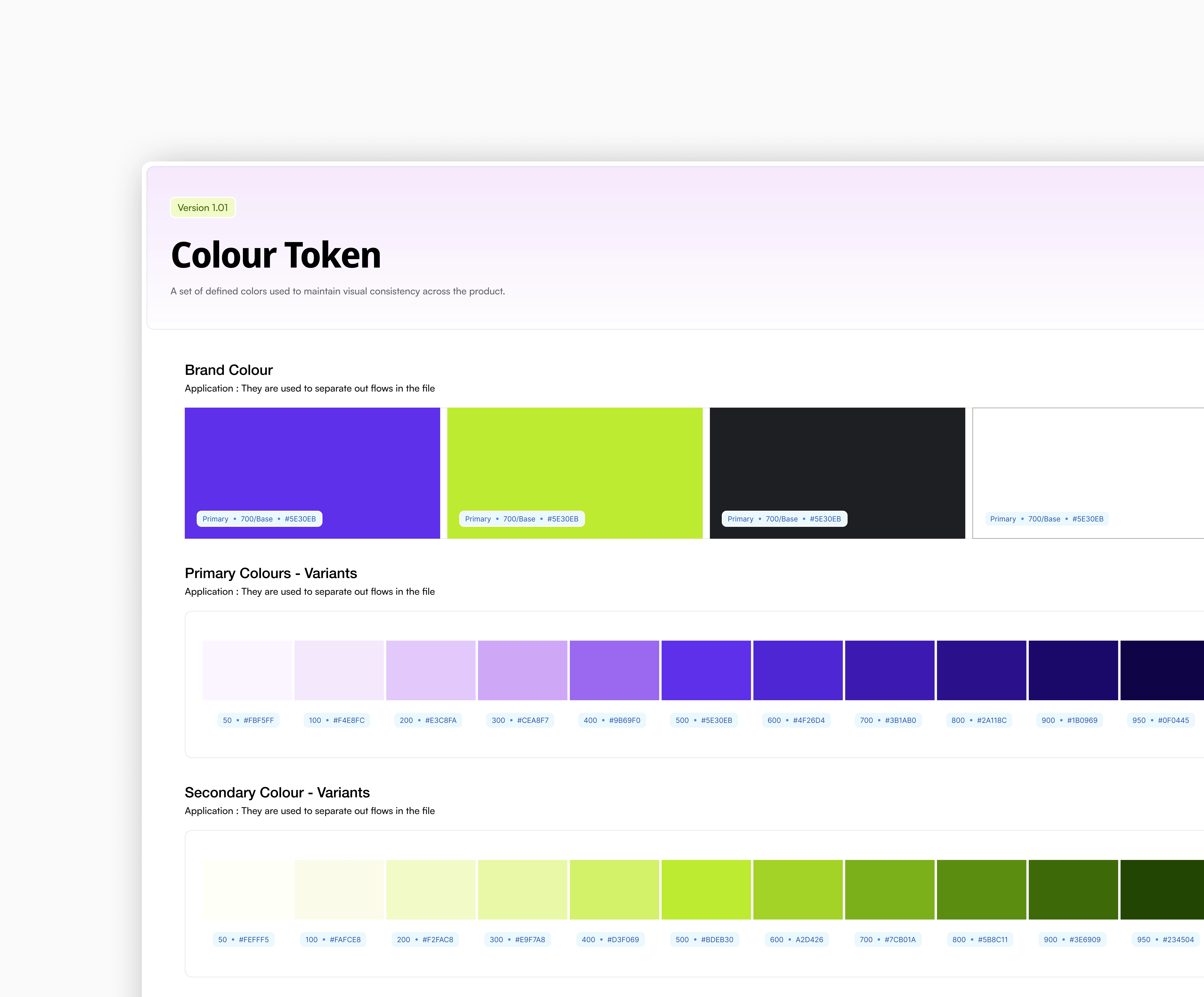
Color Token

The color system is structured using semantic tokens to make it scalable and easy to manage. I defined core primitives—neutral, primary, success, warning, and error—and mapped them to roles like background, text, border, and surface. This helps maintain visual consistency while making it easier to adjust themes or switch palettes without breaking the UI. Each color is accessible and tested for contrast, and variants (like hover, active, disabled) are also tokenized for predictable behavior across components.
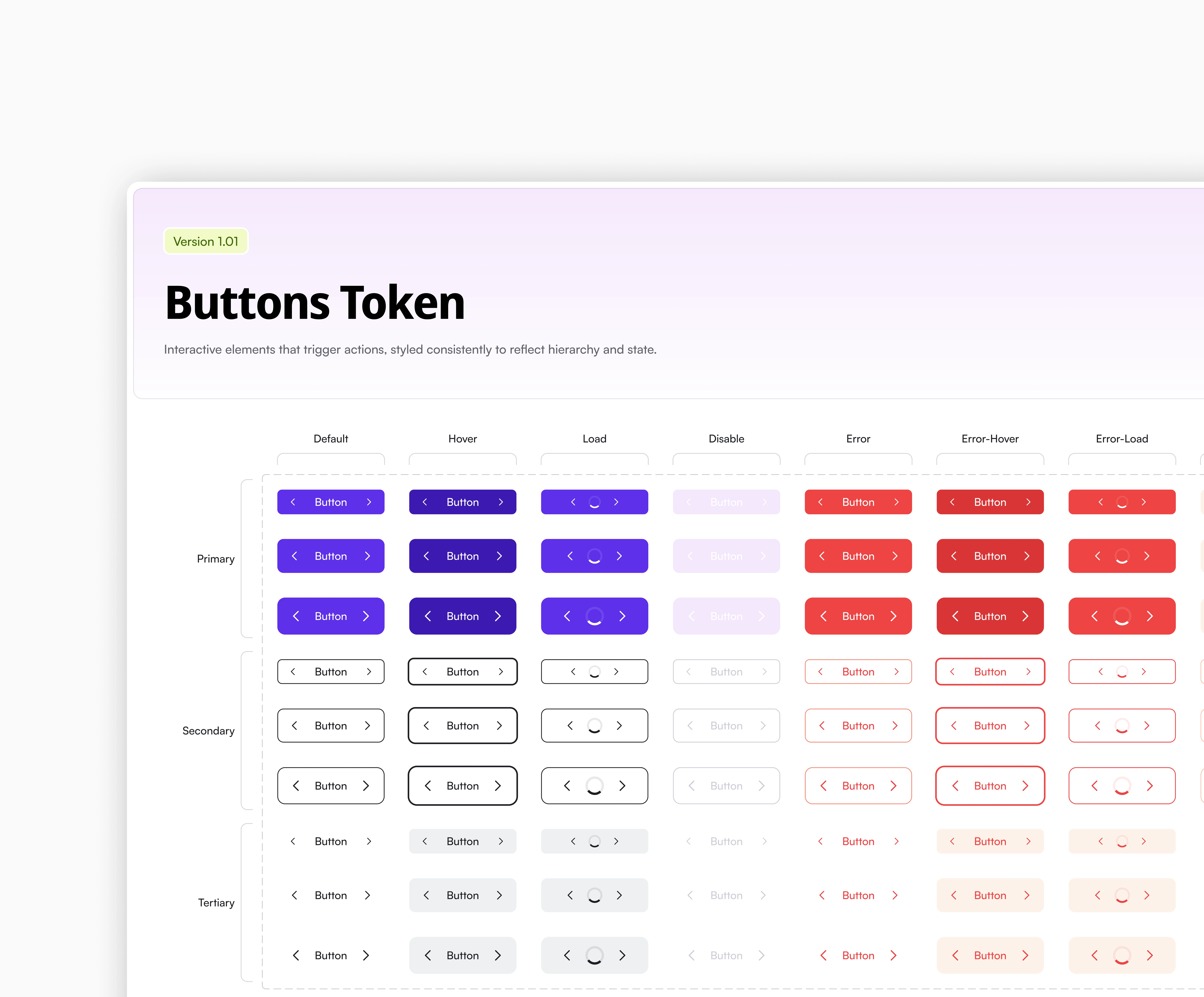
Button Token

The button system was built with flexibility and clarity in mind. I created a range of button styles—primary, secondary, tertiary, ghost, and icon-only—to cover different use cases across the platform. Special attention was given to critical actions, like error and delete states, with distinct styles and color tokens to signal caution and prevent accidental actions. Each variant is responsive, accessible, and defined with clear states (default, hover, disabled, loading) for consistency in both design and implementation.
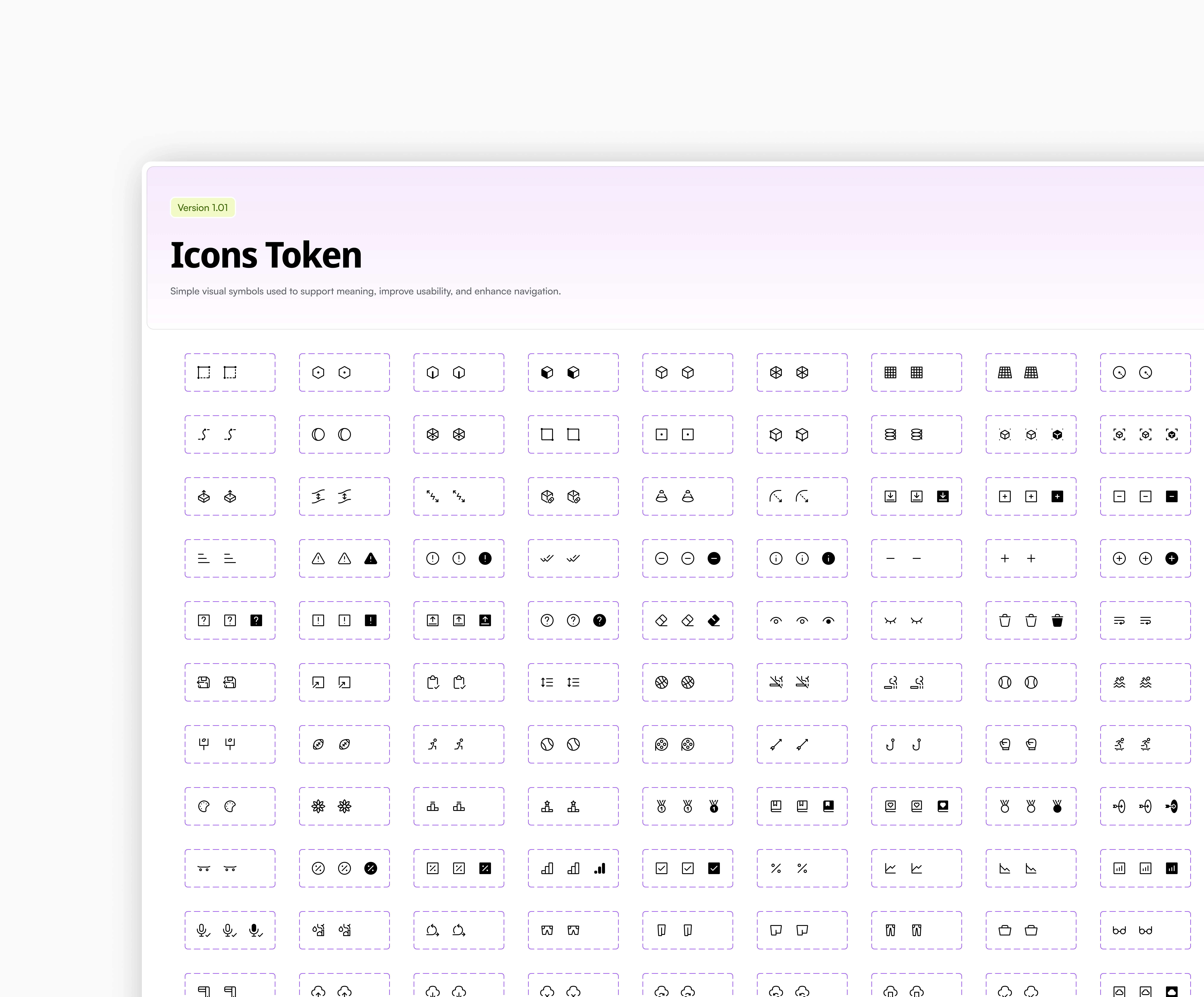
Iconography

For the icon system, I introduced icon tokens to maintain consistency in size, stroke weight, and alignment across components. I used the Iconoir icon set for its extensive collection of clean, modern, and open-source icons. It fits well with the visual style of the product and is flexible enough for both product and marketing use. By tokenizing icons, the system stays scalable and easy to update as the product evolves.
Want a closer look?
If you’re curious about my approach, want to dive deeper into the system, or just have questions about how it was structured—feel free to reach out or shoot me a message. I’m always happy to share more.
Like this project
Posted Aug 15, 2025
Developed Haraka design system for a B2B SaaS platform.
Likes
0
Views
0


