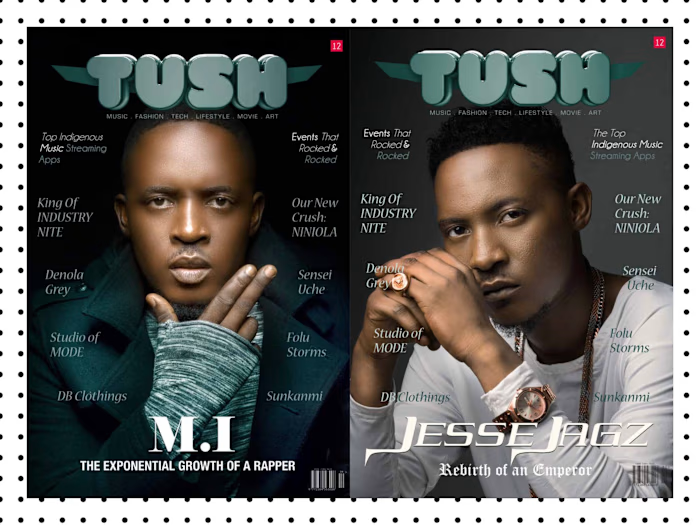
Magazine Design - TUSH Magazine Issue 9
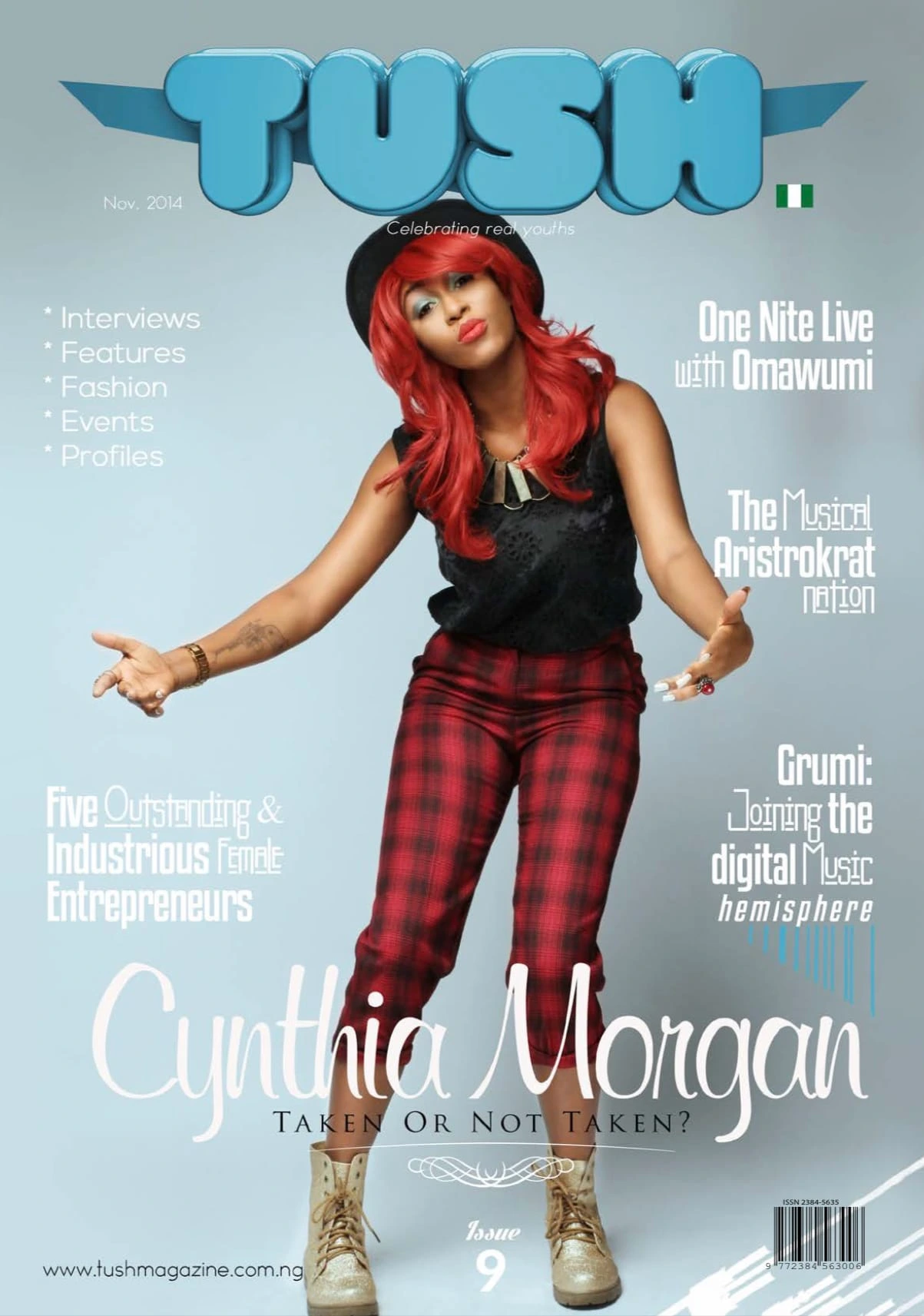
A Visual Voyage through the Modern Zeitgeist
Prologue: Setting Sail
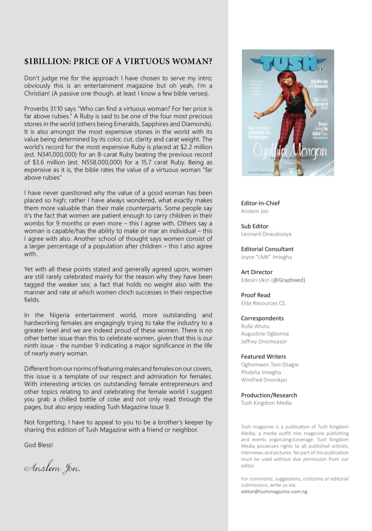
In the realm of design, every project is an expedition. TUSH Magazine's 9th issue was a unique odyssey, and as the Art Director, I steered this creative ship through uncharted waters. Our destination? The diverse and dynamic world of global youth culture.
Chapter 1: "Navigating the Cultural Archipelago"
Typography: The Cartographer's Quill
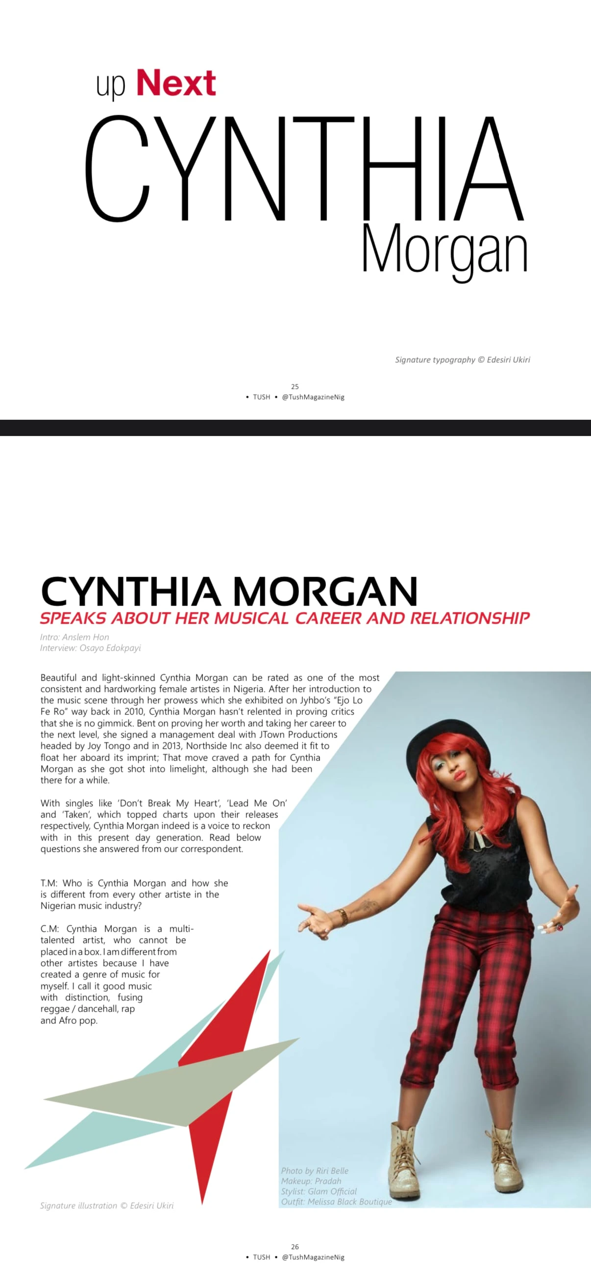
Like explorers charting unknown islands, we used typography to map our journey. In each section of the magazine, fonts became our cartographer's quill, guiding readers through distinct cultural landscapes. Bold sans-serifs spoke of rebellion in the music section, while graceful serifs whispered tales of tradition in the business realm.

Chapter 2: "Designing the Constellations"
Layouts: Stars in the Design Galaxy
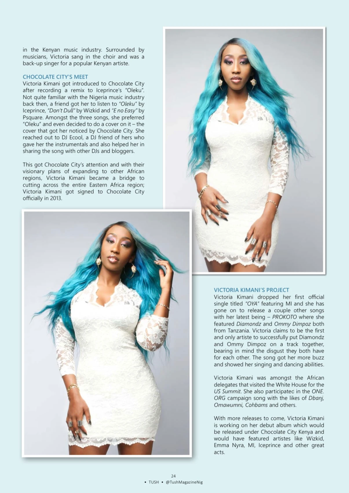
Our magazine's pages were like constellations, each layout a unique arrangement of stars. Design elements swirled and twinkled, forming a celestial dance that encapsulated the essence of each niche. Our goal was to create a cosmic symphony of visuals that left readers starstruck.
Chapter 3: "The Chromatic Chronicles"
Color: The Palette of Emotions
Colors were our palette, painting the emotional landscape of our odyssey. Each niche had its hues, evoking feelings and atmospheres unique to its stories. As readers journeyed through the magazine, they followed a rainbow of emotions, experiencing the world through color.
Chapter 4: "Capturing Moments, Crafting Epics"
Photography: The Chronicles of Youth
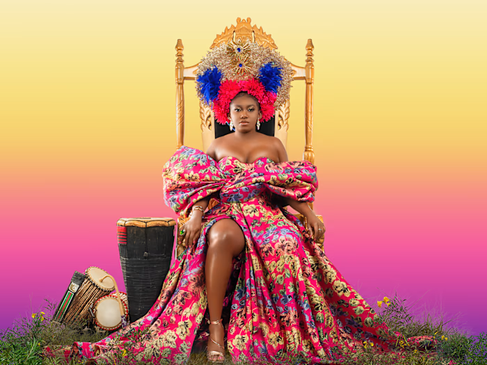
Our photographers were storytellers, capturing moments that became chapters in our youth saga. Each click froze a fragment of global youth culture, preserving it as part of our visual epic.
Chapter 5: "Visual Poetry and Cultural Codex"
Design Elements: The Lexicon of Culture
Design elements were our cultural codex, the language of our voyage. Infographics and visual metaphors became poetic verses, decoding complex narratives and connecting readers to the cultural heartbeat of each niche.
Chapter 6: "Digital Constellations and Interactive Voyages"
Online Odyssey: Extending the Expedition
The digital version of the magazine was a continuation of our voyage, an interactive odyssey that invited readers to explore further. Videos, animations, and clickable elements created constellations in the digital sky, extending our journey to a global online audience.

Epilogue: The Odyssey Unveiled
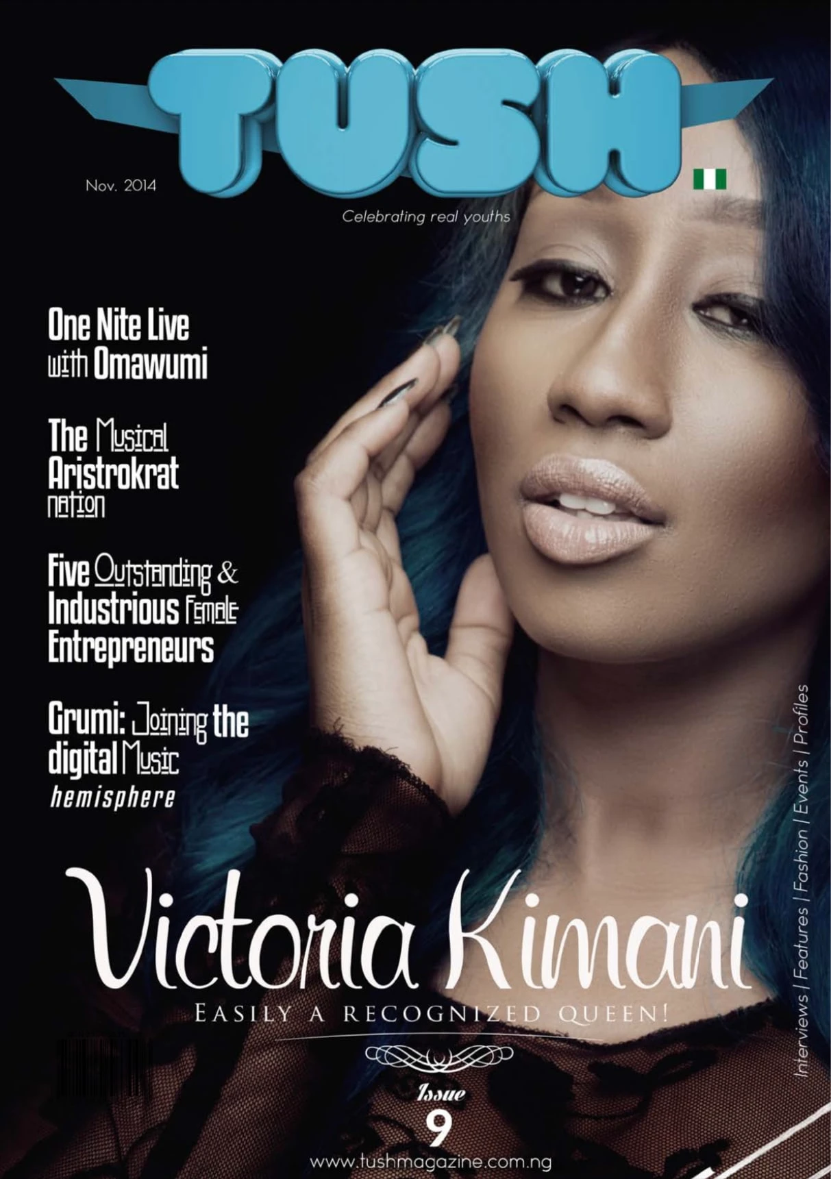
TUSH Magazine Issue 9 was more than a publication; it was a global youth odyssey, and I was the captain of this creative ship. This portfolio piece reveals the design expedition that celebrated youth culture across the world. It invites you to embark on this visual voyage, where design served as the compass, guiding us through the modern zeitgeist.
Like this project
Posted Sep 22, 2023
As Lead Creative, I meticulously crafted the design and layout of TUSH Magazine Issue 9, ensuring its visual excellence celebrated global youth culture.

