Venture Accelerator | UI Design + Illustration + Custom Web Dev

Anush N
Motion Designer
UI Designer
Framer Developer
Figma
Framer
LottieFiles
Case Study: Redefining Fashion Entrepreneurship with Neo Brutalist UI Design
Introduction:
Ink & Runway’s mission is to empower aspiring fashion designers and emerging brands through a comprehensive array of services. From fashion design consultation to brand strategy and digital presence, they are committed to fostering creativity and innovation in the competitive fashion industry.
LIVE SITE (WORK IN PROGRESS)
Lottie Animations
Adobe After Effect Animation
Project Scope:
The project aimed to create a distinctive landing page for [Ink & Runway] through meticulous UI design and Framer development, emphasizing the neo brutalist design style. This involved capturing the essence of raw creativity and bold aesthetics while ensuring a seamless user experience.
Research and Analysis:
Our journey began with extensive market research and competitor analysis within the fashion industry. Insights revealed a growing preference for minimalist yet impactful design styles, prompting our adoption of neo brutalism. This style resonates with our target audience's desire for authenticity and a break from traditional norms in fashion branding.
**Planning and Strategy:**
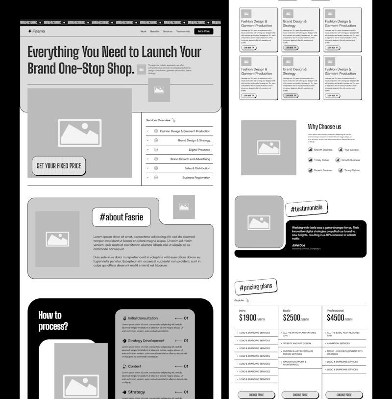
With neo brutalism as our guiding aesthetic, we devised a strategic plan focused on UI/UX design principles tailored to enhance user engagement. Information architecture was structured to prioritize clarity and direct user interaction, reflecting the bold and unapologetic nature of our brand.
**Design Execution:**
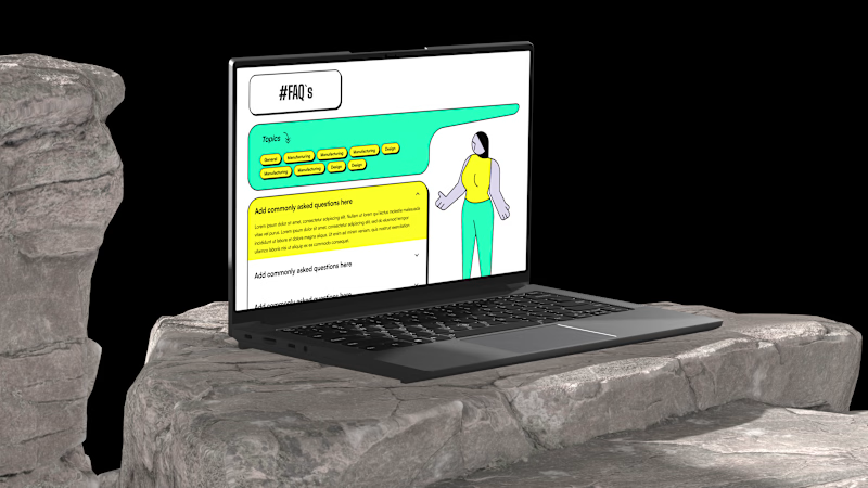
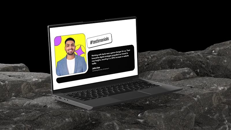
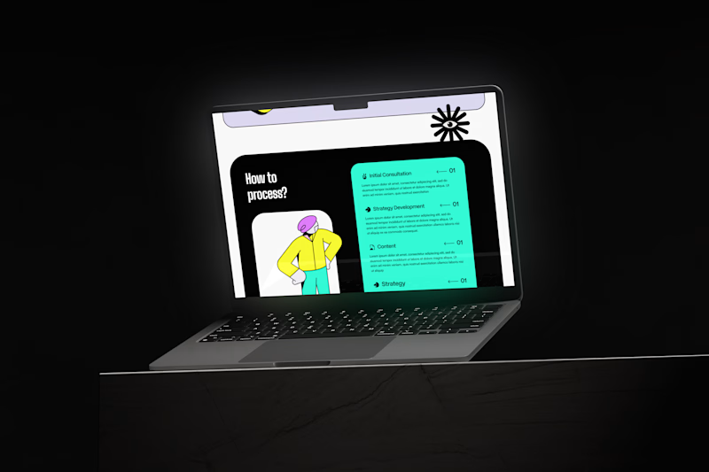
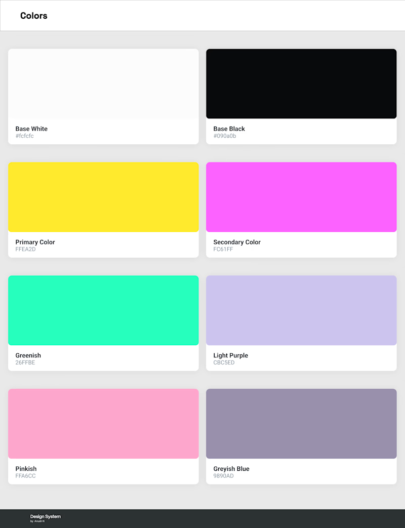
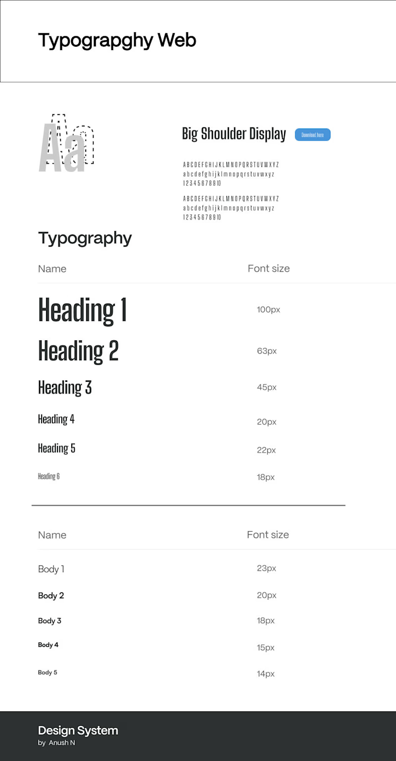
The UI design phase unfolded with a blend of raw textures, asymmetrical layouts, and minimalist typography characteristic of neo brutalism. Colors were deliberately chosen to evoke contrast and evoke emotions aligned with the fashion industry's dynamism and creativity. This approach ensured that every visual element conveyed our brand's ethos of innovation and disruption.
**Interaction Design:**
Interactive elements were thoughtfully integrated to amplify user engagement. From unconventional navigation patterns to animated transitions that surprise and delight, our design encouraged exploration and interaction, enhancing the overall user experience while maintaining accessibility standards.
**Testing and Iteration:**
Throughout the process, iterative testing played a crucial role in refining our design choices. User feedback guided adjustments to ensure intuitive navigation and seamless functionality across devices. Accessibility features were meticulously implemented to ensure inclusivity without compromising the bold aesthetic of neo brutalism.
**Current Progress:**
The UI design phase has been successfully completed, capturing the essence of [Ink & Runway]'s innovative spirit and commitment to pushing boundaries in fashion entrepreneurship. The website now stands as a testament to our dedication to excellence and creativity in digital branding.
**Next Steps:**
Moving forward, our focus shifts to Framer development, where we will translate our neo brutalist UI design into interactive prototypes. Dynamic animations, responsive layouts, and immersive user interactions will further elevate the user experience, setting a new standard for digital engagement in the fashion industry.
**Conclusion:**
In conclusion, the strategic alignment of neo brutalist UI design principles with [Ink & Runway]'s brand identity has resulted in a visually striking and user-centric website. By embracing bold aesthetics and functional design, we are poised to redefine fashion entrepreneurship and inspire the next generation of designers and brands worldwide.
Wireframe
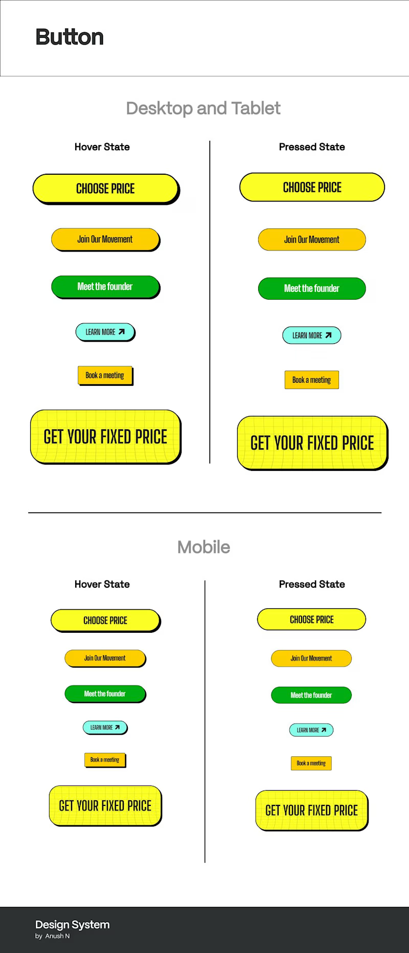
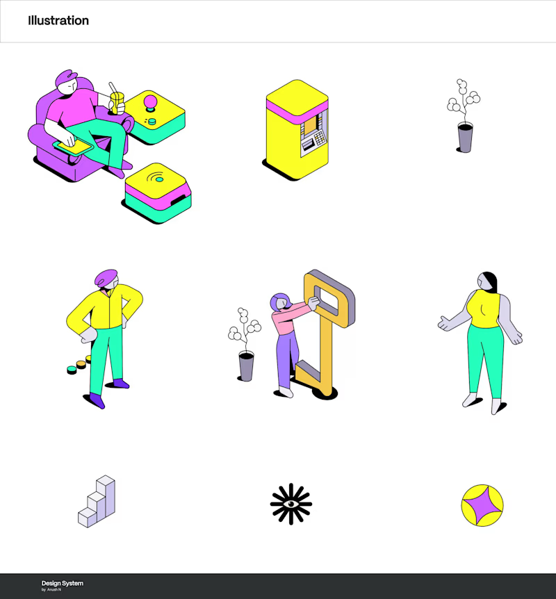
Design System
Landing page (UI Design)


