International Client
Julie Elwood
After researching the aesthetic and overall personality of the Hellish APT Cafe & Bar, a rebrand was created to update and fit the needs of the client, Tsuragi Sato. Deliverables for this project include a logo, a menu, a sign, and a final PDF booklet.
Introduction
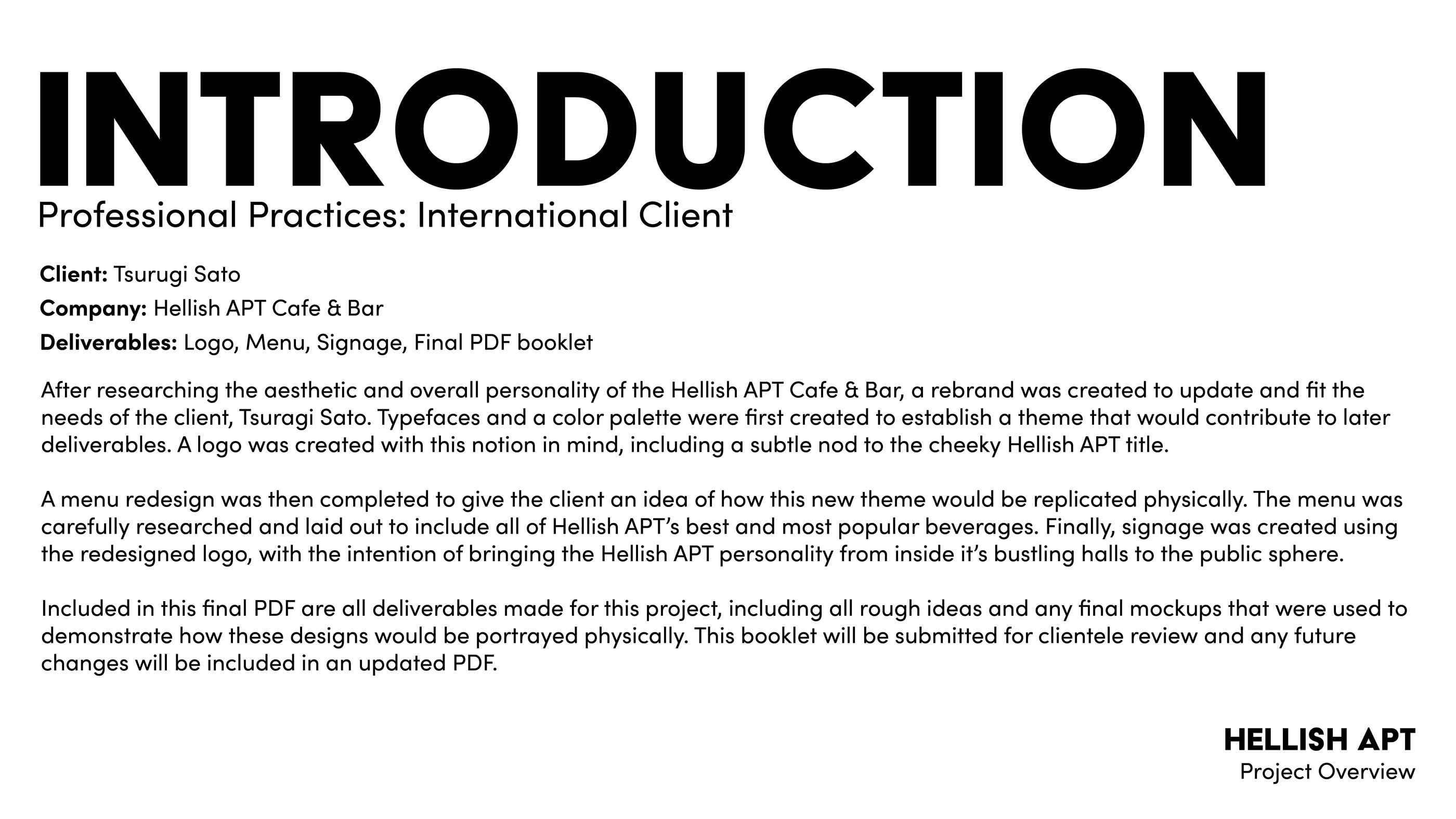
The image above shows the project overview for the assignment.
Hellish APT Branding
Before deliverables were created for this project, I researched everything I could about the Hellish APT company and derived possible color palettes and typefaces from their established aesthetic.
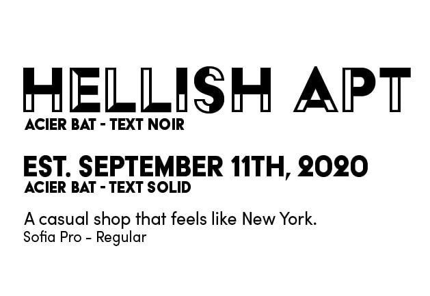
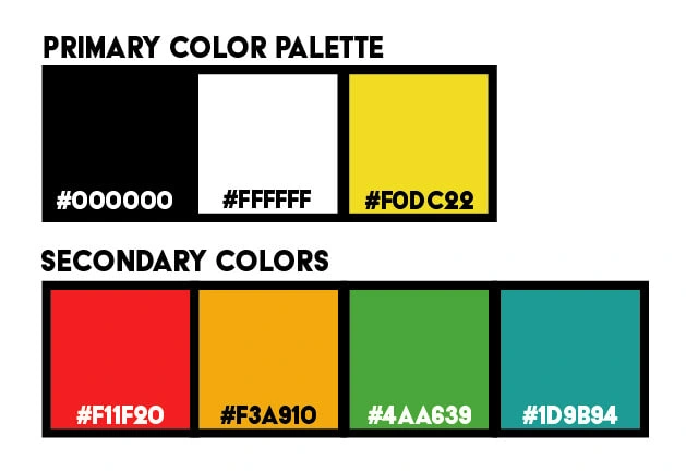
I originally had three typefaces, one decorative, one for titles, and one for body text. I also was going to have three primary color choices with a few possible options I could implement on a needed basis.
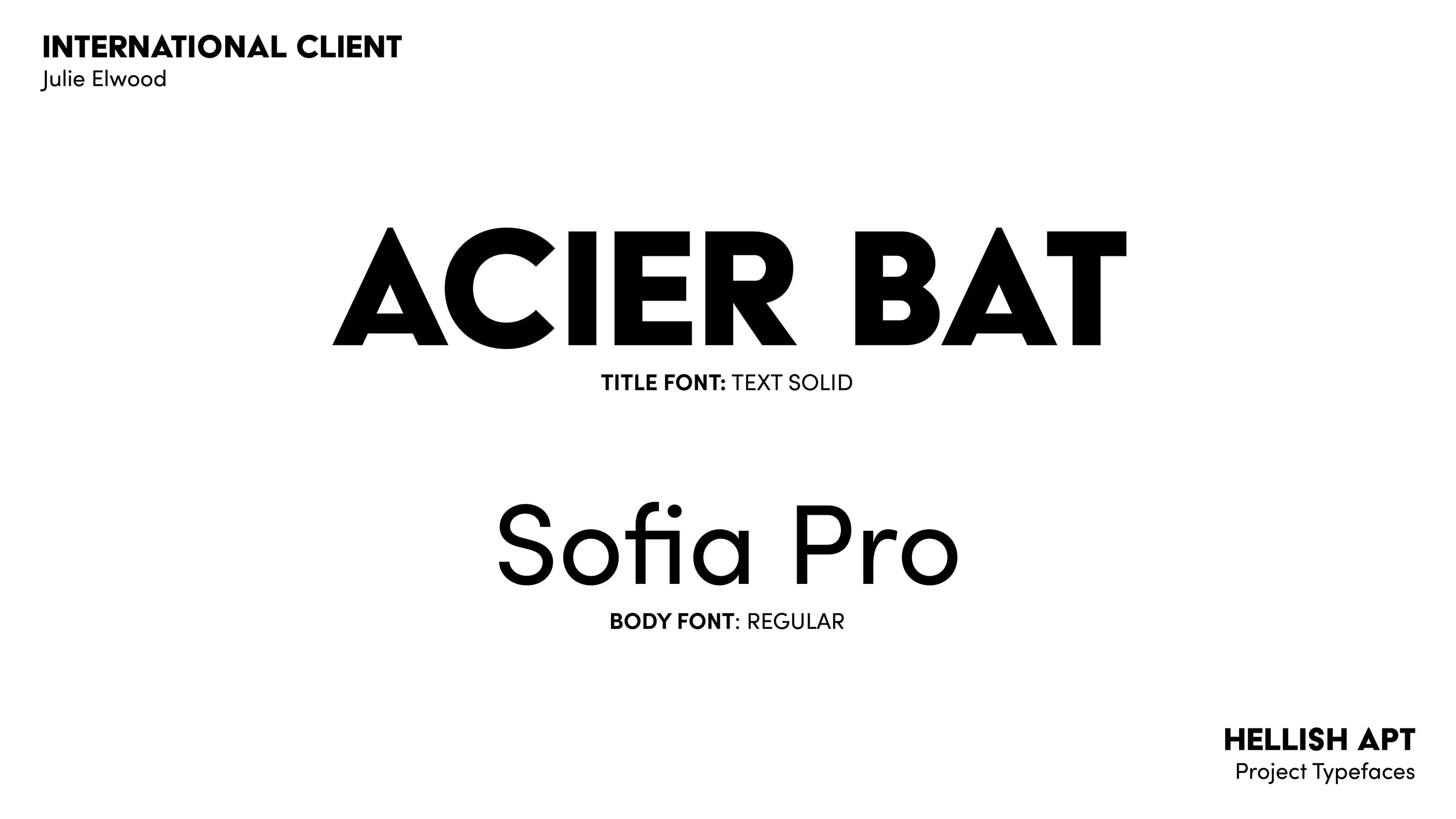
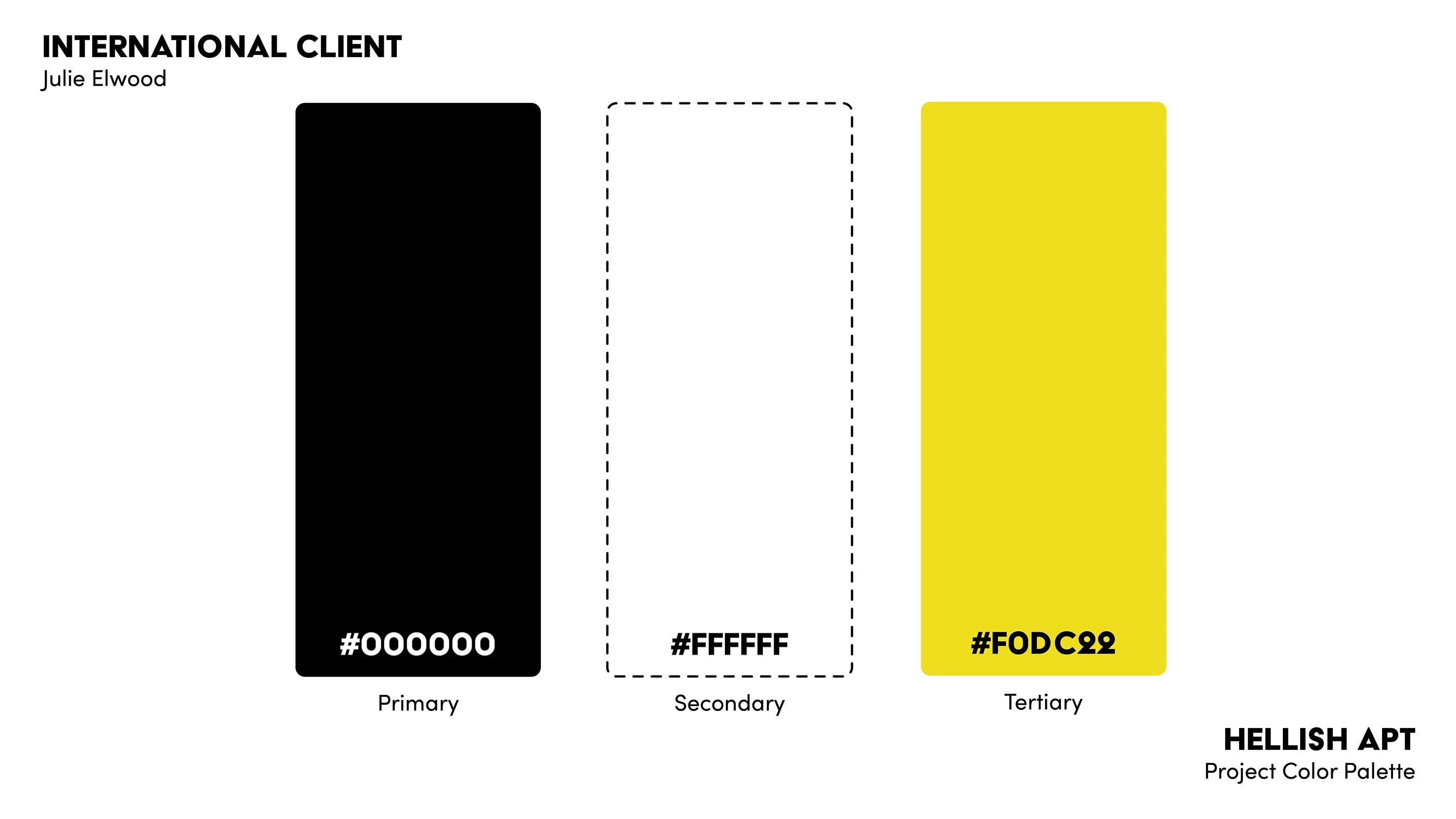
As I continued further throughout the project, I made changes to the overall branding. After only using the yellow swatch in one piece of the project, I decided to leave out the possible secondary color options. I also decided to leave out the decorative font choice and just use a title and body font.
Hellish APT Logo Design

The first deliverable for this project was a logo for the Hellish APT company. The logo needed to embrace the personality of the bar while keep consistent with modern logo design.
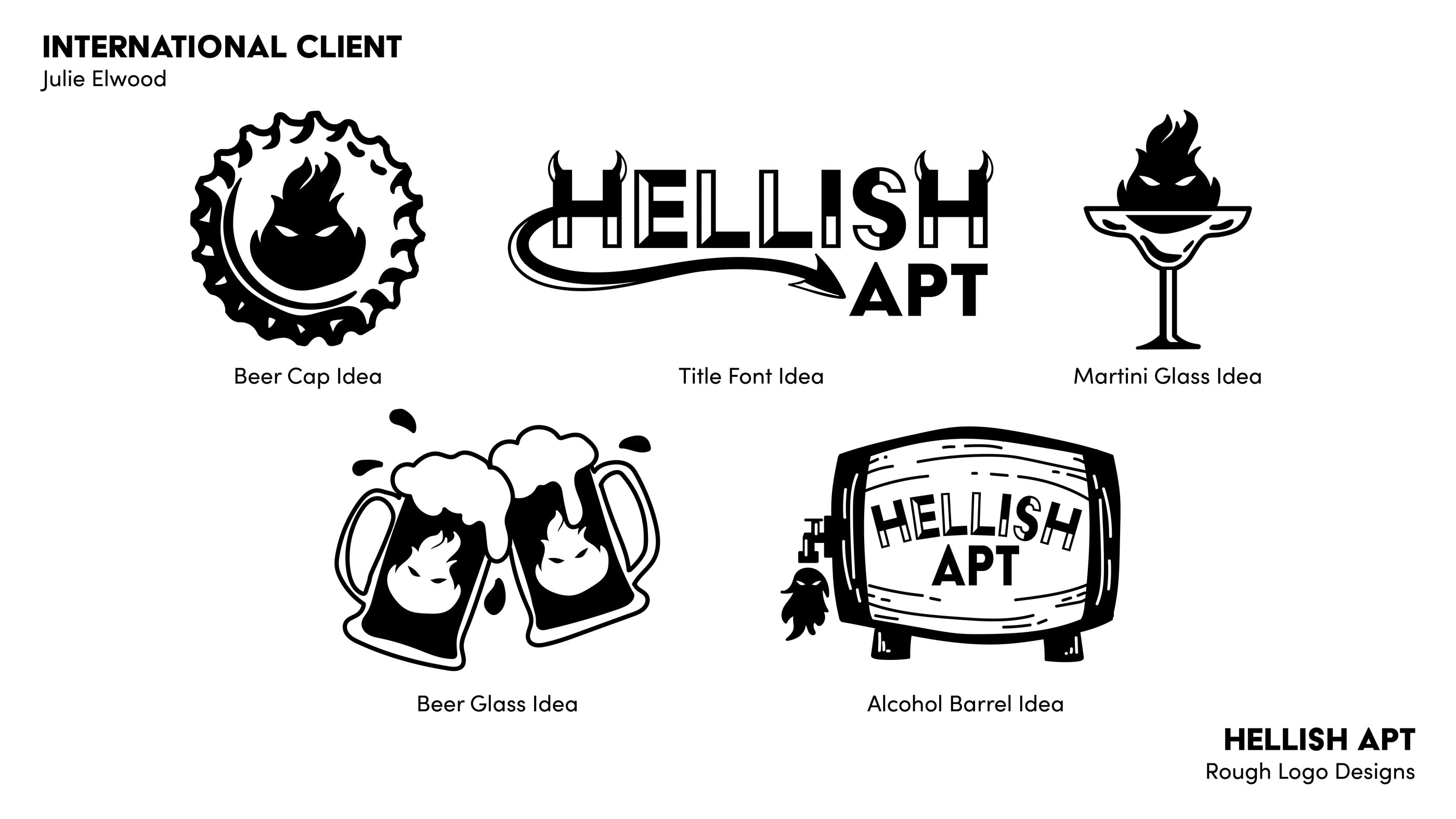
After spending time researching the Hellish APT company, I came up with five logos I thought reflected their image. Each logo has nods (in varying degrees of subtly) to the Hellish APT name and the Americana bar personality the company is perceived to have.
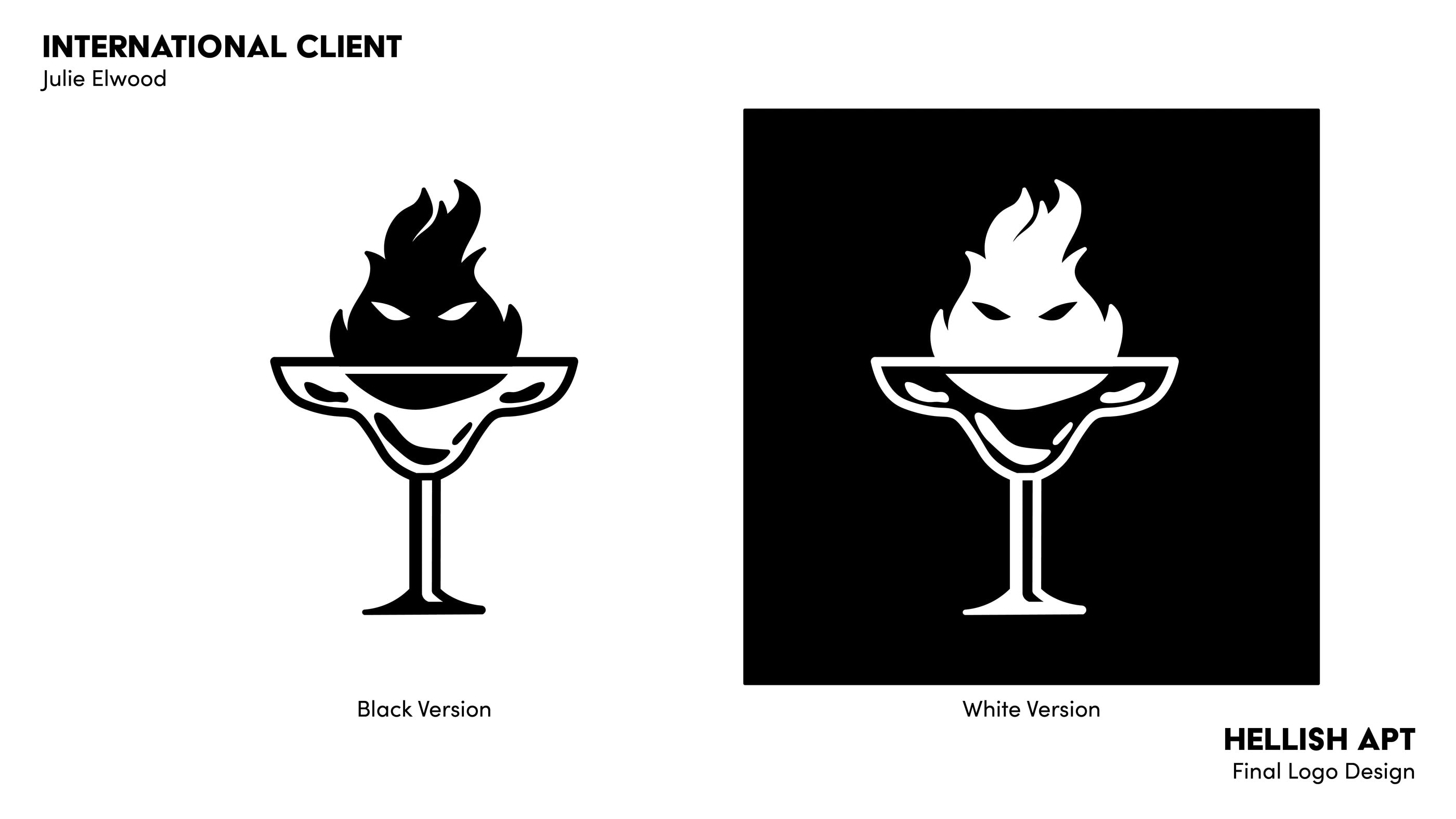
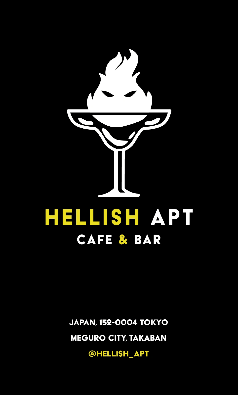
I decided to move forward with the martini glass holding a devilish flame for this project. I cleaned up any inconsistencies and created a white version to use in the future on different materials. I decided the logo was effective enough on its own without any additional color.
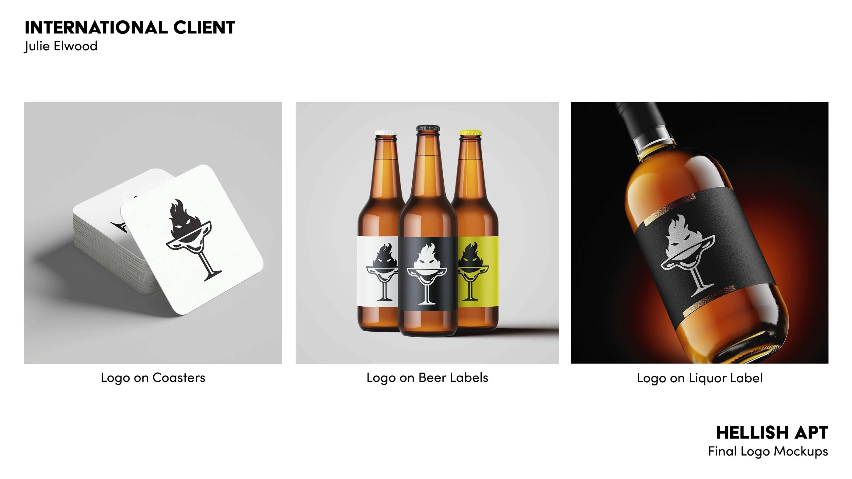
Once the logo was finalized, I created several mockups of possible branding options for the bar, including on alcoholic labels and on coasters.
Hellish APT Menu Design

After successfully creating a logo for the Hellish APT Cafe & Bar, I went forward with redesigning a drink menu that would feature Hellish APT’s most popular drinks.
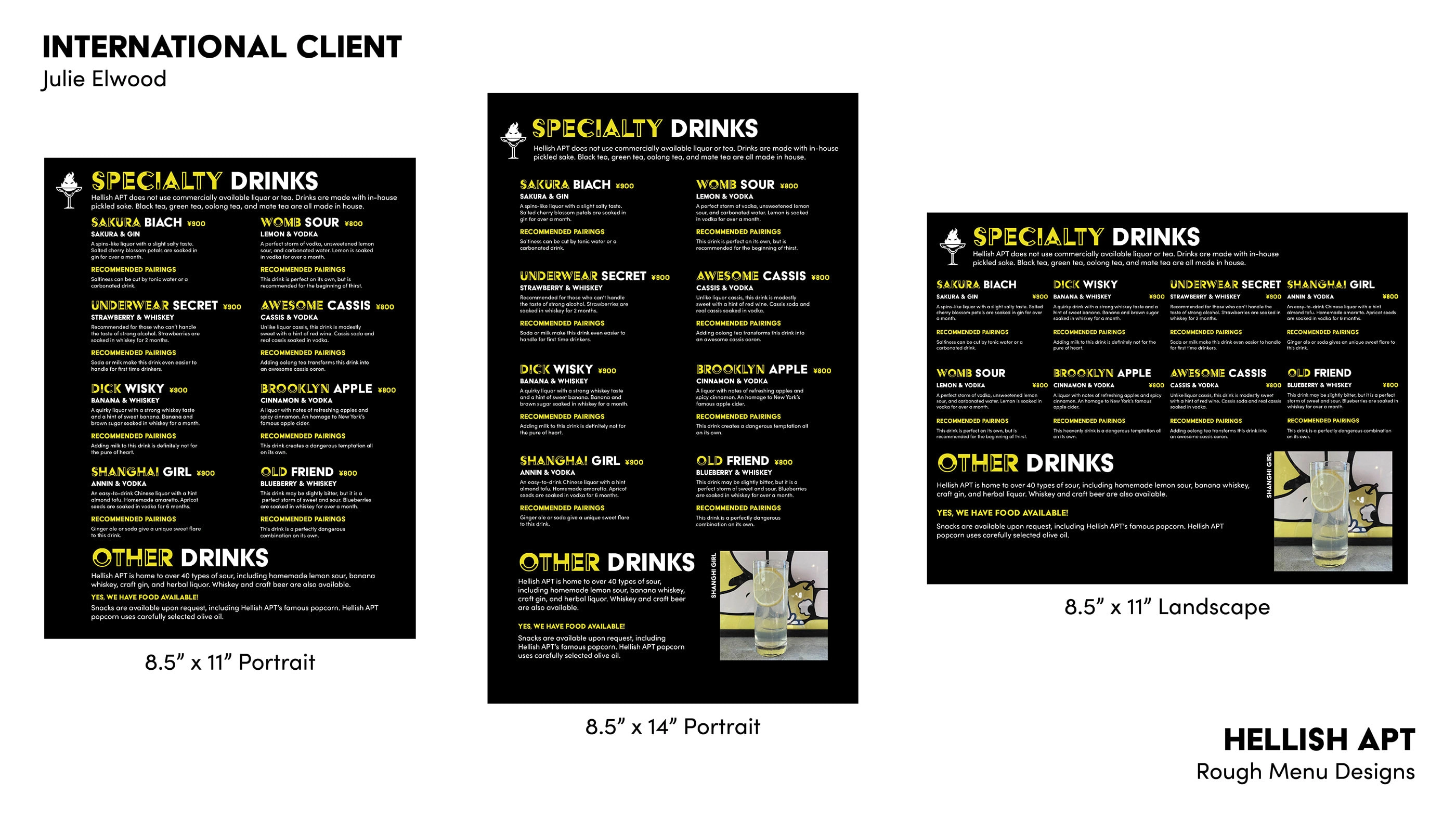
I made three different layouts using the rough branding choices, two that were 8.5″ x 11″ and one that was 8.5″ x 14″. All information listed on the menu was derived from information found while researching the bar. I ended up choosing the 8.5″ x 14″ menu layout, as I felt as though it fit better on the page and followed standard menu sizing.
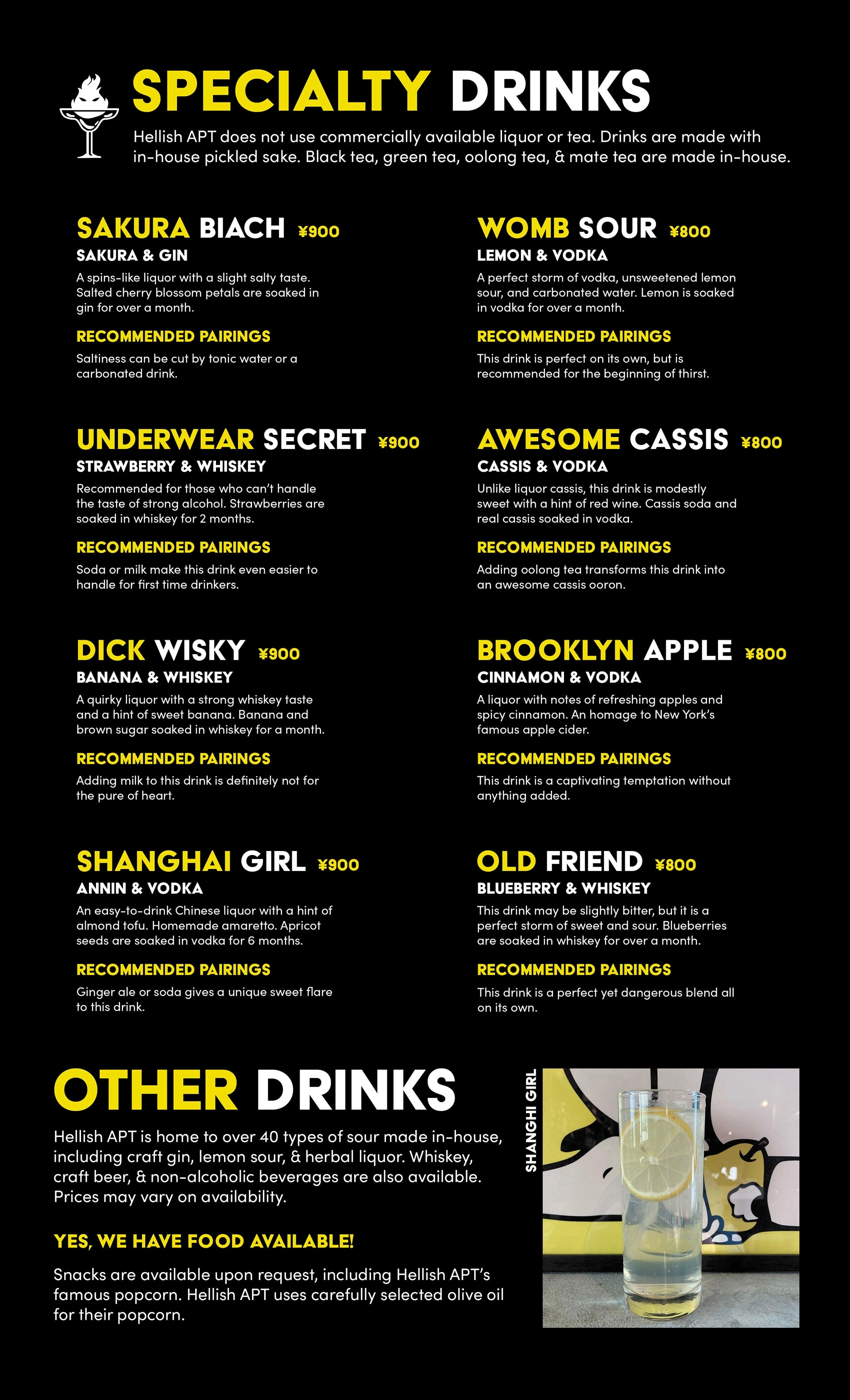
The biggest change to the menu was the replacement of the decorative font and the inclusion of a front cover. Spelling and grammatical errors were also fixed and some text was modified.
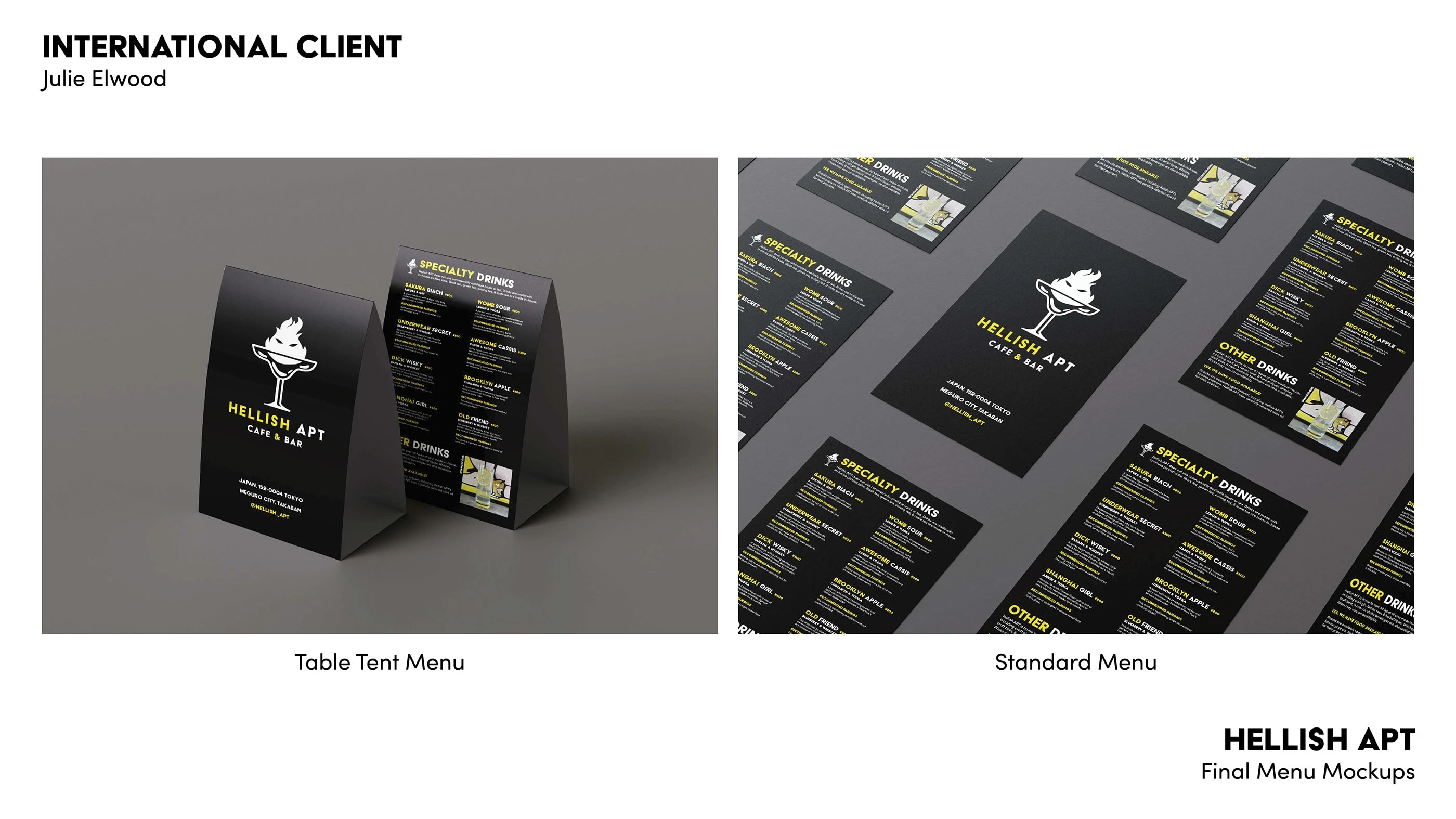
Once the menu was finalized, I created several mockups of how the menu would look in a more physical space.
Hellish APT Signage Design

After completing the logo and menu designs for this project, I moved on to the last deliverable, which was signage design. These signs are intended to be used on the exterior of the bar.
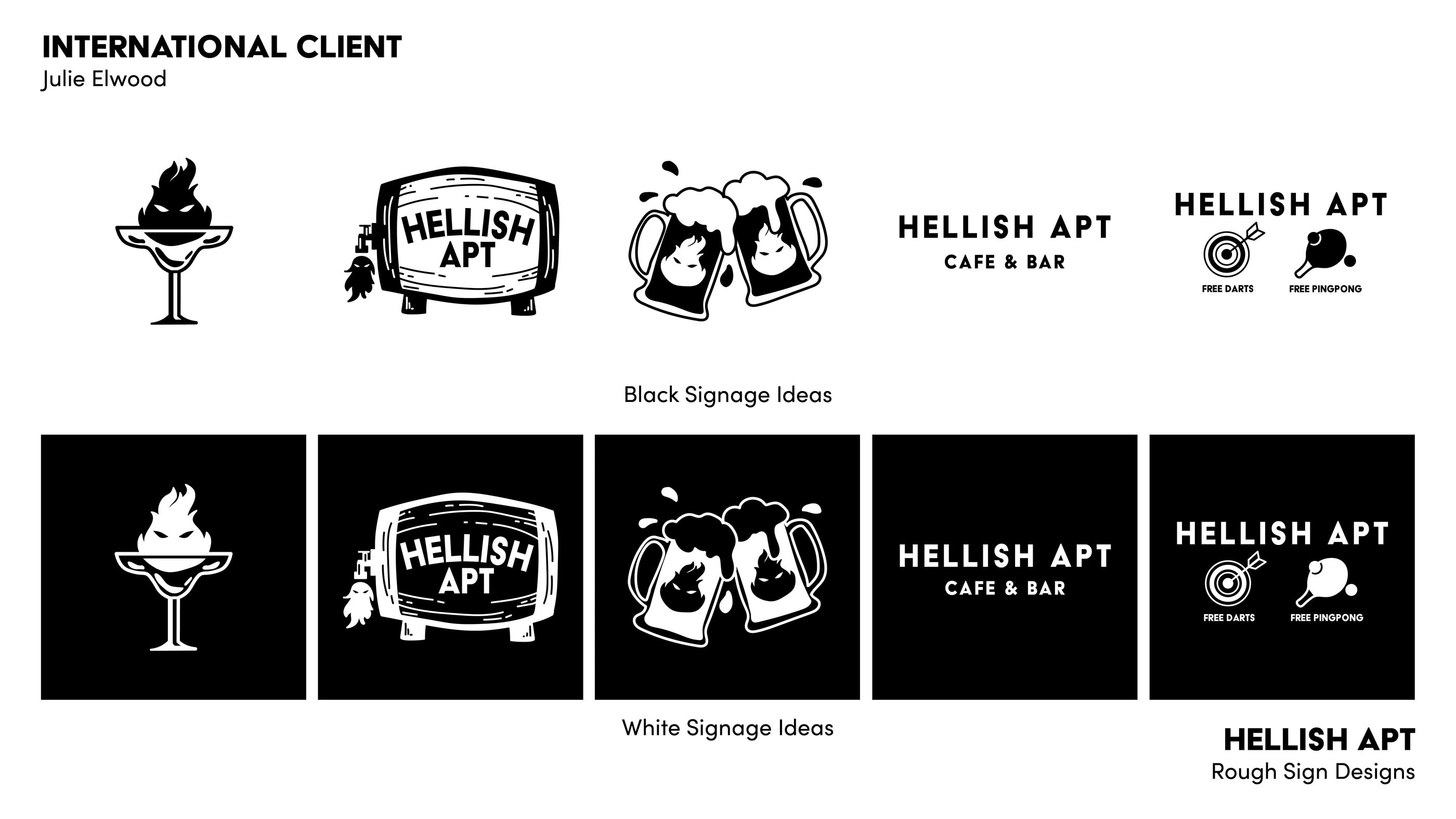
For outside signage, I made five different concepts with two variations each. One concept was to reuse the logo I created in the first step of the project, while two of the designs were logo concepts I believed could be repurposed.
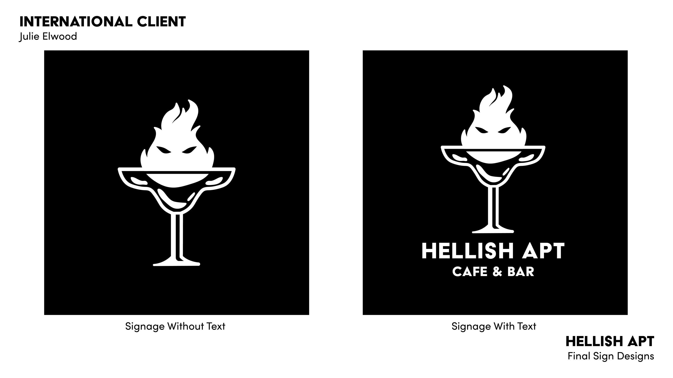
I decided to reuse the logo I had created for Hellish APT for outside signage to keep it consistent. From here I made two variations, one with text and one without, that could be used for different types of signage.
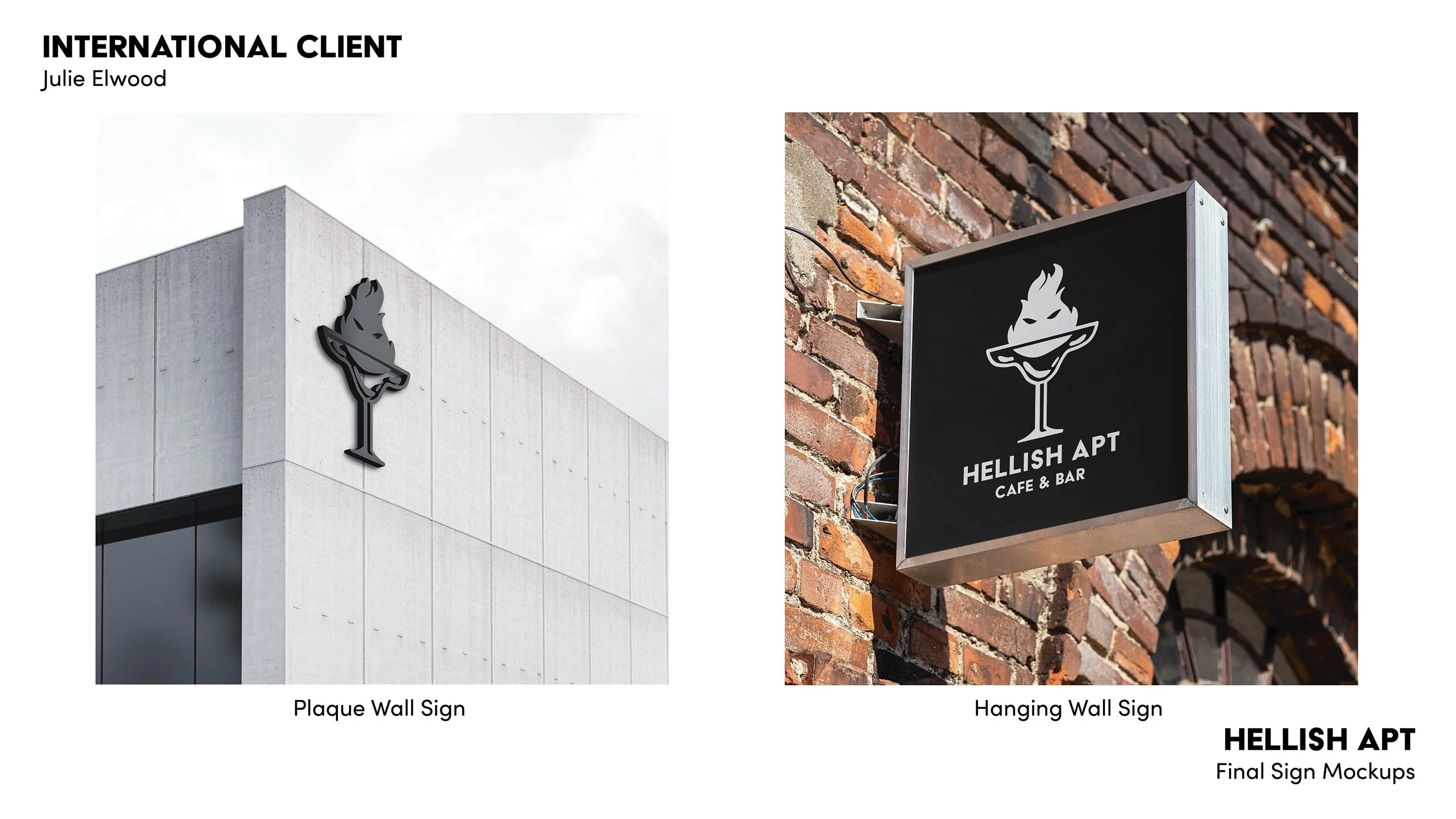
Once the signage was finalized, I created several mockups of how the signs would look in a more physical space.
Final Notes
Once all deliverables were finalized, I organized everything into a PDF booklet to send to the client. The PDF is organized in chronological order of what was created and includes a title page, a project introduction section and dividers, that separate different sections. This project took a fairly long time to complete, but I believe the product is worth all of the hard work accomplished.
Like this project
Posted Aug 3, 2022
This mock rebrand was created to update and fit the needs of the client, Tsuragi Sato for his business the Hellish APT Cafe & Bar.