Built with Kittl
Freshnest — A Wholesome Brand for Modern Grocery Lovers
Gureesha Singh
Freshnest — A Wholesome Brand for Modern Grocery Lovers
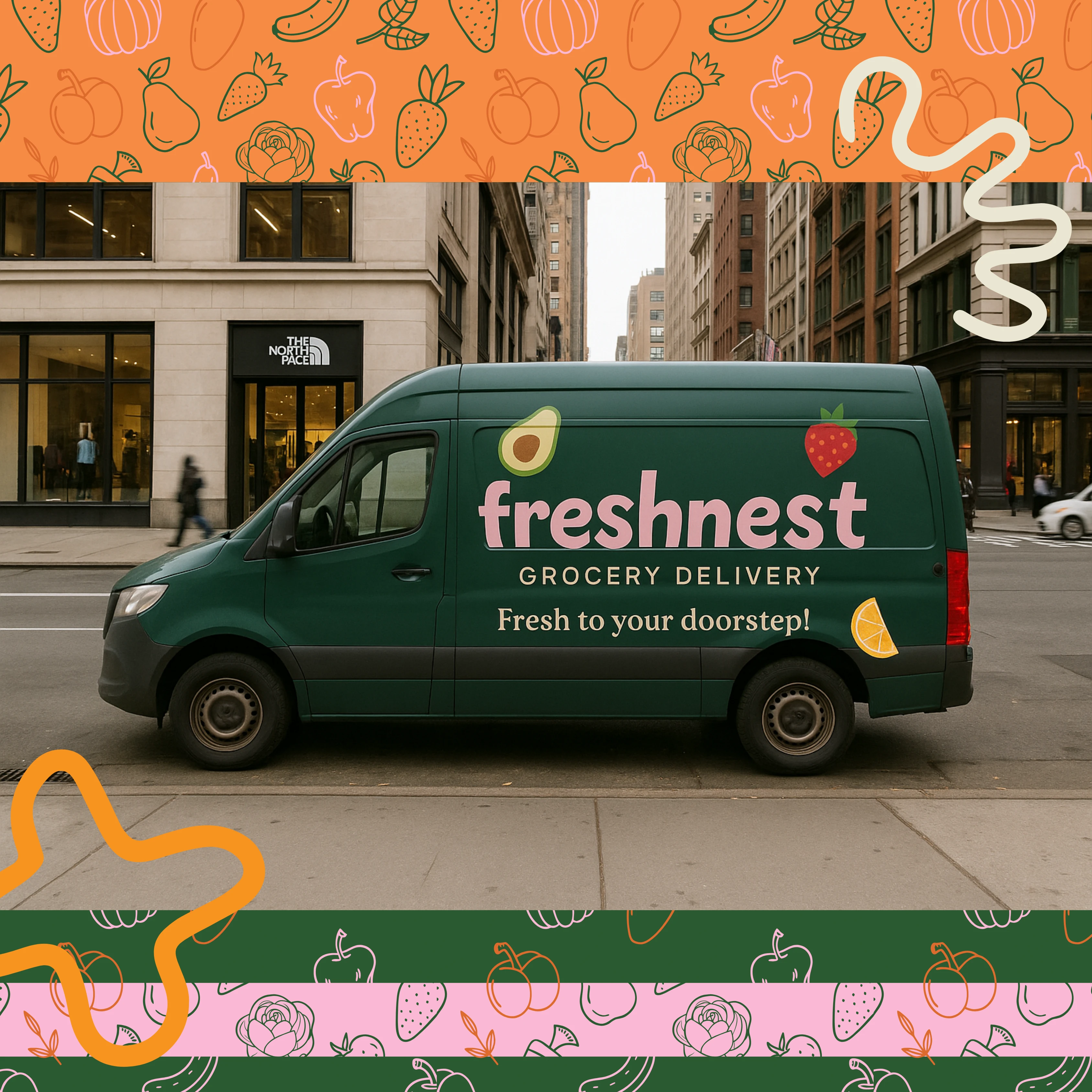
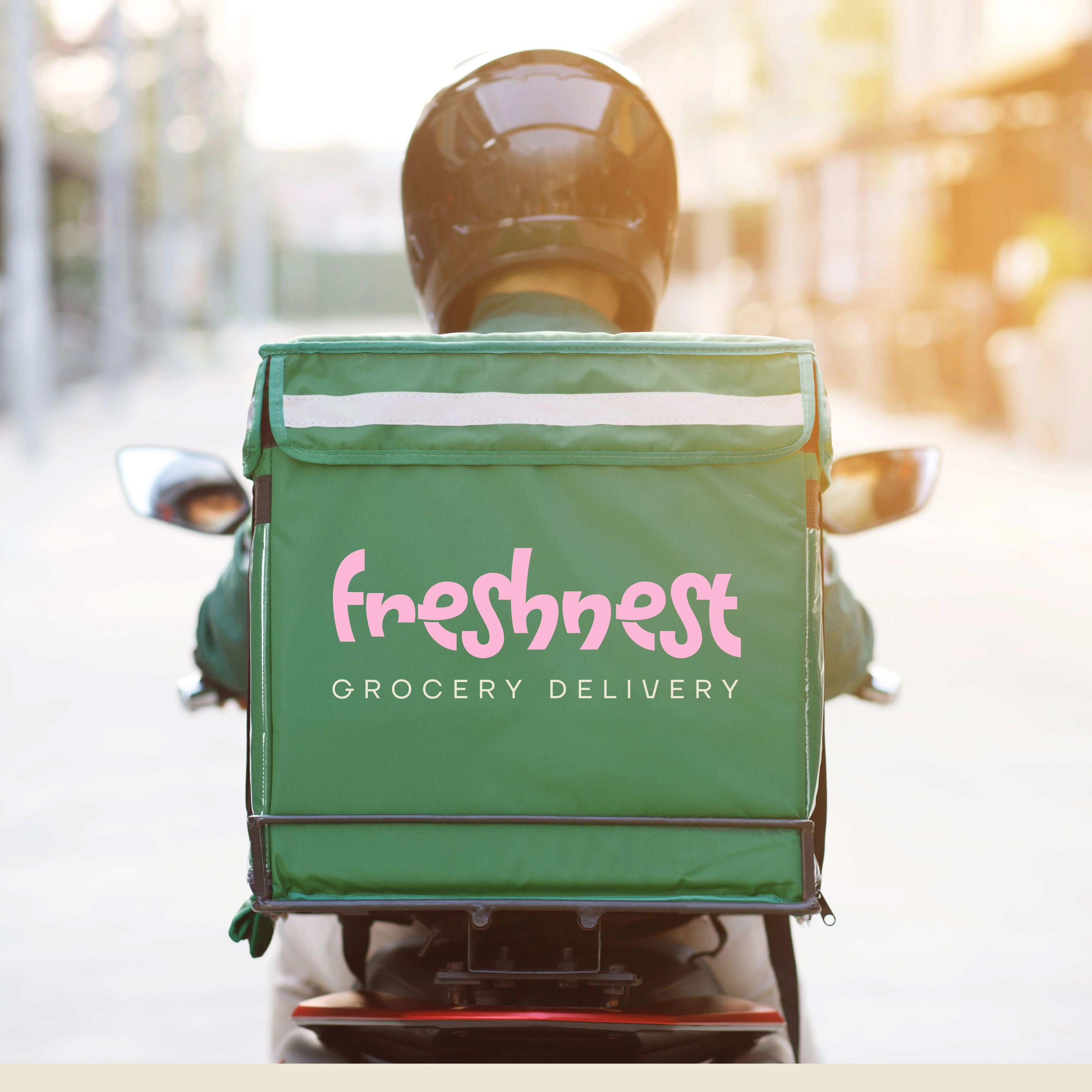
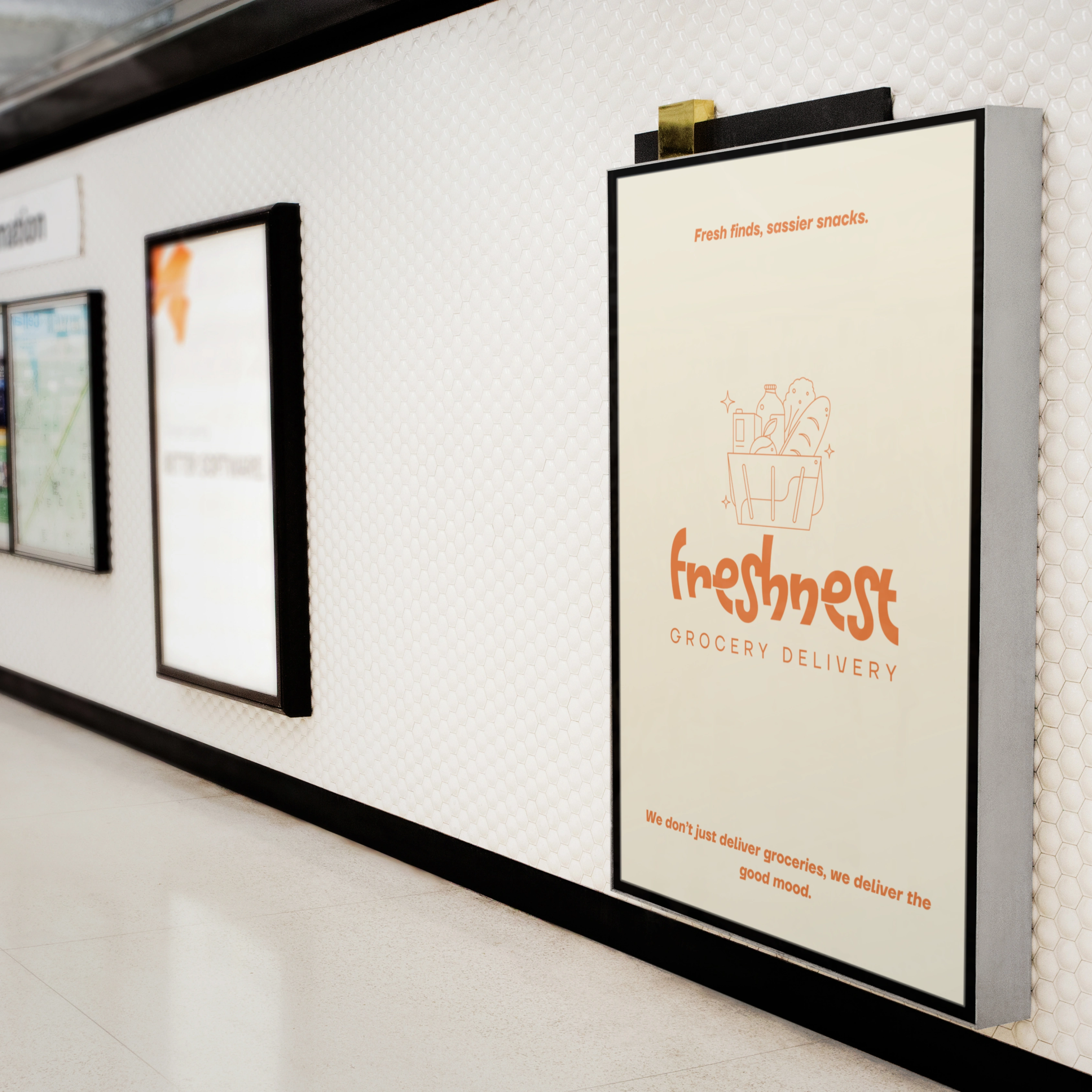
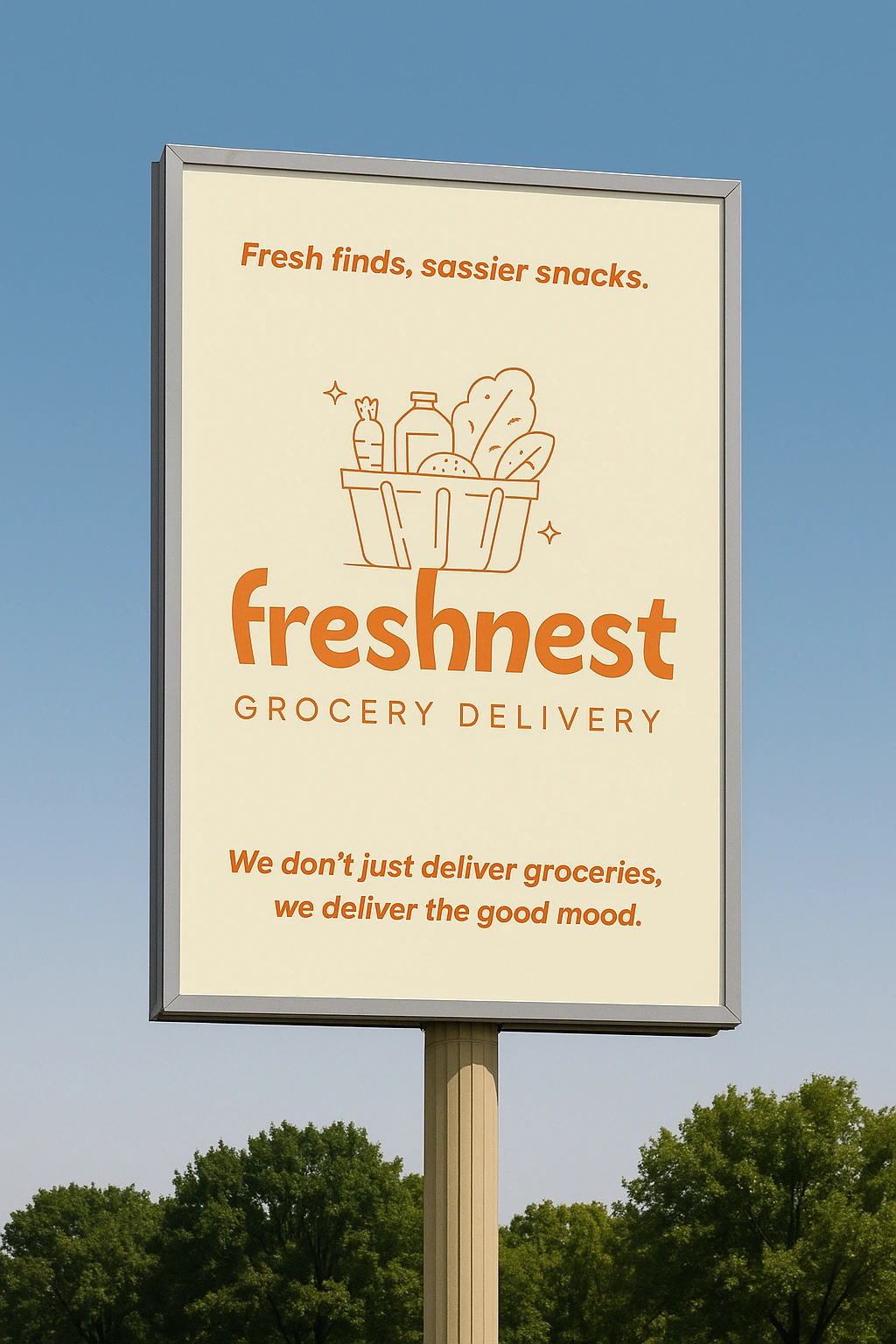
Freshnest is a grocery delivery brand designed to feel soft, fresh, and friendly — a visual departure from cold, hypermarket energy. Built around the concept of freshness with heart, this identity system delivers both convenience and charm.
With playful typography, a pink-based palette, and warm-toned visuals, Freshnest turns everyday essentials into something delightful. This case study includes branding, mockups, social media, packaging, and UI snippets for a full 360° experience.
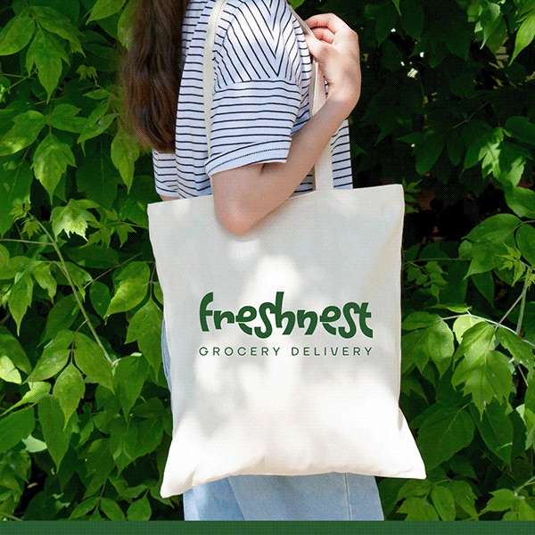
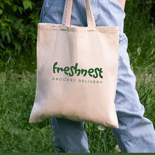
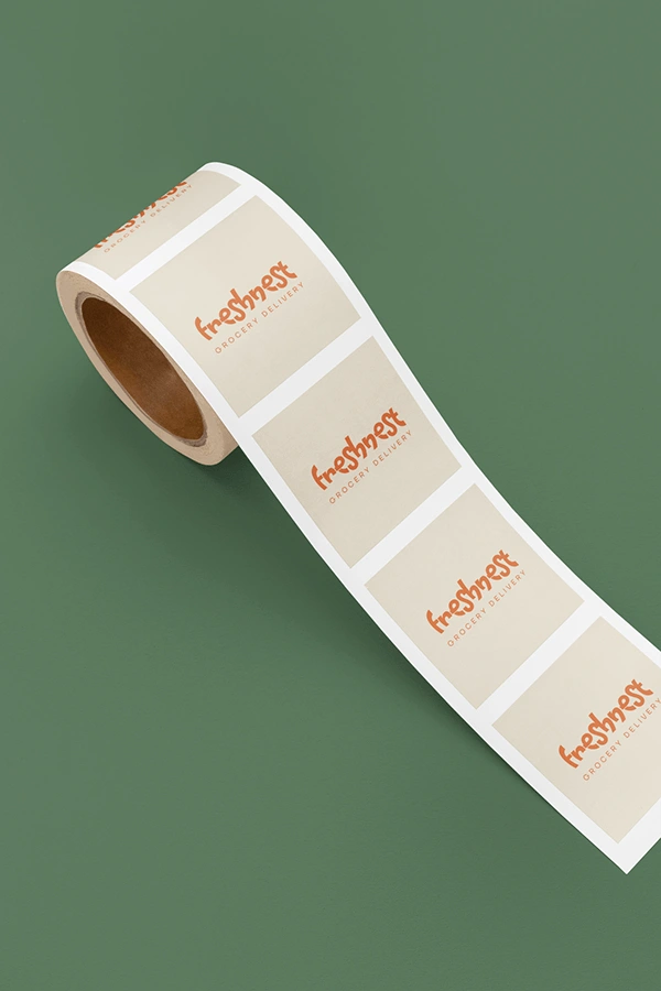
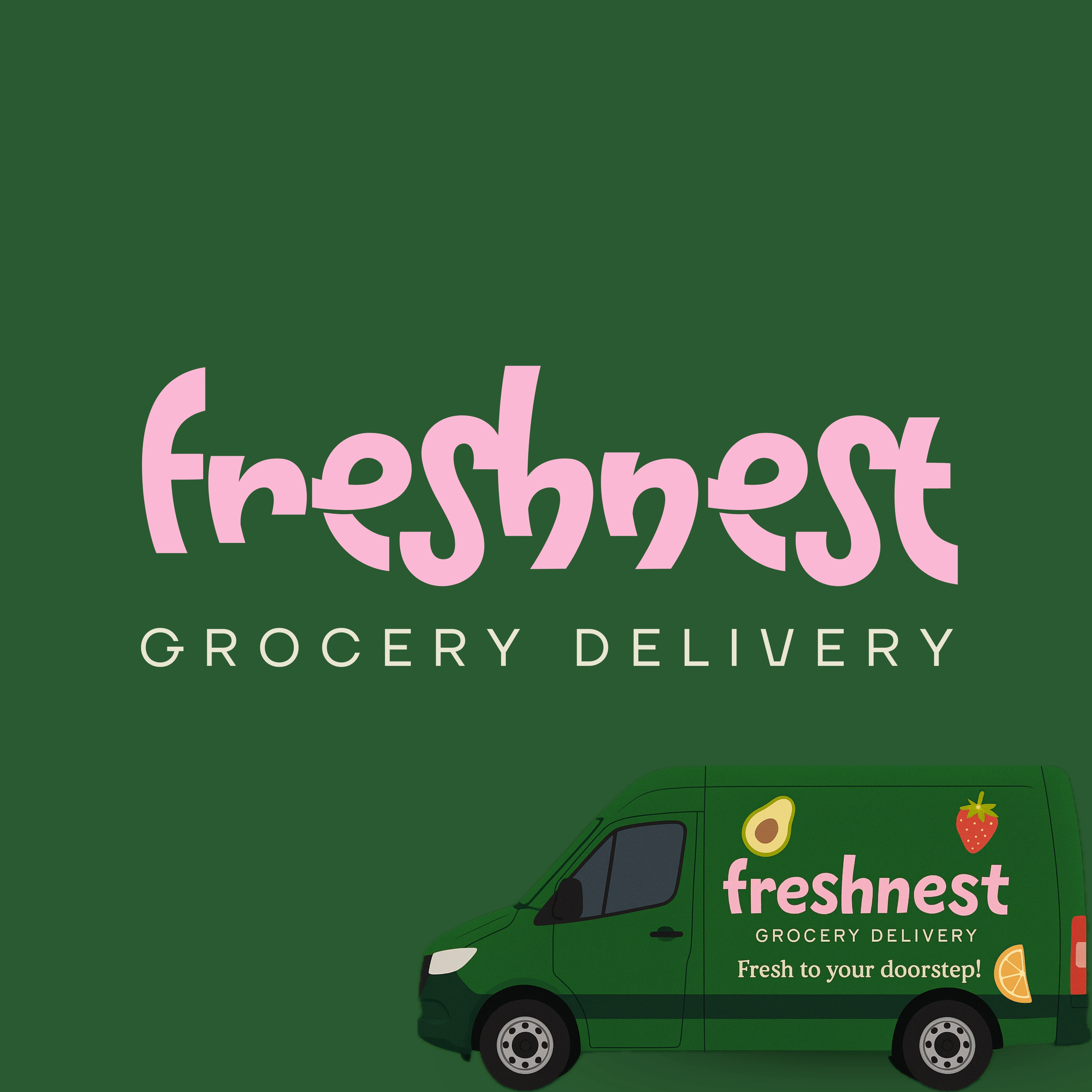
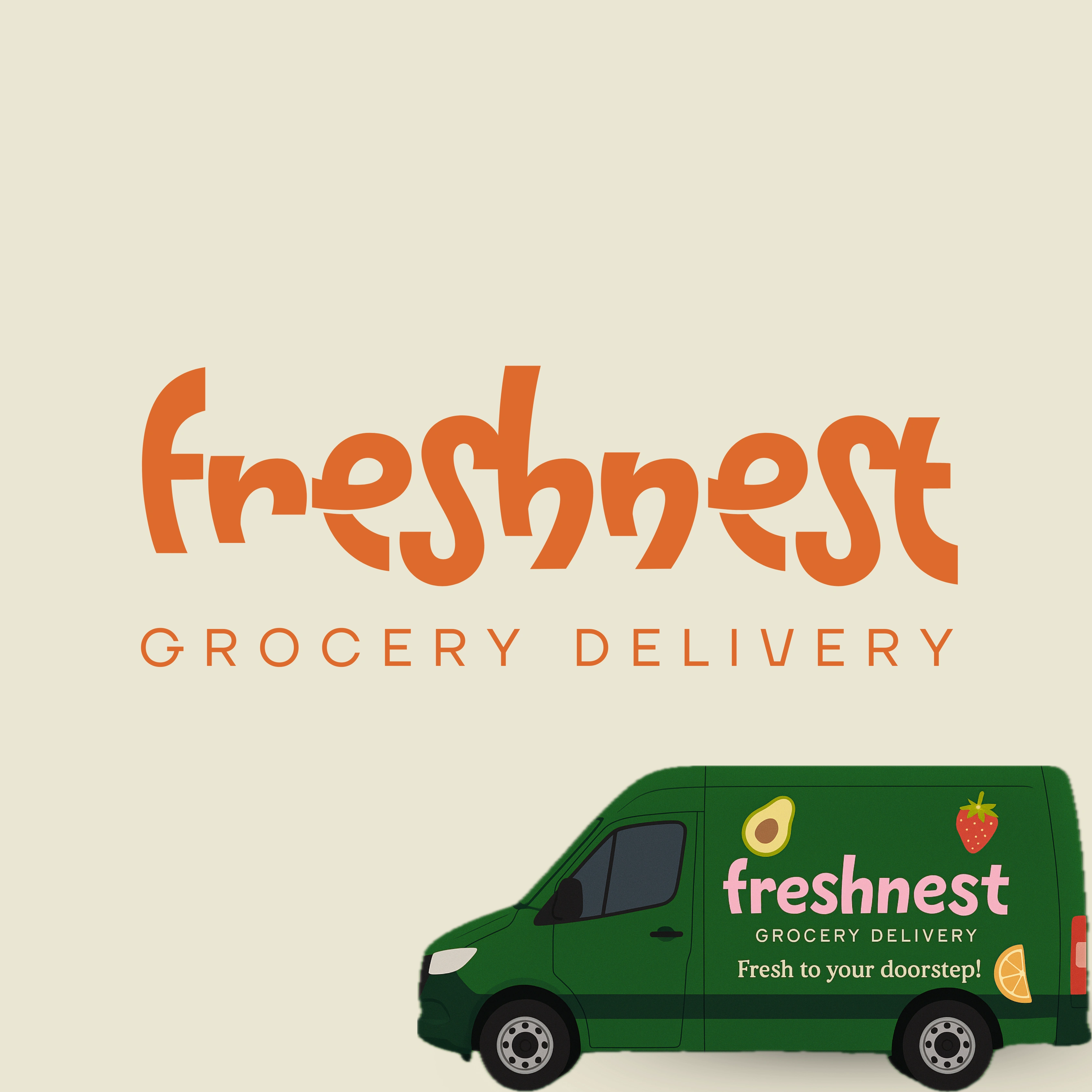
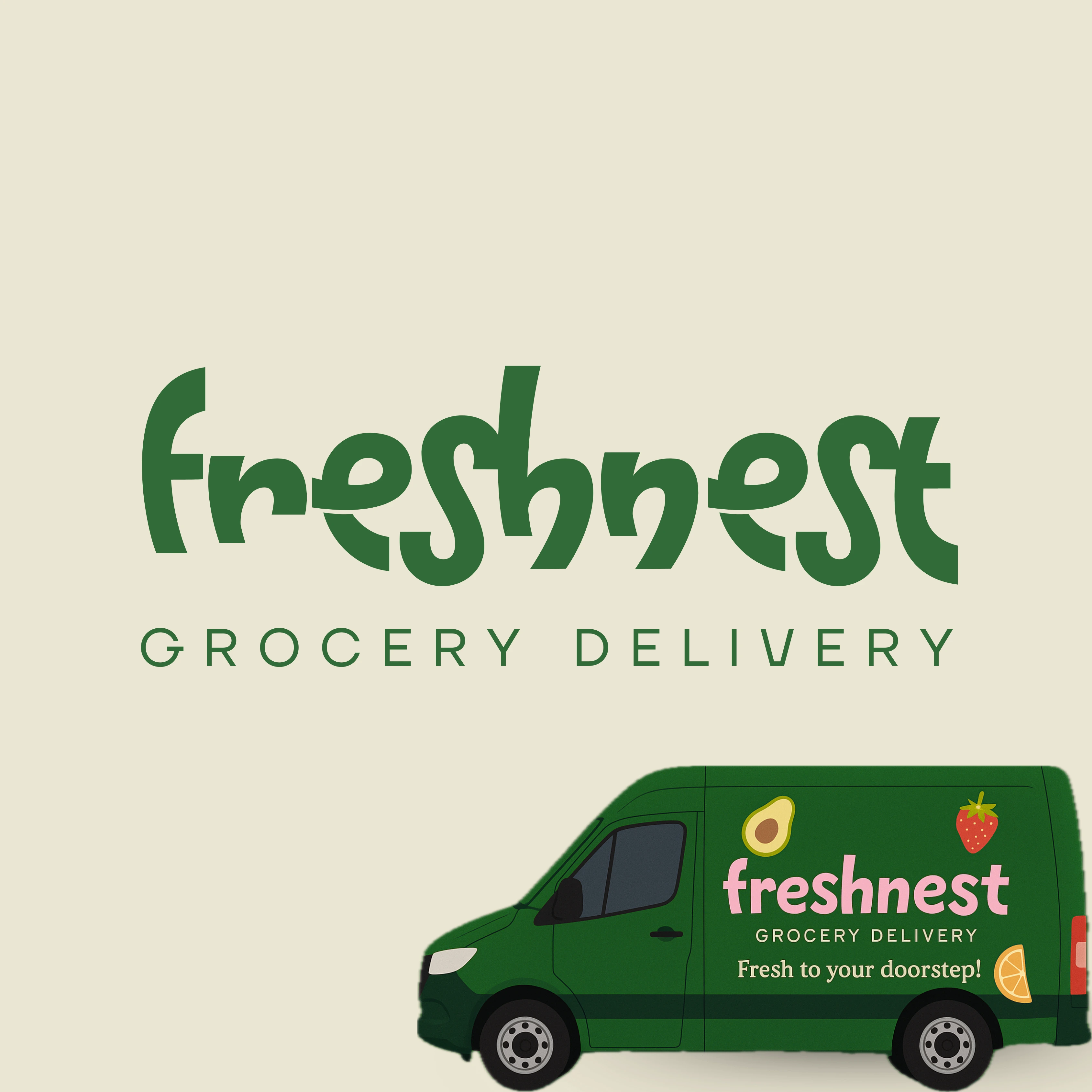
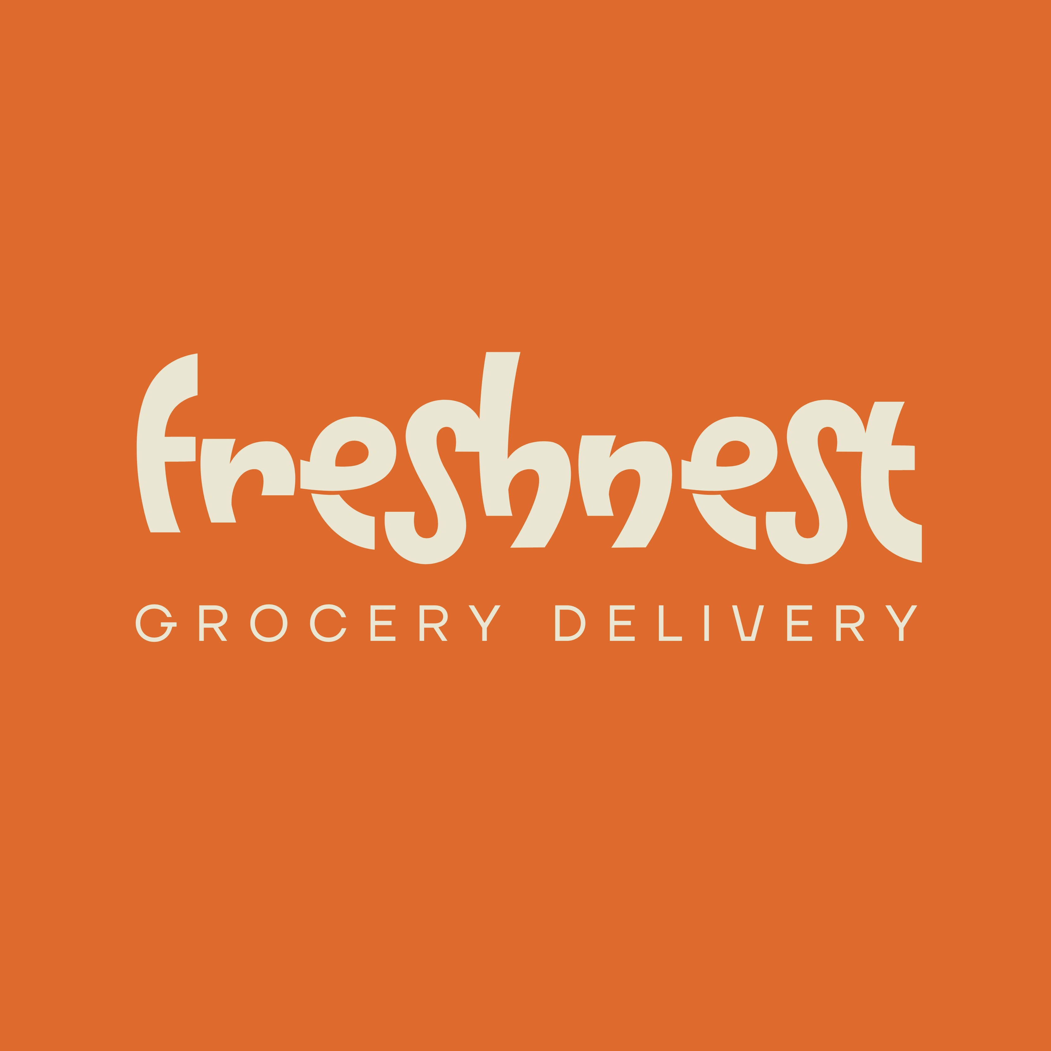
🌸 Logo & Brand Identity


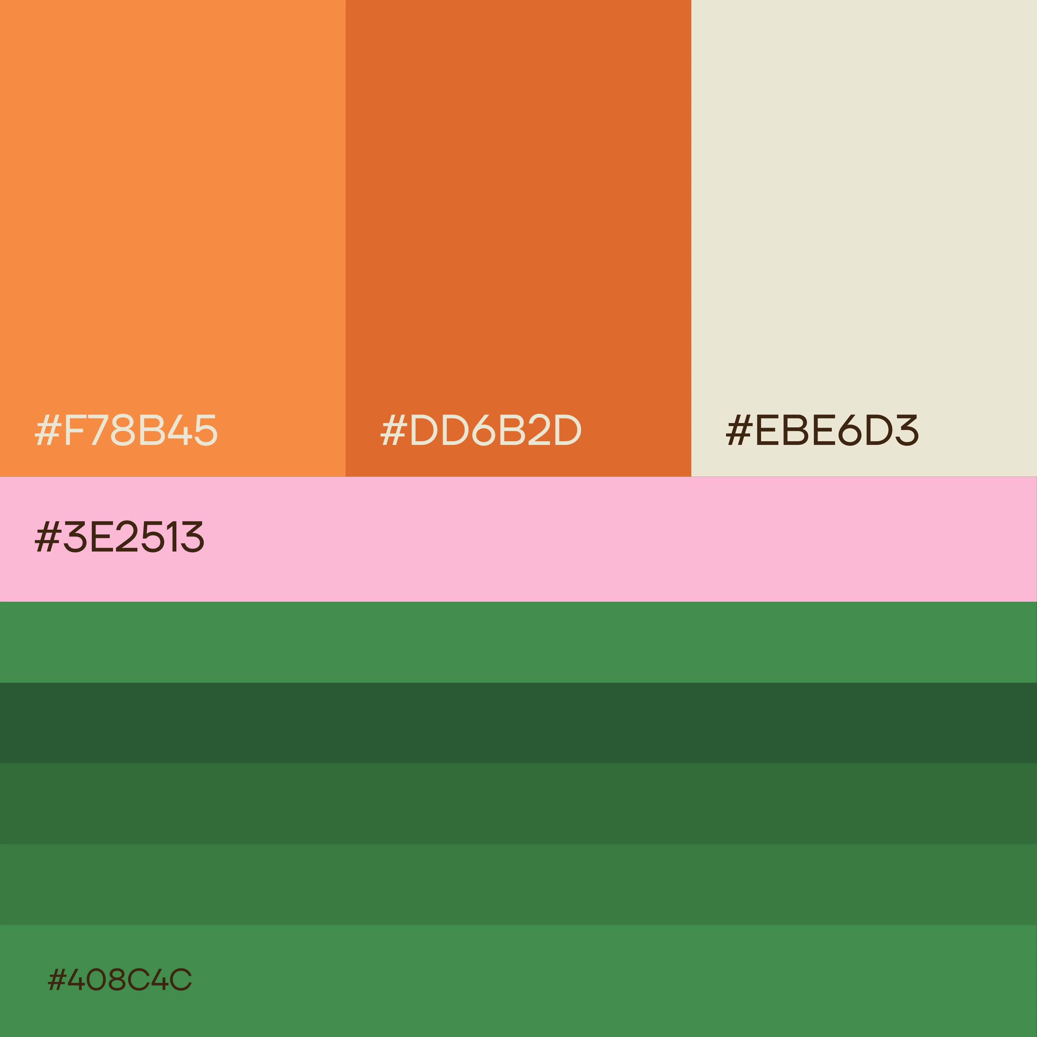
The logotype is rounded, lowercase, and welcoming. The color palette is grounded in shades of rose, cream, and leaf green — invoking freshness, sweetness, and approachability.
Packaging & Product Mockups
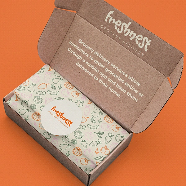
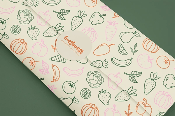
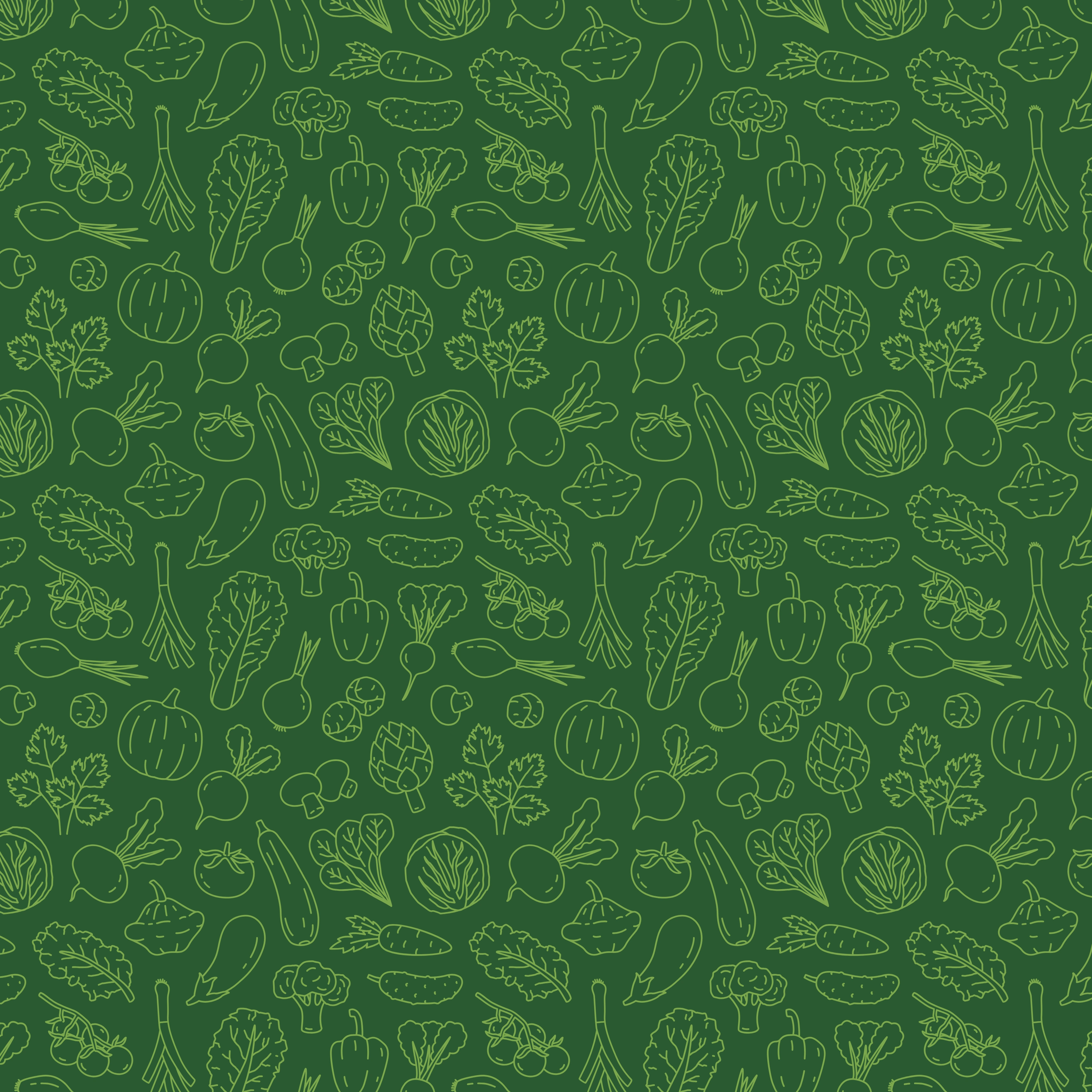
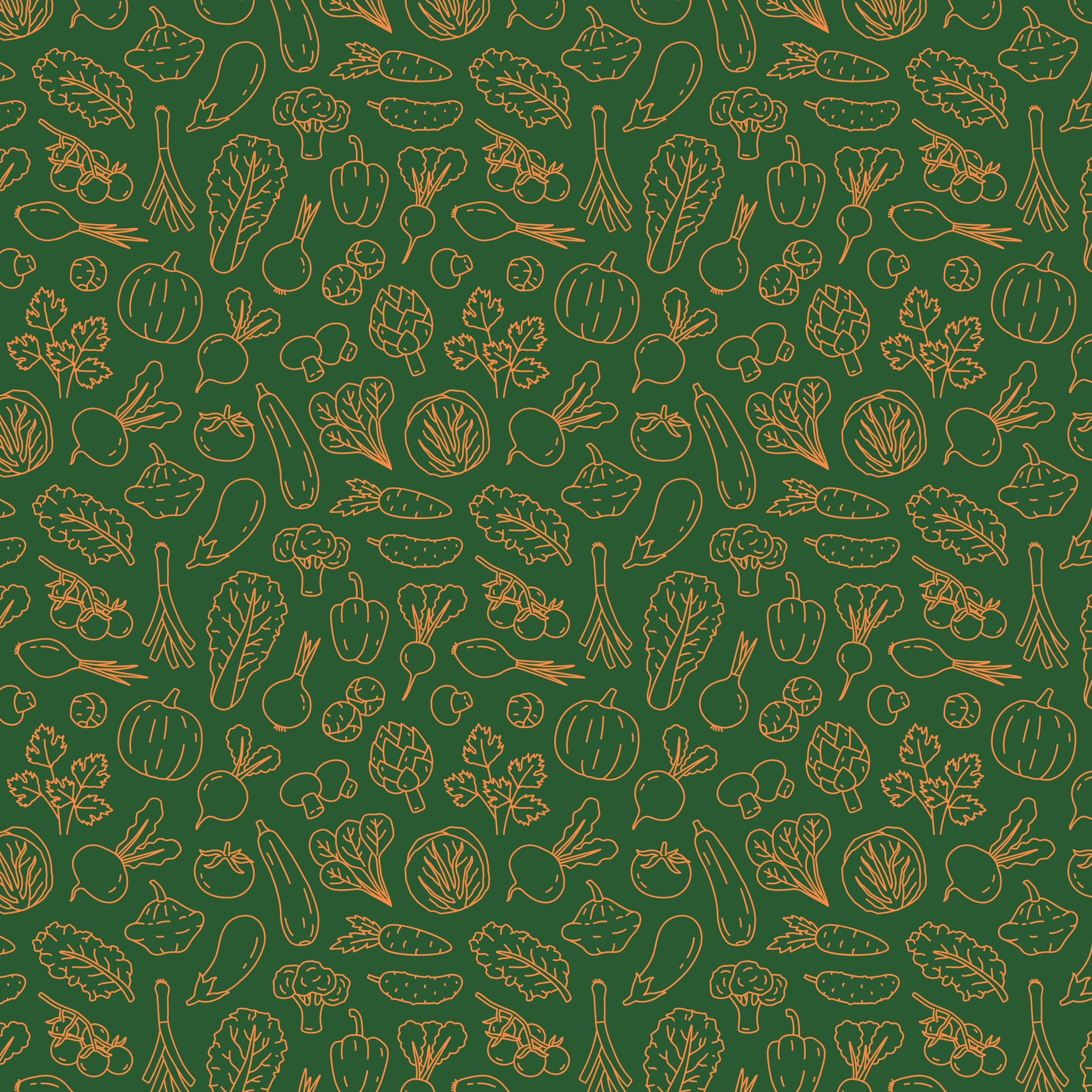
Packaging was designed to feel both eco-conscious and joyful. Soft gradients, sticker graphics, and handwritten-style labels add a personal touch to everyday items.
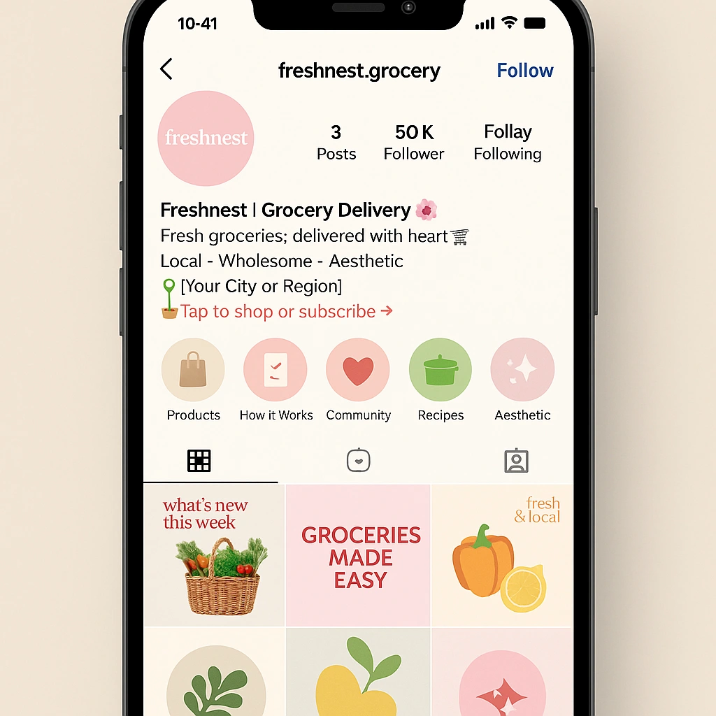
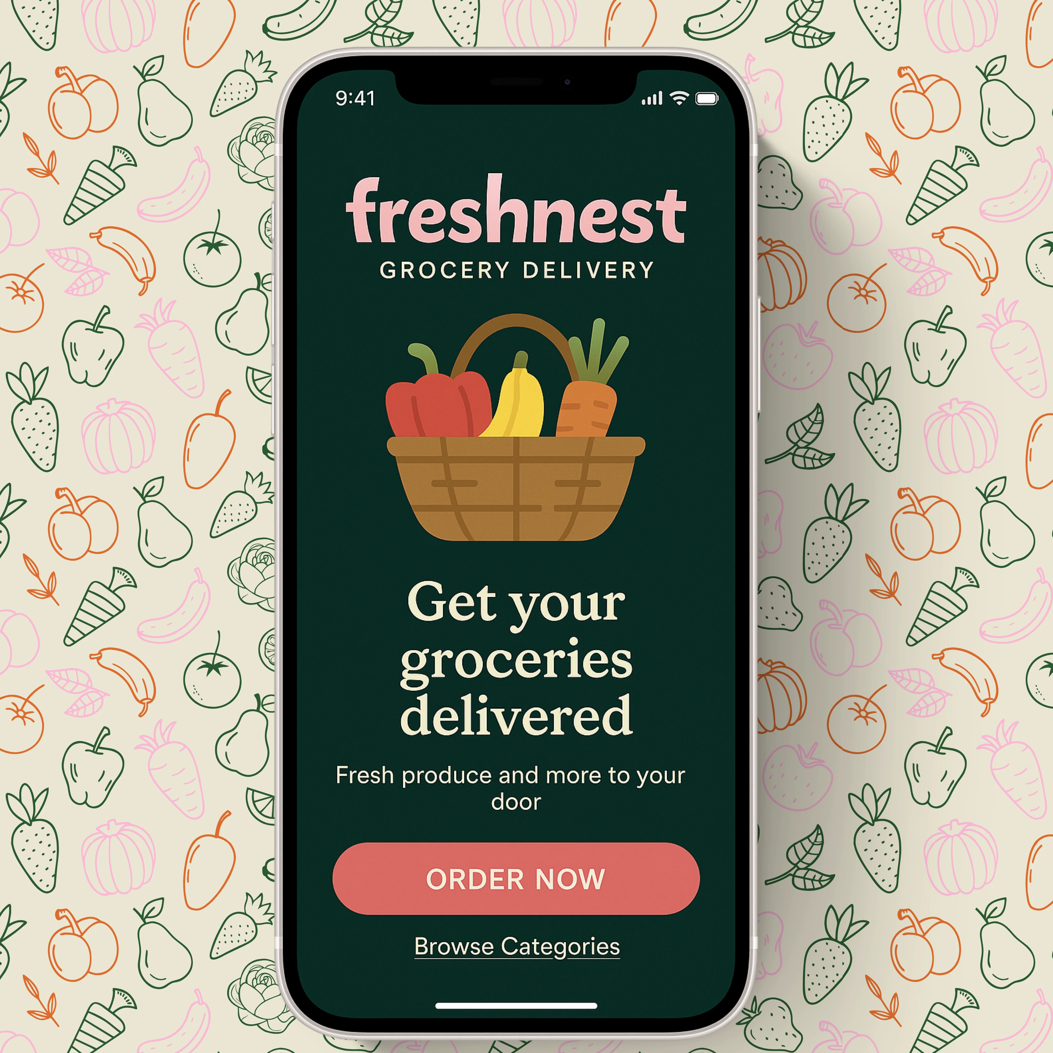
UI/UX – App Snippets
Moodboard Vibe
Freshnest was an exploration of making the ordinary feel extraordinary. In a space often dominated by cold efficiency, this brand invites warmth, intention, and visual joy.
My role included:
✔ Brand strategy & identity
✔ Design system & mockups
✔ Social media assets
✔ UI direction & packaging layout
Like this project
Posted Apr 22, 2025
Freshnest was an exploration of making the ordinary feel extraordinary.
Likes
1
Views
6