Full case Paytion

Vlad Kalynovych


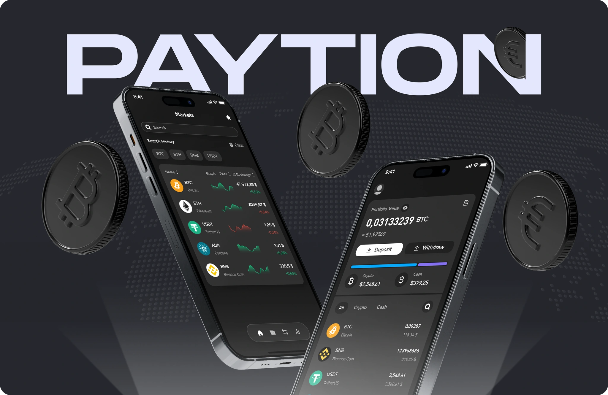
Full case Paytion
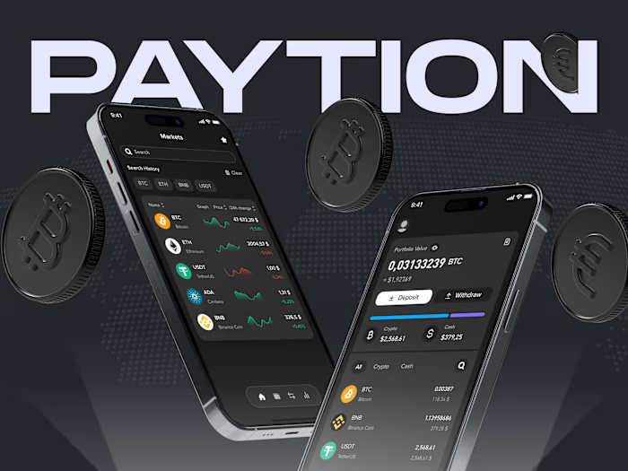
Key scenario: Creating a simple, transparent, and convenient way to use digital currencies in everyday life.
About issues
Users of financial services often face difficulties when exchanging due to complex interfaces and unclear features. This makes it harder to find exchange rates, explore services, and manage finances.

The main challenge was to deliver solutions for a client who had no clear understanding of how card management functionality should operate. Therefore, it was essential to analyze UX patterns from banking experiences and seamlessly integrate them into the interface. I worked on creating the unique UX for the app, conducted market research, and tested various solutions.
How I organized the process
Furthermore, in the project
1. Competitor analysing
I analyzed direct competitors and applications with similar card management mechanisms, highlighting their advantages and disadvantages.
Similar applications

Revolut — minimalist design, quick account opening, easy expense control, smart notifications.

Monzo — flexible financial management, smart budgets, savings automation.

Chime — simple and user-friendly interface, instant deposits, cashback systems.
Monobank — fast registration, gamification, convenient expense control, real-time financial push notifications.
Conclusions from the analysis
Additional services provide clients with more options, increase the average transaction value, and enhance personalization. The main goal is to establish a stable client service with a simple interface, ensuring an intuitive and user-friendly experience for common users.
2. From Challenges to Problem Solving
User scenario development

For each stage, metrics were defined as indicators to justify the implementation of each solution in the final product.
Simplified and secure Login process
Enhanced financial workflows
Transparent fund monitoring and transaction history
Notifications
Results:
Considering banking service features, a Sitemap was initially sketched on paper, incorporating the overall User Story. During the design process, user behavior patterns and needs for effective management were identified and addressed.
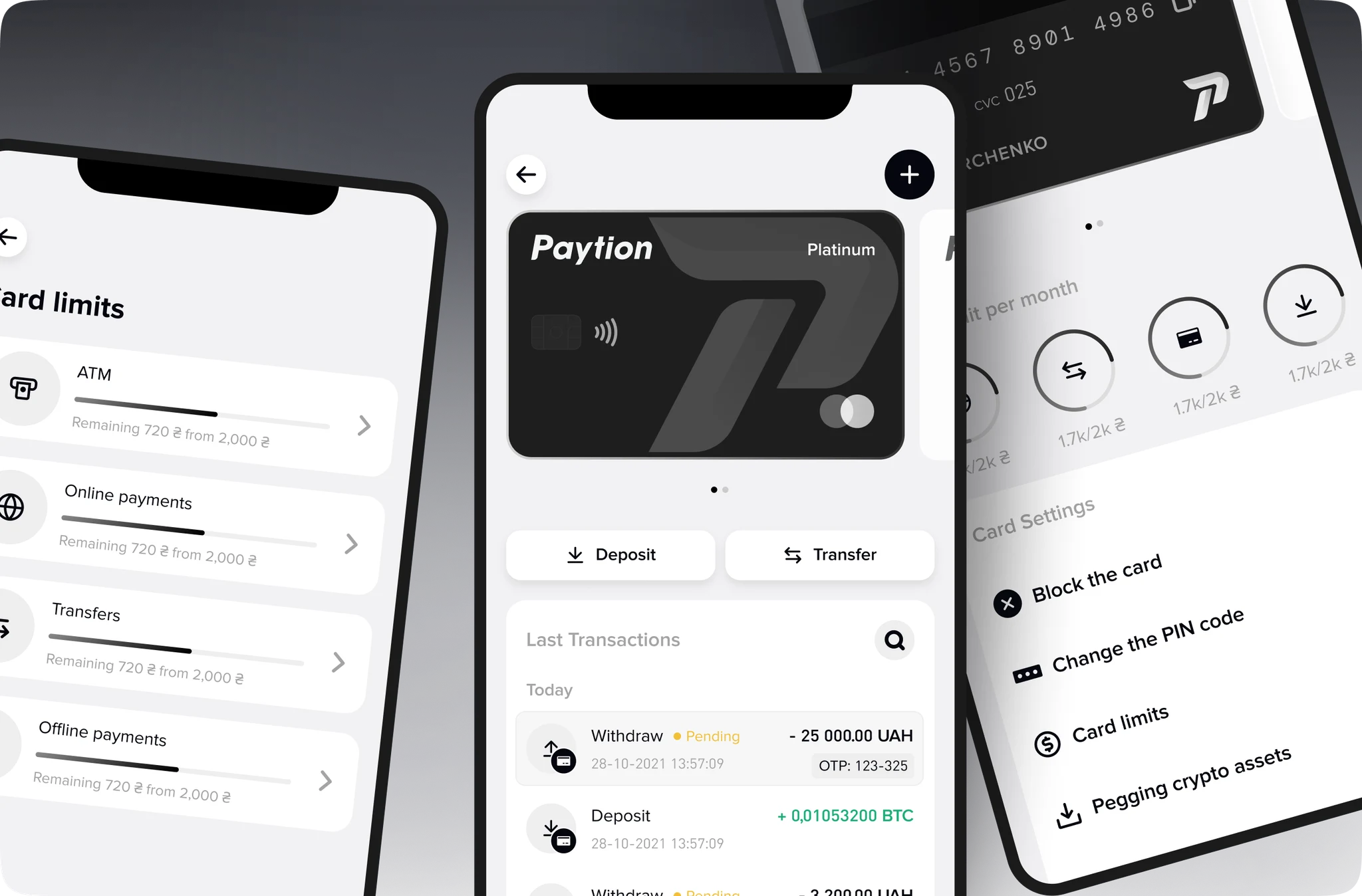
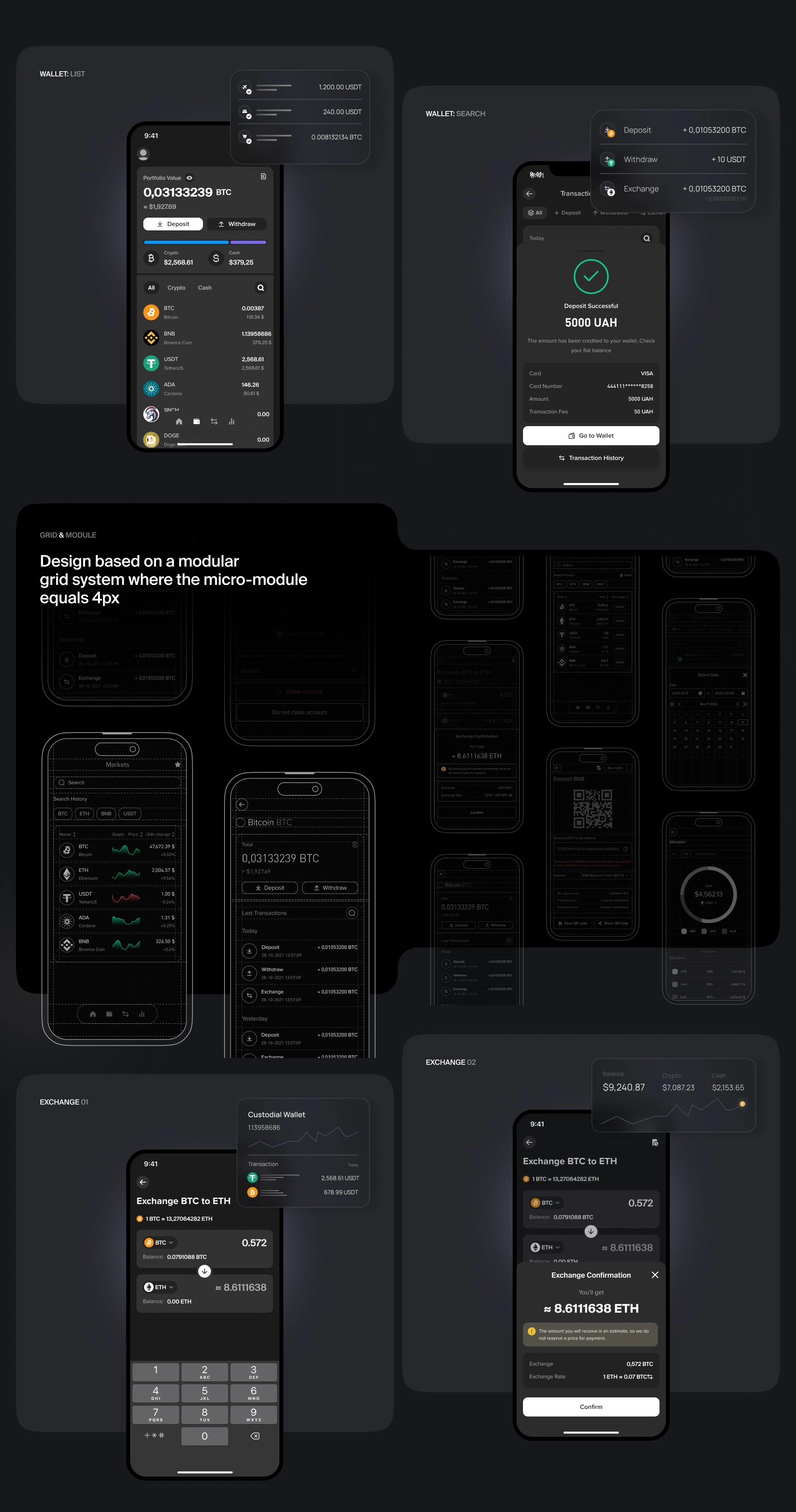
Solutions enable users to quickly make deposits, withdraw funds, view transaction history, transfer money, and set limits — all accessible from the main screen.
After implementing the core functionality to enable quick and simple operations with a high level of clarity and trust, the next milestone was the integration of a card management service.
3. Prototyping
After analyzing the findings, the structure of the necessary screens was agreed upon, which allowed for the efficient start of prototyping key elements.

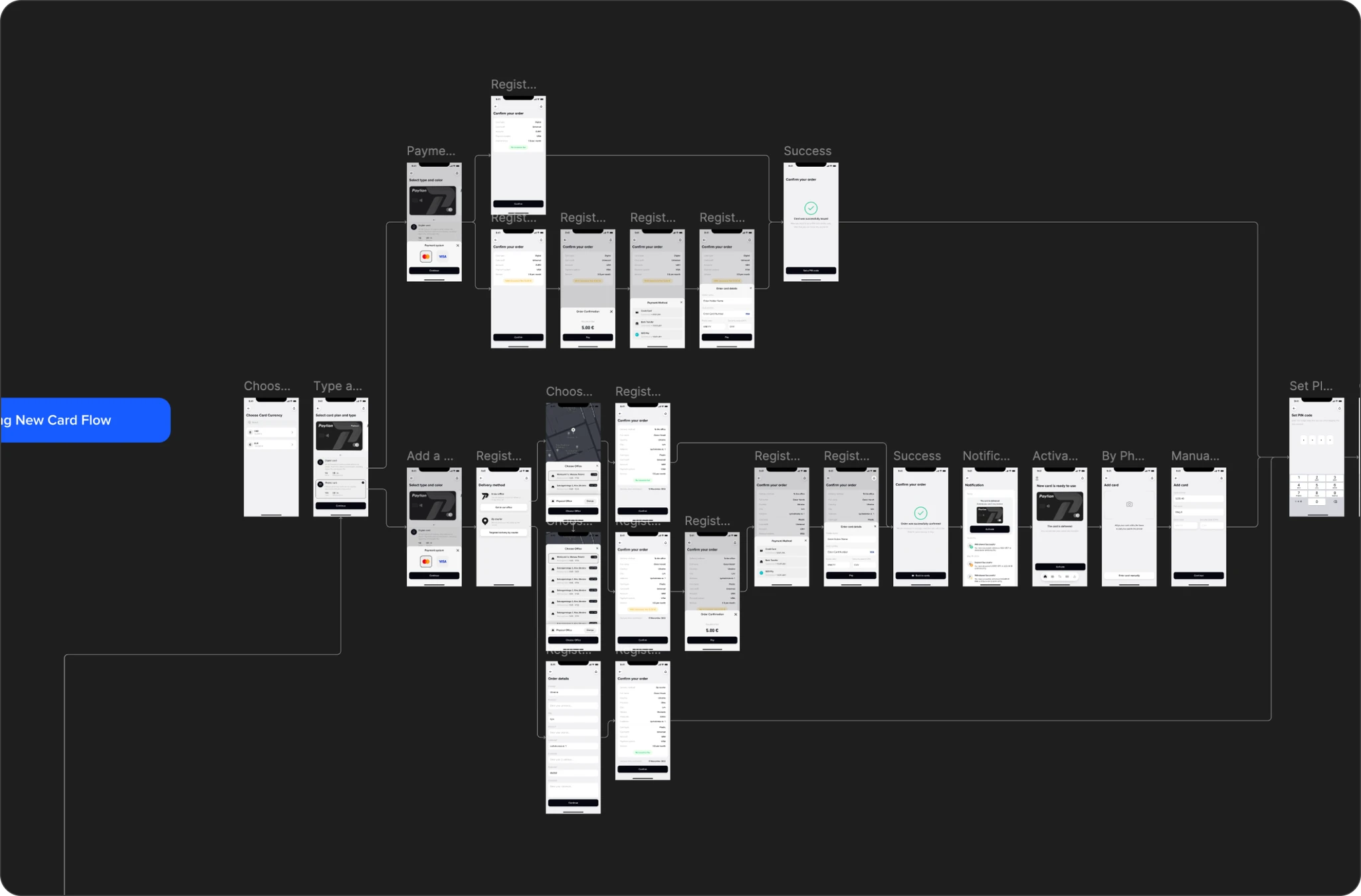
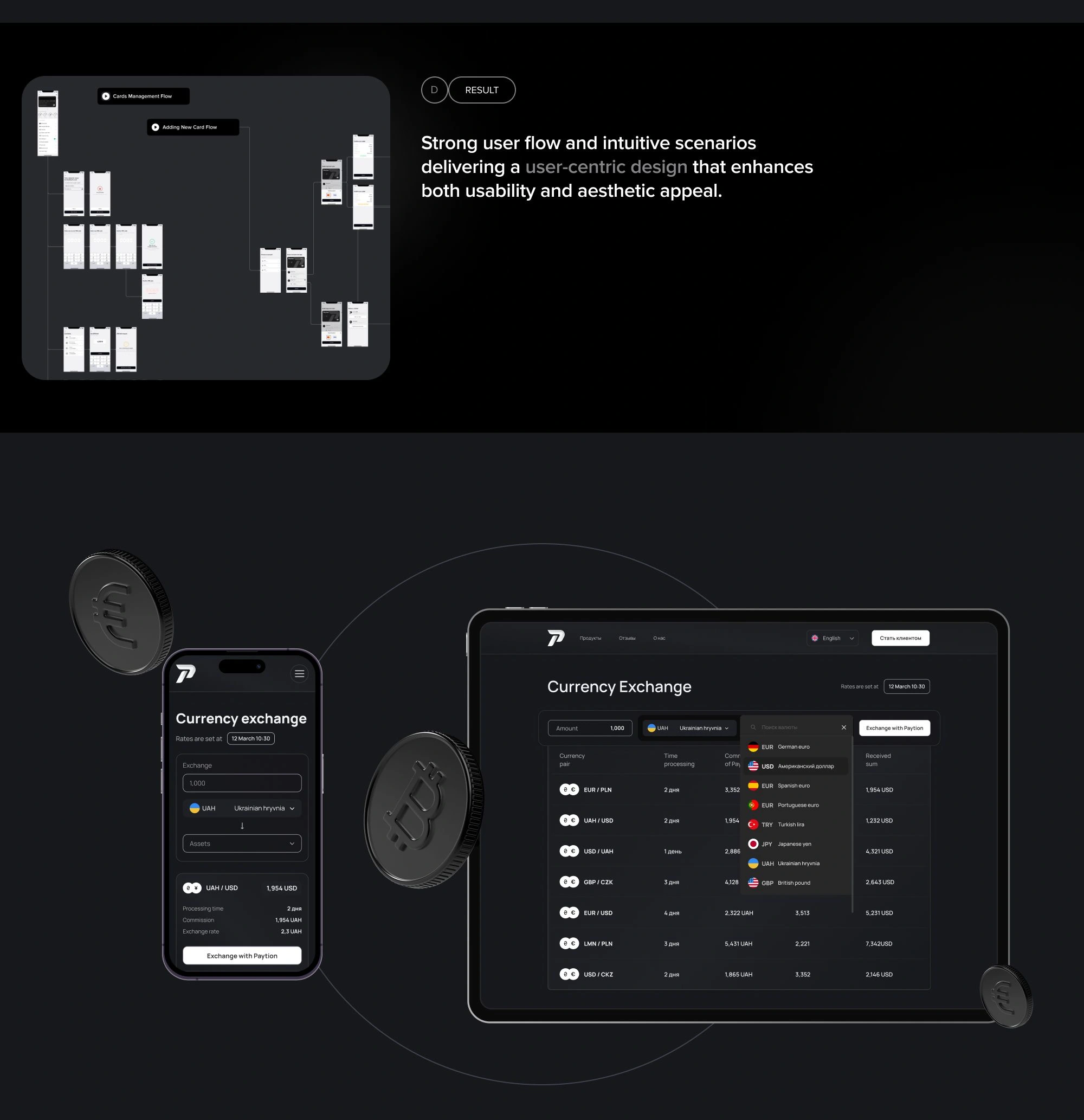
The wireframing stage helped simplify the user flow by implementing clear navigation and reducing the number of screens for a faster, more efficient experience. Key aspects, such as content interaction and intuitive management, were balanced with a streamlined UI.
Joining the Waitlist for a New Card
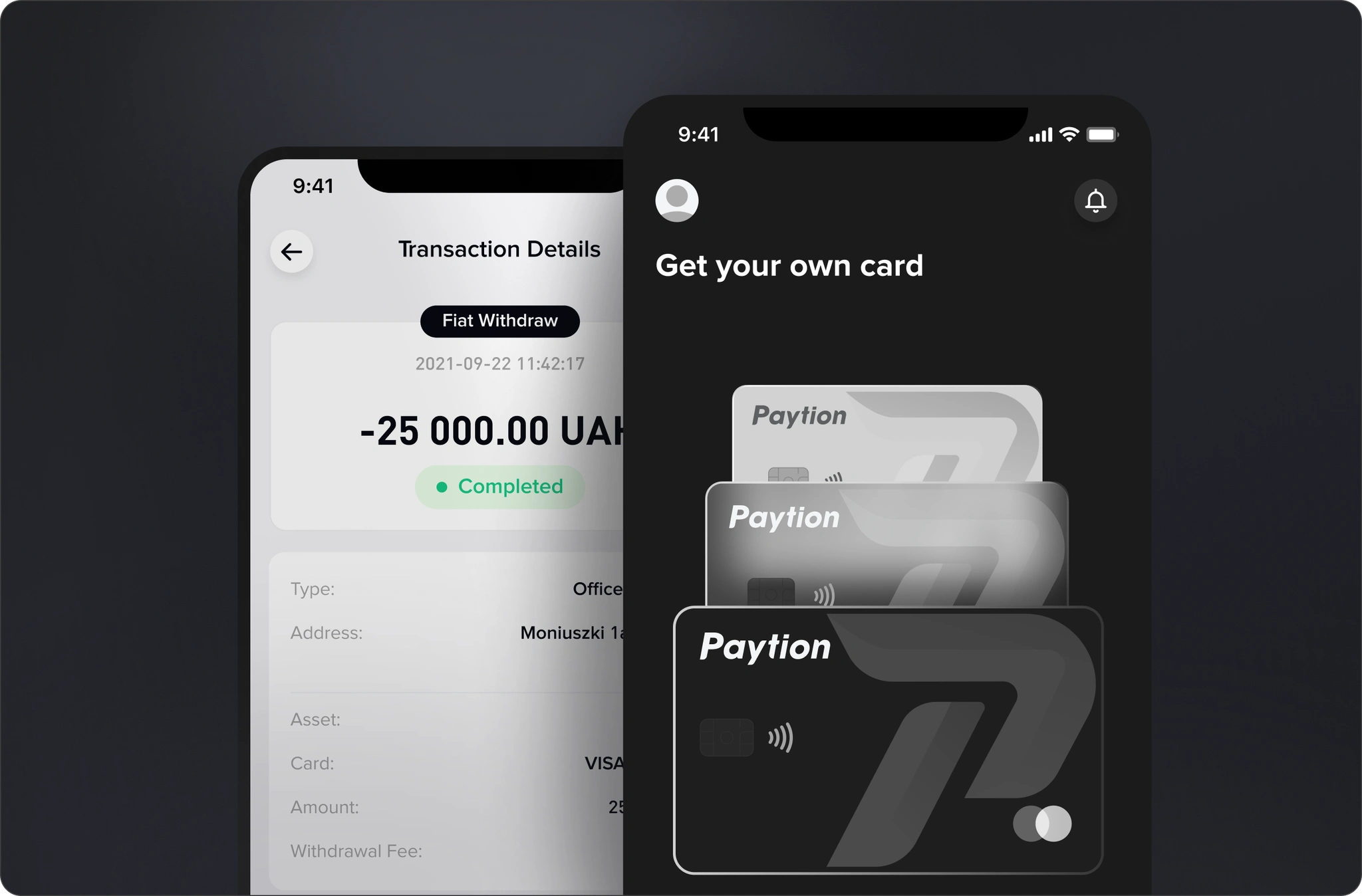
The joining the waitlist stage is designed to engage users before the official release of a new card, ensuring a smooth onboarding experience.
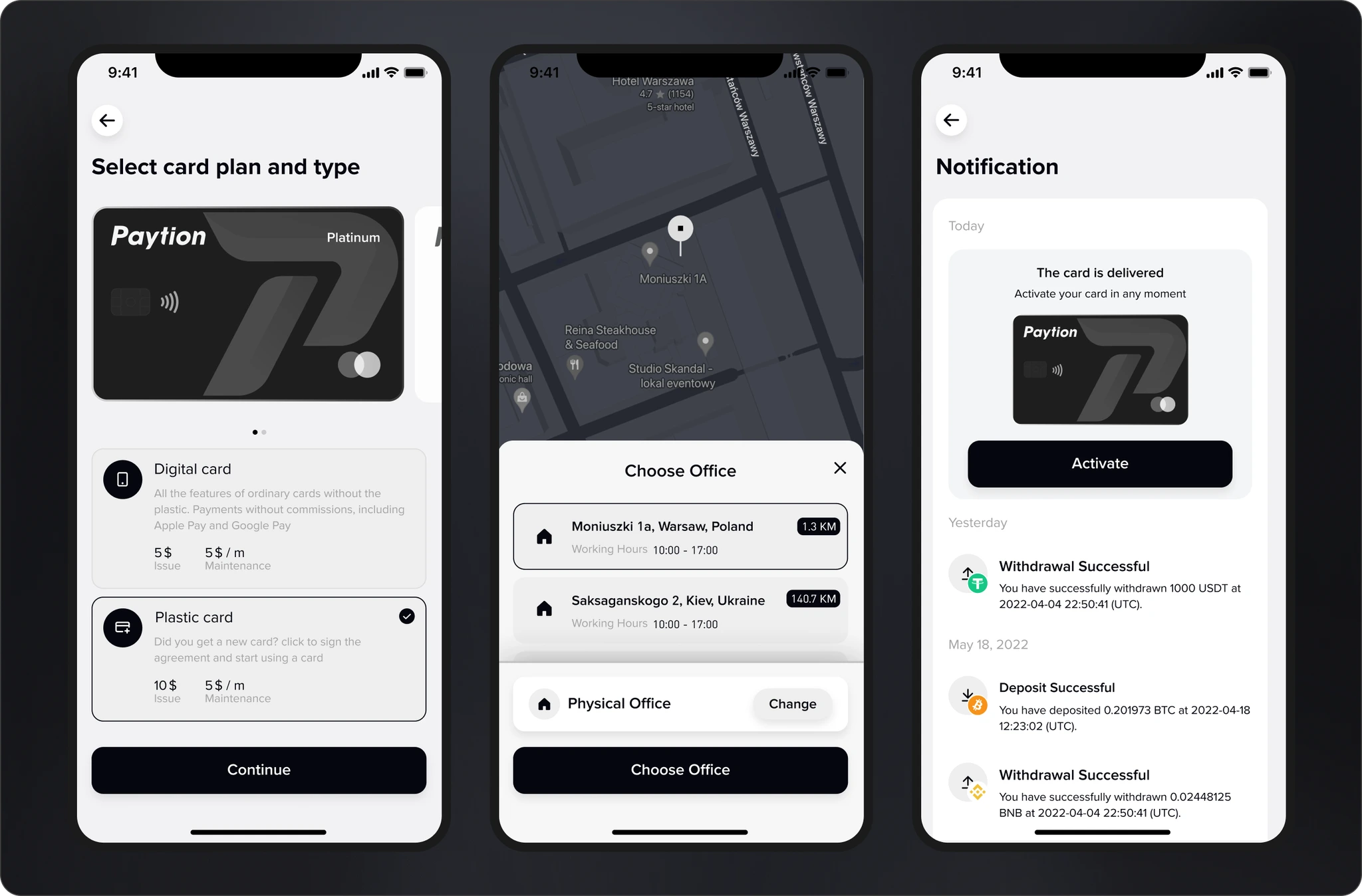
Release of a new card
This stage includes selecting the card type with a description, making the payment, and the option to receive the card online.
Card management
On the main screen, the user has access to an easy navigation service and all necessary information about the card.
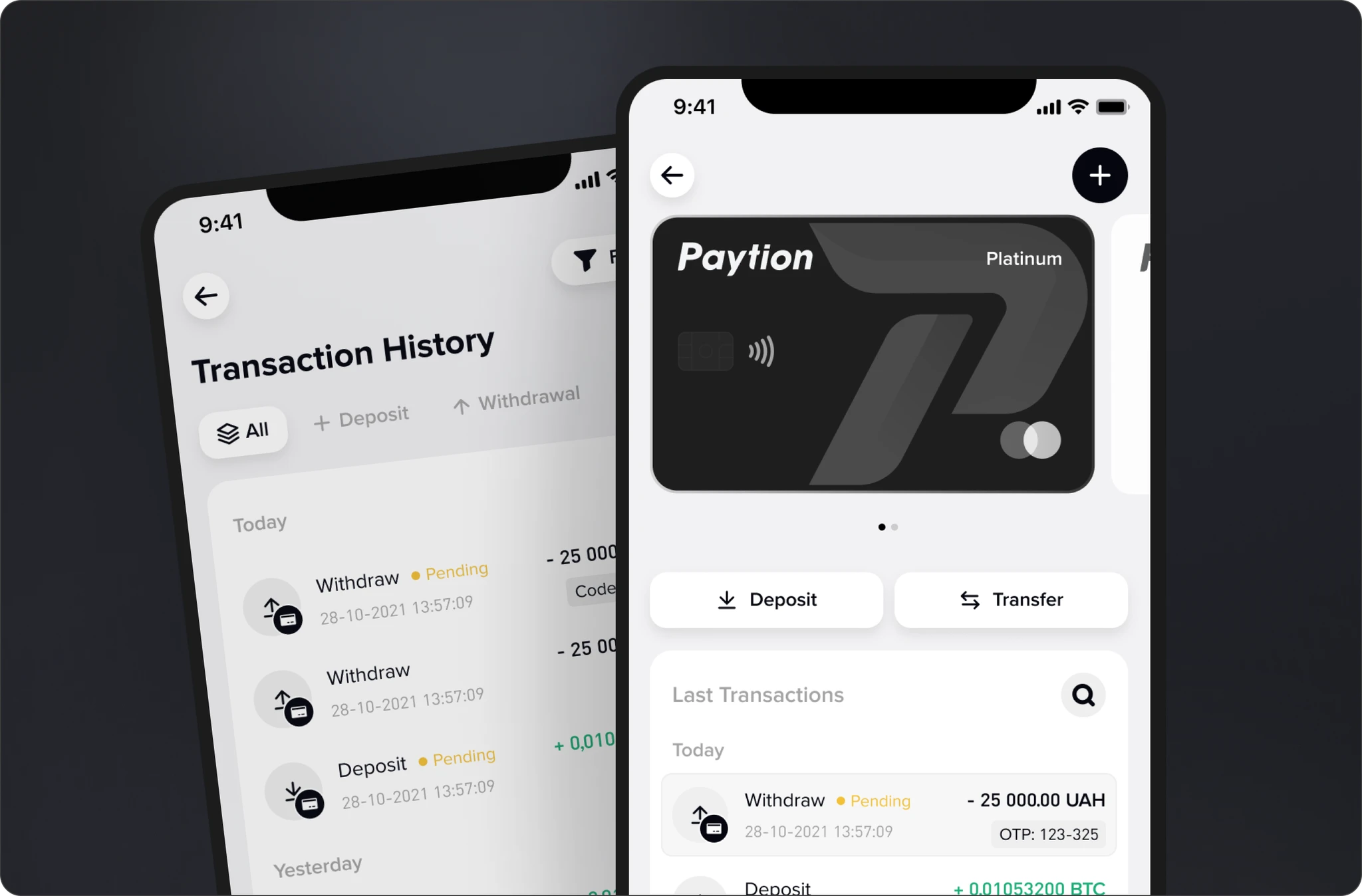
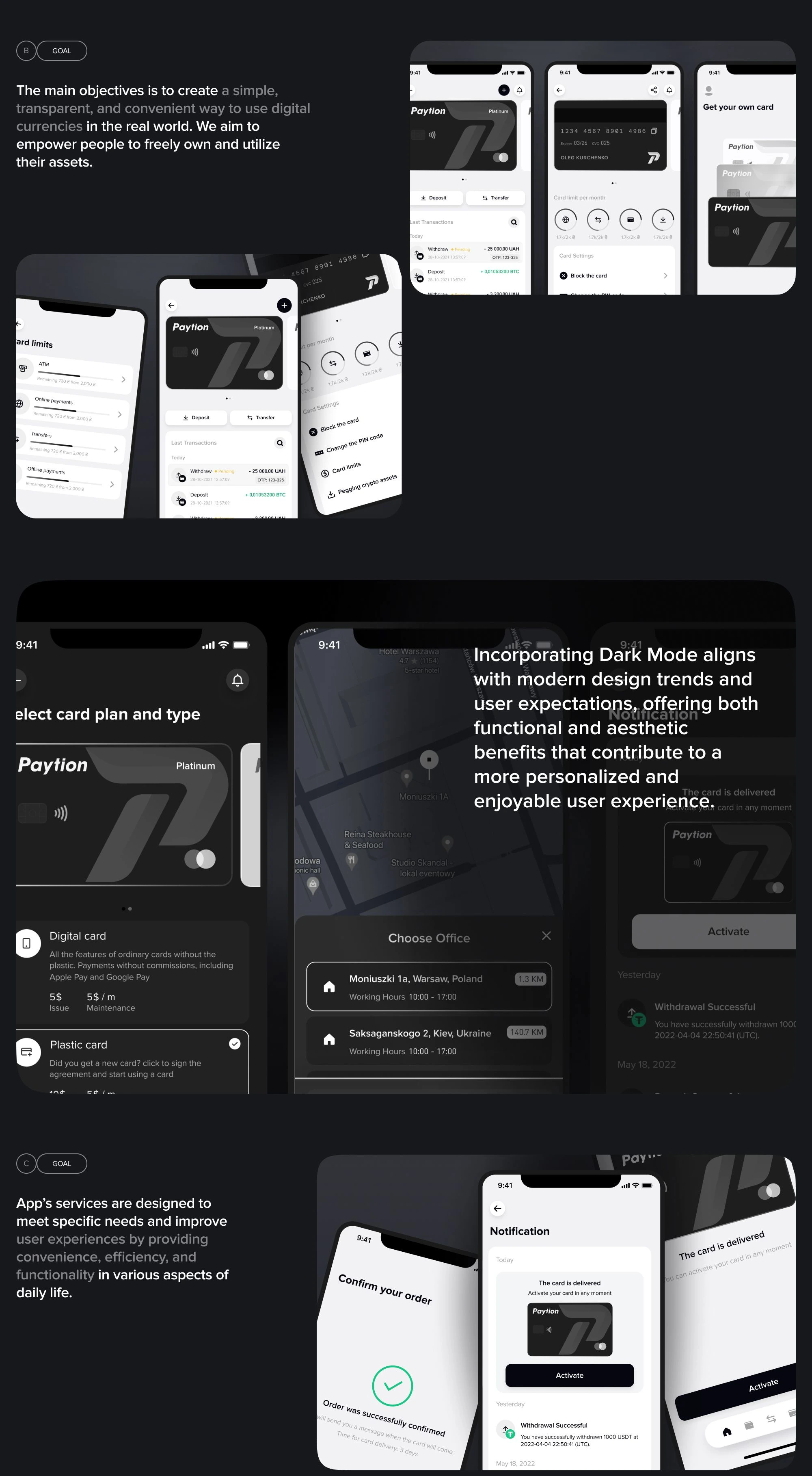
With just two clicks, users can navigate card issuance scenarios, configure existing cards (including blocking, security settings, PIN changes), set up notifications, manage payment methods, link assets, reissue, or close a card.
Dark & white
Themes for the application as a personalization of the user experience.
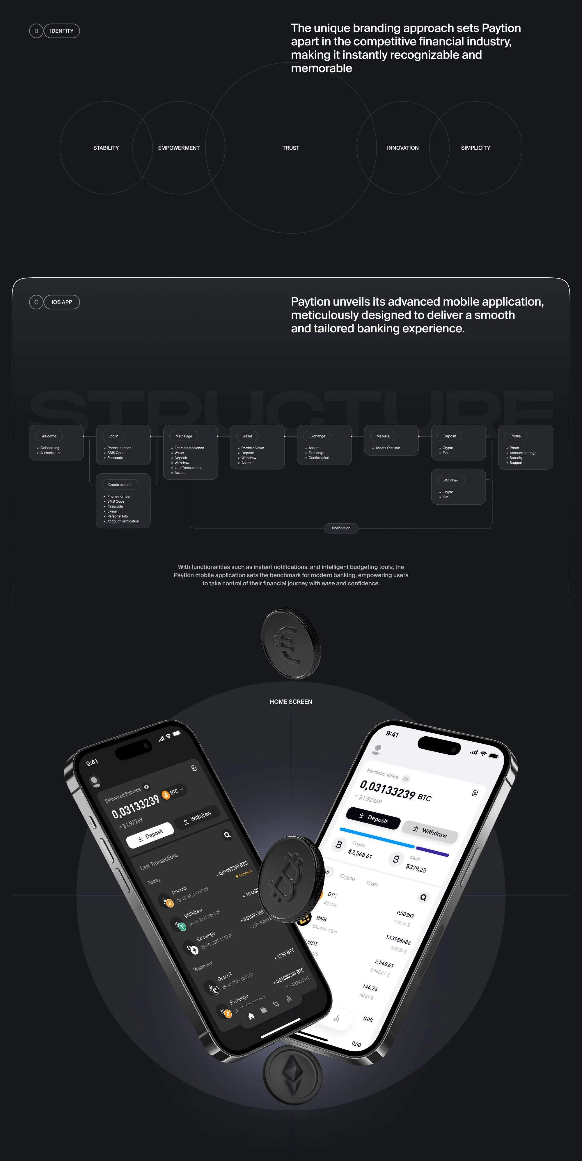
4. Creating the final UI design (product artefacts and visual identity)
5. Achievements

Provided a strong identity through user experience, ensuring intuitive usage of the mobile app. It was implemented a unique UI and developed numerous services focused on user needs.
6. Additional details about the project
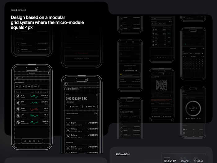
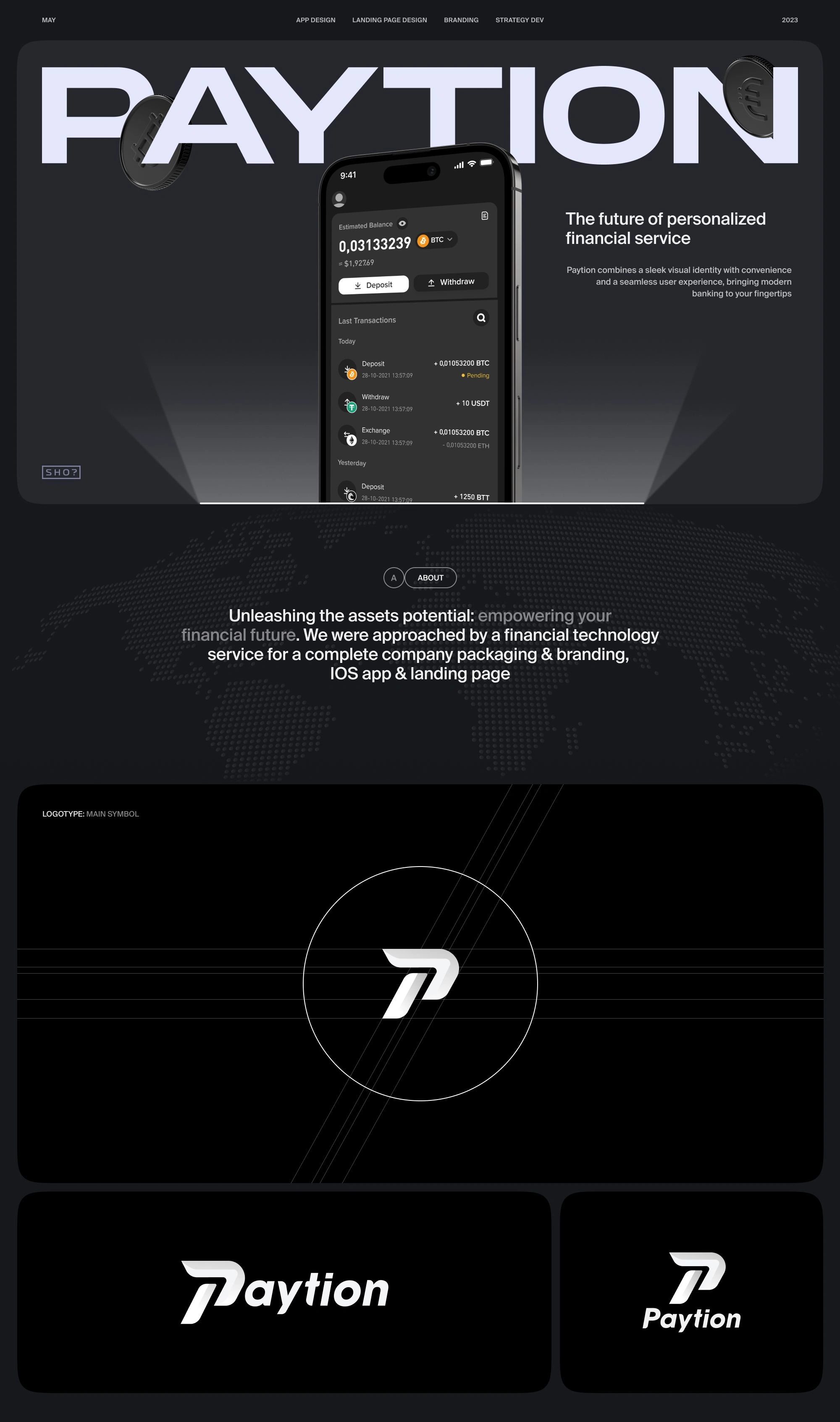
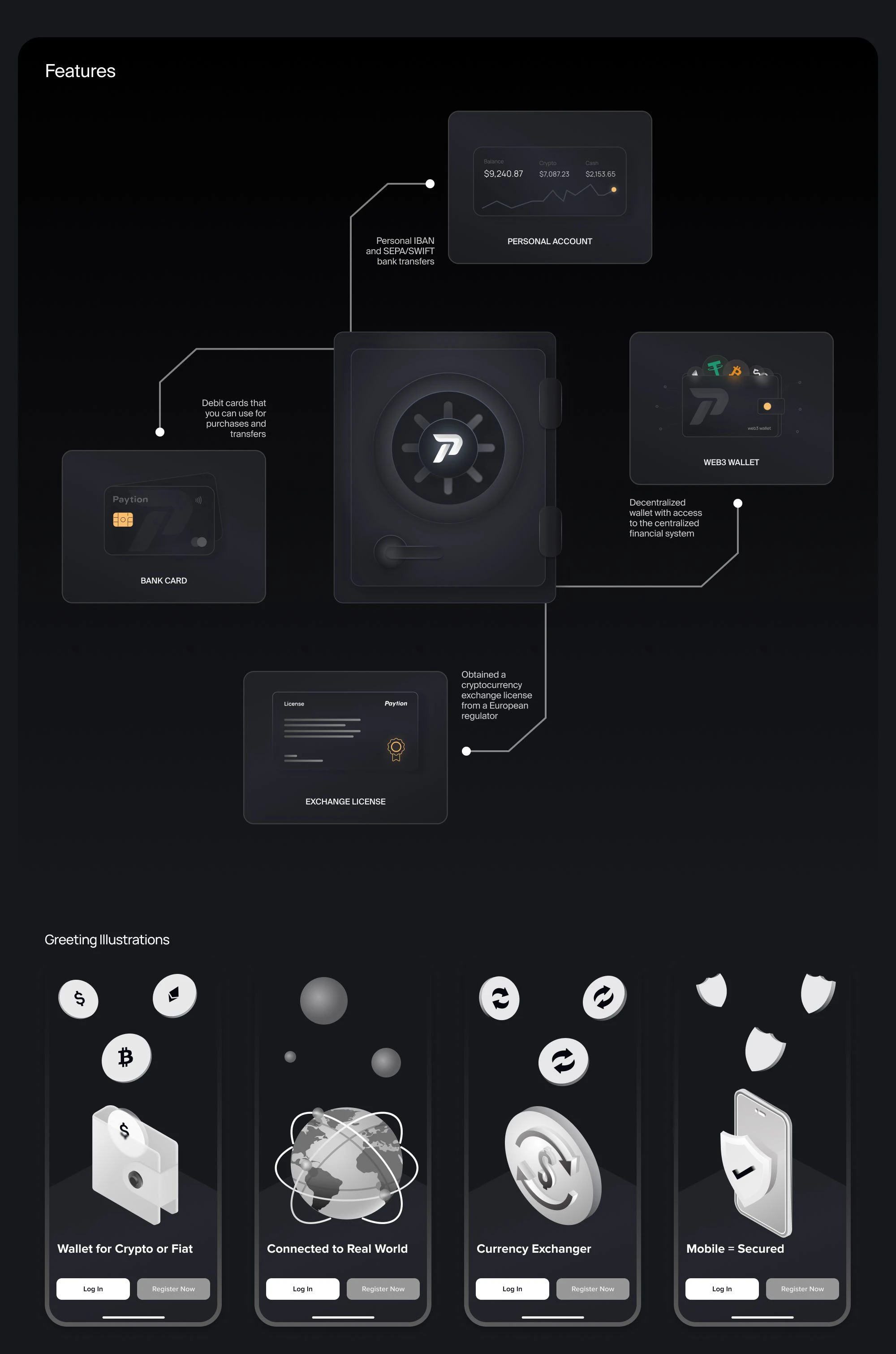
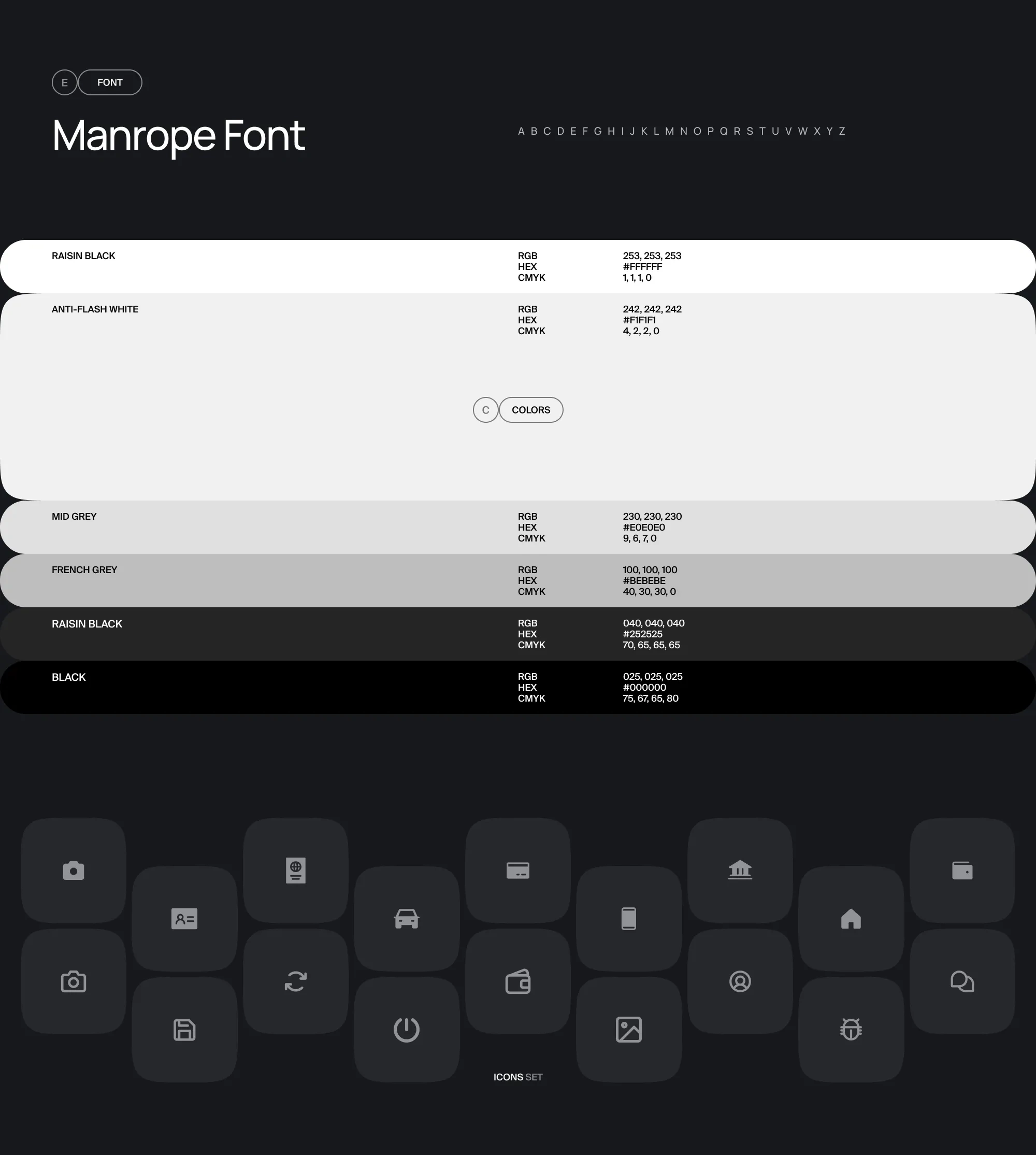
A unique branding and brand book have been created for the visual authenticity of the product.
A UI Kit has been created with all the necessary components and states.
A thoughtful color palette has been implemented for both light and dark themes.
7. Links

View Paytion Branding
Visit Paytion Website
2024 PAYTION
Like this project
Posted Sep 23, 2026
Full Paytion case study covering UX process: competitor analysis, prototyping, UI design, and achievements.
Likes
0
Views
0