E‑commerce Platform – UI/UX Case Study
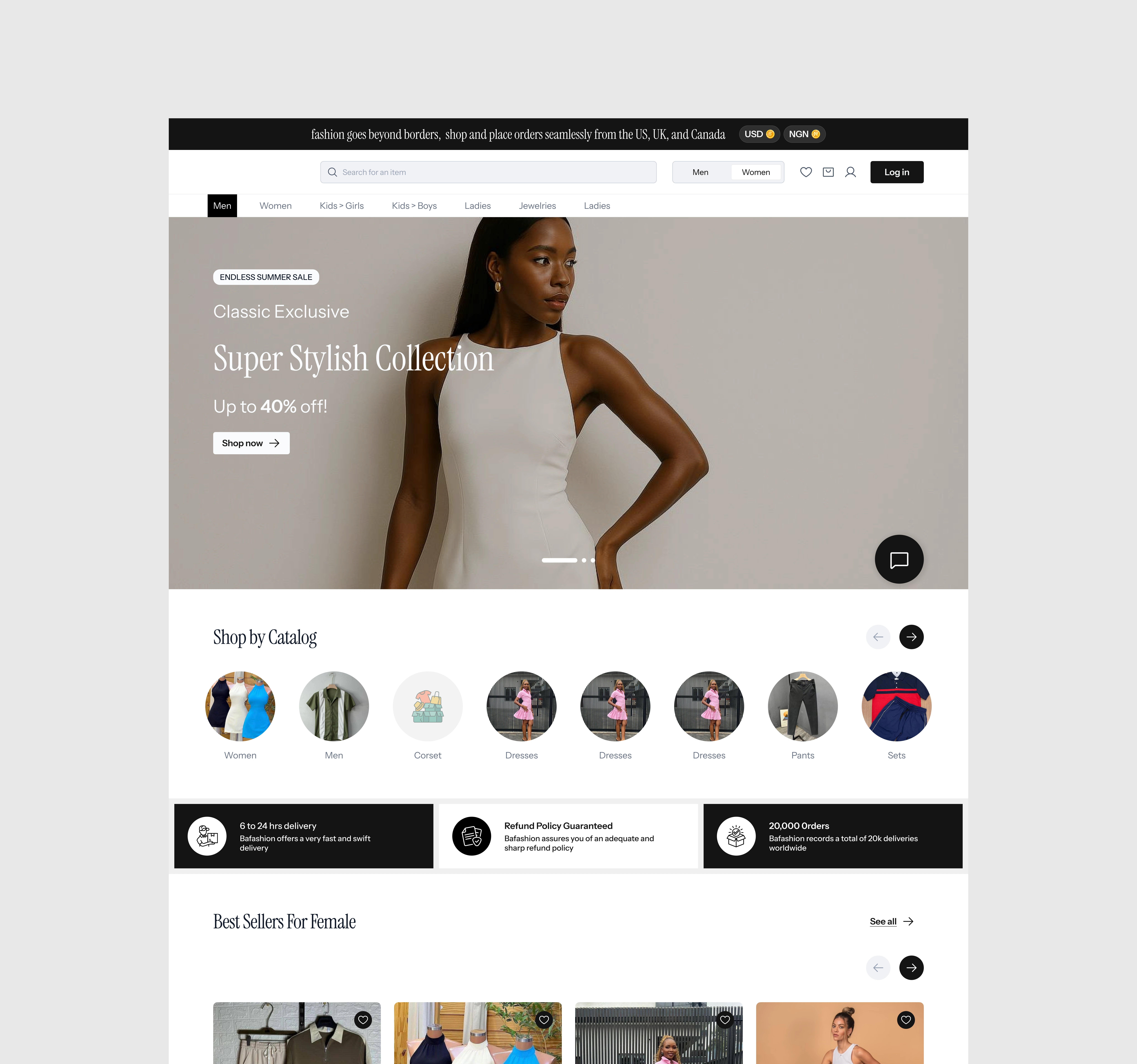
Homepage – Product Discovery Hub
Purpose
The homepage serves as the primary entry point, helping users quickly understand the brand offering and discover products.
Design Approach
A prominent hero banner is used to communicate value propositions, promotions, or seasonal campaigns. Below the banner, products are displayed in a clean, scannable grid that prioritizes imagery, pricing, and key product details.
Outcome
The layout reduces cognitive load, encourages exploration, and drives users deeper into the shopping experience.
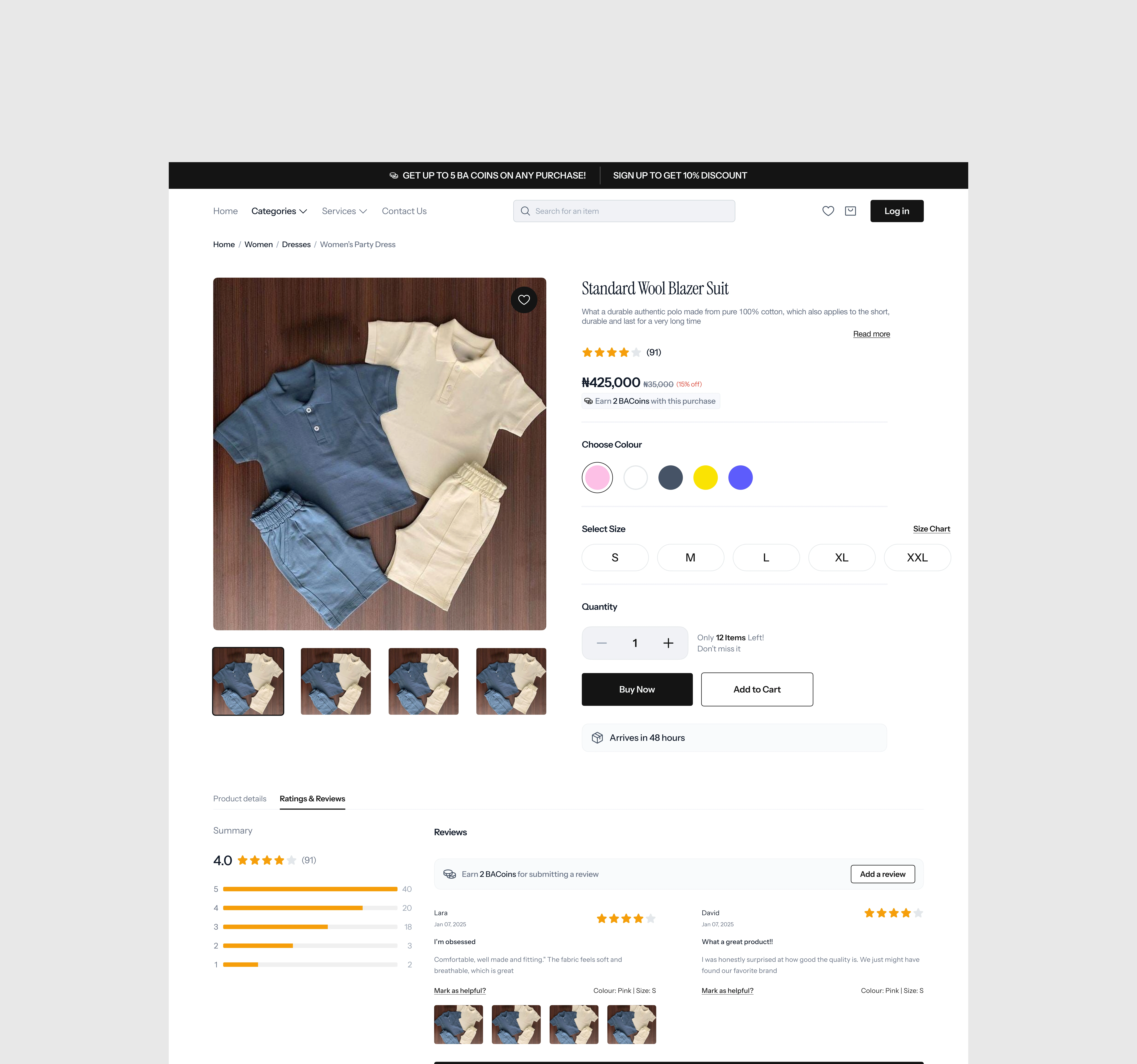
Product Details Page – Informed Decision Making
Purpose
This screen helps users evaluate a product before committing to a purchase.
Design Approach
The page highlights high‑quality product images, clear pricing, descriptions, and essential attributes. Call‑to‑action buttons are made prominent, while secondary information is neatly structured to avoid clutter.
Outcome
Users can confidently assess products, reducing hesitation and increasing conversion intent.
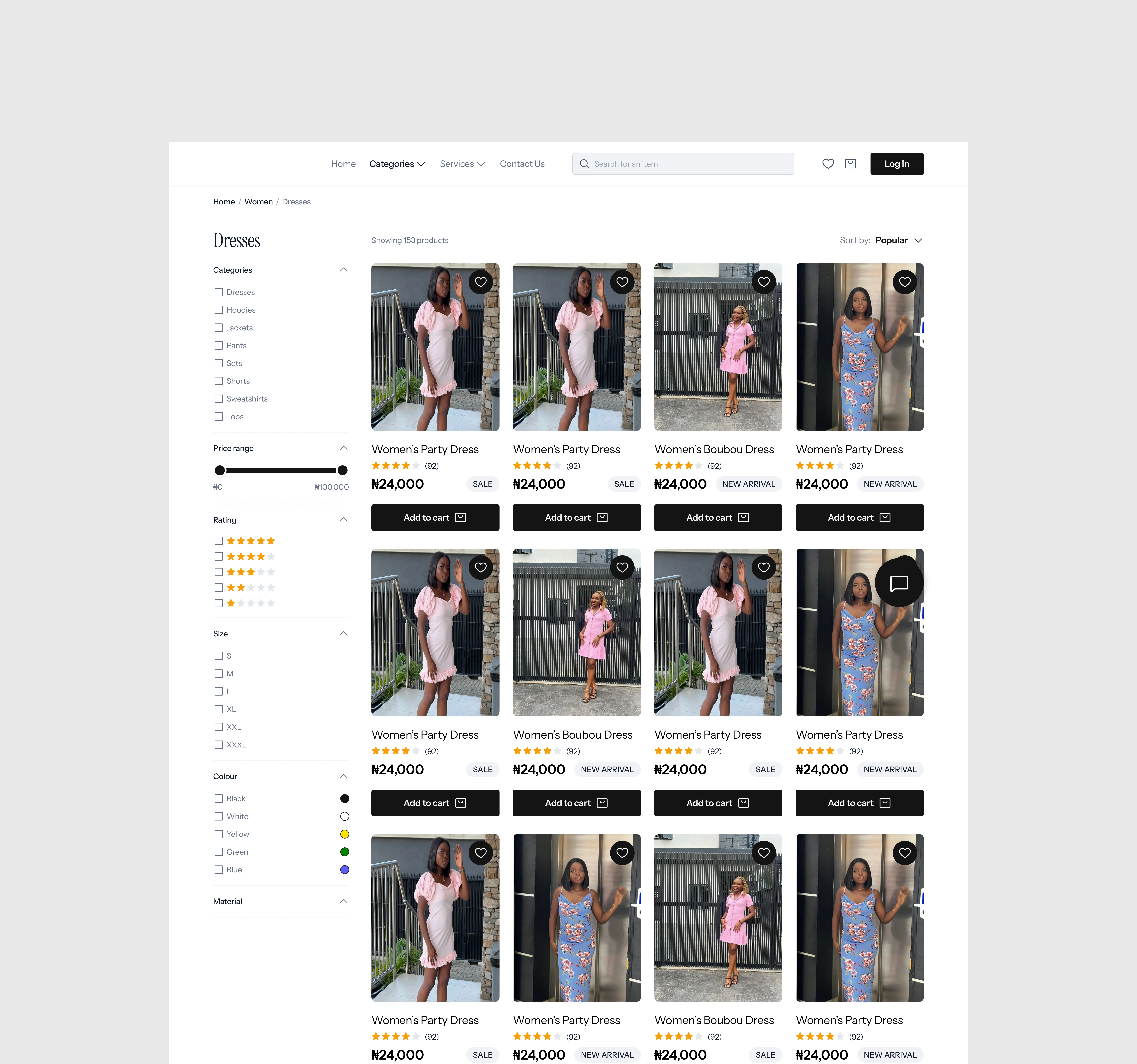
Product Filter Page – Faster Product Matching
Purpose
The filter page allows users to narrow down products based on their preferences.
Design Approach
Filters are designed to be intuitive and easy to apply, with clear categories such as price, product type, and relevance. Visual feedback ensures users understand when filters are active.
Outcome
Users find relevant products faster, improving efficiency and overall shopping satisfaction.
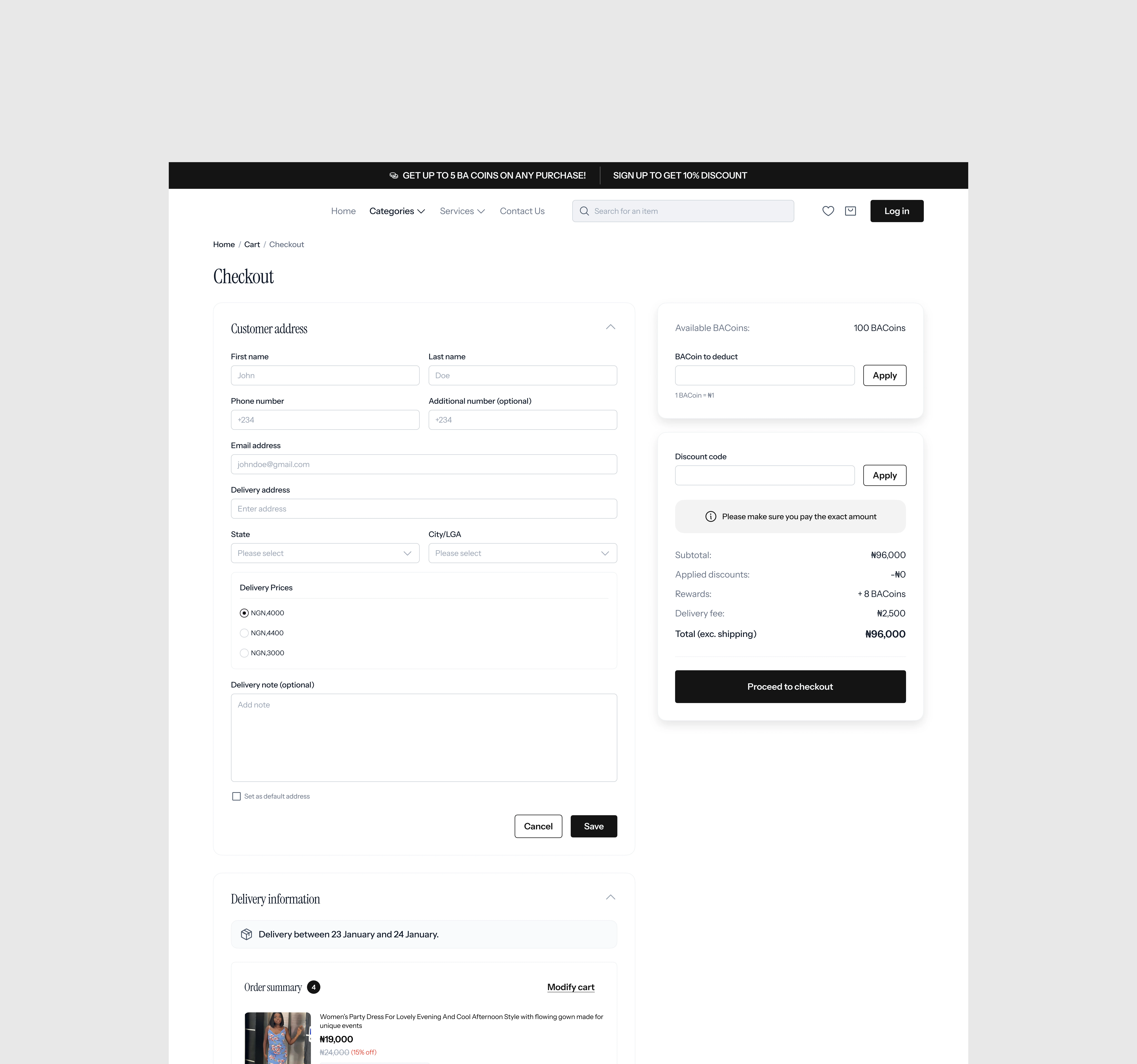
Checkout Screens – Seamless Purchase Flow
Purpose
The checkout process is designed to help users complete purchases quickly and securely.
Design Approach
The flow is broken into clear, manageable steps with minimal distractions. Form fields are optimized for clarity, and progress indicators reassure users throughout the process.
Outcome
Reduced drop‑off rates and a smoother transition from intent to purchase.
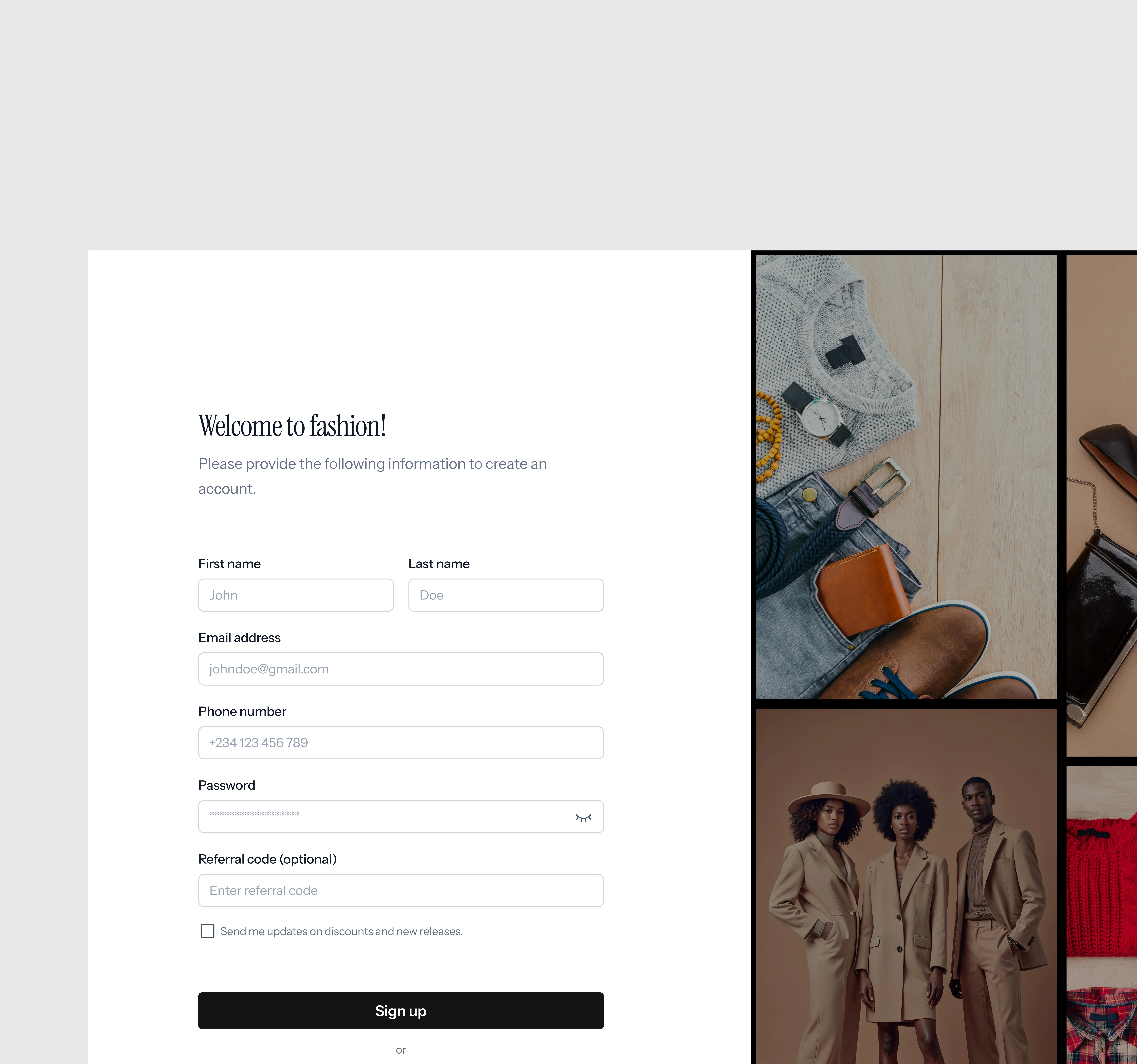
Sign‑Up Page – Simple Onboarding
Purpose
The sign‑up screen enables account creation while minimizing friction.
Design Approach
Only essential fields are requested: first name, last name, email address, and phone number. The layout is clean and approachable, with clear input labels and validation states.
Outcome
Users can create accounts quickly without feeling overwhelmed, supporting higher completion rates.
Key Takeaways
Focused on clarity and usability across all core screens
Designed scalable layouts suitable for a wide product catalog
Prioritized conversion, trust, and ease of navigation throughout the user journey
This case study demonstrates a thoughtful approach to designing an end‑to‑end e‑commerce experience that aligns business goals with user needs.
Like this project
Posted Jan 13, 2026
A robust e-commerce experience focused on effortless discovery, decision-making, and checkout.
Likes
1
Views
0

