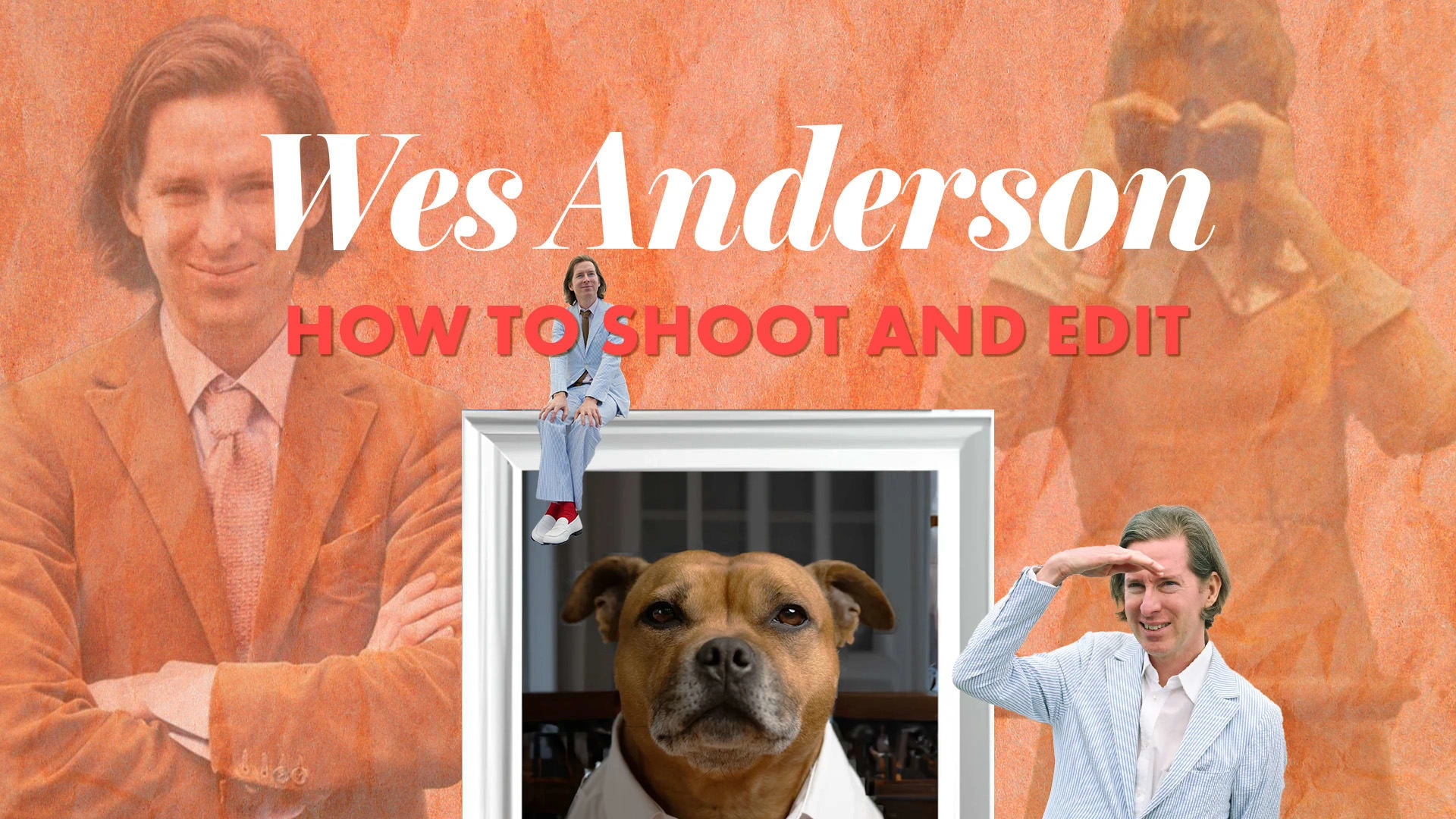
Learn How to Shoot and Edit Like Wes Anderson
I. Introduction
In this article, we’re gonna cover what makes a Wes Anderson movie look and feel like, well, a Wes Anderson movie. But first: a brief introduction.
Wes Anderson is a renowned filmmaker who’s known for his very distinctive visual style, having made films like Fantastic Mr. Fox, The Grand Budapest Hotel, Isle of Dogs, Rushmore, and Asteroid City. The most notable trade in his films is visual symmetry, often having things centered, with a clear hierarchy. There are several other noteworthy characteristics in his work, like his use of color pallets, which we will be discussing in this article. The goal is to provide tips on how to achieve a look in photography and film, inspired by Wes Anderson.
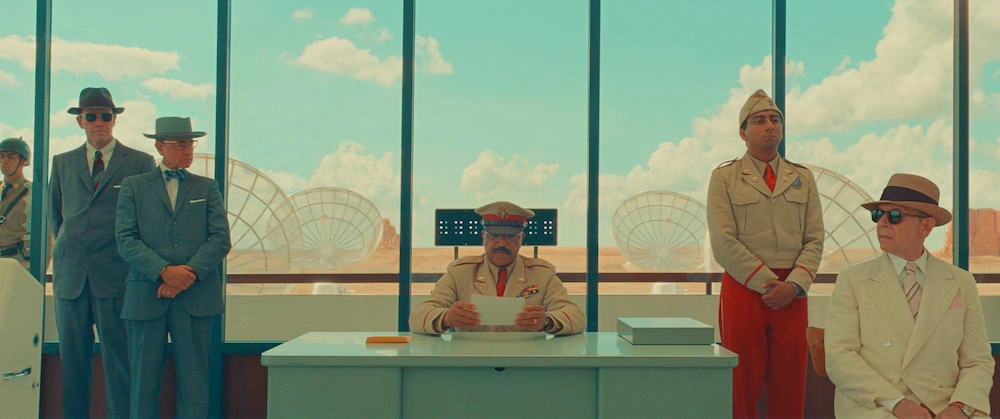
Asteroid City
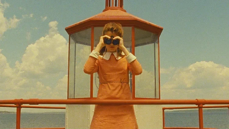
Moonrise Kingdom
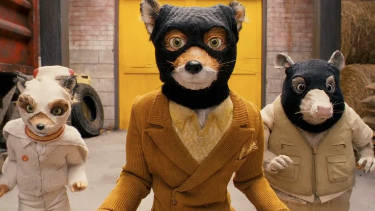
Mr. Fox
II. Understanding Visual Symmetry
Visual symmetry is when both sides of something mirror one another. In other words, if you cut the image in half, the right side would look more or less the same as the left side (mirrored of course).
Wes Anderson will often use this technique, combined with placing the main subject in the center. This creates an image that is pleasant to look at, where your eyes don’t have to keep searching for the most important thing in the frame. Wes Anderson didn’t create visual symmetry, but in modern films, he is one of the filmmakers who use this technique the most. So much in fact that people who don’t know much about filmmaking, or even about Wes Anderson himself, can distinguish the look easily. That’s why we've had a TikTok trend, where creators are utilizing the same visual symmetry, camera movements, and sometimes even the same colors, to create "their own" Wes Anderson films.
III. Composition Techniques for Achieving Symmetry
The two most popular composition guidelines are the rule of thirds and centered composition.
The rule of thirds places your subject in the left or right third of an image, leaving the other two-thirds more open.
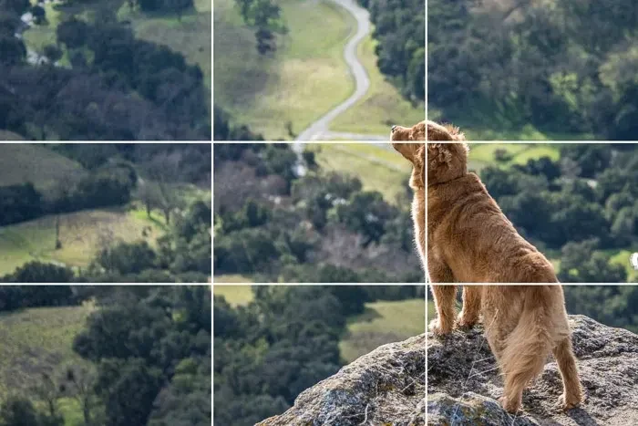
Rule of thirds
In the center composition, the main subject is placed right in the middle of the frame. Easy to see what’s the most important part of the composition, the viewers don’t need to think at all.
Often this is combined with leading lines: Human-made or natural lines that lead the viewer's eyes toward the main subject. This is the visual composition that Wes Anderson uses the most, which stands out from what you typically see in other movies.
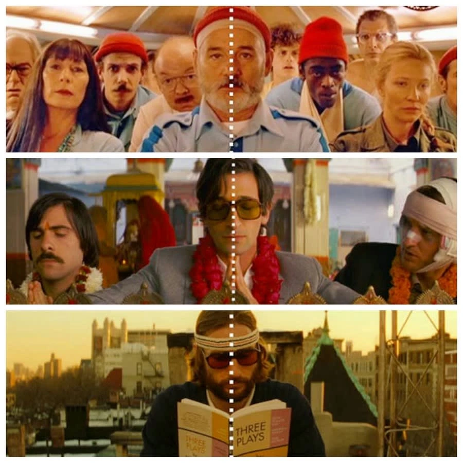
Centered composition
IV. Color and Visual Symmetry
In many of Wes Anderson’s movies, you will see harmonious color schemes. This means that the different colors that appear on the screen at the same time “agree” with each other. The colors that often appear in his movies are red, orange, and yellow. In this color chart by Beth Matthews, you can see different combinations from some of Andersons’ movies.
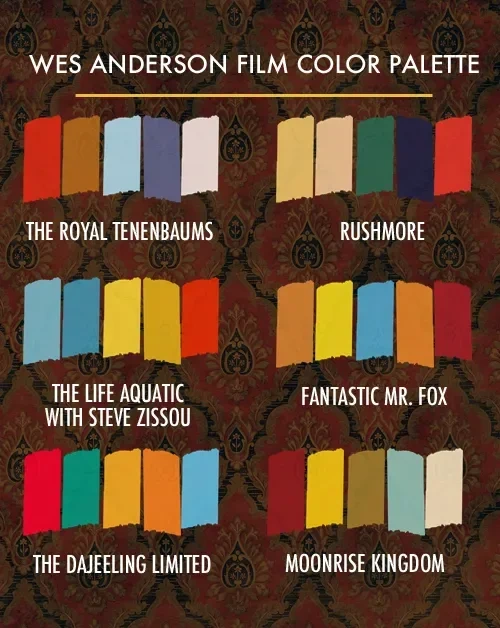
Wes Anderson Color Palette
Another technique he uses is color blocking. This is when you combine opposite colors of the color wheel to create contrast for an interesting look, like yellow and purple, or blue and orange.
V. Editing Techniques for Achieving Anderson-like Symmetry
Most of the framing is done when setting up the composition during the shoot. But there are some things done during post-production as well. Typical transitions he uses are whip-pans, match-cuts, and split screens (in addition to hard cuts). A way to hide cuts is to do either a whip-pan or panini shots. In the video below you can see all of the panning shots in The Grand Budapest Hotel.
As technology progresses there are more things that can be done in post than ever before. The ways we can manipulate to achieve the perfect look are getting more advanced every day. But that’s actually something that goes against what might feel like a Wes Anderson film. He likes to embrace an analog feel, with its flaws and quirkiness. In the video below you can see them talking about how Anderson wanted to use real animal fur for the puppets instead of synthetic fur.
VI. Mimicking the look with Ai.
Caleb Ward of Curious Refuge took it to the next level by combining several AI tools like ChatGPT, Midjourney, D-ID, and Eleven Labs, with editing software like After Effects, to create two mock movie trailers that went super viral. One of them was Star Wars, in the Wes Anderson style. This is probably the best example out there of the visual symmetry, color palettes, and lighting techniques that goes into his distinguished look.
VII. Conclusion
There’s no doubt that Wes Anderson's films have a certain look and feel to them. That’s why they are so easy to copy and make parodies of. And that brings me to my final point, which is to steal like an artist.
Wes Anderson didn’t invent any of his techniques. He has seen and learned them at an earlier stage in his career. But he has executed and combined the techniques in his own unique way. He steals like an artist, and so should you.
I encourage you to experiment with the techniques mentioned above, have fun with them, and see if there’s something you wanna bring into your own work. If so, remember to put your own twist on it.
VIII. Bonus
I just came across this YouTube video that borrows many of the tools to achieve the Wes Anderson look and feel. It addresses creative burnout and tips on what to do about it.
Like this project
Posted Jun 16, 2023
In this article, we’re gonna cover what makes a Wes Anderson movie look and feel like it does.


