MedStudy Academy
Project Overview
The MedStudy Academy is a platform dedicated to guiding pre-med and medical students, supporting them in achieving high scores on their examinations.
Objective
Von reached out to me about creating an identity for MedStudy Academy, an online coaching platform focused on aiding pre-med and medical students in exam preparation, with the ultimate goal of achieving impressive scores.
Challenge
Tasked with developing a brand identity, the challenge was to encapsulate the essence of MedStudy Academy while adhering to specific design brief requirements. The project demanded a simple, modern, and responsive identity.
Result
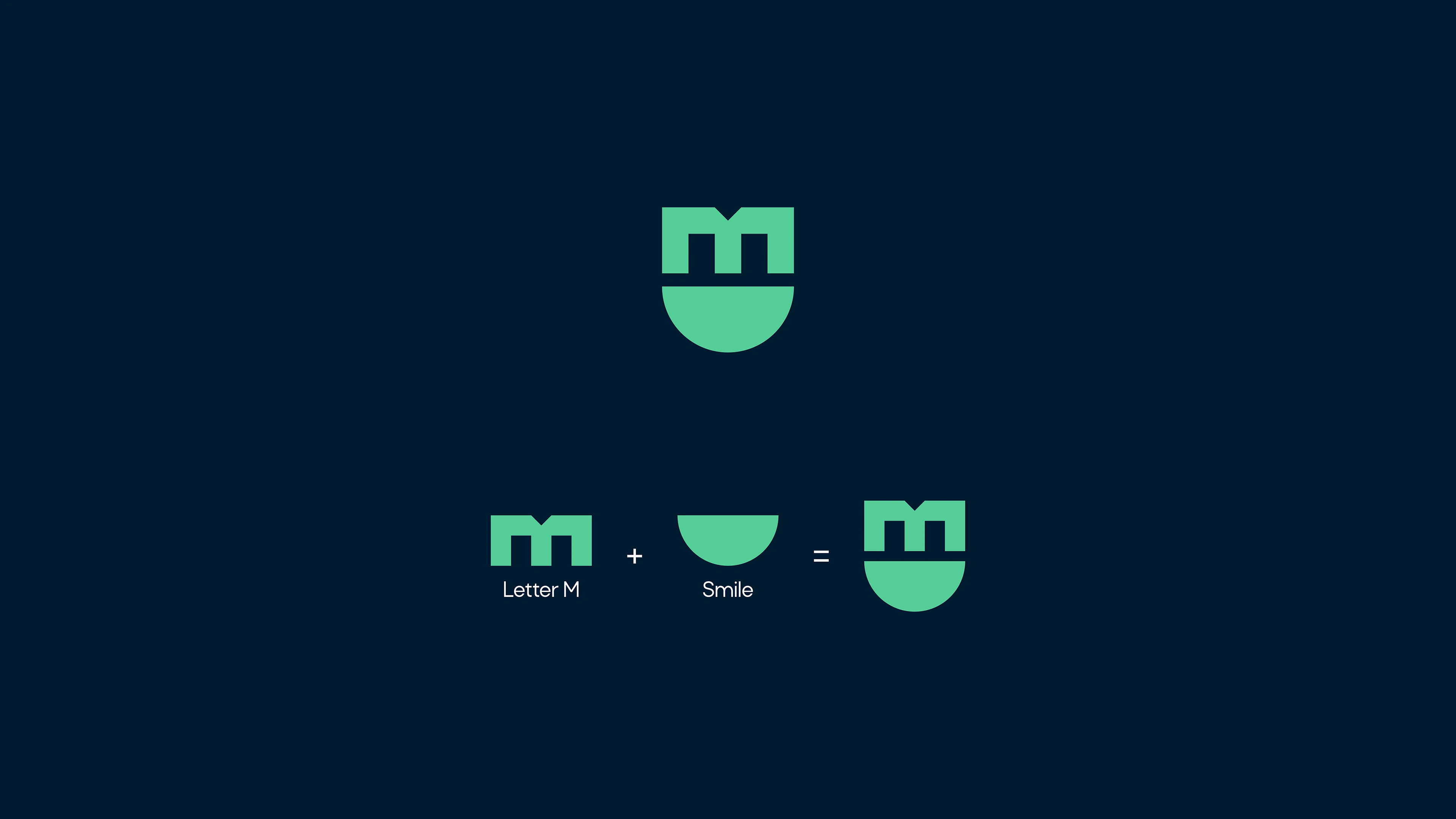
Drawing inspiration from the client's vision and project requirements, I generated multiple design concepts, carefully selecting those that aligned seamlessly with the design brief. The focus was on crafting a logo that not only met the criteria of simplicity, modernity, and responsiveness but also visually conveyed the desired emotional connection. The final execution featured the letter 'M' intertwined with a semi-circle, successfully representing the joy and accomplishment associated with acing examinations.


Like this project
Posted Feb 5, 2024
MedStudy Academy is a platform that helps prospective students prepare and eventually get into their dream medical s…


