Apple Bites - Logo and Graphic Designs
The Brief
Two clients, Emily and Sarah, have approached me for a logo design project for their new venture, Apple Bites, a company specializing in healthy snacks and food products. Apple Bites focuses on providing bite-sized apple snacks, dried fruits, and a variety of fruit-based products such as apple chips, apple sauces, and apple-flavored snacks.
Logo Requirements
The logo should be hip and appeal to a younger audience.
It must have the ability to be used in one color for versatile application.
Consider incorporating elements like apples, leaves, or other natural imagery to emphasize the brand’s focus on health and nature.
The design should be simple yet memorable, ensuring it stands out on packaging and digital platforms.
Firstly
Creating a mood board for visual inspiration

Typography
The Creative Process Begins! With the mood board as my guide, I dove into the design process with a focus on crafting something that is both hip and modern. I approached the designs with a youthful energy, keeping the playful and fresh vibe of Apple Bites in mind.
I always start my designs in black and white, ensuring that the core elements stand out without the influence of color. This allows me to focus on the strength and clarity of the typography and logo structure, free from any bias that color might introduce.

I experimented with various ways to infuse playfulness into the Apple Bites logo. One idea was to incorporate a dotted "i," adding a whimsical touch that could resonate with the younger audience. I also considered making the letters slightly uneven or having the "B" take on a more dynamic shape to embody the playful essence of the brand.

Once I was satisfied with the typography, I shifted my focus to developing the icon part of the logo, ensuring it harmonized with the overall design.

I explored a few more font options and brainstormed additional ways to bring out the playful essence of Apple Bites. I considered how to best represent the brand's fresh, healthy vibe, and sketched out a few more apple-themed illustrations.
Once I shared these updates, Emily and Sarah felt like we were definitely moving in the right direction—I'd say about there! They particularly loved the bottom right font paired with the apple icon. They were so excited about the progress that we began discussing colors right away.

The big decision was whether to go with a red or green apple. Red felt bold and classic, evoking a sense of tradition and familiarity, while green suggested freshness and vitality. Each had its merits, so it was just a matter of which one would best capture the brand's identity.

The Finalized Logo
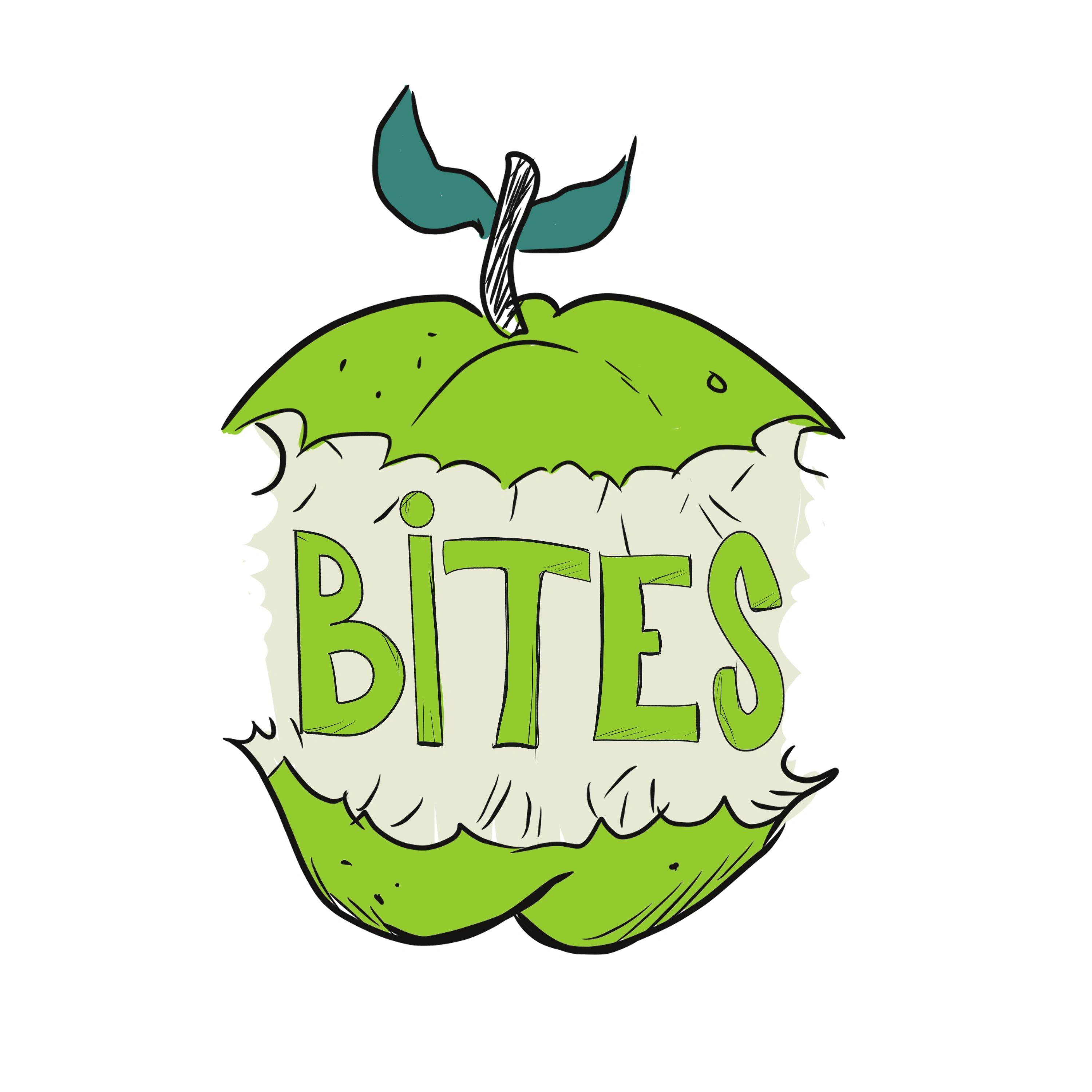
The Final Logo
After almost two weeks of creative exploration, we’ve successfully met our deadline, delivering the final logo for Apple Bites!
Emily and Sarah were both thrilled with the outcome, and I have to say, I’m really pleased with how it turned out as well. While I still have a soft spot for some of the earlier, more playful designs, I understand the need for a slightly more urban and refined look that still appeals to a younger audience. The final logo strikes the perfect balance—it’s fun and inviting.
Here's the final logo

Like this project
Posted Aug 22, 2024
Apple Bites is a fresh and innovative company offering healthy, bite-sized apple snacks and a variety of fruit-based products. They provide nutritious options l
Likes
0
Views
9


