Design System Foundation for Healthcare
viro
Design System Foundation
Building a scalable and web-accessible design system
Overview
🏥 The company
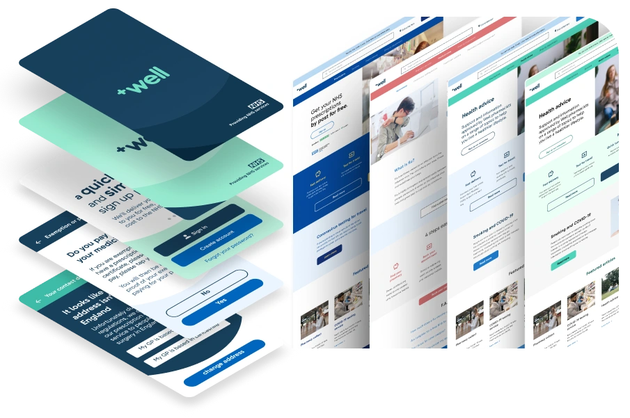
Well Pharmacy is a healthcare company that provides digital pharmacy services and support the UK's medical prescription for the National Healthcare System - NHS.
They are the third-largest Pharmacy chain in the UK, and over the past few years have decided to invest heavily in technology to give their clients more choice in how to get their medicine and make the business more efficient.
🪤 The challenge
To quickly design and iterate across teams on new features for products, we needed a consistent, reusable and web-accessible design system. (*1)
-(*1) "A design system is complex configured libraries of design elements and decisions, treated as single source-of-truth, that helps to seamlessly design and build consistent and scalable digital products - Viro "
This project was developed in a fast pace along with other projects for around 6 months. I was responsible for leading the foundation and design strategy contributing to produce all major deliverables in collaboration with a developer and a designer.
Discovery
🎯 Problem definition
Along with multiple team members, we conducted a series of workshop to identify
the main problems and needs for the design system.
Some of the main issues addressed were:
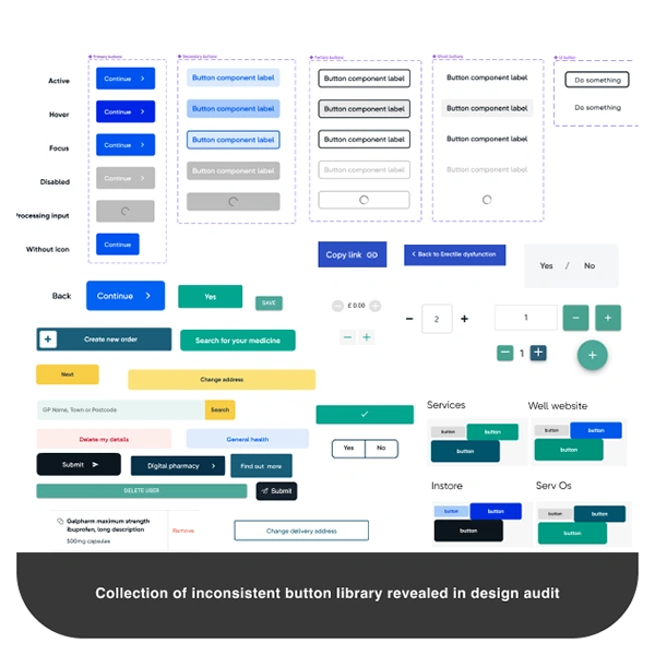
● Lack of design consistency in components across multiple products.
● Not clear design guidelines and handoff specifications for engineers.
● Accessibility problems in foundations design elements like: colour, typography, layout and spacing.
● Broken, non-reusable and inconsistent design components not linked to the main source-of-truth.
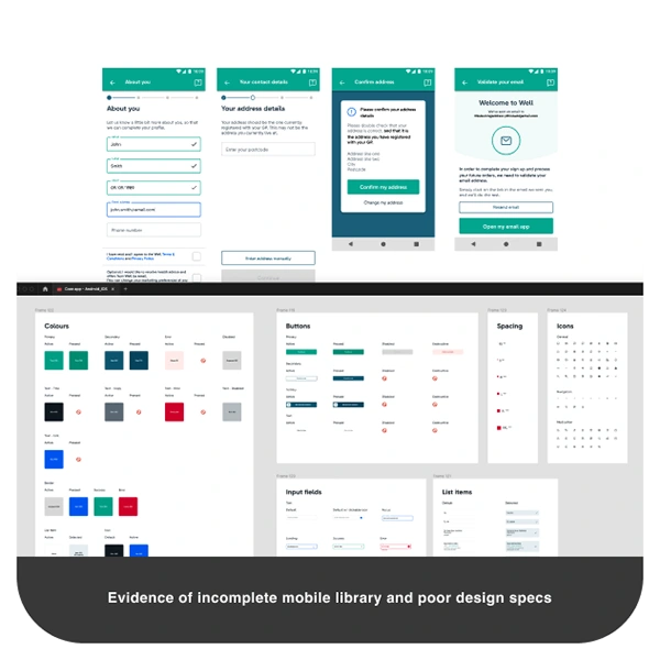
● Absence of mobile components and guidelines in different screen sizes.
Considering the team's more critical problems and the business needs in terms of product grow and workflow speed, we set the following two main goals at the first stage of the project:
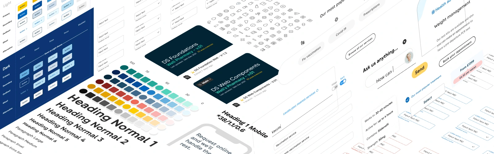
⭐️ Creating a foundational design system library that included colours, typography and layout settings and meet the minimum web accessibility standards.
⭐️ Setting up a reusable design system library in Figma with core
components that could be reused across platforms and services
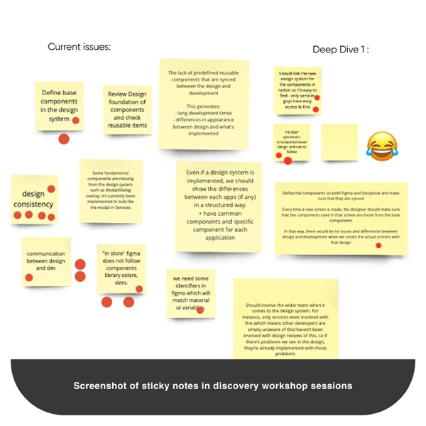
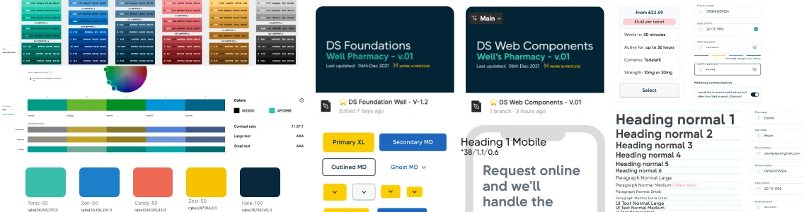
Screenshot of findings in Discovery sessions
Design process
🔬 Test and validation
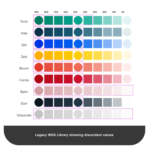
Firstly, we started auditing legacy design system libraries and filtering off the components across all the products. Thanks to Figma Analytics, we could identify the most used components and noticed a huge amount of not reusable, detached and async variants, in some cases even with inconsistent Token values. (*2 )
2 - "Design Tokens are identifier or data values created by a design decision, which is set in either in a source-of-truth or Dev environment. - Viro"
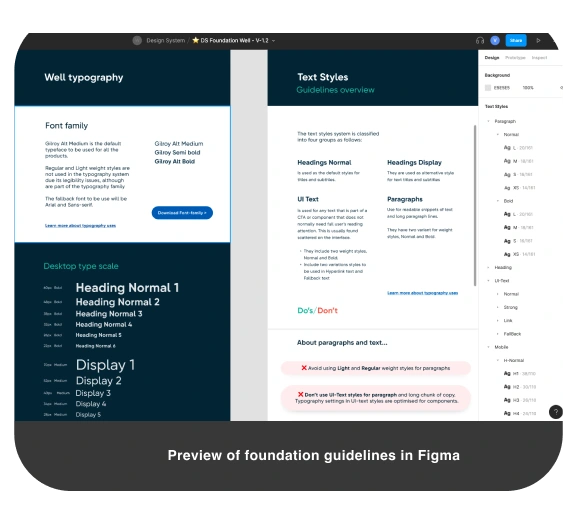
Finally, we dived into foundation design elements that conformed the brand, such as colour hues, text styles, spacing system and layout sizes.
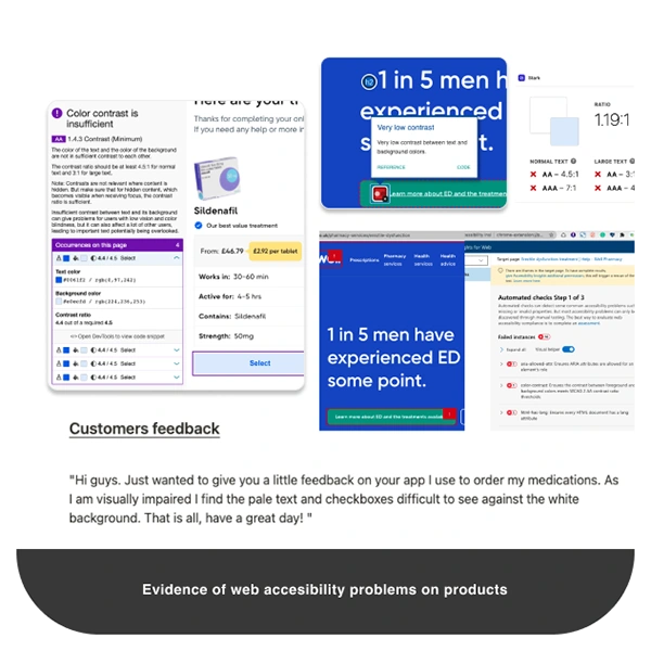
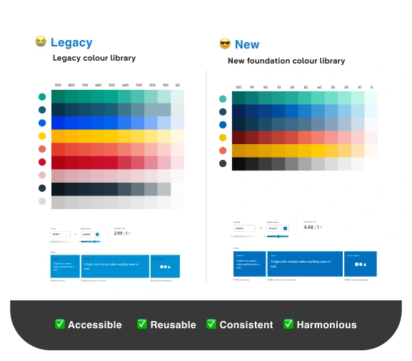
Colour tests showed combination of colours not accesible for visual impaired users and poor colour contrast ratio in text styles. Library of hue colours were inefficient and not reusable in components.
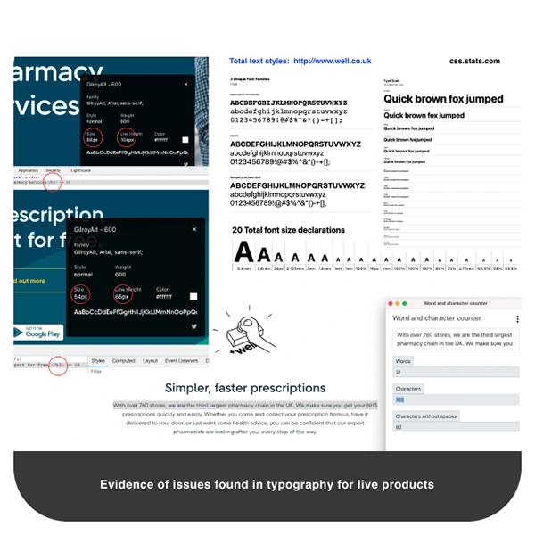
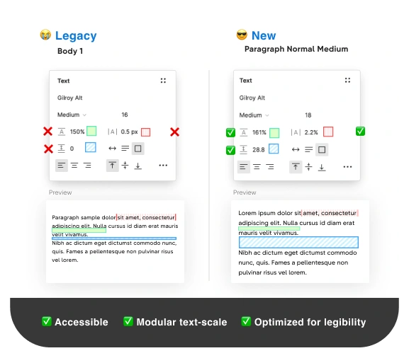
When analysing text styles we found out inconsistencies in text hierarchy, legibility issues and absence of text styles for mobile. Designers, were often forced to detach desktop styles and manually modify them for use.
All tests run, validated our assumptions in regards to the problems and help us to define and implement a clear design strategy. We performed stress tests and quality assurance checks in Figma and Storybook components. Accessibility tests were run with various online tools such as Accessibility Insight, Chrome Lighthouse, Colorbox and Sim Daltonism for Mac. In Figma we used plugins like Contrast and Stark.
Product audits and test sessions
🔑 Strategy and creation
After a in-depth online research, competitive analysis and check of design settings, I proposed to adopt the Atomic design strategy ideated by Brad Frost. The model works as a cascade design and is managed in a single source-of-truth meaning that we could have a unified point of control and a consistent scalable library.
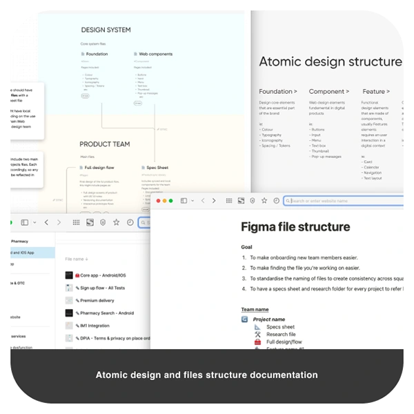
Design strategy documentation
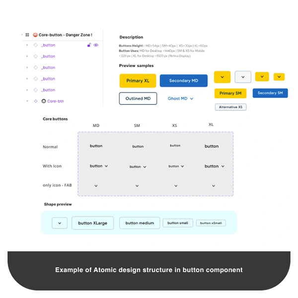
To make the most of the reusable components and trying to emulate CSS code conventions, I came up with a universal component design strategy to build core elements, like buttons and input fields.
A universal component is made up by a single source of elements that cascades along multiple variants and act as a matrix. This helps to quickly develop new iterations and reduce drastically the amount of variants needed in the library.
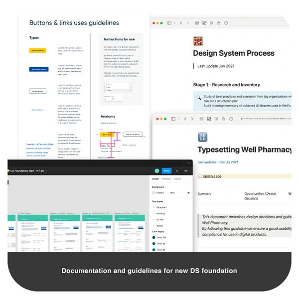
Guidelines of use and specifications were thoroughly documented in Notion and Figma. In addition, comments were added in key areas of Figma GUI for adding extra support to team members.
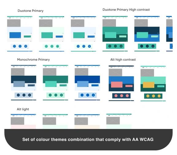
Interactive accessible set of buttons in Figma, applied to different backgrounds
Delivery
📈 Results and final thoughts
Though, only core components were built in the DS, process for new UX iterations and spreading of the new system were gradually implemented in other services.
In this project, I set the cornerstone for evolution and growth of the brand in compliance with the best web design practices and accessibility standards.
We see a huge improvement for delivery times, design iteration and prototyping among designers, this help us to focus more in UX problems and new features rather than UI patterns or visual design elements.
Deployed products synced and matched delivered designs and therefore impacted positively on end-users across all services.
Design systems are constantly evolving and adapting to designer's solutions, having a well-crafted and configured library meant hundreds of working-hours saved and better collaboration across all the UX team.
Disclaimer: Some images or processes could be omitted or uncompleted due privacy and confidentiality purposes
#Figma #Accessibility #DesignSystem #AtomicDesignSystem #DesignFoundation #UniversalComponent
Victor Romero | virodesign
UI Designer Lead
Thanks for your appreciation ♥️
Like this project
Posted Sep 11, 2025
Setting up a Design System Foundation library accessible and reusable for a pharmacy company in the UK